Society of Visual Storytelling

    SVSLearn Forums

    • Register
    • Login
    • Search
    • Recent
    • Tags
    • Popular
    • Users
    • Groups
    • Search

    JULY CONTEST WIP: South Beach

    Artwork
    7
    15
    963
    Loading More Posts
    • Oldest to Newest
    • Newest to Oldest
    • Most Votes
    Reply
    • Reply as topic
    Log in to reply
    This topic has been deleted. Only users with topic management privileges can see it.
    • djly
      djly last edited by

      I love the idea and hope to see the final result!

      1 Reply Last reply Reply Quote 0
      • braden H
        braden H last edited by

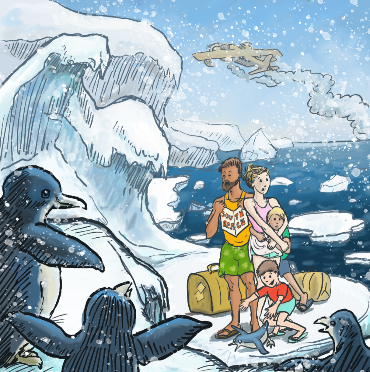
        I was gonna say 'you should have a boat steaming away in the background' but then noticed the float plane takin' off :smiling_face_with_open_mouth_closed_eyes:

        This one's gonna look awesome, i think.

        1 Reply Last reply Reply Quote 0
        • chrisaakins
          chrisaakins last edited by

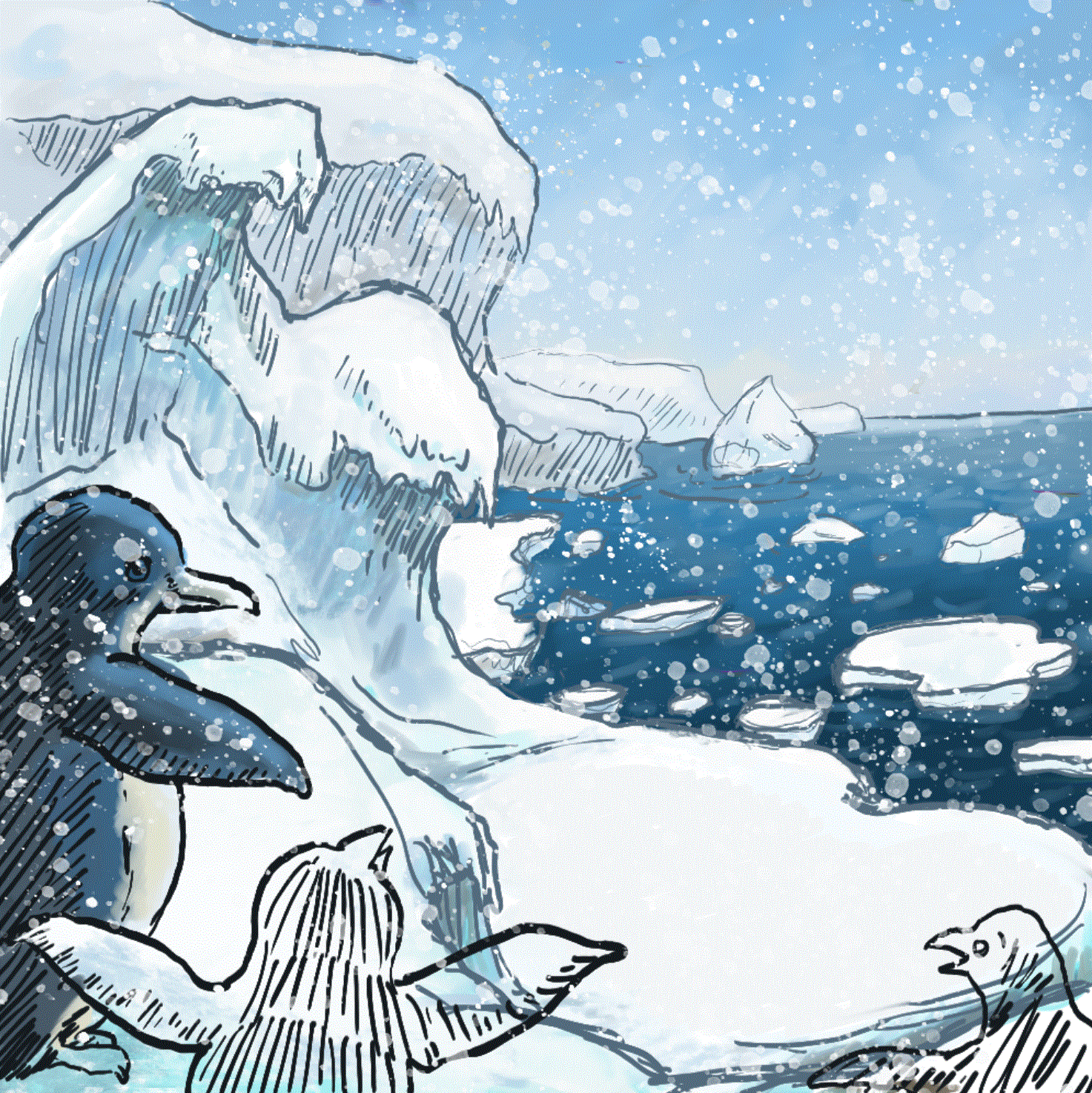
          Thanks @Chip-Valecek @djly and @Braden-Hallett. I have had several hours to work today and so I worked on the background. I have started my penguins. I added the snow to see what it would like. What do you think so far?

          BTW I love your line work @Braden-Hallett and I am curious what brush you use. I am using Kyle's thin to thick but I am not entirely satisfied with it.

          south beach GIF.GIF

          Chris Akins
          www.chrisakinsart.com
          www.instagram.com/chrisakinsart/

          MichaelaH braden H Erin.Cortese 3 Replies Last reply Reply Quote 2
          • MichaelaH
            MichaelaH @chrisaakins last edited by

            @chrisaakins Wow that was quick, great work so far.

            https://www.instagram.com/michaelaheimlich/
            https://www.heimlich-illustration.de/

            1 Reply Last reply Reply Quote 0
            • braden H
              braden H @chrisaakins last edited by

              @chrisaakins Thanks 😃

              I use a custom brush in corel painter. I can't actually remember what I started with since I've modified it so many times over the years. It always looks a little different with different textures, too.

              1 Reply Last reply Reply Quote 0
              • chrisaakins
                chrisaakins last edited by

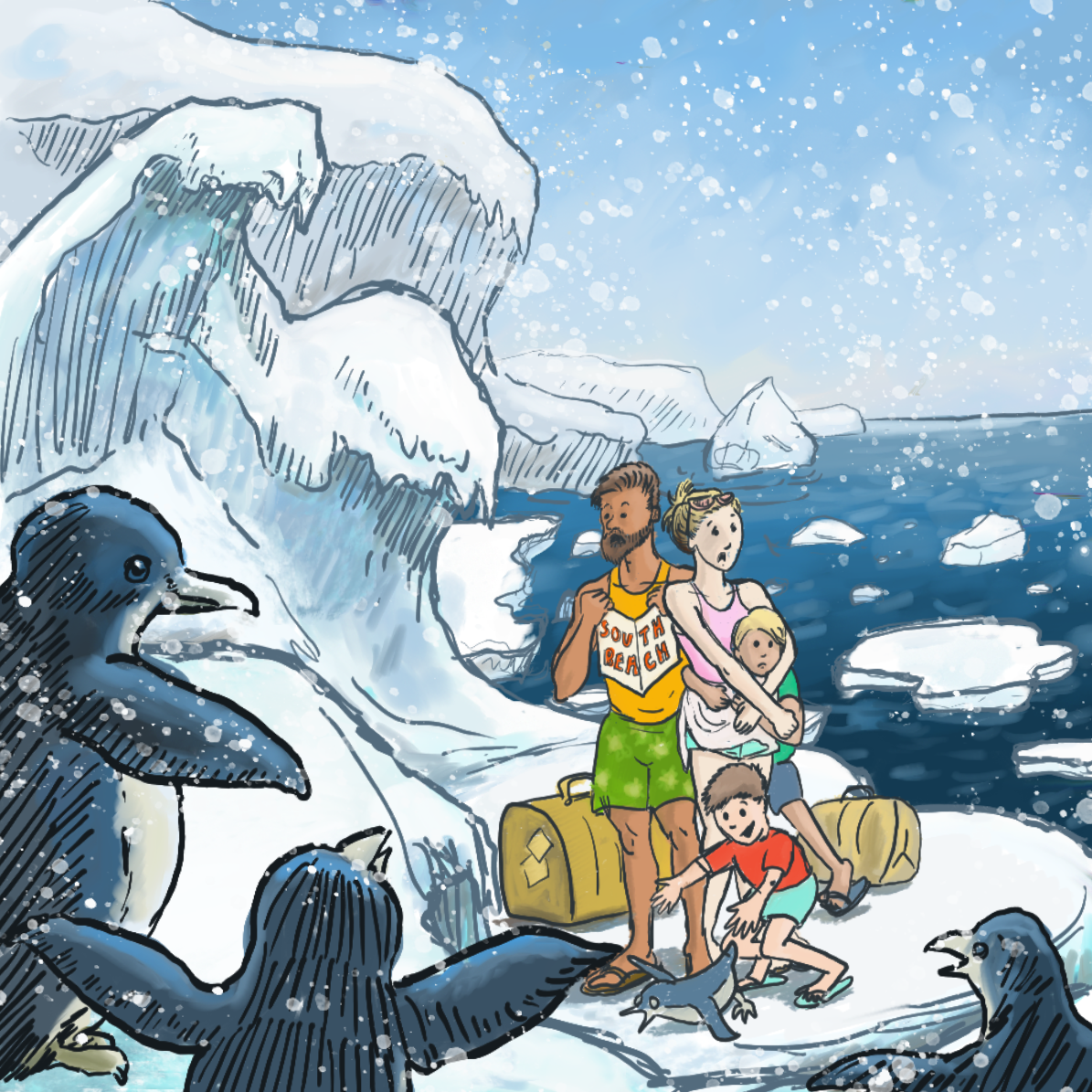
                Here is it so far. I still have to add the plane in the background. I feel like it needs something extra to emphasize the people. Almost like they need a warm glow or something. I know there are a couple of tangents (like the dad's foot and the penguin flipper).

                Should I darken the lines of the background? I do like the way it gives it a sense of space but maybe they are TOO light.

                ecd9a2dd-fab1-40fa-9640-ed3fc41334d4-image.png

                Chris Akins
                www.chrisakinsart.com
                www.instagram.com/chrisakinsart/

                1 Reply Last reply Reply Quote 1
                • chrisaakins
                  chrisaakins last edited by

                  So I darkened the foreground line and moved the people over and drew highlights on the penguin being chased by the kid. It looks a little better.
                  1da747f4-8a7e-4999-987c-14b0ec079edb-image.png

                  Chris Akins
                  www.chrisakinsart.com
                  www.instagram.com/chrisakinsart/

                  1 Reply Last reply Reply Quote 5
                  • chrisaakins
                    chrisaakins last edited by

                    Maybe mom just needs a tan....

                    Chris Akins
                    www.chrisakinsart.com
                    www.instagram.com/chrisakinsart/

                    braden H 1 Reply Last reply Reply Quote 0
                    • braden H
                      braden H @chrisaakins last edited by

                      @chrisaakins I think you're MORE likely to get a sunburn at the south pole that most other places on earth. So she could totally get a tan if she wanted to. She's just freeze to death in the process šŸ™‚

                      1 Reply Last reply Reply Quote 1
                      • Erin.Cortese
                        Erin.Cortese Moderator @chrisaakins last edited by Erin.Cortese

                        @chrisaakins This is looking great so far! I’m looking forward to seeing the final. Lol, just scrolled down and saw the updates. Nice work.

                        1 Reply Last reply Reply Quote 1
                        • chrisaakins
                          chrisaakins last edited by

                          Here it is, done-ish, I think. Now I need some critiquing. How is the composition? How does the story read? Does it look polished or amateurish? Is there anything that bothers you about it?

                          (In other words, "What would @Lee-White say about it" ? ) I think it looks funny and I like it. To me it has kind of a Calvin and Hobbes feels or a "For Better or Worse" feel and those are two of my faves. BUT what are your thoughts O wise and wonderful Forum people?
                          b6217001-7032-4fc3-868f-e6f4ee7a9e5e-image.png

                          Chris Akins
                          www.chrisakinsart.com
                          www.instagram.com/chrisakinsart/

                          Erin.Cortese 1 Reply Last reply Reply Quote 2
                          • KathrynAdebayo
                            KathrynAdebayo last edited by KathrynAdebayo

                            Hi Chris! This is funny and great! I really like it. šŸ™‚

                            In case it's of any help, here are two things that were part of my initial read of your piece...

                            To me at least, the map/brochure looks like part of the dad's shirt, but the way he's holding it may contribute to that.

                            The ice burg touching the dad's head distracts me a bit.

                            Thanks for sharing... this is really humorous, and I know you're relatively new at digital illustration, so to me it looks excellent.

                            Edit: One more thing - I'd suggest putting snow strategically in front of the characters or tone it down in other areas of the piece. šŸ™‚

                            1 Reply Last reply Reply Quote 3
                            • Erin.Cortese
                              Erin.Cortese Moderator @chrisaakins last edited by

                              @chrisaakins I love the addition of the plane, it really finishes it off! There is an out of place line and dot on the arms of the smallest boy, and the father collar bone lines seem a bit out of place too. Otherwise, I really like the feel of this piece.

                              1 Reply Last reply Reply Quote 0
                              • First post
                                Last post