July WIP - Summer School
-
@Erin-Cortese
Apologies for the very quick sketch. The chalkboard would be on the right. This is definitely just a suggestion, and something that came to mind when I saw your piece so take it with a grain of salt.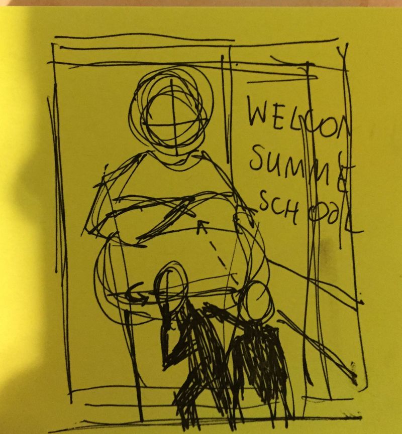
I imagined a more frontal/confrontational view of the teacher, with one of the students unaware of having been caught yet, and the other trying to alert them.
-
@Alicja-W Thanks for taking the time to sketch it out! I do worry about how the board would read in that angle. I see what you mean by it having more impact though, but I’m not sure how I could make it work. I am trying to go for a more simplistic rendering this time around, and I am hoping the spotlight from the overhead projector will help add interest. I will try to experiment with the camera angle a little more. Thanks!
-
@Erin-Cortese
It seems like you've already got a vision for your piece, and I'm excited to see how you execute it! Best of luck! -
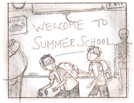
Here is a more detailed sketch of one of my thumbnails. I was thinking the kid on the right will have a cell phone in his backpack, the light from the screen will show through the pouch to give the idea that it made a sound and alerted the teacher. Feedback welcome!
-
great concept!
-
@Erin-Cortese hi, Erin. Perhaps add a door to the left to emphasis that the kids are sneaking out and move the teacher to the right with his arms crossed. Great concept here.
Portfolio: nyrrylcadiz.com
Instagram: https://www.instagram.com/nyrryl_cadiz/
YouTube: https://www.youtube.com/channel/UCbJCF1Im8ZO7hpGWTKOJMuA -
@Nyrryl-Cadiz I think your suggestions are great, but I can't seem to get the door on the left to work. I have everything centred in the background, and the door throws everything off. I see what you mean by placing the teacher on the right, but I'm not sure that I am making it work either? Do you think the teacher is still better on the right if I do not add the door?
-
Hi, Erin. Perhaps you can do something like this.
Portfolio: nyrrylcadiz.com
Instagram: https://www.instagram.com/nyrryl_cadiz/
YouTube: https://www.youtube.com/channel/UCbJCF1Im8ZO7hpGWTKOJMuA -
@Nyrryl-Cadiz Ahhh now I understand what you meant! Thank you for taking the time to draw that out. The main issue with recomposing it that way is that I could not use the spotlight effect and close crop that I am going for. You and @Alicja-W have both suggested a change in perspective and I can see why - the perspective I chose is generally not very interesting and not great for storytelling. But I am hoping this will be an exception to the rule
 ! There is a good chance this will come back to bite me Lol. Nonetheless, your comments have made me realize I am going to have to use layering and other methods to try and get some depth. When I first had the idea for this layout the book cover below came to mind, I thought it used a spotlight, but it doesn’t. Loosely, this is the perspective I had in mind.
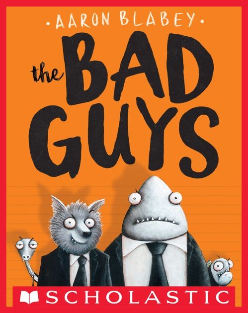
-
@Erin-Cortese no worries. I like your vision
-
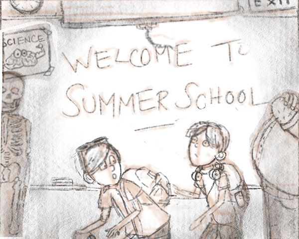
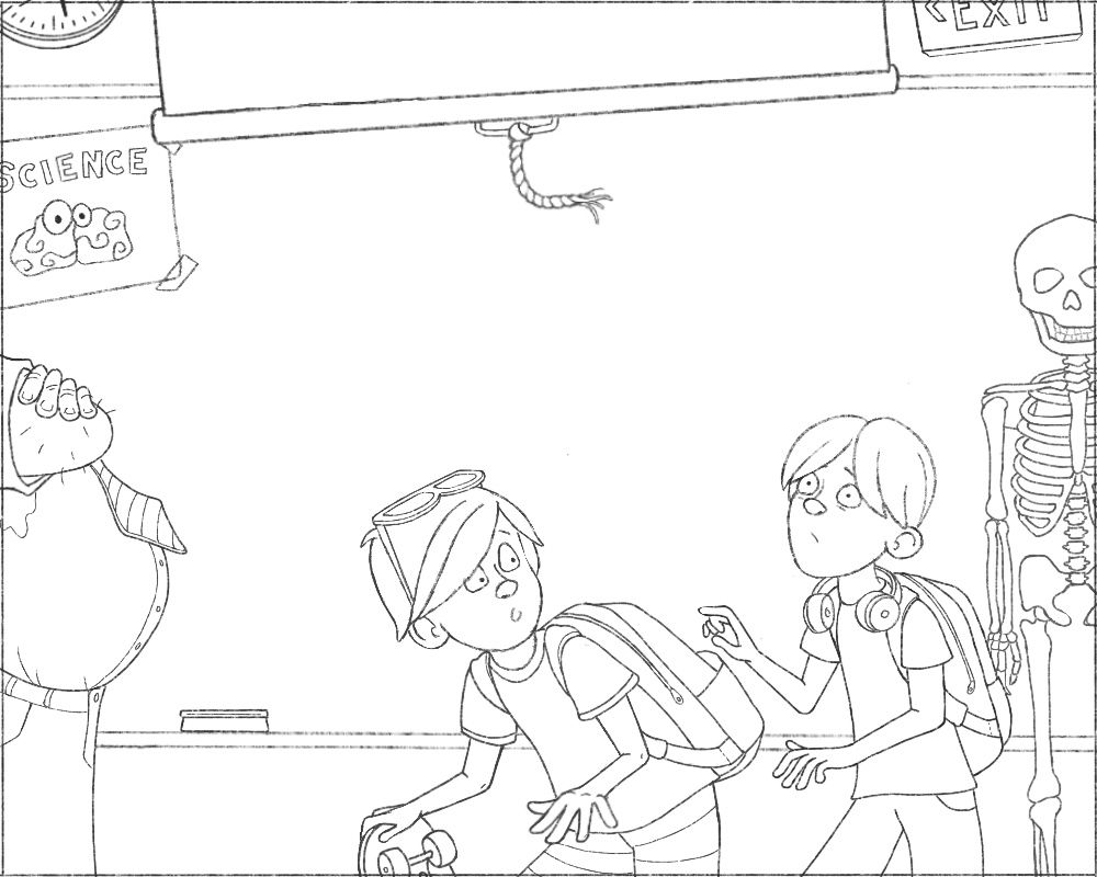
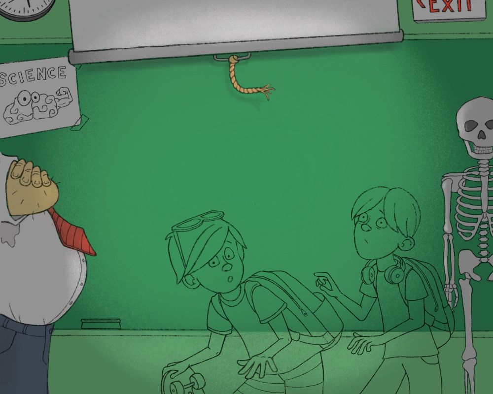
This is my final sketch minus the “Welcome To Summer School” text. I am going to leave that until the final rendering stage because I’m not sure what texture will work best.
-
@Erin-Cortese
It looks great! I love the facial expression of the kid on the right! Can't wait to see it colored -
I would probably try and show more of the character on the left in a foreground position as @Nyrryl-Cadiz mentioned to add depth and readability.
-
@Alicja-W Thanks! I was hoping for the kid on the left to be the focal point, I tried hard to get the face expression right. Still nervous about how this will read.
-
@Gary-Wilkinson Thanks for the suggestion, I just can’t seem to make that work and still keep the feeling I was going for. I have definitely tried! I feel like it becomes a totally different composition at that point. It may be that I am just not doing a good job of pulling off what I had in mind, and it is hard to tell if I will get the depth I need in the rendering stage. I will try to play with it some more.
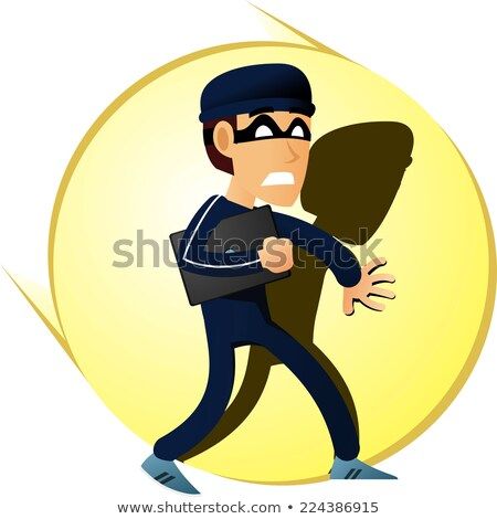
I think I am trying to do two things here. First, I want to create a sense of tension by having one of the kids know they just got caught, and the other just about to find out in the worst way - pretty much walking right into the teacher. The other thing I was trying to do is shine a spotlight on them to create that caught red handed feeling similar to the stock image below. Am I trying to do too much? Am I doing either one of those things successfully?
-
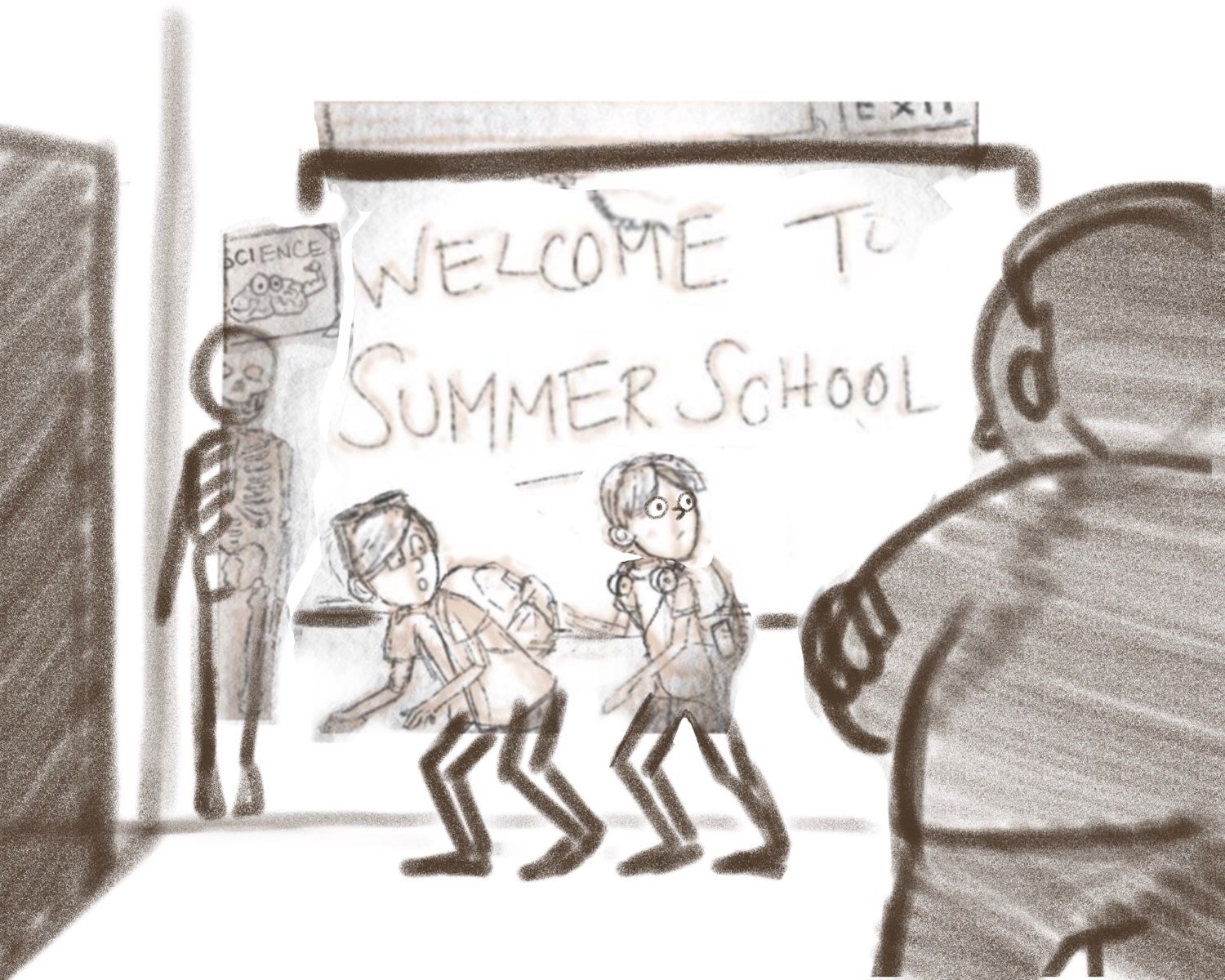
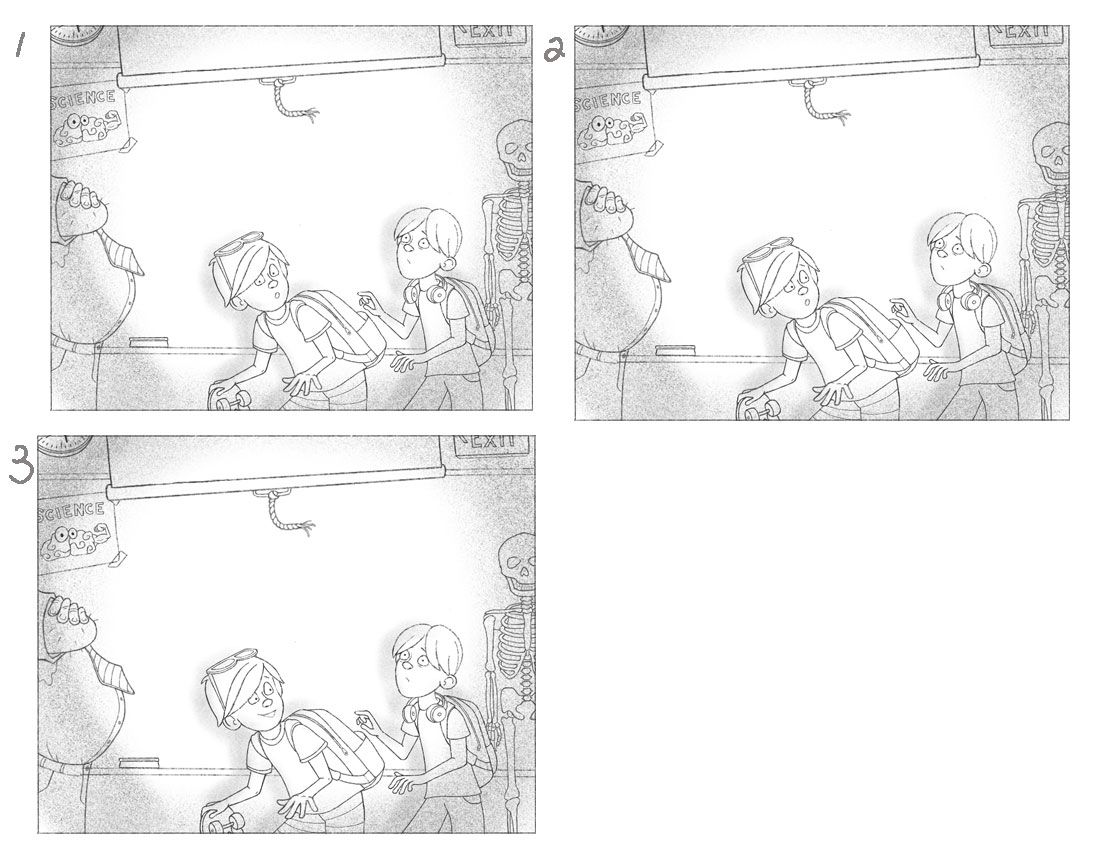
I think I may have answered my own question from the previous comment. I think I am trying to do too much and really not succeeding at anything. I need to think it through a little better. I do want to stick with this general layout, I had a vision for a straight on scene from the beginning. I realized in the last post that the person being caught in the spotlight is usually looking right at the camera, so I tried a version with one of the kids doing that. I also tried another version with him smiling not knowing they are caught yet. I enlarged the teacher in all of them in hopes he would read better. Any preferences for 1,2, or 3? I would also appreciate any suggestions on how I might make the straight on angle read better. I know other people have managed to be successful with it, I just feel like I am missing something.
-
Hahaha! These are great! It reminds me of a book cover with the angle being strait on and the blank space for type. I Like 3, I feel like it more conveys the idea, that they are being sneaking and doing something exciting and adventures. But then they get caught, but one kids is still in exciting sneak mode.
-
@Squirrel-Size Yay, thank you! I was kind of hoping it would read that way once I put the text in, so maybe I am not as far off as I thought!
-
@Erin-Cortese
I agree with what was said about #3! I think it conveys the scene perfectly. And I always like it when the audience knows more than the character in the scene does! -
Ok, colour time. Here is where I so often get stuck and frustrated! I did some colour studies with just the background colours, and for whatever reason felt I needed to work full scale for the others. For the most part I have local colours set and I am very happy with them, but I am really stuck with the colour for the kids. I would like to stop choosing colours aimlessly hoping they will work, and actually have a strategy based on some solid principles. Looking for some technical advice on the following:
***Edited- The more I watch Will Terry’s course the more answers I get.
-
How do I work with with multiple bright and saturated colours on the kids, without it being an assault on the eyes.
-
Do I need to add more red somewhere in the kids for balance?
-