How to ink 2.0 Group Runthrough Week 2
-
I inked in between chores and back to school night classes today. It was not very productive or helpful because I had to keep stopping. I will not be doing THAT again. Lol.
The little girl is from last weeks practice. I forgot to post it. A page from a Precious Moments color book.
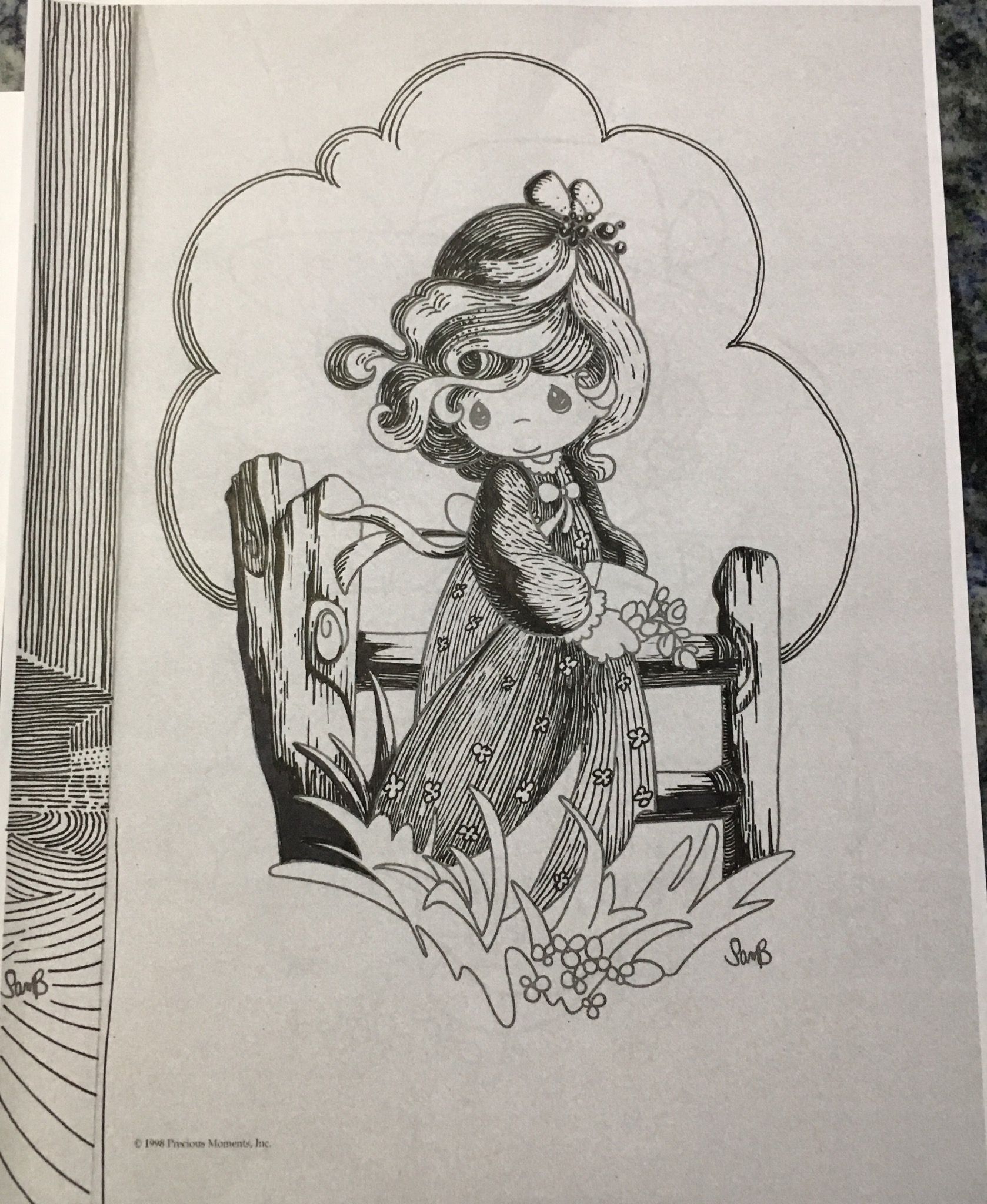
Lisa Burvant
www.lisaburvant.com
Instagram & Twitter & SVS: @burvantill -
For todat's practice, I did inking of a character from Sasek's illustration. Struggling keeping the line consistant in weights, also lots of decision making process on when to use which line weight. It is harder than it looks.
-
I was watching the video on Contour - Light, in which Jake drew three circles to show how line thickness can show the direction of light. As an aside, he said something like, "You can have line that doesn't vary if you don't want the line to be a dominant feature of the painting." This raises the question I've had. While hatching etc. can go along with pretty traditional looking illustrations, when I vary the thickness of the contour line, it starts to look more like comic book or cartoon illustrations. Am I just varying it too much or do you all think that some illustration styles should avoid fiddling with contour line style?
Laurie DeMott
instagram.com/demotlj -
@demotlj
I think it depends, ultimately, on what you are going for. Maybe if the overall thickness of the line was minimal then it wouldn't be as noticeable. I think Jake mentions varying the thickness to go along with the way you are planning to light your illustration, which might minimize it even more. -
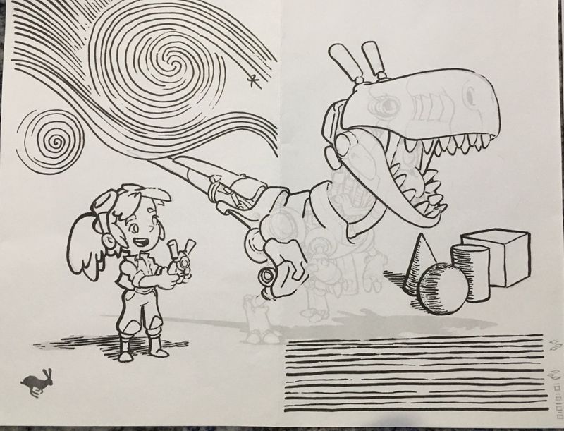
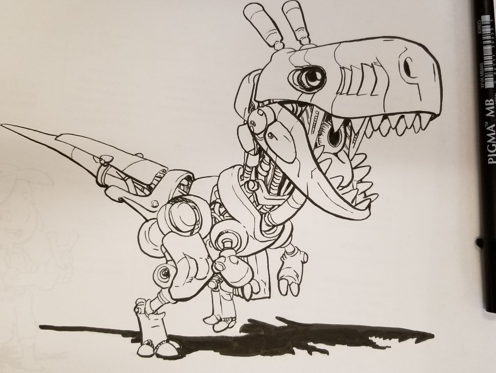
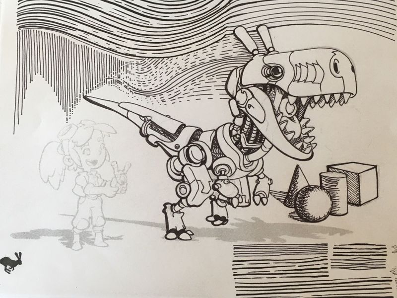
Haven't quite gotten to the girl. I remember when watching the inking 2.0 videos that @Jake-Parker said he didn't ink exactly as he penciled especially on small details such as the "innards". I took that to heart with this one. I am getting old and I couldn't see all the little parts even with my reading glasses so I took liberties. Enjoy.
Also, you really learn a lot about how you can improve in your own drawings when you copy a master's work. I wish all the great comic artists would send me penciled in work for me to ink. It would be so fun.
-
@burvantill Going for a little Starry Night, I see. I love it. I am having my kids do Zentangles in my High School classes right now and I think Van Gogh would have loved creating those.
-
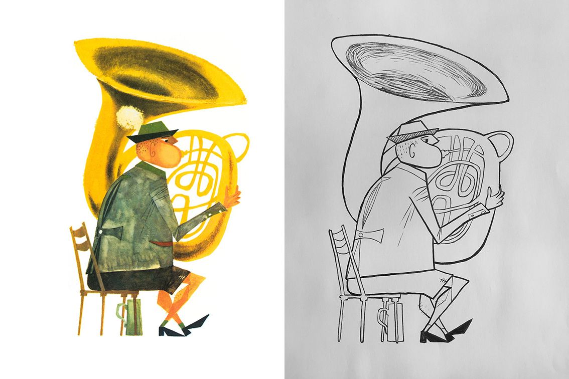
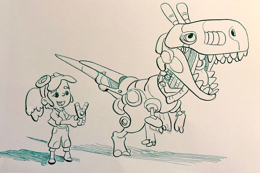
@MikeCañas good work! Looks like a pro job to me! I like how you increased the weight of the lines on the bottom even more than the drawing. I felt like I should have done the same but I was trying to stay true to the original. After seeing yours, I should have trusted my instincts. It is my practice sheet, right?
-
@xin-li said in How to ink 2.0 Group Runthrough Week 2:
also lots of decision making process on when to use which line weight
I know what you mean! Up til now I've been focussing only on light and not thinking about proximity, weight, material, etc. It seems like there's a long list of rules and a longer list of when to break them
")
-
@demotlj said in How to ink 2.0 Group Runthrough Week 2:
Am I just varying it too much or do you all think that some illustration styles should avoid fiddling with contour line style
Ligne Claire tends to not vary line weight at all
-
@chrisaakins LOL! That's funny! that was completely unintentional. I had the paper folded so it would fit in my sketchbook and was just doing what i could in between bell rings.

-
Today’s practice. Used a sharpie today. My Pentel brush pens are supposed to be in the mail tomorrow. I thought they were coming last week but it was just auto parts for my husband.

Lisa Burvant
www.lisaburvant.com
Instagram & Twitter & SVS: @burvantill -
Hello, I'm still sorting out what daily practice with pen-flavored tools looks like. So far, rather than picking a specific set of exercises, I write down a few ideas that I remember like: ways to fill space with tone; types of consistency - solo line (weight) vs grouped lines (weight/spacing/length/direction) ; types of variation - solo line (length/weight/layered) vs group line (weight/spacing/length/direction), and then experiment in semi-directed, semi-freeform fashion.
I'd be curious to hear how you folks here choose what to practice from day to day!
-
@Geoffrey-Anderson I am working on line consistency with a brush pen. Making it thin when I want it thin and being able to transition to a heavy weight in a seamless line. I also just want more fine motor control. I grew up on rapidograph pens and using a brush pen is a newer experience.
-
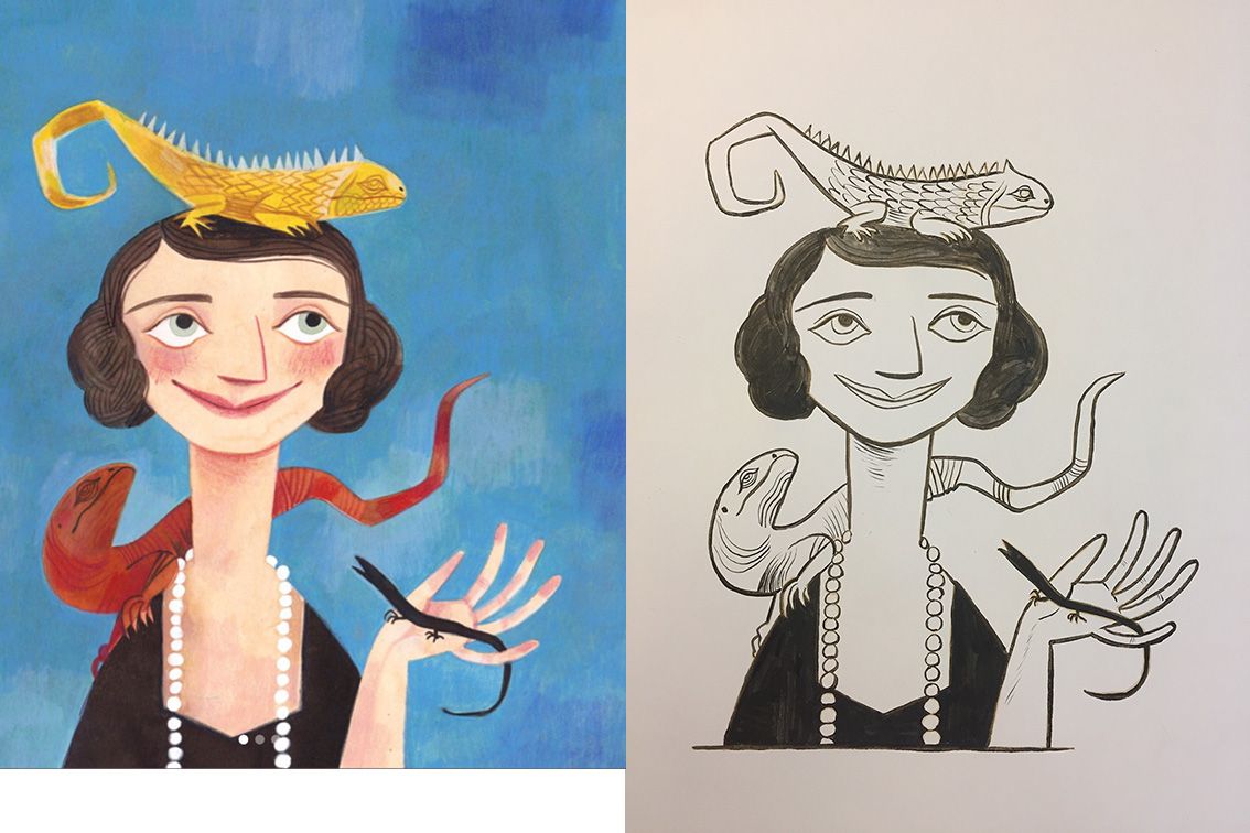
Keeping my inking excise interesting by copying my favorite characters. I am having a very inconsistent lines today, and I really miss the "undo" button.:smiling_face_with_open_mouth_closed_eyes: when coming to inking the facial feature.
Wish you guys have a happy drawing/painting day.
-
@Geoffrey-Anderson said in How to ink 2.0 Group Runthrough Week 2:
I'd be curious to hear how you folks here choose what to practice from day to day!
That's one of the reasons I'm participating in the group run-through is to add to my repertoire of daily exercises. I've been doing plain ol' straight lines with a few circles for a loooooong time now and though it's helped immensely over the years I need a bit more. It's already paying off

-
@xin-li said in How to ink 2.0 Group Runthrough Week 2:
I am having a very inconsistent lines today
I dunno, those look like some nice smooth curved lines to me.
Taking a lineless illustration and decoding it for ink is a great idea. I may do the same. It looks like it really helps to teach you how to suggest/imply those little plane changes and shapes.
Very cool
-
@burvantill said in How to ink 2.0 Group Runthrough Week 2:
but it was just auto parts for my husband
I mean really, who needs autoparts? :smiling_face_with_open_mouth_closed_eyes:
-
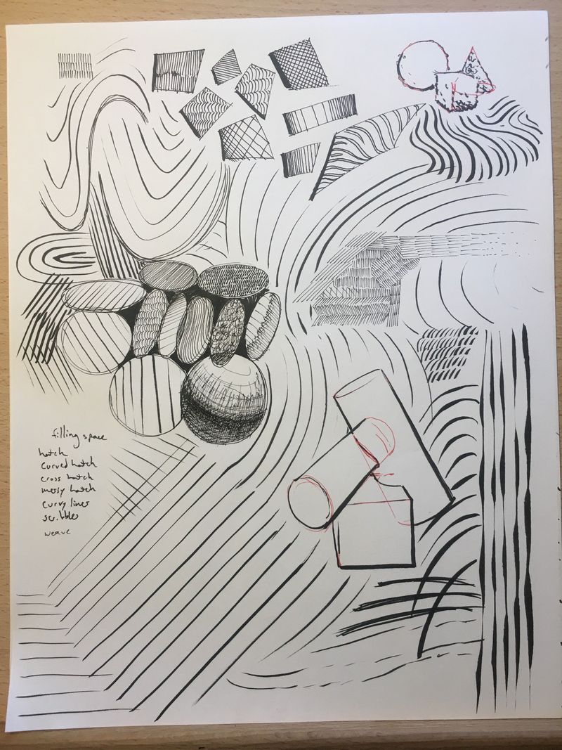
Here’s my homework and here are my excuses! I am trying to do all of these exercises with a dip pen because the Luddite in me really wants to learn it but I discovered that dip pens don’t like copy paper so I had to trace the template onto Bristol board and because the template is so light I had to just make up a lot of it.
What I learned from this:
- Dip pens require thicker paper
- If I press too hard on a dip pen for a thicker line it blots.
- I still need to practice long straight lines (see shadows)
- The Tombow correction tape works well (Yay!)
- I need to either learn how not to blot or how to soak up a blot.
Really good exercise!
-
@Geoffrey-Anderson I am working on areas of most fine-motor difficulty drawing, using this inking course as a guide for daily practice. For me, the goals are to work toward consistent spacing, drawing anything that involves pressure without line “tremors”, trying to identify the sweet spot where things don’t completely break down but are just difficult enough to challenge moving forward.
-
@xin-li great idea, love seeing how you translate these to ink!