Narrative Journey to Mars
-
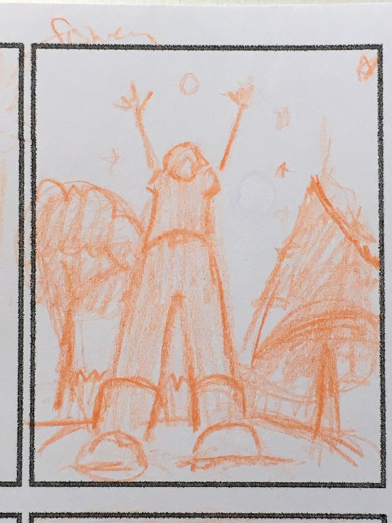
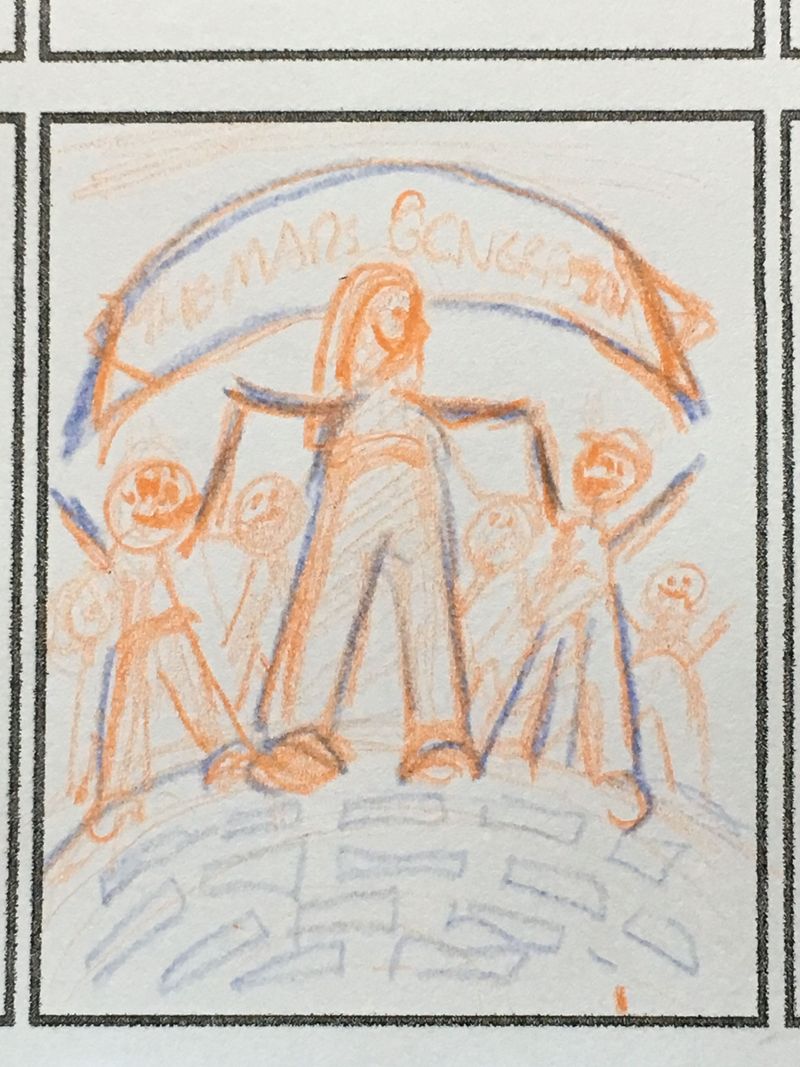
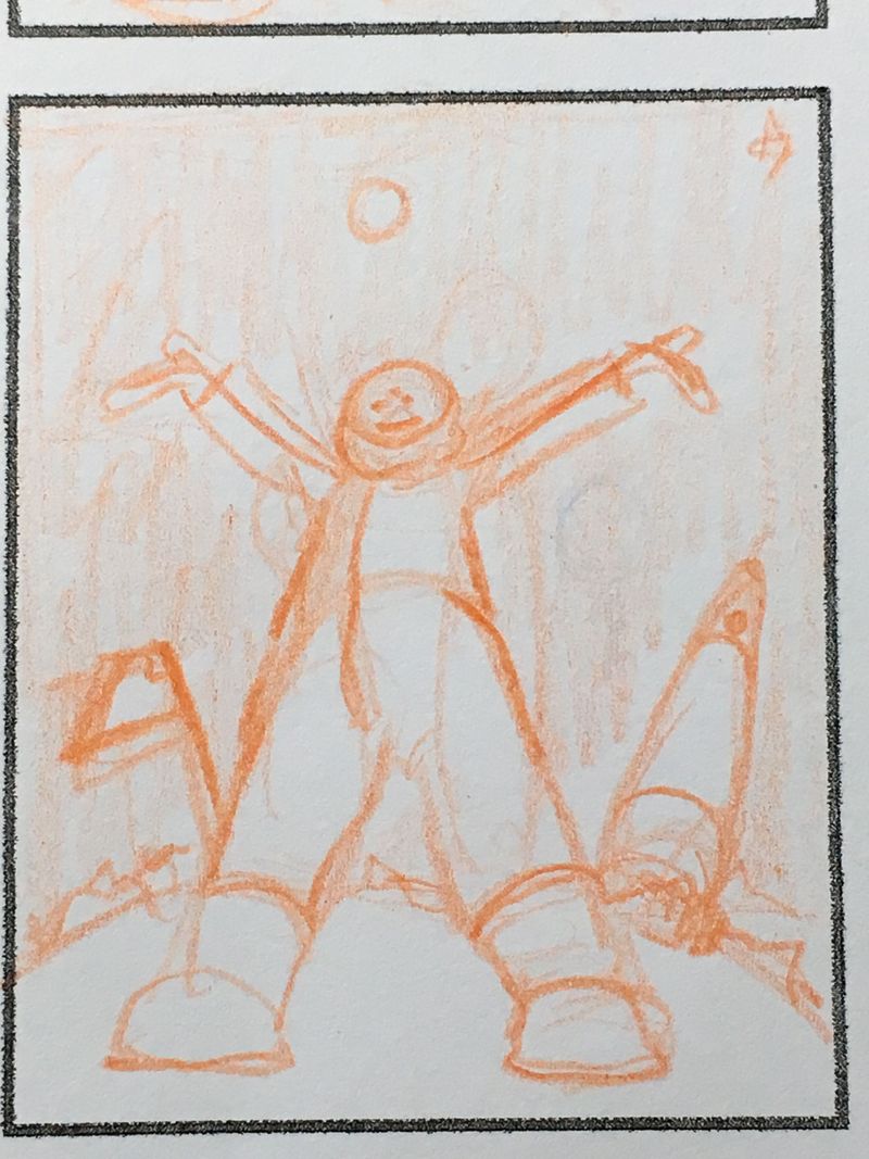
I am doing a three picture narrative art project. It is about a young girl who dreams of going into space and her journey to get there and be the first person on Mars. After loads of thumbnails I’ve settled on the first panel, is her as a little girl when she first dreams of space, the third panel when she’s on Mars, but the middle panel I am having trouble with because she does so much to get there, she is working her butt off and has done all these things to fill her goal so I simplified it and just focused on one of the big things she’s accomplished.
Question 1: Are they “narrative enough” . Am i getting the story across or have I simplified it too much? I like that all panels are views from below with her in the middle to show how strong she is.
I am thinking of putting faded or ghost images of the people who supported her journey behind her in panels 1&3. In panel 2, She is supporting others. So it’s a give and take of support.
Question 2: Do the 3 panels go together visually or is #2 too different?I was also thinking of overlaying descriptive words instead of people in the background.
Q3: Is the fact that all three images show her in almost the same pose, bad? Her body language will be different in each but that doesn’t show in a thumbnail


-
@burvantill when I read your idea I pictured the middle frame as her sitting at a desk writing feverishly with vignettes of her hard work and effort in muted tones all round her.
-
@chrisaakins one of my thumbnails had her standing with her arms crossed, all proud =)x, with all of her accomplishments floating around her like the stars in the other two panels. But there were sooooo many. lol. she's a pretty awesome person. I want to include what she's done, but its so much. that's why I was thinking of the descriptive words, like determination, fear, courage perseverance, etc, kind of overlaid in the background of a simple image.
 @Lee-White would probably say do more thumbnails. lol
  . I'll get on that...right after I i meet the school bus and cook dinner, and do the accounting.... lol.
 -
@burvantill I would say do a LOT more thumbnails! This is a good start, but the centered compositions might not be working as well as they could. The "up" view seems like a good idea in theory, but it's an awkward angle to pull off in reality. With such rich subject matter, I'd like to see more options that enhance that.
Also, if the three panels are supposed to be seen together, what format would that be in? You need to lay it out exactly how the finished art will be seen because that will definitely affect your compositions and how they read as a whole and individually.
-
@Lee-White I have the format vertical because of the extreme view angle and the "outer space" factor. Design wise I thought that would enhance those things. I will do more thumbnails this evening and play around with that. This is the second time I've tried to do a narrative flow. The first time I made a picture book dummy and it was way easier because I had so many pages to tell the story. Trying to tell a story that spans a lifetime plus a future event in 3 panels is DIFFICULT. lol. My thumbnails were getting way too busy (i thought) so I went the other extreme, too simple.
I picked a tough subject, but a good subject. If I can pull this off, I will be very happy.Thank you for your feedback. It is greatly appreciated.

-
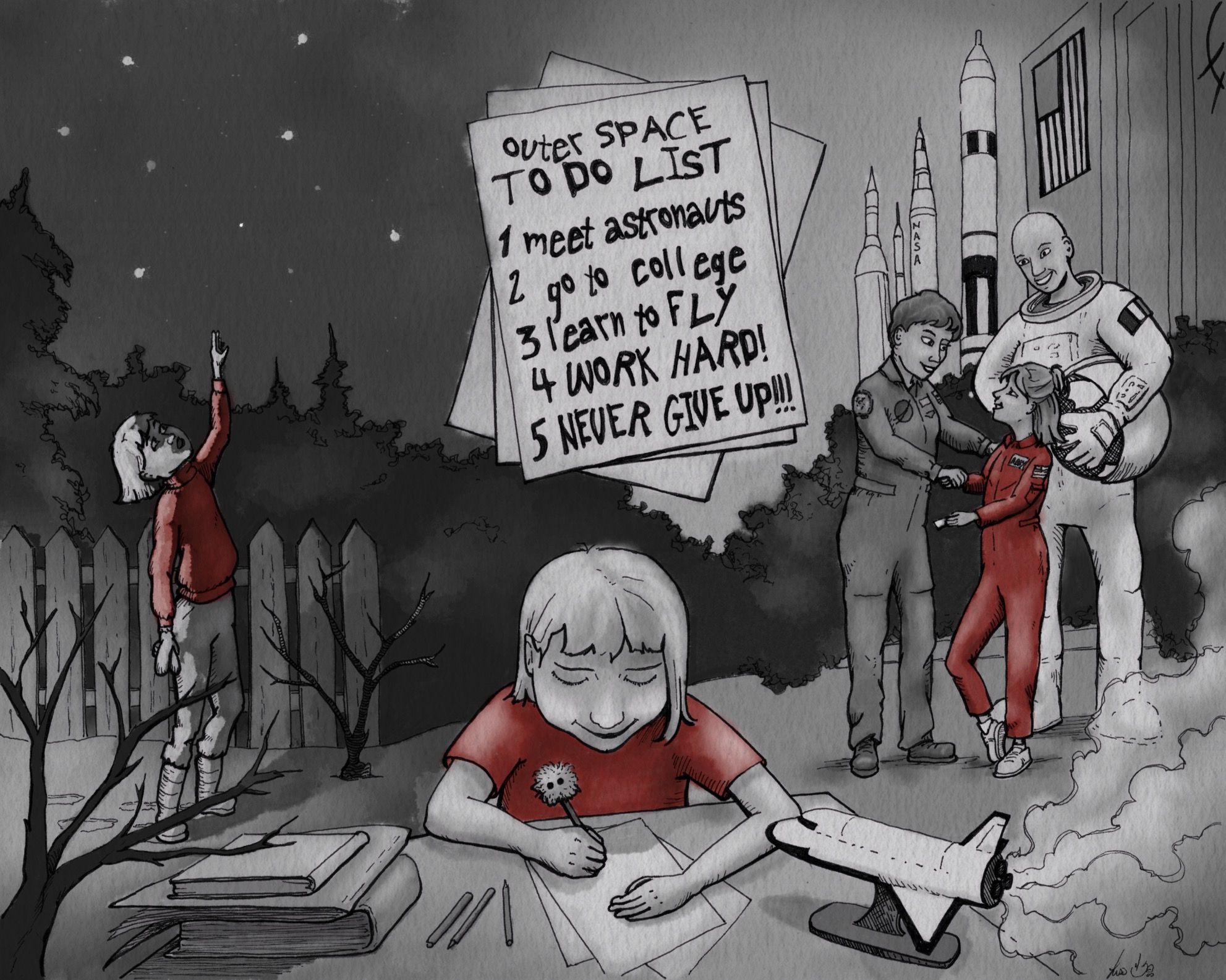
I'm calling them done! Just waiting on @kaitlinmakes to give them a once over with fresh eyes, but here's what I sent her, so if anyone wants to tear these apart, go ahead. Lol.
I went back to the drawing board with @Lee-White 's comments in my head and completely overhauled the images. I am satisfied that I have shown as much of Abby's story as I possibly could in 3 panels. I was really stumped, but then I thought I could use the three panels as if they were full spreads which would equal 6 pages instead of just 3 [of course, these can't really be spreads because there is relevant image where the fold would be ] and in doing this, I freed my brain and I laid out a timeline of Abby's accomplishments, past, present and future (which I got from interviews of what she plans to do in the future). I stuck with the mountain of thumbnails that we are advised to do
 and I'm so glad. It helped me make the absolute right images. Now I can't say that I couldn't do better in the future, but I am happy with what I've done right now. =)x
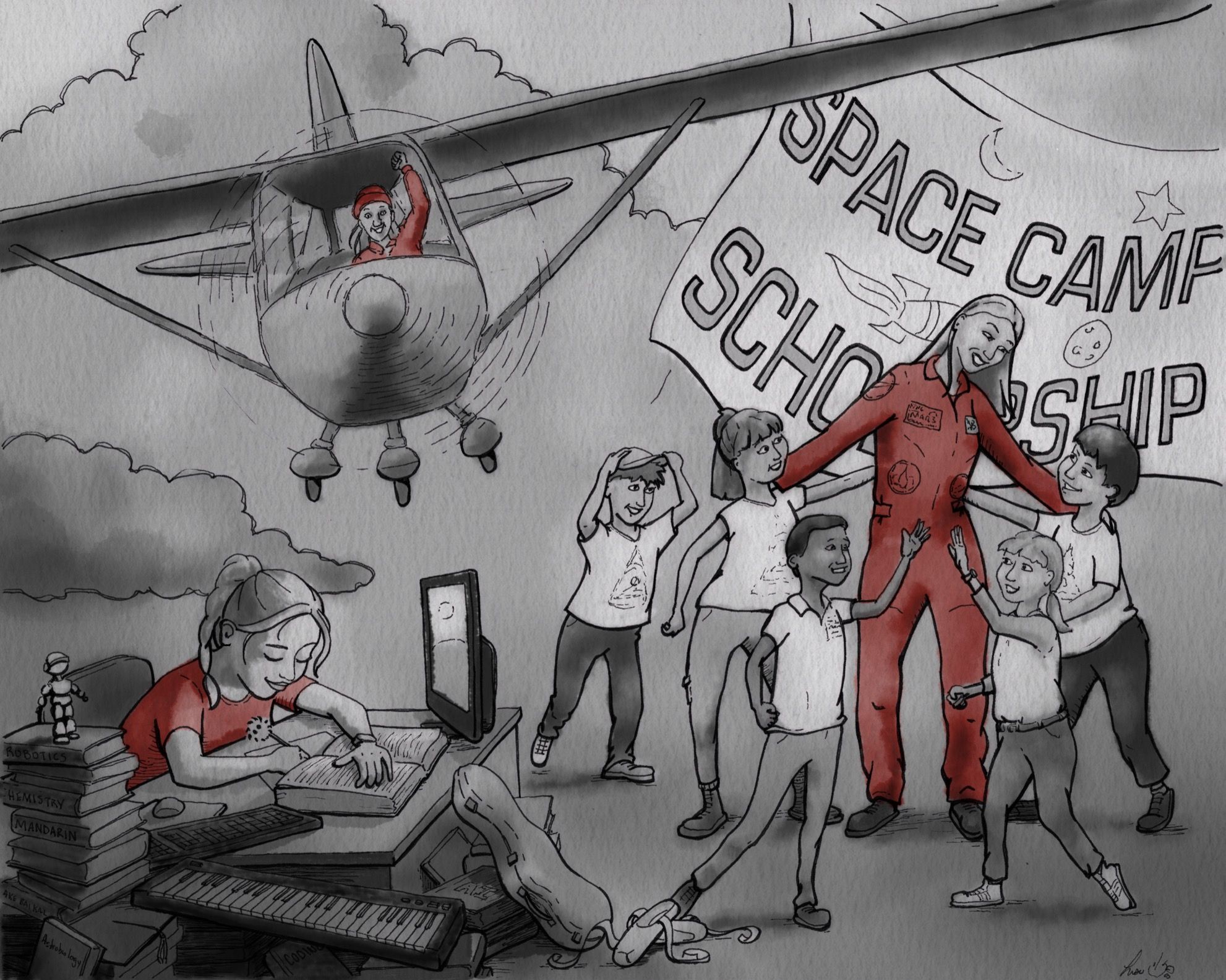
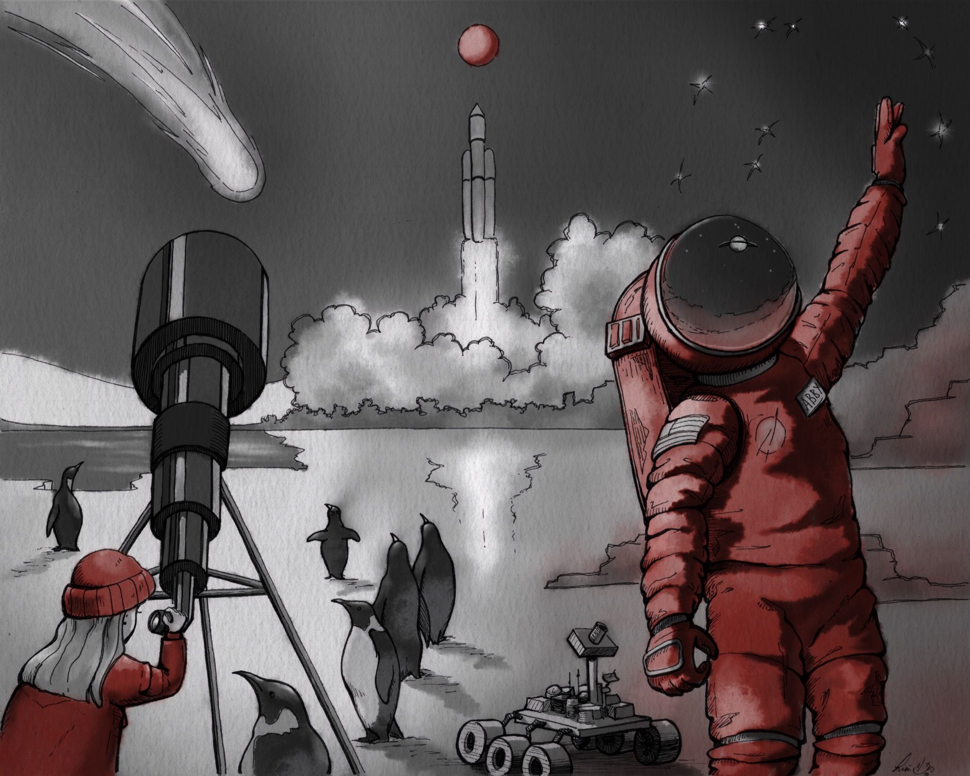
I also wanted to share a instant replay video. Before this project, I STRUGGLED with drawing people. I could do it, it just took me forever to get there because i had no real process. I was very frustrated and ended up getting behind schedule because of it. I talked about it in the September Virtual Studio. Anyway, I watched the SVS Learn video on Posing Characters and DAMN, it totally clicked. I was able to basically fly through drawing all the people. I'm still flubbing on the head to body ratio, but i'm working it out. Lol. Unfortunately I can't post video to the forum so you just have to take my word for it. Take the Posing Characters class.