September “SCALES!” WIP
-
I love this so far!
I don't get election day vibes from it, either. My concern with election day would be how you would show that it's election day and she's running for class president, and let us know at the same time that the girl with the scales is the girl that's running for office. It seems like a job for a few frames rather than just one.
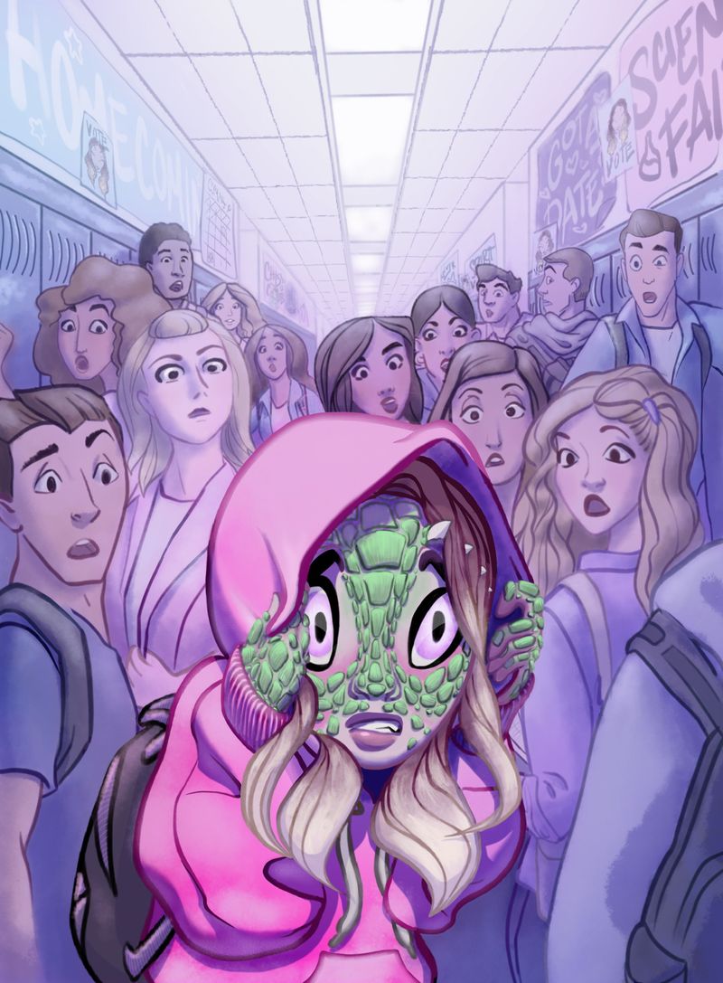
I really like her pose and her scared look. Her left hand-- our right -- sort of blends in with the hood.
I love how you drew her hair.
-
Thanks Chip and Twiggy for noting that the Election Day idea isn’t very visible. There are some subtle posters on the walls. I think you’re right Chip that a clear sans scales sign would be really cool. I’ll see what I can balance in.
Thankfully, it’s more of an Easter egg backstory note and not meant to be the focal story.

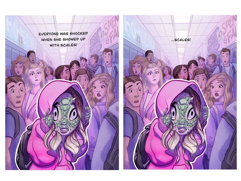
Is it clear that I’m completing the prompt with “scales”? That’s the part I really want to be a clear first read.
Thanks for the note on the hand Twiggy. I’ll give that some clarification.
Many thanks for your look and notes.
Onward!!
-
Alright! Here’s where it is after some further dialing in.
I looked at adding some more overt election signs, almost pick picket signs, but I didn't like how it effected the balance. I might come back to that idea after later with some more tests. I almost would put in an election banner across the top of the hall, but I like how the ceiling is kind of acting as a white space for text placement.
I’m debating the hard white stroke. I think my next test will be to tidy up that edge under the stroke and see how the focal point and visual hierarchy hold up. The stroke feels like a cheat. I don’t normally use them in an illustration like this, but I wanted try it.
I also think I need to bump up the darker shadows around her hand on our right. I worked on it, but it’s still blending in quite a bit.
Oh! I also want to put some hard light shapes on the lockers to make them read more like shiny metal.
I also wonder if I need to lighten the darker hair colors so they don’t take away attention. They seem mostly balanced and secondary to the focal point. How do you think the additional coloring is working?
And here are two text options I tried out for fun. I’ll probably leave the final submission without text though.
-
@Shara-Mills I actually like the white stroke. I started to do that in some of my pieces but then I was getting mixed emotions on it from others. Some like it and some don't. Its personal preference I guess.
-
@Shara-Mills Can you post a version without the white stroke?
-
@Shara-Mills I really love this concept a lot, and I think you nailed the composition! I would use color as your ally here, and keep things simple. What I mean is, instead of using the white outline to separate the focal point and the background, I would use different hues of the complimentary colors that are going on here. Like maybe a blue/violet-ish wash in the background and keep the bright pink hoodie and what you have with the main character. Does that make sense? Anyway, again, great concept, it definitely makes me want to know more of the story!
Blessings, Noah
-
Good idea, Noah! Gently cooling the colors around her would lend to a strong warm focal point. I had been thinking of temperature in perspective. I hadn’t thought to contrast the temperatures for focus. Genius!
It’s good to know that I’m not the only one who likes the white stroke look, Chip. I won’t completely discard the idea. I am going to try without to see which is stronger.
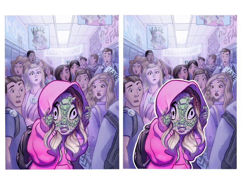
I’ve also sketched in more election stuff. Pins. Posters. An “Election Day” banner. I really do like it more with that story element. Though it’ll need to be clear enough that it’s her for the story to come across. Maybe it’ll still work if it’s a second read and doesn’t distract. I’d love to get it into clear harmony with the first read though!
I’ll definitely post the adjustments and additions when they’re ready for feedback again.
-
Ok! Here’s where I’ve gotten...
- more election stuff, how is that part of the story reading?
- darker shadows around the hands and hood, I think it’s reading better now around the hand
- cooler everywhere but the focal subject, I quite like how that works
- test between white stroke or no stroke.
Which do you think is better?
My next pass I plan on giving some extra love in the focal point/face area and apply your feedback.
Thanks so much for your eyes and mind to help me improve this illustration!
PS. I’m still inclined to keeping the white stroke element of the design. I like it. It seems an appropriately crisp distinction from the sharp focal area and the softer mid and back ranges. Your thoughts?
-
I think the white stroke brings out the main character better. Interesting idea I haven't noticed anyone doing it before
")
-
@Shara-Mills I definitely like it better without the white stroke. I think the white stroke effect is really good for a movie poster or comic cover when you have characters clumped together but no real setting in order to set apart the main character. (See @Jake-Parker 's skyheart for an example) But here I feel it brings her too far forward and isolated her from the context. This is a great rendering of a clever idea. You have definitely brought your A game!
-
@Shara-Mills I like her also without the white stroke
-
@Shara-Mills I also prefer her without the stroke. I think it separates her from the rest of the piece too much. I think you are doing a great job having her stand out from the crowd with your color choices.
I'm having a little trouble connecting that she is the girl running for school president. I don't think the Ombre in her hair is enough, or perhaps the poster where you see her full face is too far away / out of focus and easy for the viewer to miss. Maybe there's a way to make her stand out more, like if she had a colored streak in her hair that was unique from the other characters in the piece. Perhaps the boy holding the VOTE poster on the right could be showing more of her face that makes it apparent that she is the girl with the scales?
-
I think this is beautifully done (though I am with those who like it without the white stroke) but I don't think you need the election stuff. I think someone showing up with scales at school is good enough without trying to get across that she is running for an election. In fact, I hadn't noticed the election elements earlier and when you made them more front and center, I had to scroll back to see why.
-
Thanks everyone for the feedback! It is so helpful.
Thanks for helping me weigh the stroke question. It was fun to test, but I think I’ll save that element for somewhere else more suited for it. Your comments really helped me clarify that design choice. Thanks!
And after giving it a day to rest, percolate and reflect on your feedback, I think the election story is a bit of a tangent and makes the story being told unnecessarily overcomplicated. It was fun to explore, and I can enjoy that story personally, but I think this illustration would be best served by simplifying it back to the core story prompt.
Thank you, thank you for your insights and observations into enhancing this piece!!!
-
Even though you dropped the election story I was thinking an easy way to connect her would be for her to have a pin or shirt that says "vote for me".
-
Good point @DarleneAnico. I think I’ll still drop the election slant, but that’s a good solution to that problem.
-
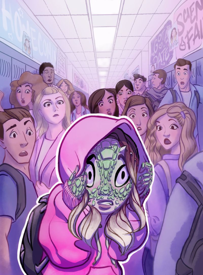
Getting close to finished!
This version is sans election and given some detail love.
Edit: I also subdued the farther away peers for atmospheric perspective.If there’s something you notice that would help dial It in the final refining stretch I’d get your eye-pinion.

And thanks to everyone for your critiques and ideas that have been so helpful getting it this far! You’re the best!!