Photoshop illustration - looking for specific feedback
-
I like the middle one. The first one looks almost as good on my desktop, but the middle one looks slightly better on desktop and a lot better on my phone. I think the slightly lighter values help balance out the weight of the the shoes/socks and allows our eyes to linger longer between all the elements.
-
I agree with everyone else. I like the middle one. Great job on that sick pattern, thats pretty amazing. One suggestion would be the ground shadows, something looks off on it, but I can't tell what. Maybe they are not large enough? If the light is coming from the upper left, then there wouldn't be a shadow in front of the shoes or behind the mouse and the shadow behind the shoes would be larger. Just a thought.
-
@Chip-Valecek yeah I feel there's something off with shadow too but can't figure it out. Shadow is coming from upper and a little right.
Maybe tho the shadow for the mouse versus a tall person should more varied from each other, maybe person's shadow should be bigger .... thanks for getting me thinking about that! Gotta figure it out. Shadow might be too dark too -
Thanks @MichaelaH & @TessaW !!! I appreciate your comments very much!
-
@MichaelaH @TessaW @Chip-Valecek sorry to bug you guys again
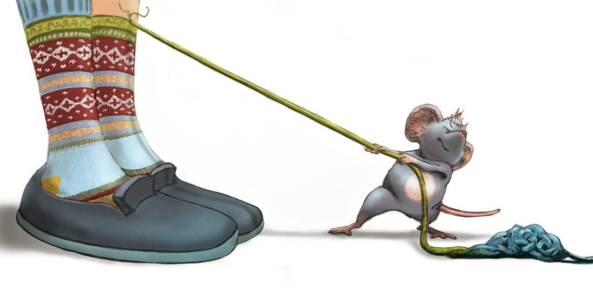
 i was just wondering if this shadow works better?
 ") I think it makes more sense. I also added a cast shadow from the yarn onto the slipper and sock
I think it makes more sense. I also added a cast shadow from the yarn onto the slipper and sock -
@Coley I liked the shadow shape better before for this particular composition (though I think it could have wrapped behind the foot just a smidgen more to follow the perspective). But, I think lightening it up is a big improvement! Just my personal taste, but I wouldn't mind seeing some very subtle sketchy lines in the shadows.

I really like this piece btw! Composition-socks-gesture-expression. . . so gud!

Website: www.tessawrathall.com
Instagram: www.instagram.com/tessawrathall_art/
-
p.s. I do like how having no shadow in front of the human feet, opens up the space between them more.

-
@TessaW thanks! More to think about now Ha ha
 I appreciate the feedback!
 -
Ooops, lol. Feel free to ignore me!
 It already looks A+ in my opinion.
Website: www.tessawrathall.com
Instagram: www.instagram.com/tessawrathall_art/
-
@TessaW Ha ha, it's always good to get feedback! Truly! I agree with you on the sketchy lines. I might try that. The fuzziness of the shadow bothers me a little. But overall I'm pretty happy with how this is going. It's not exactly where I want to go but I'm figuring out how to get closer to what I want and feedback here is helping me push myself harder so it's all good!!!
-
Looks great! At this point it's just knit-picky stuff.
If I were to add my two cents on the shadow, I'd say the shadow from the thread is trapping the eye a little bit. The distance grows but the shadow stays the same. I'd say fade that out a little bit down the ankle and make it a lot more subtle all the way to the mouse (so that the rope shadow is less opaque than the actual mouse shadow since it would be stronger right under him).
-
@jdubz yes I understand your point! Thanks, I'll do that
-
@Coley Something was bothering me about this second version & I just realised what it is. Removing the shadow from the front makes it look like the toe of the shoe is flat against the floor. At rest, pretty much all footwear will curve up to some degree at the front

Even with the light source where you have it there would be some sort of shadow under the toe.
Also notice here that the shadow is darker where the shoe is closest to the ground.I love the strained expression of the mouse, he's very cute
Nicola Schofield
Twitter: twitter.com/NSchofieldArt
Instagram: instagram.com/NicolaSchofieldArt/ -
@neschof thank you
 ️ I'm going back to figure out the shadow now. The fabulous thing about Photoshop is being able to ditch a shadow layer and make a new one so this feedback is great. I can't go back and change the sketch or shape of the shoes too much because the painting is on top of it but shadows I can fiddle with. Thanks
-
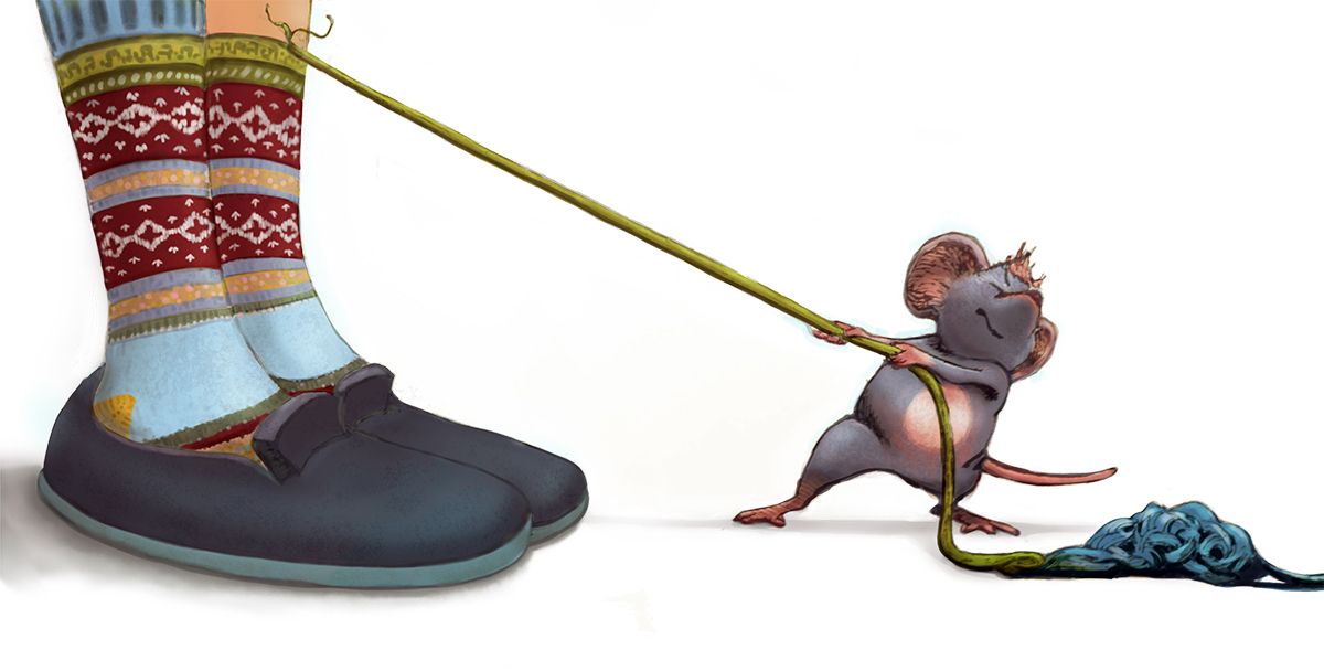
pretty close to done I think. Thanks everyone for feedback! I changed shapes and lightness etc of shadows. DEcided to keep it light and simple.
-
@Coley This looks really good! I love the socks and I can almost read the "Really?!?" expression on the human's face. As far as a comment goes, I am not sure a shadow is even needed for the tail and the yarn. I think the ambient light would negate such a small shadow in all but the most direct light source (A bright sunny day or a spotlight). The two shadows almost have the same weight as the larger forms. I suggest either thinning them out to a really tiny line or getting rid of them altogether. I love this composition and the coloring. Looks like something my mice might do.
-
@chrisaakins thanks! I did thin it out quite a bit but I think youre absolutely right. Boy I'm learning a lot with every piece I do.... I was almost trying too hard on shadows! Might thin it out a bit more. Thanks!
Any yeah I think my mischievous little mouse would get along with yours quite well LoL. Little mouse gangsters ha Ha.