Discovering our style - Who's in?
-
@Zachary-Drenski, Great observations & analysis!
-
@Braden-Hallett When I think of you, I think of someone who already has a very distinct style and point of view, and very strong skills to back them up. I'm interested to see what you get out of an assignment like this.
-
@Elena-Marengoni, If you see an image you like, but don't have the artist's name, you can use the image to search on Google.
Macs: Control-click on the image (right-click? on PC), then select "Search Google for Image".
Even when it doesn't find the exact image, it provides "Visually similar images" that could be useful.
-
@burvantill said in Discovering our style - Who's in?:
If I see something out in the world I try and find it online and then add it in to the dream board.
In case you haven't seen this--for the things you find in the real world, you can take a photo & upload it to Pinterest.
Click the circular "+" button at the lower right of the screen (not sure if this is the same for mobile) & click "create a pin" (I don't know why they make you click twice--there aren't any other options!), and you can upload a photo from your computer to pin on a board. -
@Meta, I just took a look at your Instagram, and your illustrations are really good! I don't know anything about the children's book industry, other than books I've seen, but your art looks like it would be great for children's literature to me.
-
@neschof said:
after some brutal culling
:smiling_face_with_open_mouth_closed_eyes: Ha, ha! That's a great description!
@neschof said):
colour....? I'd love some help with this
I don't know much about color, but I am noticing a lot of bright colors, with somewhat subdued saturation. I especially notice the same Pink! in several of these images.
I'm also seeing that most of the images have people or buildings or other human objects. Only a few of them have only animals/nature.
-
This post is deleted! -
@neschof Did you assemble the two boards at the same time? The second group feels much more of a piece to me than the first one. There are three in there at least that make use of the same complementary colour approach (blue-orange) for their mood. The range and depth of colour is greater in the first group and I can't see a pattern in the colours there.
-
Hi, all! This is a great thread to follow, and I'm really impressed with how good you guys are at analyzing these collections. I've been trying for months to come up with a dream portfolio (watched Lee's video awhile ago) but I just can't seem to whittle it down to just 20 images. Then I find more....it's a real struggle, but I'm going to keep trying. Anyway, thanks for all the great examples of dream portfolios and analysis - just wanted to thank you all for sharing!
-
@neschof Yours really does have a consistent style! I'd call it "fanciful lines." And did you notice how much pink and blue there was?
-
@Zachary-Drenski I notice that we like a lot of the same artists (some of yours l like a lot but had to eliminate them in the end, others stayed), but we chose different pieces or styles that, in the end, have a different effect together. It's interesting how people can like the same artist, but get a totally different read on him/her!
-
@kat Cut the extra pieces out! It's so much fun once you get started!
@LauraA I was really surprised with how my dream portfolio turned out. I thought I liked color more. I haven't seen your dream portfolio but I can imagine all kinds of interesting combinations using these artists. It's really interesting.
-
So, do we post these here or create our own thread? I gather people are doing both.
Anyway, I think I just proved that I am stylistically confused
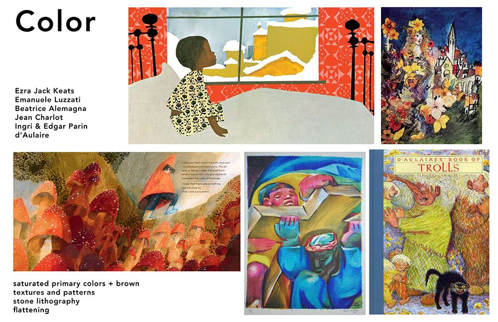
 . After culling and culling, I still have four boards! They total over 20, but I'm still going to put them up here to see if anyone can find what they all have in common. Here's the best explanation I can come up with:
-
The first set is the kind of illustrations I liked as a child, and they still have something I deeply long for in a book.
-
The second set probably have something to do with my studio painting degree. I love all the artists involved, but I probably wouldn't copy any of them directly. And I do love bright color, but then why are two of my other boards so unsaturated?
-
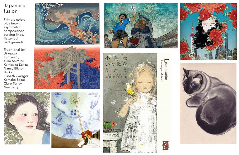
The third set (the "Japanese" one) is very near to my heart. It may even be my favorite. I can't figure out why, as I am not Japanese and have never even been to Japan. But I have also loved this kind of art since childhood.
-
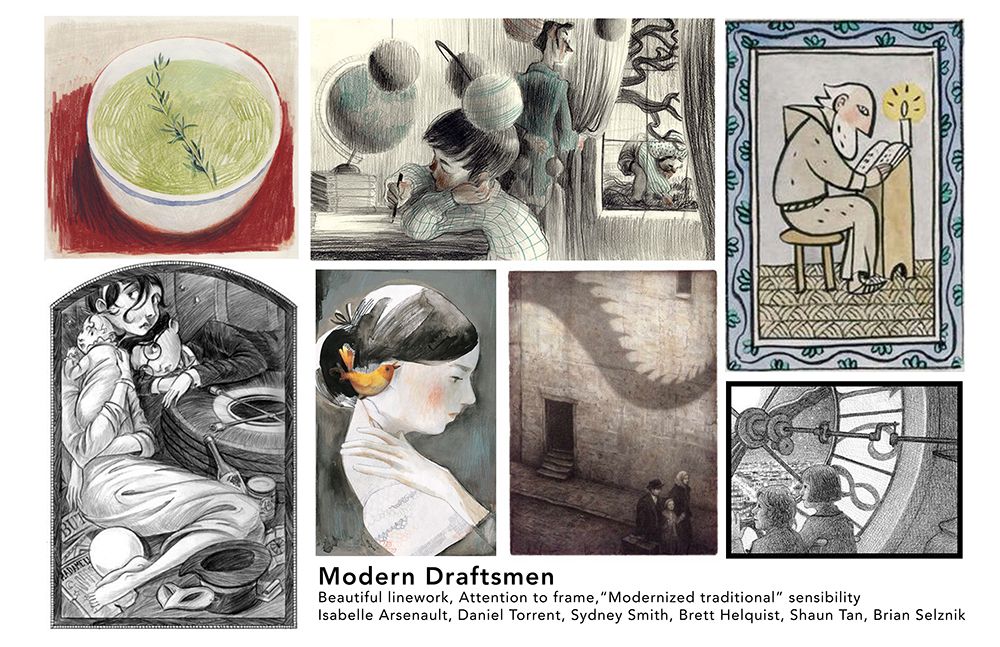
The last set is my favorite modern illustrators. I have a great respect for all of them. How much will my style modernize to meet up with theirs? I don't know yet!
And finally, here is my Instagram account so you can see my work: https://www.instagram.com/lauraintorino/ My favorite posts are the Puritan girl, the man looking into the pond, Cosette, and perhaps the little boy with the blanket hair. But there needs to be more production!
Haha! If anyone wants to help me make sense of this, I'd be extremely grateful!

-
-
@Zachary-Drenski Just posted. I have a color/no color problem as well!
-
@Miriam said in Discovering our style - Who's in?:
I'm wondering if you might be "trying to hard" & are too focused on finding works to copy. Perhaps you could benefit from allowing yourself to relax more, and try gathering collections on boards for art that you don't necessarily want to copy, or do that style, but just like.
This is pretty much what I ended dup doing
") While the dream portfolio I ended up with isn't perfect it gave me a place to start (I'm gonna over the next month add and subtract images).
While the dream portfolio I ended up with isn't perfect it gave me a place to start (I'm gonna over the next month add and subtract images).But I was definitely overthinking it, lol
-
@Miriam Thankyou. I have done this before with my phone. I uploaded my own pics of a sewing technique I used for Boy Scout merit badges. I haven’t used it for anything else though. I forget about that feature.
 Thanx for the reminder.
 -
@LauraA @Zachary-Drenski seems to be a common theme these days...
-
@Braden-Hallett I'm working on mine again but yeah over a month -bringing in and taking out until I am more settled.
-
@LauraA Looking at your work and your dream portfolio a few words to describe them would be 'nostalgic, tenderness, and hand-made.' For some reason when I looked at your dream portfolio, Aaron Becker popped into mind as a possible combination of all of these (not saying you should emulate his work). Your work is really lovely, by the way, and am interested to see how you would handle more complex compositions.
-
Thank you for commenting - yes I need to find that exact pink paint!
I think illustrating people is a weak point of mine so I'm very drawn to images that do this well and in an interesting way. Definitely a priority for me to work on.
@Miriam said in Discovering our style - Who's in?:
I don't know much about color, but I am noticing a lot of bright colors, with somewhat subdued saturation. I especially notice the same Pink! in several of these images.
I'm also seeing that most of the images have people or buildings or other human objects. Only a few of them have only animals/nature.
Nicola Schofield
Twitter: twitter.com/NSchofieldArt
Instagram: instagram.com/NicolaSchofieldArt/