SLOWVEMBER WIP Critique requested
-
Hey @chrisaakins
Really nice!
Here are my thoughts on your questions
- I don't really get the 3 wise men reference unless I know that's what's happening. Maybe you might put more thought into the costumes. Something that feels more "biblical" might help. I suppose it being a christmas card would lend it some context, but I still feel like you could push it to feel more of that time and place.
- I feel like your lines are overall pretty nice. The shadows feel like the weakest part of this to me. They feel a little blurry and undefined. You can have soft shadows and still have them be "defined". I'm not sure I know how to explain it, but to me, that's the thing that pops out most.
- Why not give it a go and try the watercolors? Since you're working digitally you can try stuff and see. Even if it's just a quick pass to test it out.
- I don't know all that much about greeting cards, but I have a feeling that cards tend to have color more often than not. I love black and white personally, but I feel like on the whole, people just love color.
- In general, I feel like it's pretty solid. There are a couple areas that pop out to me that you could clean up A. the bag feels a little tentatively drawn, I think you could "clean up" the line on that. B. The shadows (see 2 above)
Hope that's helpful!
-
@robgale That is very helpful. I am not exactly sure what you mean about the shadows but I will work on them. I may try using a soft gray to add more texture. Yeah about the bag. I agree that it is the weakest part. More work on that too. I didn't want the texture of it to compete with Inky.
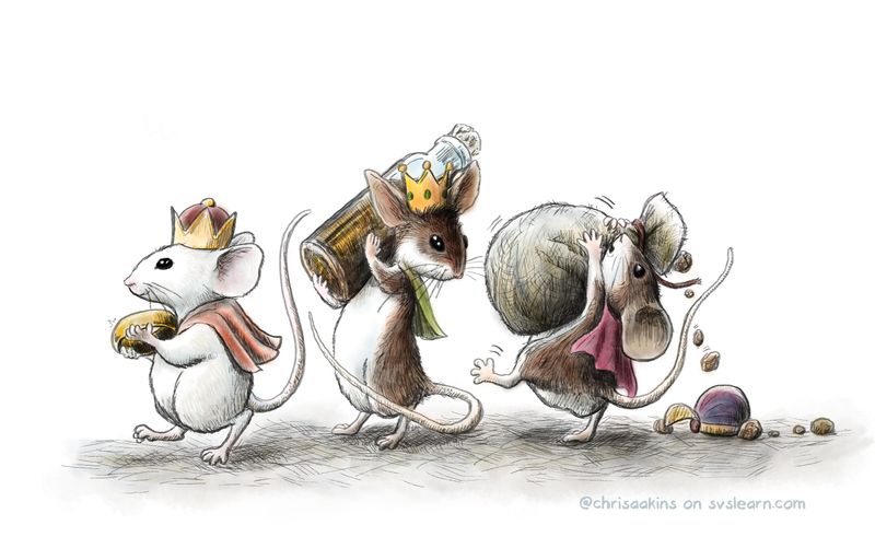
Thank you so much for your input!I took your advice and watercolored it. Does that help?
-
@chrisaakins said in SLOWVEMBER WIP Critique requested:
Questions:
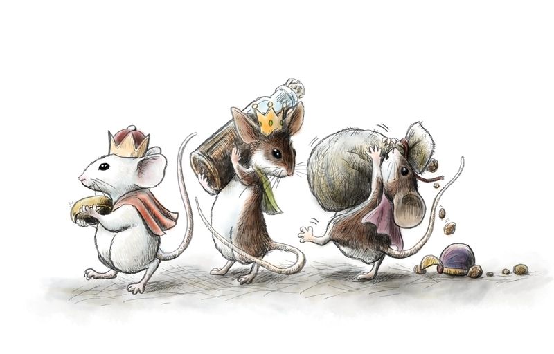
Does it read well as the Three Wise Men (um er Mice)?
-It does, but it took me a few looks to decode that the front mouse was holding a gold ring. I may make it a literal gold coin?
What areas do you see that I should fix or do more of?
-If you want the silhouettes to really REALLY read I would separate the mice from their objects. Right now the bottle and the sack are kinda melding with the mice. I might try having the middle mouse holding the bottle over its head, and the rear mouse dragging the sack.
Should I add muted watercolors or is it good as a stand-alone pic?
-My vote's always for colour
")
If this were a card would it catch your eye and would you buy it (NO I am not soliciting, just curious)
-It would absolutely catch my eye. However, I don't buy cards, lol.
Does it look professional or amateurish? If it looks amateurish, what can I do to make it more polished?
That's a really good question. In many ways professional. Depends on whether you're going for realistic mice, or stylized mice.
How does it compare with my traditional? I did it all digitally with a new inking brush I really like.
-It's hard for me to tell the difference (in a good way)
Nice work so far! Are you going to be re-exploring the concept and reworking it for the rest of the month? Trying out new rendering methods?
-
@Braden-Hallett Thanks for the critique. I wish that I could go back and change things up and explore a bunch of different options, but with grad school, I may have to call it done or almost done. I like the rendering with the watercolor brush. I thought of going back in and doing some sort of texturizing as Lee does in his but I think it might compete with the inking. Who knows? Maybe if I can catch some more free time I can give it a try. I doubt it will make the sweet 16 for this month but I do like the progress I made on inking with digital. I am also impressed with how you pull all the quotes. I forget to do that. As far as the positioning of the mice I think the gestures of the mice are good enough to make the lack of silhouettes justified. I also like how the crown is silhouetted. But you are probably right, I just like the idea of the bag being too heavy for Inky to handle and it making him all topsy turvy .
Yet I am second guessing myself... Ahhhhhh. I may go back and explore other ideas. I draw pretty fast so maybe I can refine the idea some more.
-
@chrisaakins said in SLOWVEMBER WIP Critique requested:
Yet I am second guessing myself... Ahhhhhh. I may go back and explore other ideas. I draw pretty fast so maybe I can refine the idea some more.
Dude, it looks good
The silhouettes are fine as is, I'm just nit-picky. -
Answering your initial questions (without reading all the replies due to lack of time):
- They read on second sight, yes. After considering it was for a christmas card.
- You could give them more attributes to distinguish them ... One of the wise was black, so maybe really make a black mouse of him, and keep the other two white. I would let them walk exactly the opposite way - in reading direction, not against it.
- I think color would be nice for the topic. You did it in the bottom as I see now. It reads better.
- I am not a buyer of cards, so a bad person to ask
")
- semi. Pay attention to details like the bottle (not symmetrical; the glassy texture could be worked out better), the sack (misses wrinkles), the objects that fall out of it (what is it?). You could find out how frankincense and myrrh look like. Draw them bigger - it's mice who carry them. I like the different positions. Still, they could be a bit more exaggerated. Whe I look at them, I see a vertical line, a more inclined line, and an angular line for the characters. You couldopen these angles more like fan (is this understandable?). Pay attention to the shape of ears mainly from the mouse in the middle. I could imagine a bit of a calm background, or ground under their feet.
- I Like your inking and brushwork! Only the grayish ground looks a bit spotty. Maybe try a larger brush size?
-
I love this, I loved drawing mice as a kid, they were a main feature in my drawings
I'm no expert but I think the shading on the ground should be a little less patchy and maybe the reds and yellows could pop a little more? Maybe that's just personal because I really like muted shades with a few brights. I would buy it. -
@Meta
Thank you for your thoughtful and detailed input. I know I didn't show all of my processes but I did research frankincense and myrrh. I chose frankincense oil instead of solids and believe it or not that is what myrrh looks like. It is a waxy resin. They sell them in these tiny little bottles and bags. I guess for children at Christmas. These are my mice from Inktober. I got a little bit of a following with them so I brought them back for Christmas, that is why the mice don't follow the traditional three kings exactly.As far as the bottle goes. Yeah, I was drawing from memory and I should have used a reference.
Also, when I was trying to draw a straight line for some reason my pen went wonky and did this wavy line thing when I bore down. I saw that happened to someone else on the forum. I think it distracted me and I lost my groove on it. I worked on it a little more. Don't know if it is better or not.I am trying to find a balance between whimsy and realism. I want my objects to look like they belong but not necessarily be rendered as realistically as possible. For example, I seriously doubt mice could carry anything the way these three are.
@Rachel-Horne I took your advice and my son's as well who said I needed to pump up the color a little bit on the bright spots. He thought it would make the muted colors even more muted. @robgale @robgale I also worked the ground a bit more ( I wasn't sure what patchy meant but I did my best!) Does it look better?
I think overall this is a success for me. I wanted a highly textured, whimsical, highly rendered line drawing with good gestures. I may have to be done for now. Still taking care of my son who just got out of the hospital (he had major surgery but is doing MUCH better) and I have several major assignments due for grad school plus and an Advent book to finish for my wife (who is my number one client).
-
@chrisaakins Yeah! I definitely like the color more. It feels more finished. And the updates you made to the ground too, definitely improves it, I feel like it ties it all together better, like it's just more complete. Nice!
I think it also helps with what I was saying about the shadows. Something about using the lines on the ground helps to make it feel more like it's all of the same "world".
-
I really like your pumped up color! You have a good effect going. The only thing I'd have to say now is that that second mouse's silhouette is still a little garbled compared to the rest. You could consider making him all dark if that doesn't mess with your previous characterizations. And while I love his gesture (totally believable), if he lifted the bottle just a bit more so you could read the silhouette better, that might help too. In fact, I might even plump him up just a tiny bit. The others just have such good silhouettes that his is a little less clear.
The 3 kings idea reads to me, but honestly I thought that was an almond in the first mouse's hand until I read it was a ring. That seemed like the kind of thing a mouse might bring as a gift! I was looking quickly, though.