Portfolio Piece- critiques wanted please
-
@theprairiefox Anyway, I was hoping more that you’d give me pointers on the perspective and composition. I’m not really concerned with the minor nuances like clutter, expressions, etc. They can be tweaked later on. Thanks for the input.
Portfolio: nyrrylcadiz.com
Instagram: https://www.instagram.com/nyrryl_cadiz/
YouTube: https://www.youtube.com/channel/UCbJCF1Im8ZO7hpGWTKOJMuA -
@Nyrryl-Cadiz Sorry to sidetrack. You asked for a critique on composition and without an understanding of what you are trying to accomplish with the piece, it is very difficult to provide feedback on the composition. The composition provides the focal points, the precedence of items to view, and overall flow for the viewer.
So I guess the feedback for the composition is as a viewer I don't know what to look at or what you are trying to communicate right off the bat (which is why I had to ask.) As for the focal point, the girl is reading as the primary and the boy secondary. Everything else kind of gets lost as to which to look at next. I am getting that something is happening on the TV, but the eyes are all leading me off the image to the left (and nothing is leading me back.)
You could clarify the composition a lot by adding value. I find it hard to provide composition feedback without it.
For perspective, you are looking pretty good. The only comment I would have there is Mom's head angle is not feeling right and Dad's arm just disappears.
Perspective is easy to critique, but the composition needs more understanding.
-The Prairie Fox
https://www.instagram.com/theprairiefox
https://www.theprairiefox.com -
@Nyrryl-Cadiz I think the composition is fine. I got the feeling it was supposed to feel cluttered. Young children tend to... clutter things, lol.
For the most part the perspective seems fine except for the coffee table. Seems like the horizon line is closer to the level of the counter top in the background and the middle of the bookcase behind Gramma. The coffee table should be sloping along with the floor.
I'm curious as to what very inappropriate show the kids have discovered to watch while mum and dad are distracted
")
-
@Braden-Hallett You got the exact point in that I was about to write about the perspective. @Nyrryl-Cadiz I'm reading the horizon line in same place (bookshelf between grandma and teen). So we should be able to see the top side of the coffeet table, the arm rest that Dad's using, and the seat cushion that grandma's sitting on. I love the composition and the story that this piece is telling. I am reading it as that a scary movie has come on after the parents fell asleep (probably because my daughter would love it and my sone would be freaked out too). I saw your note that it's a rainbow/unicorn show and that there's gonna be a lot of pink, so I'm expecting the type of show being revealed as sickeningly cute will be revealed through the colors glowing fro the TV and the drawings of unicorns and rainbows that the little girl has taped onto the wall.
-
Others already mentioned the horizon line - good catch there.
I think in terms of pure lineart from a composition standpoint is I look at which lines are thick and which ones are thin. For example, the TV, the daughters face, the little girl's head and dad's shirt have some of the thicker lines. You could make adjustments to give the focal point thicker linework to give it more emphasis and bring down the lines that are less important.
-
@jdubz hi! Thanks for the input but I won’t really keep the line work when I reach the painting stage. So I’m not really concerned about their weight. Again, thanks for the help.
-
Would it help you do to a quick value study? Value can do a lot to tame a chaotic composition!
-
@ajillustrates @Braden-Hallett i totally get what you mean. I always felt there was something wrong with the perspective. Thanks for helping me spot it. I’m working on a new version and I’ll be posting it shortly. Once again, thank you for the critique.
-
@LauraA Thanks but i’m actually changing the whole thing tho. I just feel that this version’s composition is not working.
-
@theprairiefox No worries. I should have been more specific on which element I wanted critique on. And you’re totally right. The composition is a mess. There’s no clear visual hierarchy for the eye to follow. I’m changing the composition and for sure, simplifying it for an easier read. Thank you so much for the critique.
-
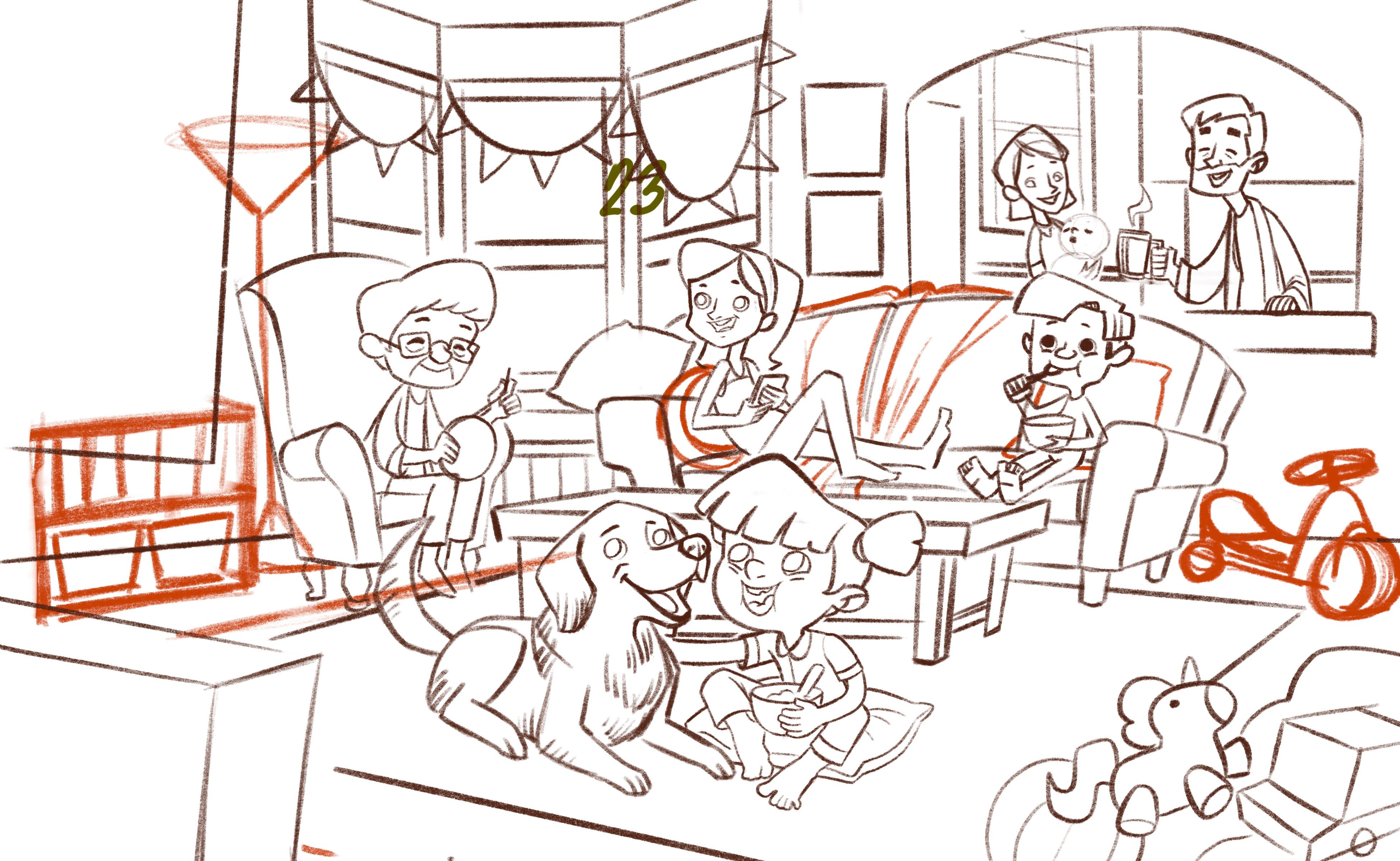
Hi! So, here’s my new sketch. I didn’t like how so many characters were crammed in such a tiny shot in the first version. They were so close to each other that their was no clear visual heirarchy aside from the girl. Hopefully, the depth and the characters’ positioning in this one will guide the viewer’s eyes for an easy read.
I also like how I can show more of the room in this one compared to slightly claustrophobic feel of the initial sketch. I also plan to set this illustration on a lazy Sunday morning so the added space will definitely add to the mood. As for what they’re watching, I’m not really sure. Maybe it’s a funny commercial or the kid’s favorite cartoon. It’s up to the viewers to guess. Lol

Anyway, I think I fixed the perspective especially on the coffee table. I see a few discrepancies on the counter and bay window but they’re an easy fix. If you spot any other perspective errors or any mistakes in general, feel free to let me know. Also if you have any suggestions, let me know too. I’d love to hear them out. Thanks!
Portfolio: nyrrylcadiz.com
Instagram: https://www.instagram.com/nyrryl_cadiz/
YouTube: https://www.youtube.com/channel/UCbJCF1Im8ZO7hpGWTKOJMuA -
@Nyrryl-Cadiz Well, they definitely look a lot more refreshed and like they're in a better mood! It's easier on the eyes. But it depends on what you were going for--the other one fit the mood for too much chaos and frazzled nerves!
-
@LauraA yeah
 I had a change of heart. I realized that I wanted a lighter mood so I changed it.
 -
@Nyrryl-Cadiz i like the changes you've made. interested to see it in color!
-
@Nyrryl-Cadiz I am trying to learn from this illustration--can you share a sketch that shows your horizon and vanishing points?