Society of Visual Storytelling

    SVSLearn Forums

    • Register
    • Login
    • Search
    • Recent
    • Tags
    • Popular
    • Users
    • Groups
    • Search

    Portfolio Piece- critiques wanted please

    Artwork
    8
    20
    848
    Loading More Posts
    • Oldest to Newest
    • Newest to Oldest
    • Most Votes
    Reply
    • Reply as topic
    Log in to reply
    This topic has been deleted. Only users with topic management privileges can see it.
    • J
      jdubz last edited by jdubz

      Others already mentioned the horizon line - good catch there.

      I think in terms of pure lineart from a composition standpoint is I look at which lines are thick and which ones are thin. For example, the TV, the daughters face, the little girl's head and dad's shirt have some of the thicker lines. You could make adjustments to give the focal point thicker linework to give it more emphasis and bring down the lines that are less important.

      Josh White
      https://www.instagram.com/joshwhiteillustration/

      Nyrryl  Cadiz 1 Reply Last reply Reply Quote 1
      • Nyrryl  Cadiz
        Nyrryl Cadiz SVS OG @jdubz last edited by

        @jdubz hi! Thanks for the input but I won’t really keep the line work when I reach the painting stage. So I’m not really concerned about their weight. Again, thanks for the help.

        Portfolio: nyrrylcadiz.com
        Instagram: https://www.instagram.com/nyrryl_cadiz/
        YouTube: https://www.youtube.com/channel/UCbJCF1Im8ZO7hpGWTKOJMuA

        1 Reply Last reply Reply Quote 0
        • LauraA
          LauraA SVS OG last edited by

          Would it help you do to a quick value study? Value can do a lot to tame a chaotic composition!

          Instagram: https://www.instagram.com/lauraintorino/
          http://lauraaldersonart.com/

          Nyrryl  Cadiz 1 Reply Last reply Reply Quote 2
          • Nyrryl  Cadiz
            Nyrryl Cadiz SVS OG last edited by

            @ajillustrates @Braden-Hallett i totally get what you mean. I always felt there was something wrong with the perspective. Thanks for helping me spot it. I’m working on a new version and I’ll be posting it shortly. Once again, thank you for the critique.

            Portfolio: nyrrylcadiz.com
            Instagram: https://www.instagram.com/nyrryl_cadiz/
            YouTube: https://www.youtube.com/channel/UCbJCF1Im8ZO7hpGWTKOJMuA

            1 Reply Last reply Reply Quote 0
            • Nyrryl  Cadiz
              Nyrryl Cadiz SVS OG @LauraA last edited by

              @LauraA Thanks but i’m actually changing the whole thing tho. I just feel that this version’s composition is not working.

              Portfolio: nyrrylcadiz.com
              Instagram: https://www.instagram.com/nyrryl_cadiz/
              YouTube: https://www.youtube.com/channel/UCbJCF1Im8ZO7hpGWTKOJMuA

              1 Reply Last reply Reply Quote 1
              • Nyrryl  Cadiz
                Nyrryl Cadiz SVS OG @theprairiefox last edited by Nyrryl Cadiz

                @theprairiefox No worries. I should have been more specific on which element I wanted critique on. And you’re totally right. The composition is a mess. There’s no clear visual hierarchy for the eye to follow. I’m changing the composition and for sure, simplifying it for an easier read. Thank you so much for the critique.

                Portfolio: nyrrylcadiz.com
                Instagram: https://www.instagram.com/nyrryl_cadiz/
                YouTube: https://www.youtube.com/channel/UCbJCF1Im8ZO7hpGWTKOJMuA

                1 Reply Last reply Reply Quote 0
                • Nyrryl  Cadiz
                  Nyrryl Cadiz SVS OG last edited by

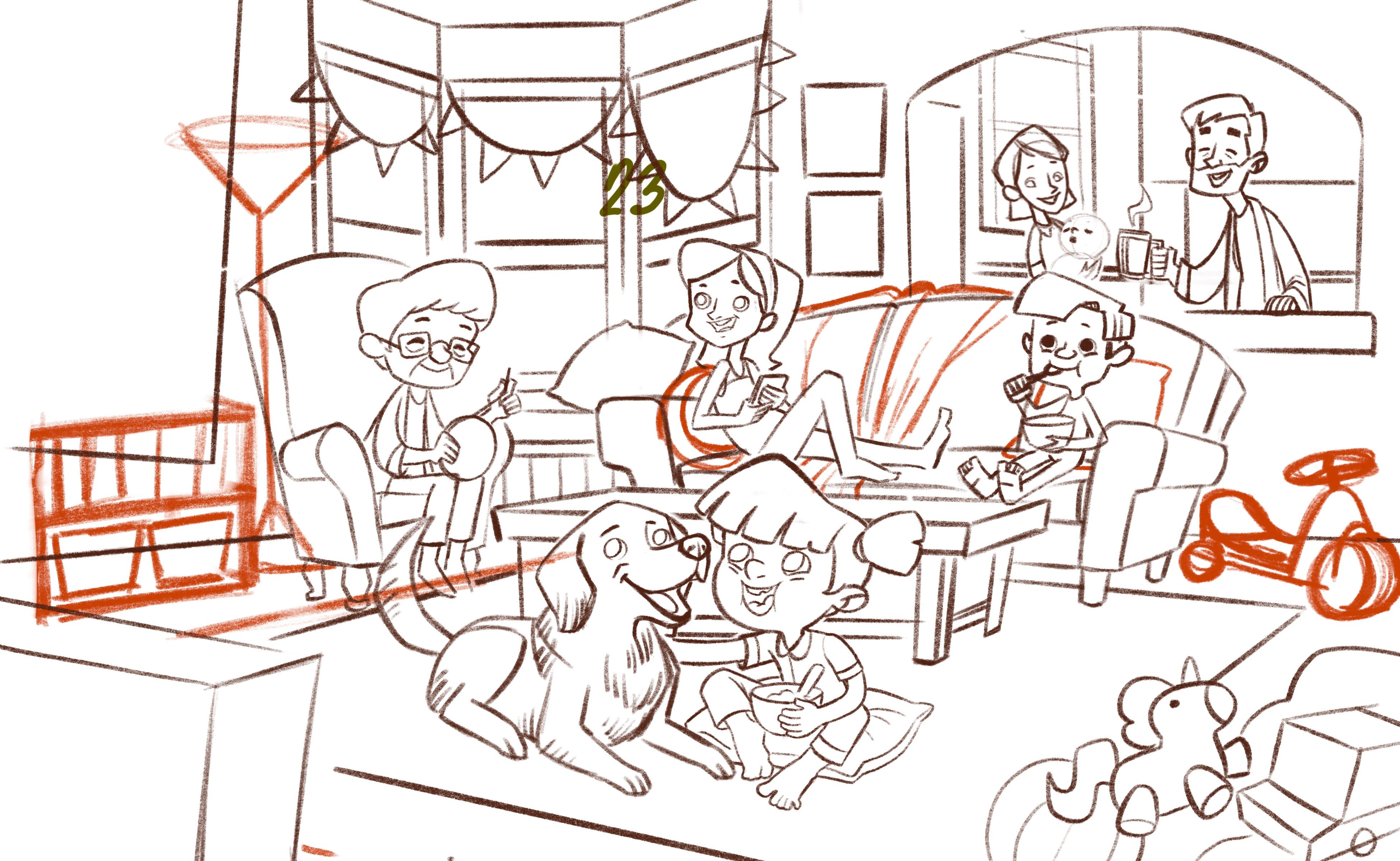
                  Hi! So, here’s my new sketch. I didn’t like how so many characters were crammed in such a tiny shot in the first version. They were so close to each other that their was no clear visual heirarchy aside from the girl. Hopefully, the depth and the characters’ positioning in this one will guide the viewer’s eyes for an easy read.

                  I also like how I can show more of the room in this one compared to slightly claustrophobic feel of the initial sketch. I also plan to set this illustration on a lazy Sunday morning so the added space will definitely add to the mood. As for what they’re watching, I’m not really sure. Maybe it’s a funny commercial or the kid’s favorite cartoon. It’s up to the viewers to guess. Lol 😂

                  Anyway, I think I fixed the perspective especially on the coffee table. I see a few discrepancies on the counter and bay window but they’re an easy fix. If you spot any other perspective errors or any mistakes in general, feel free to let me know. Also if you have any suggestions, let me know too. I’d love to hear them out. Thanks!

                  21A21A99-71BD-45D4-977F-874B401CF3C0.jpeg

                  Portfolio: nyrrylcadiz.com
                  Instagram: https://www.instagram.com/nyrryl_cadiz/
                  YouTube: https://www.youtube.com/channel/UCbJCF1Im8ZO7hpGWTKOJMuA

                  LauraA KaraDaniel BichonBistro 3 Replies Last reply Reply Quote 2
                  • LauraA
                    LauraA SVS OG @Nyrryl Cadiz last edited by

                    @Nyrryl-Cadiz Well, they definitely look a lot more refreshed and like they're in a better mood! It's easier on the eyes. But it depends on what you were going for--the other one fit the mood for too much chaos and frazzled nerves!

                    Instagram: https://www.instagram.com/lauraintorino/
                    http://lauraaldersonart.com/

                    Nyrryl  Cadiz 1 Reply Last reply Reply Quote 1
                    • Nyrryl  Cadiz
                      Nyrryl Cadiz SVS OG @LauraA last edited by

                      @LauraA yeah 😅 I had a change of heart. I realized that I wanted a lighter mood so I changed it.

                      Portfolio: nyrrylcadiz.com
                      Instagram: https://www.instagram.com/nyrryl_cadiz/
                      YouTube: https://www.youtube.com/channel/UCbJCF1Im8ZO7hpGWTKOJMuA

                      1 Reply Last reply Reply Quote 1
                      • KaraDaniel
                        KaraDaniel @Nyrryl Cadiz last edited by

                        @Nyrryl-Cadiz i like the changes you've made. interested to see it in color!

                        instagram.com/sha_kara
                        karadaniel.net

                        1 Reply Last reply Reply Quote 2
                        • BichonBistro
                          BichonBistro @Nyrryl Cadiz last edited by

                          @Nyrryl-Cadiz I am trying to learn from this illustration--can you share a sketch that shows your horizon and vanishing points?

                          https://www.instagram.com/bichonbistro
                          http://www.heartfeltimpressions.com
                          https://www.facebook.com/patty.burke.9655
                          https://twitter.com/BichonBistro

                          1 Reply Last reply Reply Quote 1
                          • First post
                            Last post