Critique on sketch
-
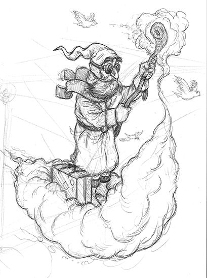
Hello SVS community. I've drifted away from art but I'm dipping my toe back in the pool with this sketch that I plan on making into a finished piece. I could use as an extra pair of eyes to look my sketch over and point out the flaws I'm unable to see.
Travelling wizard
Thanks in advance!
-
Hi, SVS community responding
") . I only have a suggestion. Your wizard's scarf may add interest if both flying ends don't look almost identical. Maybe one catches the wind slightly differently (tilted more behind the other). Though I am not certain if this would be contrary to what would happen in reality (that's why it's a suggestion). That and his feet placement -seems very static (he might fall over (he's also creating a windy environment) because he's not grounded so well) -one leg ahead of the other and maybe with some bend.
. I only have a suggestion. Your wizard's scarf may add interest if both flying ends don't look almost identical. Maybe one catches the wind slightly differently (tilted more behind the other). Though I am not certain if this would be contrary to what would happen in reality (that's why it's a suggestion). That and his feet placement -seems very static (he might fall over (he's also creating a windy environment) because he's not grounded so well) -one leg ahead of the other and maybe with some bend.Other than those I really quite like your character and his journey.
-
@IanS this is so cool. Reminds me a bit of Merlin from Sword in the stone... when he gets back from Bermuda.

-
Thanks @Heather-Boyd! I appreciate the help.
-
@Pamela-Fraley I haven't thought about the movie in years but your right. I can't look at it now without thinking about that scene. I'm going to have to re-watch that movie. It was one of my childhood fav's!
-
@IanS it’s my all time favorite Disney Movie.
 ️
️ -
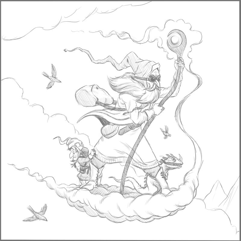
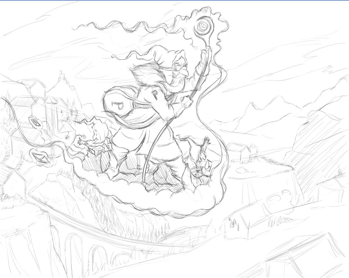
Second draft of my wizard piece. Added a couple of passengers.
-
@IanS I just went through the composition class by @Will-Terry and one thing he said in the balance section was that when a character is looking out of the picture you want to make sure there is more space in front of the character than behind. The empty space provides balance.
I mangled your image (I am not a digital artist.) to get the effect. You might want to consider shifting the characters to the left.
I think it improves the balance, but I suspect that if you widened the image further and provided more space on the right it may work even better.
-
@IanS I definitely feel the energy and movement more. The suspense! Lols I also agree with @theprairiefox about the mountains.
-
Love the character design, and the energy of this piece. So cool.
I echo @theprairiefox: there is something about the composition that you work to develop more. Taking the character off-center is almost always making the piece more interesting. But where to put him would depend on what story you want to tell with this piece.
It might be interesting to start thinking about the story, who is he, and where is he going? What is he going to do? Is he chilling up on the cloud, or is he in a hurry to go somewhere?
Have fun -
great progress! feels more intense and I really love the addition of the little characters.
-
@theprairiefox: Thanks for the draw over. It was a big help! The composition vid is one I need to watch asap.
@xin-li: I think I got caught up in the character design and making it look cool. I didn't give the story much thought so thanks for highlighting that. I'll see what I can come up with! If I can't rectify this piece I'll be thinking about the story much more on the next one.
@KaraDaniel: Cheers Kara!
-
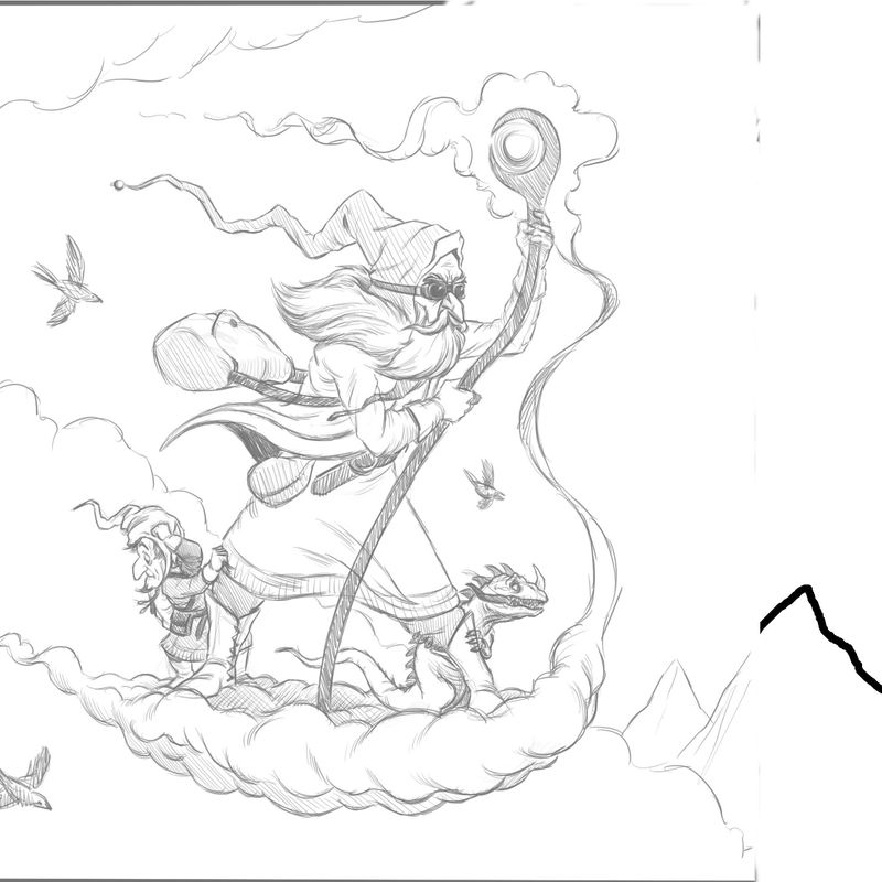
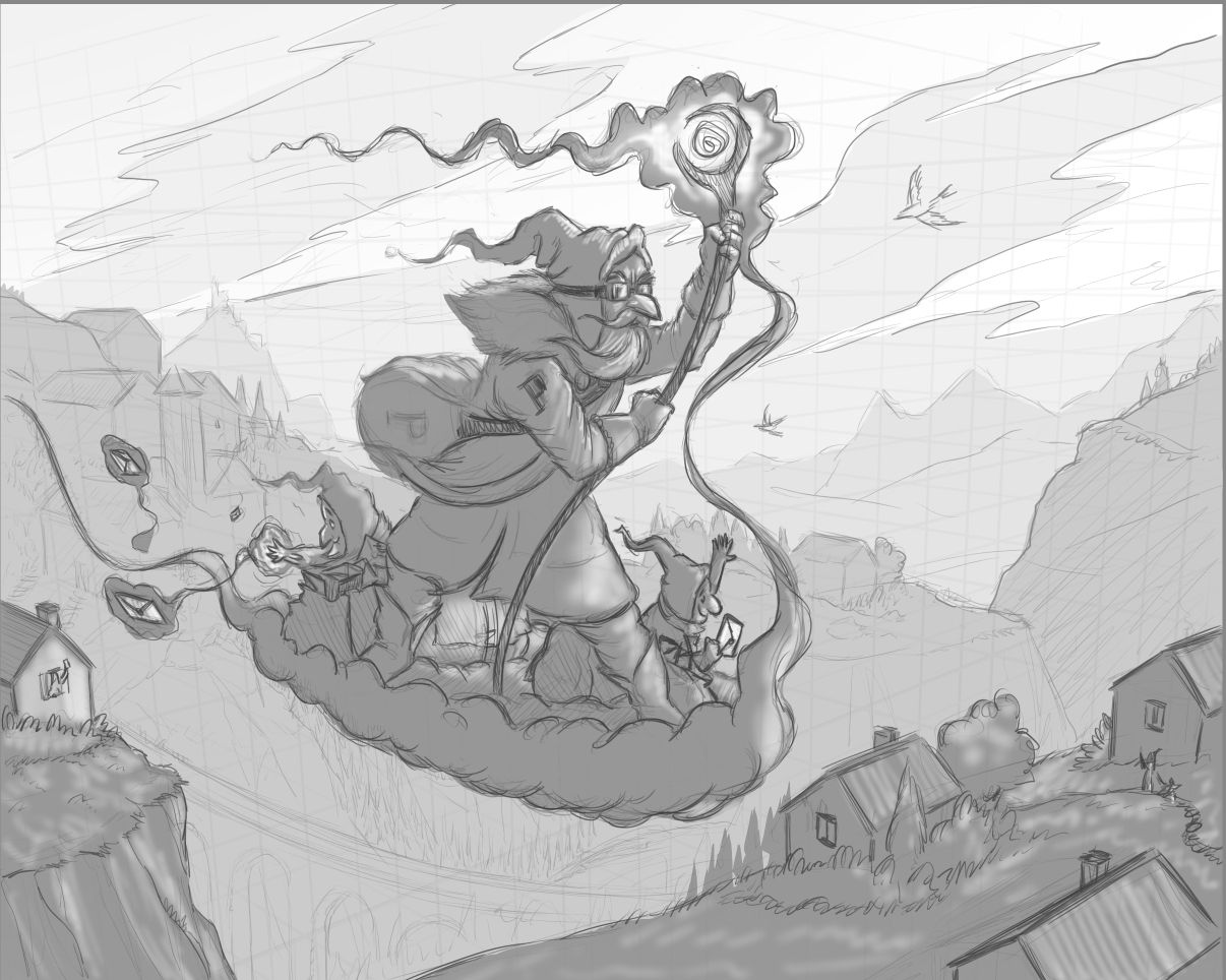
I've changed the composition as per suggestion and added a story element. They're now postal workers on their rounds. It's a little slapdash but it's a little tricky to add a story in later. Lesson for the future: Consider story from the beginning!
-
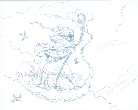
@IanS Hey Ian - i just checked out your website - really nice work! I really like this drawing too - i definitely agree with @theprairiefox and @xin-li about shifting the character compositionally and think it looks great now that you have done so - i was thinking that adding the ground to the image could give room to flesh out the story a bit more (very much like the first image on your portfolio page) - in my scribbly/cut-and-pastey draw over i tried to tilt the perspective of the cloud the wizard is riding to allow a view of the ground plane and a little village below - (I googled swiss mountain village and mashed two photos together
I'm thinking it could really add to and change the story depending on what you put below - i tried a village in front of the wizard but i really could not seem to make it work - anyways... i hope you don't mind the draw over - really nice image!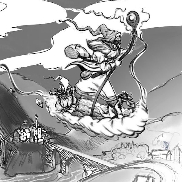
-
@Kevin-Longueil: Thanks so much for taking the time to do this draw over. I really appreciate it! I love the addition of the envelop in the lizards mouth. The new perspective of the cloud definitely invites more options for the background. The background you've added is great! You've given me lots to think about which is exactly what I needed. Thanks again!
-
@IanS "consider story from the beginning!" should be my next tattoo
-
@josegalue25 My next tattoo may read "Composition first detail later!"
-
I've kept the sketch much looser this time as adding lots of detail at this stage is proving to be a really effective way of wasting time! I was really inspired by @Kevin-Longueil's draw over and tweaked it a little. Also replaced the lizard with another postal helper (Starting to look more and more like Santa which is fitting considering the time of year) and instead of letters spilling out the bag the elf is releasing them magic style! Am I getting there?
-
Latest comp. I moved everything down as I didn't like how close the wizard was to the top frame. I've also added a quick value layer to separate foreground, midground and background. Any feedback welcome. I'll be starting the final artwork soon I think. As Mr Parker says "Finished not perfect!"
-
I've been away from the forum for awhile and just read through this thread. What an incredible development from your original sketch. I thought the original was good but by the time I scrolled through and got to your latest, I was really impressed. Can't wait to see it finished.