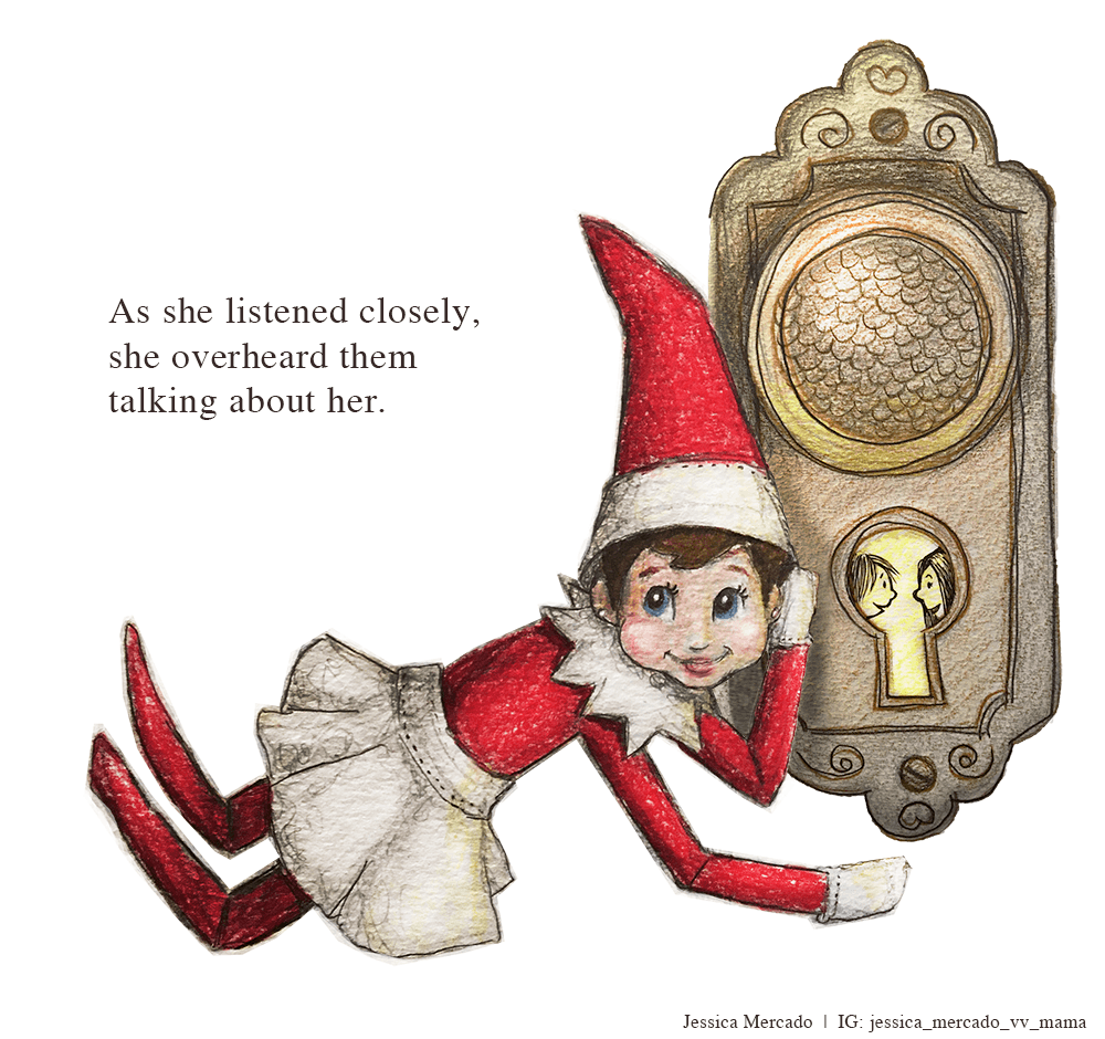
Dec WIP + Will Terry Assignment
-
After listening to 3 point perspective podcast on great illustration assignments, I decided to try one for the December prompt.
Using @Will-Terry 's borrow-an-existing-composition assignment, I'm working on a piece using Alice and Martin Provensen's illustration of 2 sisters peeking through a keyhole.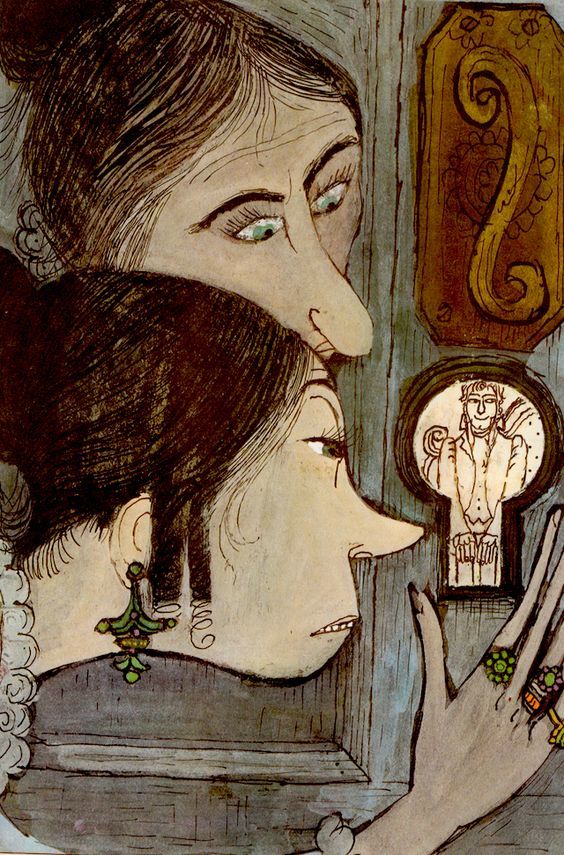
I'm not 100% done yet but wanted to get feedback on finishing touches. I love Provensen's line work and I feel like mine is a bit too timid. I'm wondering if I should go ahead and ink lines or keep working up texture/color on the door a bit more...what do you think?
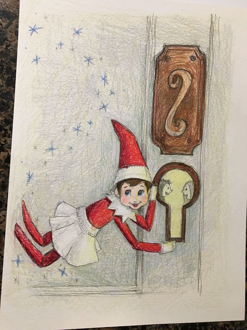
I will scan and photoshop any make minor edits after I'm done. This is prismacolor pencil on watercolor paper. I'd appreciate any feedback. Thanks for looking

-
Nice work.
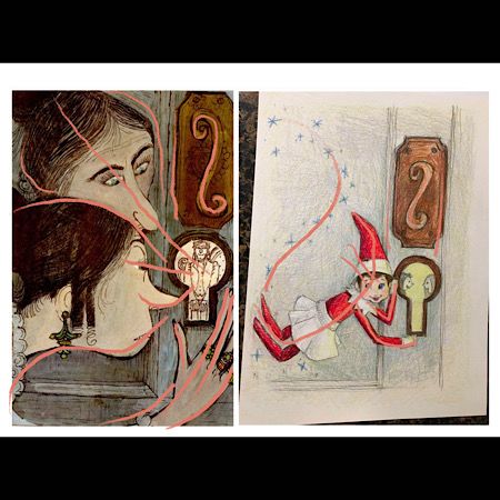
I hope you don’t mind, I did a quick draw over. Alice and Martin Provensons illustration show lots of lines which direct you to the main focus of the image, the keyhole.
At the moment the focus in your image isn’t as directed. It might help to draw up some rough thumbnails so you can work out your composition.
Hope this helps -
That is helpful. I appreciate the time you took to respond.
Your feedback has sparked some ideas I hadn't considered.
I'm wondering if maybe a Christmas wreath with a pointy tipped bow tail pointing down at the keyhole would help.
I probably could do more with lighting so the light comes from the keyhole more too.I will keep working on it. Thanks again!!!
-
@Jessica-Mercado that sounds like a really good solution. Often it helps to sketch it out rough somewhere first before you commit.
-
Sounds like a great assignment! @peteolczyk has made some great points. A couple of suggestions I have:
-
Careful about cropping out feet like that. @burvantill recently linked an article about 10 mistakes illustrators make. Number 6 is about cropping and it has a few good rules of thumb to follow. Might be worth reading! http://www.gcastellano.com/arttips/2015/3/5/10-mistakes-illustrators-make
-
I would be careful about copying the doorplate design so closely to the original. Since you are using the composition for inspiration, also using the doorplate design might be crossing too much of a line into straight out copying?
-
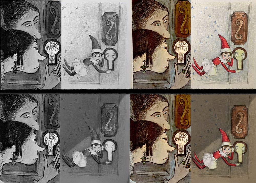
Following how the values affect the composition is also something to consider. In your inspiration, they use quite a bit of dark values to emphasis focal points. If you make most of the door a midtone, it will give a nice value for the elf and the keyhole to work against- it will play up the feeling of being sneaky, and emphasize the feeling of glowing warmth from the keyhole and you could also make the magic from the fairy/elf pop more. It's not like you have to copy the original comp directly in all the elements, but value is something to think about too.
-
-
@TessaW Thank you soooo much for your feedback.
The Elf on the Shelf dolls don't actually have feet. The ends of their legs just look like that. It's weird. But they are a bit too close to the edge of the illustration so I will try to fix that too.
Good advice on the door knob. I could try for something more modern to fit my era.

Your value draw over is interesting. I guess that puts more of her in the light. I was thinking of making the keyhole the light source. I wonder if I could attempt 2 light sources...eeeek! sounds tricky. I may have to watch the lighting course videos again.
I don't want to go for a sneaky mood (like the Provensen one). I wanted the mood to be the unseen magic of Christmas with the flying Elf on the Shelf (which only flies around at night when the kids aren't aware).
Maybe because the scale of my character doesn't match the original, it loses a little of the wow factor. The close up of those sisters' faces is just so good. I'm missing that large, med, small thing in my composition.
This is definitely a good lesson. I thought for sure it would make things easier but there is still so much to consider! -
I submitted my final illustration. I drew a new doorknob and decided to do a spot illustration to avoid the door interfering with value/composition.
