Painting colour and light 2.0 Group run through week Two!
-
@Heather-Boyd thanks that’s a kind answer


-
@peteolczyk said in Painting colour and light 2.0 Group run through week Two!:
I’m going to ask the Stupid question again. What’s the workbook? Is that the excercise numbers or am I missing something?
head to the video and download list. At the very bottom in 'homework downloads' you'll find the 'painting color and light workbook'
")
-
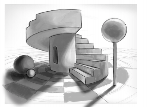
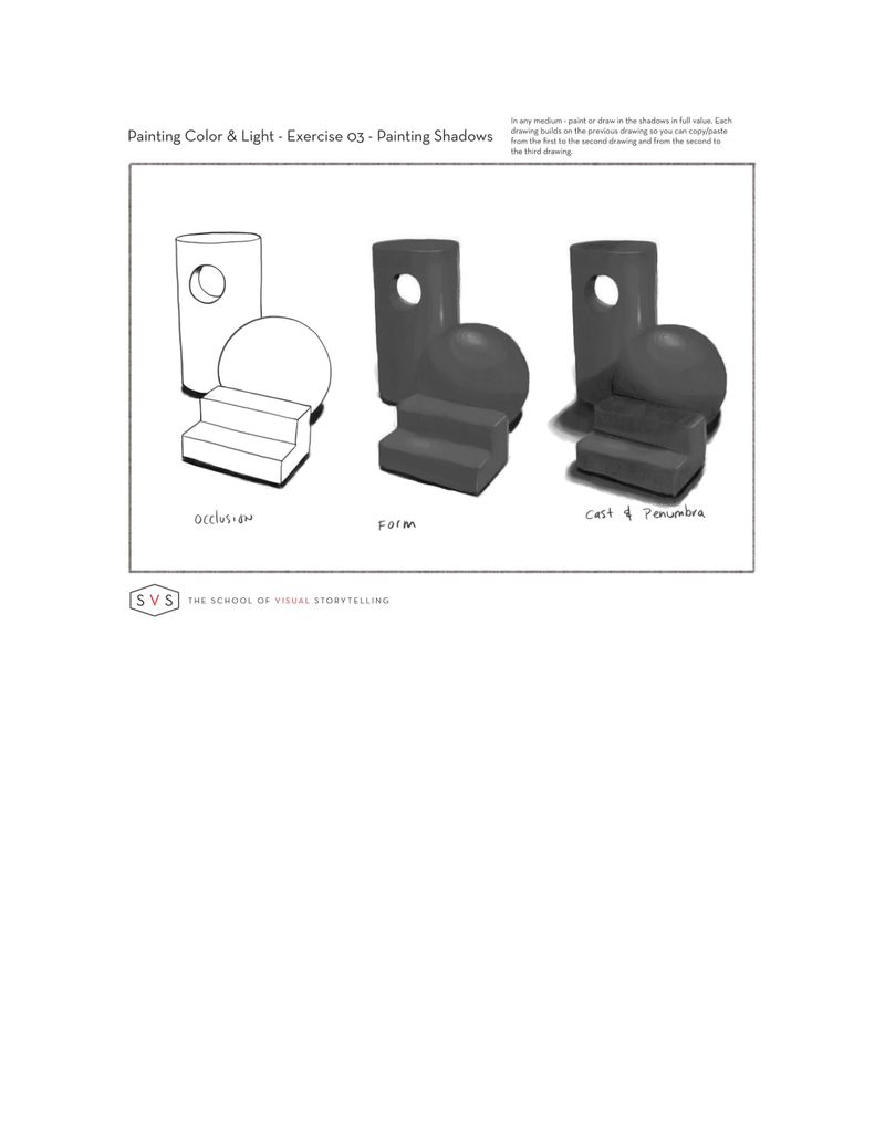
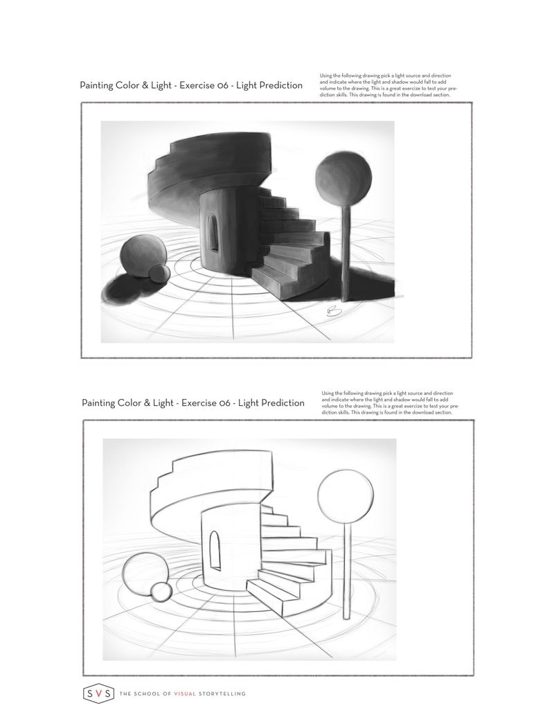
Still working on the exercise 3, but here are some of the finished exercise 6's. I changed the direct on the color one. I think I'm going to try and do a few more on this one.
-
@jdubz This one's definitely a hard one
-
I hope it’s okay, I’m crashing your party. I started the class over the summer and never did the exercises.
I wanted to try making a ball the light source. I had trouble with the roof area but I think it passes.
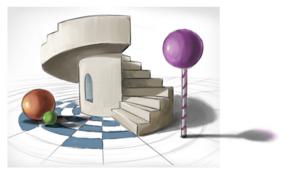
I just noticed @jdubz made the floor checkerboard. That’s cool. I’ll try that with the colored version.Lisa Burvant
www.lisaburvant.com
Instagram & Twitter & SVS: @burvantill -
@burvantill like the shadow going up the stairs, cool.
-
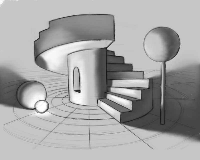
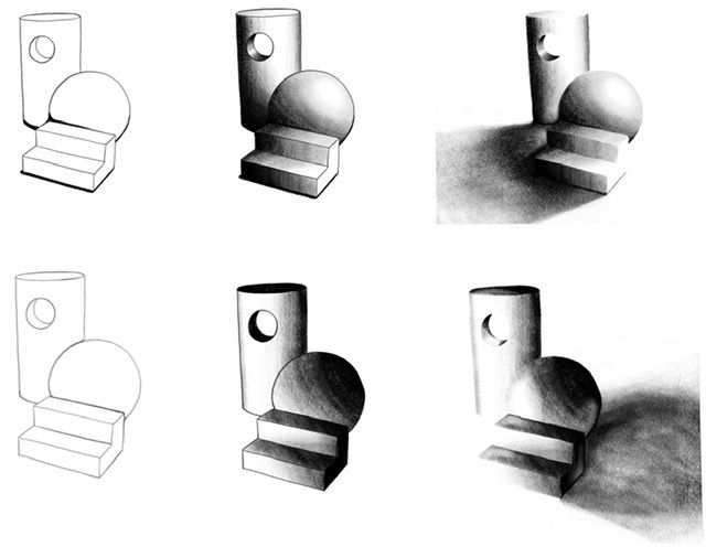
My first bit of the homework. I found it quite hard to separate out the different types of shadow in my mind and think about them separately. I’m used to drawing from observation and it’s just all there all at once.
Edit: The steps & another direction
-
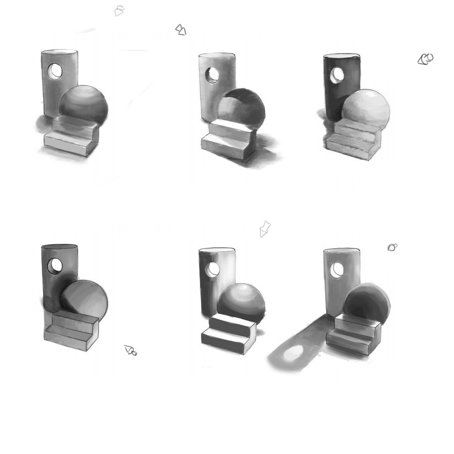
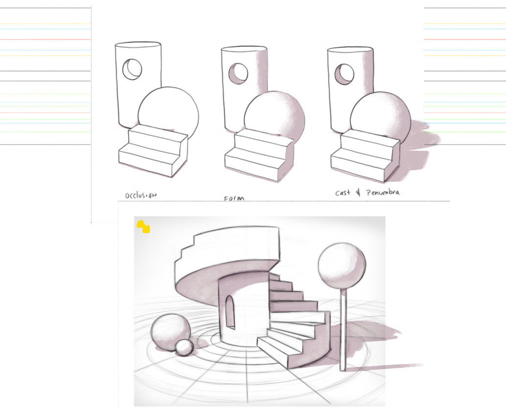
I already notice things to tweak (occlusion under the ball to the steps and to the second step) *and so I went back and fixed it.
However if something looks really off please let me know. I wanted to go more subtle and have the light more above to the right for shorter casts.
Thanks,
-
Ehhh I realized I totally screwed up the directions and didn't work progressively moving from stage 1 to 2 to 3 on the first ones. So I kinda just went with it and finished those and then just skipped into a bunch of angles. I'm going to try and look at some reference because some of my angles I think are not flowing correctly. But it was a great exercise that makes you think about the scene a lot more.
-
This is fun.

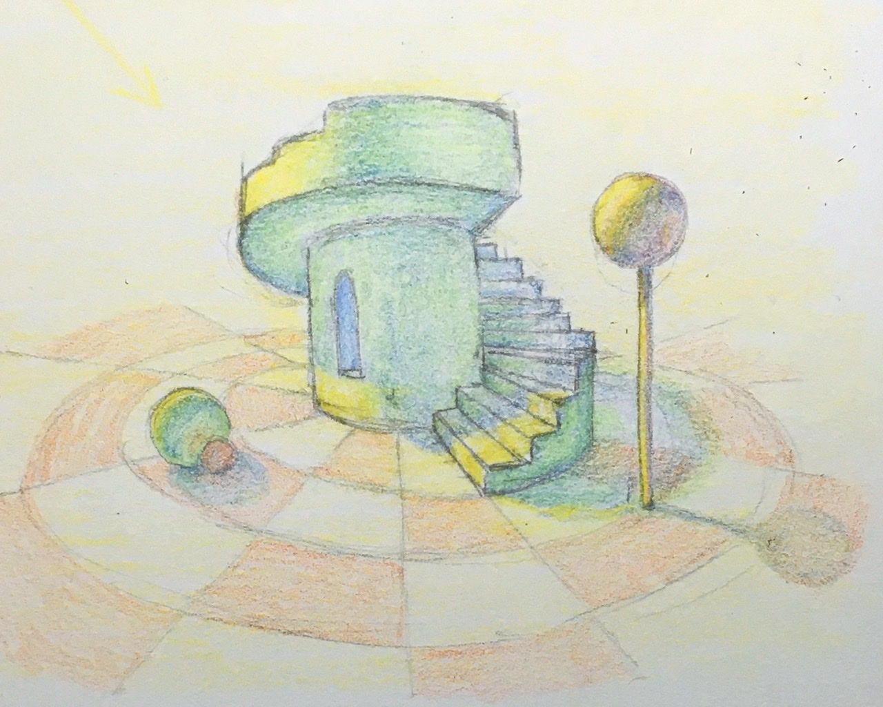
Does anyone else have trouble with the lollipop? That stumped me both times.Lisa Burvant
www.lisaburvant.com
Instagram & Twitter & SVS: @burvantill -
@burvantill Yeah I did for sure. One thing I tried that worked well (I ended up doing like 3 of these until I couldn't stand it any more lol) if you do it digitally is copying the shape of the lollipop and then transform > distort and dragged it around until it felt right.
That works pretty well for most of the separate shapes so you start off with the right proportions.
-
I did my best. I did my best, lols. I know I missed some cast shadows. Oh the struggle but I love light and shadow so I'll keep pushing through it. Thank you @jdubz and @burvantill for the stair case shadow. Left an empty one to return to complete it later/replace it.
-
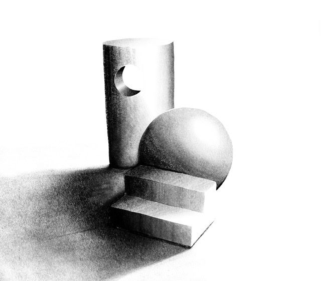
Things always get busy when I decide to do one of these courses, lol. But I did it! For this exercise I was NOT worried about local value, but just where light would hit and where the shadows would be.
If anyone is having a hard time with this (or, just you know, wants to do better) Go watch the new Light and Shadow for illustrators course. GO WATCH IT.
It will change the way you think about local tone vs. shadows and it is EXCEPTIONALLY well laid out as a class. Seriously. Go watch it.
-
@burvantill said in Painting colour and light 2.0 Group run through week Two!:
Does anyone else have trouble with the lollipop? That stumped me both times.
In what way did it stump you?
-
I'm really curious to what processes you all use when you build a piece. That's something I've struggled with to get right.
For example, are you building the mid-tones and setting the base color of all the objects flat, and then applying shadow, then coming back and adding light?
Let's say you have a darker scene - how dark do you start? Or do you not worry about it and just build the local hue/value, like green couch, red bedspread, blue dress, skintone, etc and then apply a global dark layer to make it fit the darker color tone (like a night scene)?
-
@Braden-Hallett start it in 2020 one by one good review but I don’t have the time now.
-
@Braden-Hallett the ball at the top. From where the light is coming from vs where the viewer is makes the light hitting to ball tough to capture. I looked for reference but all I could find were images where the light source and viewpoint are on the same side. I think I got it right but I’m not sure.
I started with a shape like A but then went with B.
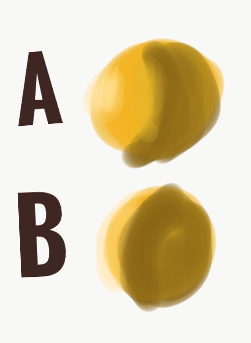
Sorry for the cruddy sample.
Lisa Burvant
www.lisaburvant.com
Instagram & Twitter & SVS: @burvantill -
@jdubz for me it depends on what media I’m using. If I’m doing digital I would normally fill in a local value as if there’s no light source or ambiant light and then put in the lights and shadows. When I’m working in watercolor you have to do it all at the same time it’s a lot to juggle
.
I learned a tip from an episode on Chiustream (either the Core or Plein and Simple) that the real world lives in the mid key values area. There is rarely any pure blacks or pure whites. Unless you are looking at a photo. I try to keep that in my head when I am pushing my darks. -
@jdubz said in Painting colour and light 2.0 Group run through week Two!:
For example, are you building the mid-tones and setting the base color of all the objects flat, and then applying shadow, then coming back and adding light?
Pretty much, yup
As for the darker scene, For the most part even if I'm doing a scene that's 'dark', it's really not dark at all. It's just predominately cool. It's dimmer, yeah, but not DARK dark.
Overall the big things that have helped me have been doing a really REALLY simple value study using 5 values only, and doing a colour study (which I'm starting to refer to as a minipainting). My problem was always though I had to figure it out as I went with the full size piece instead of working small and playing until I got something that looked 'right' if you get what I mean.
-
@burvantill said in Painting colour and light 2.0 Group run through week Two!:
he ball at the top. From where the light is coming from vs where the viewer is makes the light hitting to ball tough to capture. I looked for reference but all I could find were images where the light source and viewpoint are on the same side. I think I got it right but I’m not sure.
I always think of phases of the moon. Crescent and gibbous show the moon (a sphere) lit from different angles. In other words, yes you did it right