Society of Visual Storytelling

    SVSLearn Forums

    • Register
    • Login
    • Search
    • Recent
    • Tags
    • Popular
    • Users
    • Groups
    • Search

    January Challenge WIP feedback appreciated.

    Artwork
    wip comics
    10
    27
    2426
    Loading More Posts
    • Oldest to Newest
    • Newest to Oldest
    • Most Votes
    Reply
    • Reply as topic
    Log in to reply
    This topic has been deleted. Only users with topic management privileges can see it.
    • chrisaakins
      chrisaakins last edited by

      I think I want to try to make this one a comic book type page. I have the idea that Will is a young space explorer out on patrol and he sees these tracks of unusual size that belong to a giant robot. If there were two sets of tracks it would look like a vehicle. One set is somewhat odd. I would try to make them unusual in the pick.

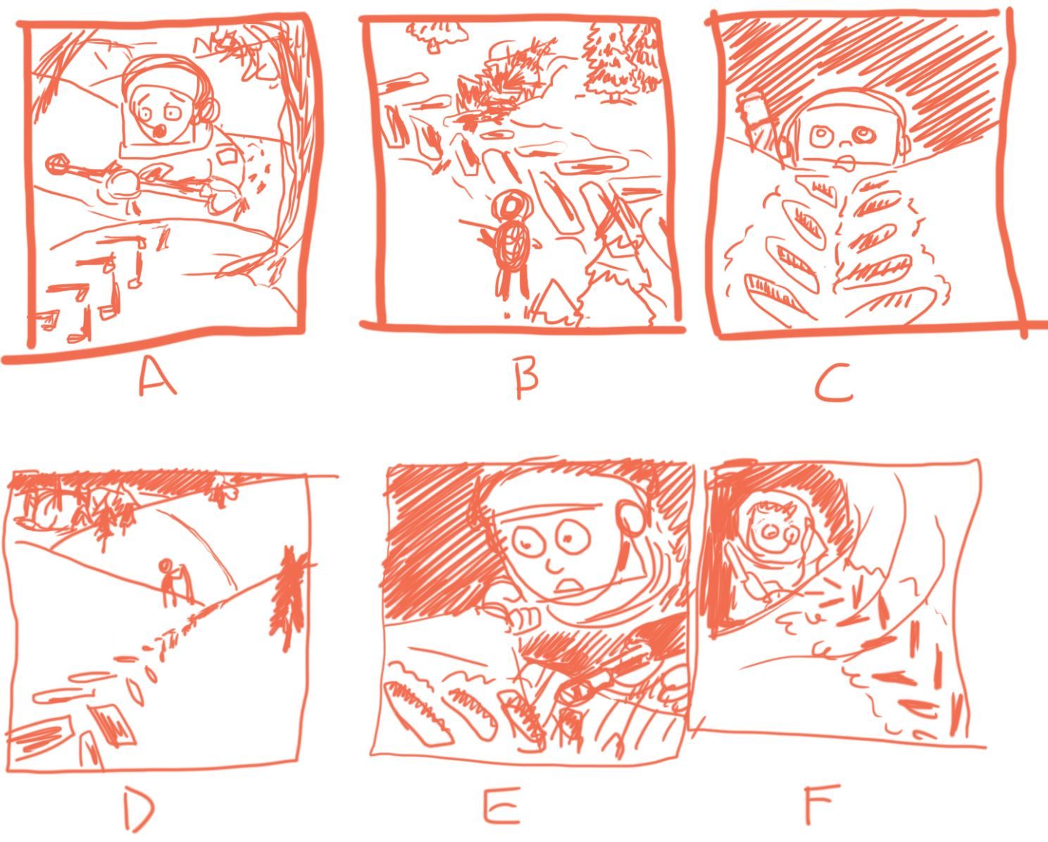
      What thumbnail do you think works best compositionally and why?
      january thumbnail.JPG

      Chris Akins
      www.chrisakinsart.com
      www.instagram.com/chrisakinsart/

      B braden H 2 Replies Last reply Reply Quote 2
      • carlianne
        carlianne last edited by

        I think I like D.

        I like that the tracks lead you to Will, and that we are able to see a close up of them. I think you should Place Will a little more to the right, so he's on the 3rd instead of close to the middle. My only concern, is that you said he is a space explorer, and this looks like he's in a snowy forest to me. So I would think about how you can make it look more Alien while in this stage.

        Check out my art and tutorials :)

        Instagram: www.instagram.com/carliannecreates/

        Youtube:
        https://youtube.com/c/CarlianneCreates

        Shop: www.carliannecreates.com

        1 Reply Last reply Reply Quote 0
        • B
          bugeyefly @chrisaakins last edited by bugeyefly

          @chrisaakins I might be wrong about this, but I guess it would be difficult to convey the unusual size of the tracks if the character is already large in the scene. So B or D for that reason, but the scale comes across most effectively in B I think. I like the layout of D, but if the wee fella was tiny and standing amid the track, that would make a heck of an impression. Or standing in one of the indentations!

          1 Reply Last reply Reply Quote 0
          • braden H
            braden H @chrisaakins last edited by

            @chrisaakins My vote's for B, all the way. Reasons being with every other thumbnail I would think that it was just a regular ol' tractor or truck track. Less so D because it's DEFINITELY a single track.

            My advice would be to play up the 'unusual size' aspect of the track. Make Will smaller, and the tracks bigger. I'd also shift Will a tad to the left to line him up on a third instead of the middle.

            I may also give Will an easily identified doggy companion (german shepherd?) to cement the fact that he's a kid.

            Maybe there could be a massive stray lag bolt that's fallen out of the massive bot?

            Either way I REALLY like this. I think it's gonna turn out great!

            1 Reply Last reply Reply Quote 0
            • ArtofAleksey
              ArtofAleksey last edited by

              B has the highest clarity

              instagram and twitter: @artofaleksey
              alekseyillustration.com

              braden H 1 Reply Last reply Reply Quote 0
              • braden H
                braden H @ArtofAleksey last edited by

                @Aleksey "B" is my nickname 🙂 I was very confused for just a few moments and then realized you were talking about OPTION 'B'.

                ArtofAleksey 1 Reply Last reply Reply Quote 0
                • ArtofAleksey
                  ArtofAleksey @braden H last edited by

                  @Braden-Hallett id also like a nickname that is just 1 letter

                  instagram and twitter: @artofaleksey
                  alekseyillustration.com

                  1 Reply Last reply Reply Quote 0
                  • deborah Haagenson
                    deborah Haagenson last edited by

                    I think option A. I might move Will a little to the left and include the robot in the far background.

                    1 Reply Last reply Reply Quote 0
                    • chrisaakins
                      chrisaakins last edited by

                      @Braden-Hallett @Aleksey
                      I fleshed out option B a little more and worked a little bit on value.
                      f43010e0-877e-4206-b8c9-9a337f0a8c9a-image.png
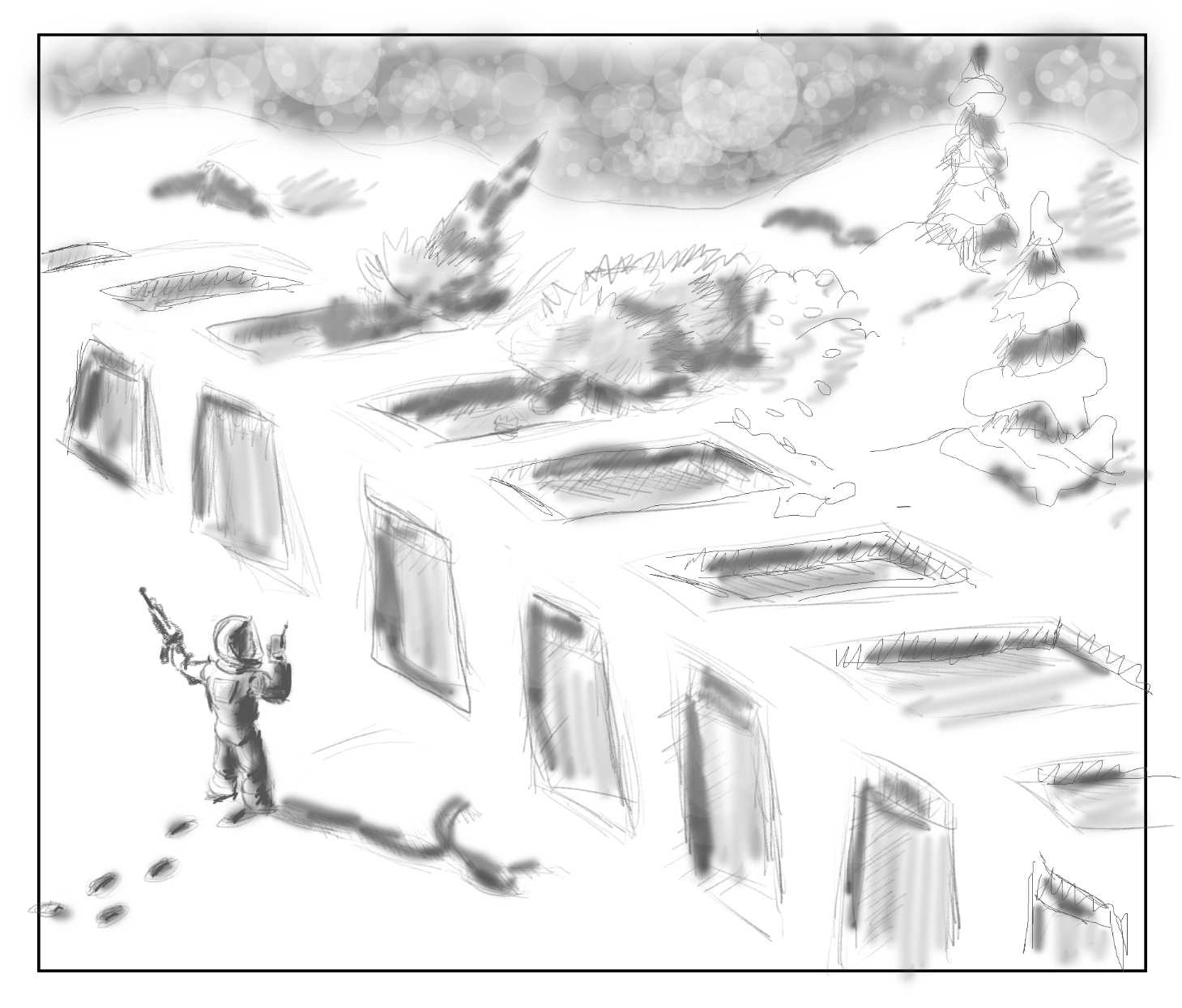
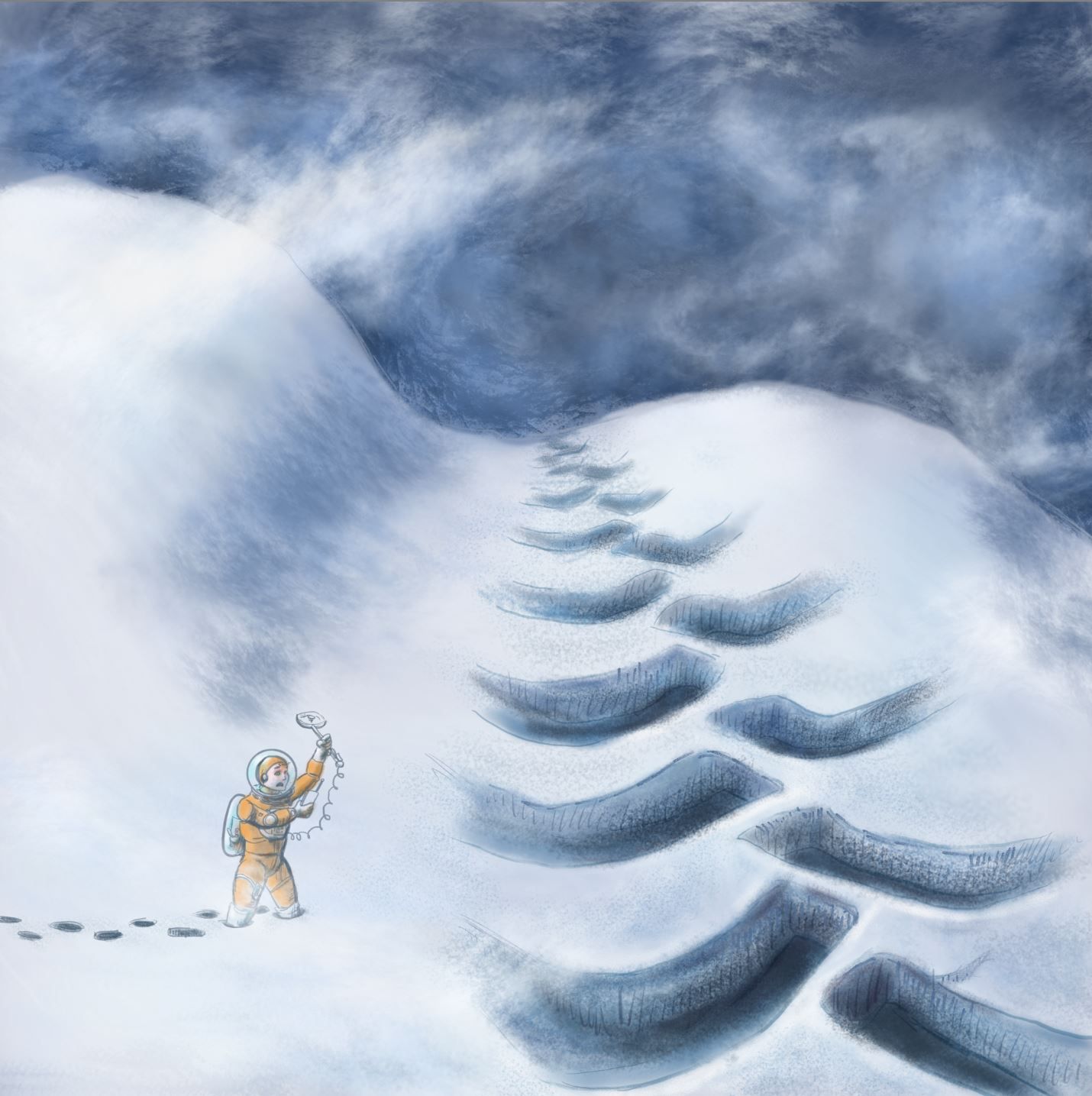
                      I figured I would make some sort of Space sky in the distant background to tell the reader that it is not set on earth.

                      I will definitely need to reference drawing tire tracks in the now. And how do you draw a crushed conifer?
                      Does the gun pointing out of the frame draw your eye off the main picture? I look at the tracks as to see where it went and then look a the crushed trees and back at the patrol, but I might be biased.

                      Chris Akins
                      www.chrisakinsart.com
                      www.instagram.com/chrisakinsart/

                      1 Reply Last reply Reply Quote 0
                      • chrisaakins
                        chrisaakins last edited by

                        Here is my progress so far. Kinda slow going.
                        Jan WIP.JPG
                        How does the sky look? Too much texture? I know it is hard to tell without the rest of it, but if you could be so kind as to comment.
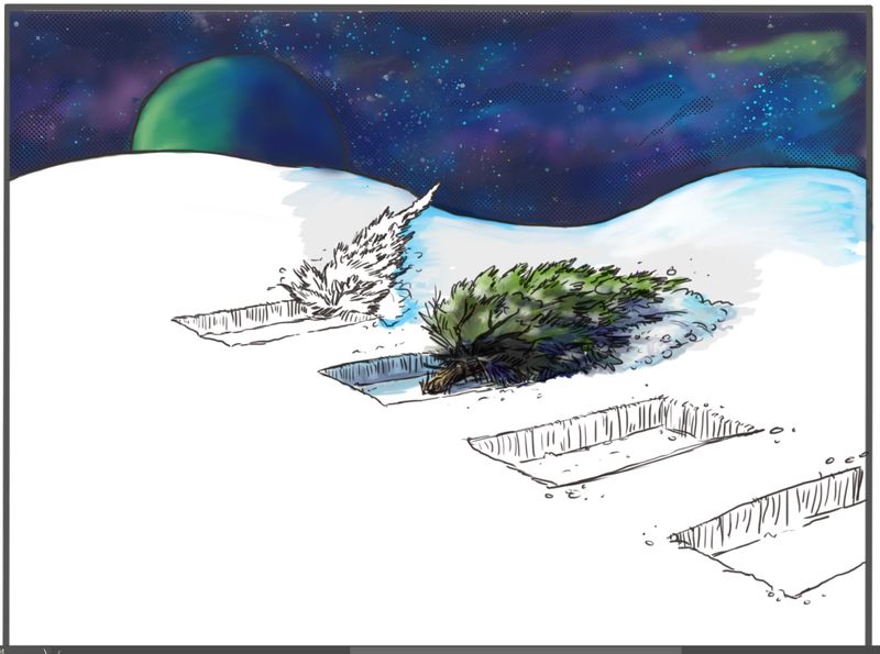
                        Chris Akins
                        www.chrisakinsart.com
                        www.instagram.com/chrisakinsart/

                        1 Reply Last reply Reply Quote 2
                        • yuriqart
                          yuriqart last edited by

                          Very good

                          1 Reply Last reply Reply Quote 1
                          • J
                            jdubz last edited by

                            I think the planet and the stars area are texturally inconsistent and it's dragging my eye up there and out of the middle.

                            Maybe sharpen up the planet details just a little bit, then push it back a bit into the background of the sky?

                            Josh White
                            https://www.instagram.com/joshwhiteillustration/

                            1 Reply Last reply Reply Quote 0
                            • deborah Haagenson
                              deborah Haagenson last edited by

                              I love the look of it! My only idea might be to flip the light shining on the planet to the right; on the inside toward the middle, so it doesn't send us out of the picture. Otherwise, it's beautiful!

                              deborah Haagenson 1 Reply Last reply Reply Quote 0
                              • deborah Haagenson
                                deborah Haagenson @deborah Haagenson last edited by

                                @deborah-Haagenson Or maybe move the planet to the right side. Then you wouldn't have to change the planet.

                                1 Reply Last reply Reply Quote 0
                                • ArtofAleksey
                                  ArtofAleksey last edited by

                                  Im curious to know what your intention is with the trees, Were they destroyed by the machine?

                                  instagram and twitter: @artofaleksey
                                  alekseyillustration.com

                                  chrisaakins 1 Reply Last reply Reply Quote 0
                                  • chrisaakins
                                    chrisaakins @ArtofAleksey last edited by

                                    @Aleksey Yes. They were driven across by the giant robot. .

                                    Chris Akins
                                    www.chrisakinsart.com
                                    www.instagram.com/chrisakinsart/

                                    ArtofAleksey 1 Reply Last reply Reply Quote 0
                                    • ArtofAleksey
                                      ArtofAleksey @chrisaakins last edited by

                                      @chrisaakins i think that it would be more affective if instead of breaking at the base, they were broken in the middle, kinda like you would break a popsicle stick in the middle?

                                      instagram and twitter: @artofaleksey
                                      alekseyillustration.com

                                      1 Reply Last reply Reply Quote 0
                                      • chrisaakins
                                        chrisaakins last edited by

                                        @Aleksey It just occurred to me that if they were trodden upon in a forward direction they would be pointing forward and would be even more smashed. Hmmm. I will have to think about this. How would I depict this?

                                        Chris Akins
                                        www.chrisakinsart.com
                                        www.instagram.com/chrisakinsart/

                                        ArtofAleksey 1 Reply Last reply Reply Quote 0
                                        • ArtofAleksey
                                          ArtofAleksey @chrisaakins last edited by

                                          @chrisaakins i think more mass of the trunks would still be im the ground, while the smashed part would be breaking off of it.
                                          Theres some good images on google I found when i searched “broken tree” where you’ll see how the mass of the trunk is still in the ground, while if you search “uprooted tree” you’ll see the roots sticking out with the whole tree. Maybe a good mix of both might help show “woah something big came through here and destroyed these trees”

                                          instagram and twitter: @artofaleksey
                                          alekseyillustration.com

                                          1 Reply Last reply Reply Quote 0
                                          • chrisaakins
                                            chrisaakins last edited by

                                            So I decided to redo my idea and go for the inhospitable planet idea. How do you like the new direction?What story does it tell? What improvements would you make?
                                            Jan WIP revision.JPG

                                            Chris Akins
                                            www.chrisakinsart.com
                                            www.instagram.com/chrisakinsart/

                                            1 Reply Last reply Reply Quote 0
                                            • First post
                                              Last post