WIP take two (critique is appreciated)
-
I think I am mostly done. I did a lot in six hours. My hands are cramping from holding the pen.
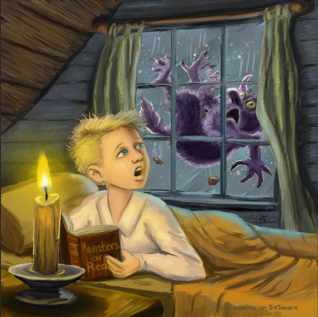
I like the general composition now and I think I am fine with the values and colors now, too. I am not totally happy with the blanket and the curtains but I have to stop for a bit. Does it look finished and polished? I might want to add a texture layer over the whole thing as soon as I figure out how.

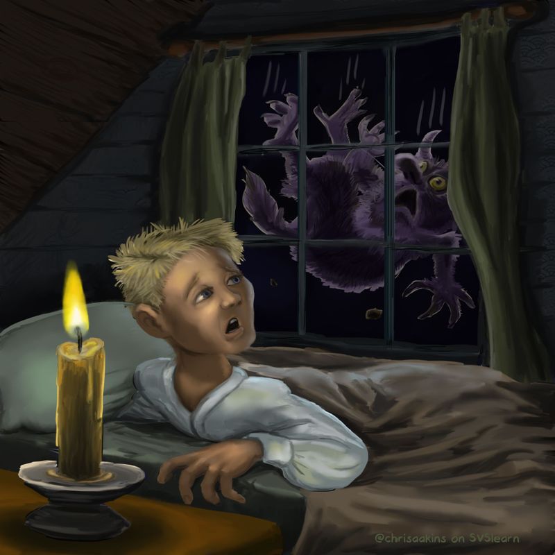
Before:

-
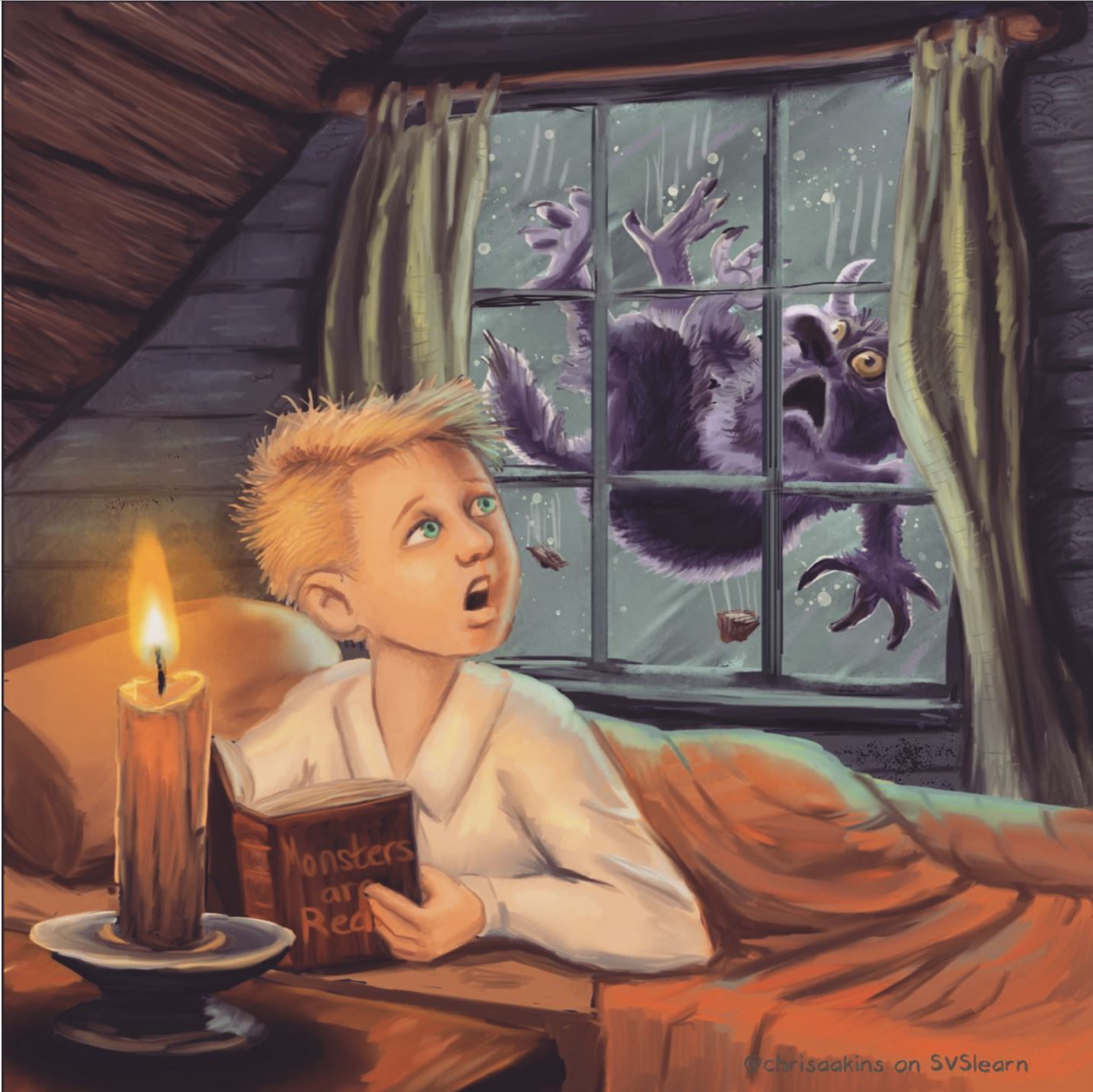
SO I was going to upload it to instagram and I thought I would play with the filters. What do you think of the reddish old-timey look?

-
@chrisaakins said in WIP take two (critique is appreciated):
Also, the scraps of roof coming off now look like turds. Which may be appropriate since he is falling.
Pah ha! They didn't, until you said that!

You work fast! The new version is looking good. Is the monster identical in both, you just lightened the background? It's amazing how the details inside the shape of the monster are more legible on the new version.
-
@neschof Pretty much. I added a few hairs here and there.
-
Wow, this piece has come on heaps and bounds already! I really like all the changes you’ve made. I am leaning more towards the softer, warmer lighting of the version with the filter. The yellows lighting of the other version feels a bit harsh, where as I associate candle light with a warm comforting glow.
-
@eriberart Me too! I was really pleasantly surprised at how much it improved it. I feel like I cheated a little using an IG filter at the end, but I'll take it any way I can get it.
-
@chrisaakins don’t feel like you’re cheating! I don’t think it’s that different from using layer modes on photoshop to alter the colours in a piece and I do that all the time
 I also save colour schemes I like and use the eye dropper tool to ‘steal’ colours haha
 -
Wow! That is a dramatic improvement in one day! I like the rose-colored light as well. I hope it was a positive experience in the end.
@Kevin-Longueil Don’t feel too bad. Some people like tough critiques. That’s why we ask! Not to get off topic, but since we’re on an international forum, I’m reading a book that discusses international cultural differences, including feedback style. Apparently Americans are among the most hesitant people in the world in giving direct negative feedback!
-
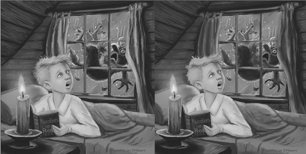
It's much improved! In my opinion you could group the values of the curtains and monster a bit more to help with quick readability. Also, my personal preference would be to simplify the hair so it isn't so stringy and break up the silhouette of the hair strands so it's more varied to convey "bedhead" better.
About the filter- that's one of the great things about digital. I change my colors all the time in photoshop using similar means. If you relate it to traditional technique, it's almost like using glazes at the end to unify the colors.

-
@TessaW I like the value choice you showed me. I will try to make that happen. I kinda like the hair but maybe I can make it more like the monster's.
@LauraA It was a great experience. I learned a ton of techniques from it. It may not be in the sweet sixteen when it is all said and done , but I think now it is a successful piece. -
@chrisaakins I LOVE the reddish glow! It really warms up the whole image.
-
@chrisaakins that was me, happy to be wrong about old timey haircuts
 Next time I will take note of it and be sure to check.
This happens a lot though with my own drawings - all these little questions I have to answer... it can kind of get overwhelming. Kind of fun, of course, but can turn into a long list of strange questions to research.
It looks so much better, btw. Hope you're feeling better by now, too. Is it still supposed to be raining outside when the monster is falling? it looks a little bit like he's is underwater without some slanting rain...
-
@carolinedrawing Hahaha. It does. I need some slanting rain I guess. It could be flooding like it is here in GA right now.
-
Is it just me, or is the edge of the book cover creating a tangent with the edge of the candle?
I love all of the changes you've made to this piece. Huge improvement. I really love the red tinge. Very warm feeling. The colors are so nice. The harsh yellow was a bit odd, but it's very soft now.
I didn't critique because there was a lot that could have been worked on, and I didn't know how to phrase it without seeming mean. I never know how much is too much for a critique. I love all the critiques you received though, it's turned this into a really fun piece.
-
@CLCanadyArts It does but I think I am not going to worry about it right now. Still recovering from the flu...