Feedback on postcards <3
-
Hi everyone! I'm putting together my first set of postcards for a campaign, and I wanted to make sure I was doing it right lol.
-
Is there any other information I should be putting on these? Should my name be on both sides, or is only one side ok?
-
Any tips for addressing this kinda thing? Do you just print on your card, hand write them? Use labels?
Any other feedback?
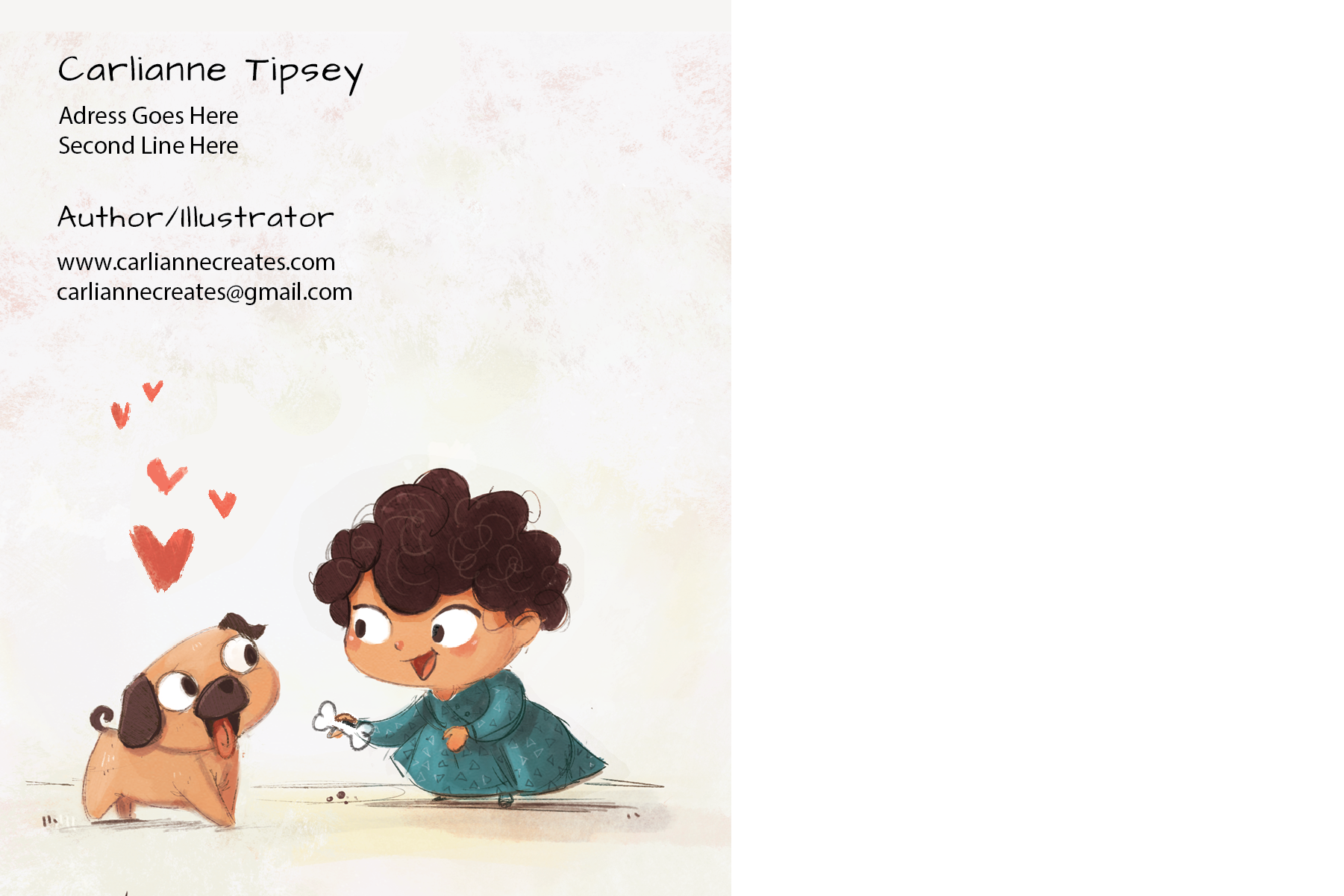
Side A
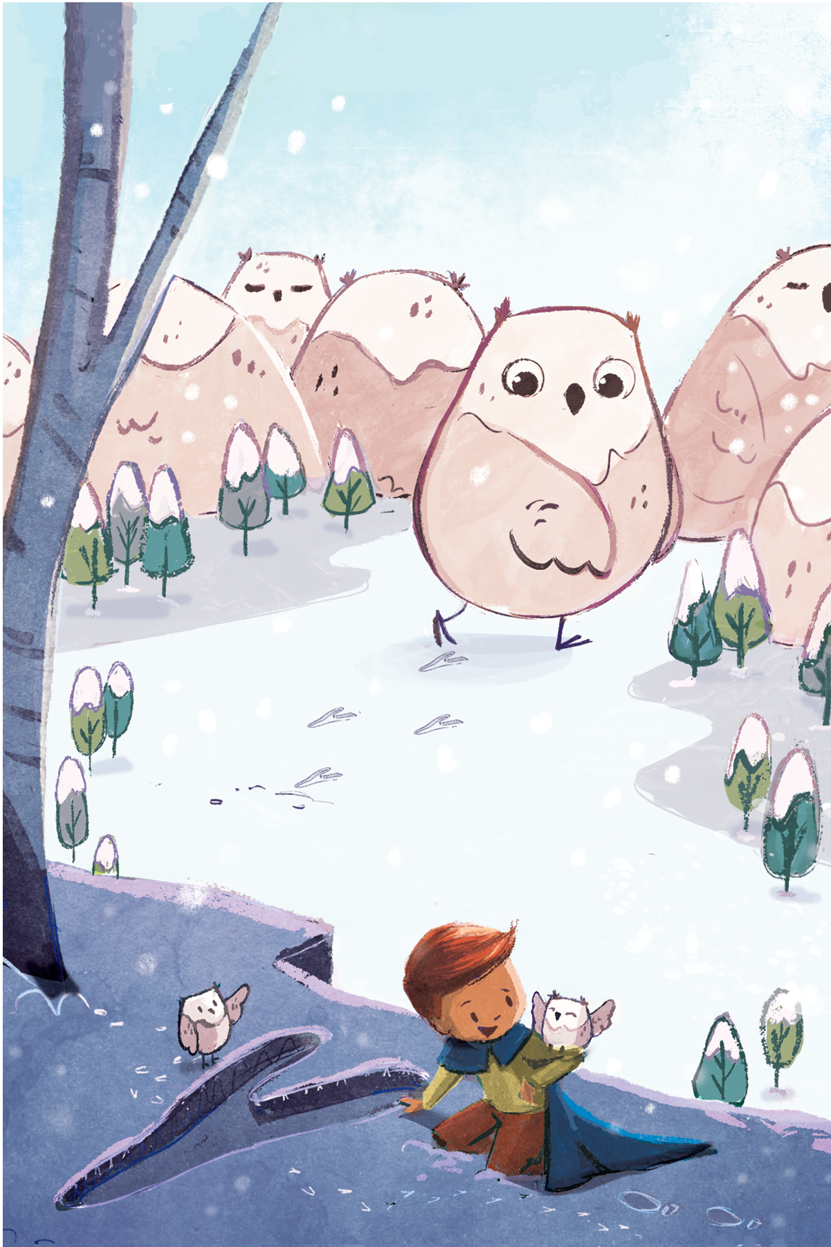
Side B
Check out my art and tutorials :)
Instagram: www.instagram.com/carliannecreates/
Youtube:
https://youtube.com/c/CarlianneCreatesShop: www.carliannecreates.com
-
-
@carlianne Lovely work and lovely choice of subjects: it‘s great to have a full bleed illustration and a vignette. It‘s a long time since I did a postcard campaign, but what I did is to print the addresses directly from Xcel to labels (Xcel has presets for all major label brands and formats) and then stick them on.
It depends, however, how many you‘re sending. If it‘s a big number, writing them by hand is not an option, but if it‘s only a few, it may be a nice touch.
I‘m not sure where you want to place the address of the recipient? Or are you sending them in envelopes? It‘s more expensive generally to send envelopes than the straight postcard, so you may want to check the option of making space for the delivery address directly on the postcard.
As for information, you don‘t really need to use your address: the e-mail and website are more than enough (telephone number if you want, but I‘m not using that anymore either). Nobody will respond by post and your location is irrelevant nowadays. I would also consider removing the „author/illustrator“ line. It‘s pretty obvious you‘re an illustrator as I‘m assuming you‘re sending these to ADs in children publishing. If you have an „about“ page on your website, they can find out additional information on your interests and activities there. -
Your postcard is very cute and it shows your style really well. I also love the typeface you have chosen.
I have never done postcards before and I am in the process of brainstorming to make a couple for the upcoming book fair in Bologna. One tip I got from other artists is to put your website or name on the main illustration as well. Postcards tend to get hanged on the wall. So it is a good idea to provide a way to identify the artist on the image somehow.Something for inspiration @burvantill made a kick-ass postcard in January. The back of the postcard is a spot image from the same story as the front full-bleed image, but a different moment of the story. A single postcard shows her storytelling ability, her skill of handling both full-bleed image, spot image, and character consistency. I think it was so clever.
-
@xin-li oh that is a super smart idea I love that! I originally had an another image with the same girl in it as the same image and thought maybe it would be nice to have variety, but I didn't think about the story telling aspect of it! And thanks for the tip about name on both sides!
@smceccarelli thank you so much! I was thinking the address was more for return mail purposes lol but good to know I can get away with out it! I was going to do a large batch, so I don't think hand writing them will be an option. And I think there is room to the right of the vignette for the address but I'm like quadruple checking it to make sure as I know the post office is suuuuuuuuper picky about that stuff.
-
@xin-li said in Feedback on postcards
 :
:a kick-ass postcard
THANX!!
I got the idea from the Sub it Club website. It’s an awesome resource.@carlianne as far as return address goes, I left mine off but then after I got them printed I started thinking (better late than never
 ), since this is my first big mailer I’m not confident that all of the adresses and contacts are correct and if there’s no return address they won’t come back to me to let me know that they are wrong. So I printed up some tiny return address labels to stick on. I will probably do the same thing in the future (just plan it out better
 ) because I don’t want my address on them if I hand them out at conferences.
 -
I love the illustrations you chose for your postcards! I need to start working on some myself.