Reworked Inktober pieces
-
@chrisaakins I prefer the first one with one exception.
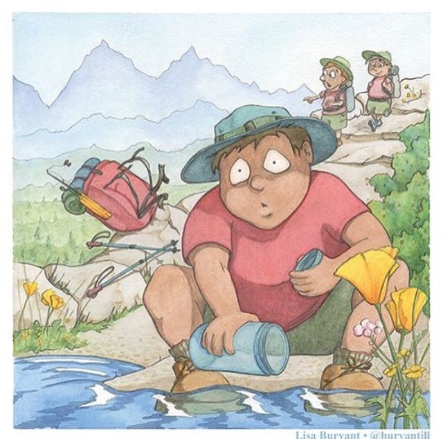
The line on the mountain. Lee critiqued a piece of mine that had line work in the background like this and he told me to lose it or minimize it. I did and loved the outcome. Even though the line is simple it still pulls your eye away from the the subject.Before
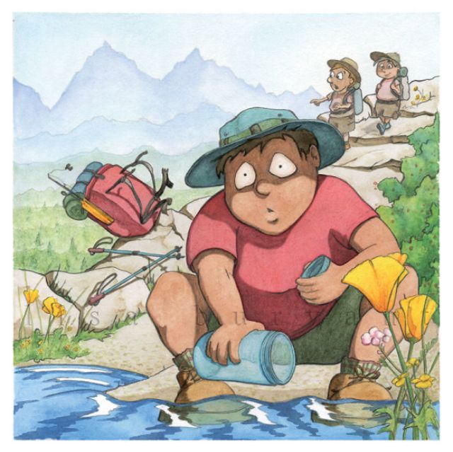
After
I’ll delete thsee as soon as you see my example so it doesn’t distract from your inktober pieces.

-
@chrisaakins The 2nd piece much more than the first I think in terms of polished look and professionalism. What's throwing me off on the 1st image:
-
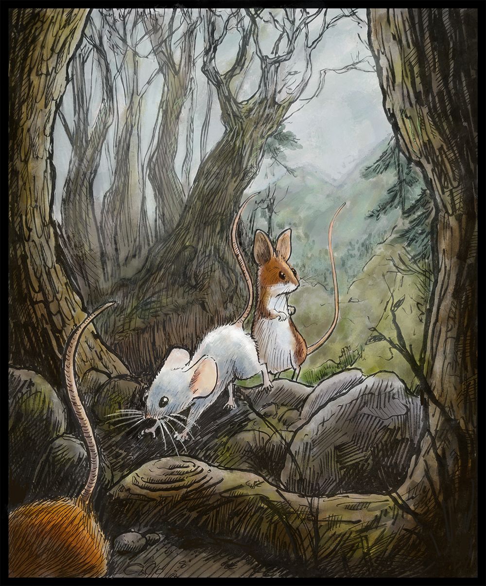
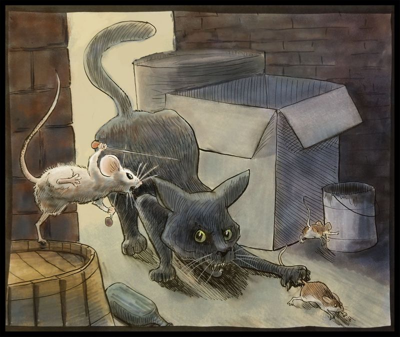
The white outlines that are being used to help pick things out of the dark background I don't think are helping the image. The 2nd image the outlines are working well with the background. On #1, it looks more like you chose not to solve the problem using value. Which isn't even the case as it's a white mouse in a darker background. One thing to maybe try is using light linework in those situations? Edit: I'm actually now seeing you did this in the 2nd image, and I didn't even realize it because it just instinctively works where you have the light lines of the mouse on the right on the head and whiskers. I'd say carry that same idea through.
-
I think on the first piece the outlines in the background are making a negative impact. I think they either need to be reduced in opacity or REALLY thin (like, as thin as the left-most side of the mountain thin). The rocks immediately behind the characters is super thin, then up on the mountain it's pretty thick, so it's just not feeling harmonious. You do have details back there that are not lined in, so you could maybe even drop the lines on the mountain in the far back and it would automatically push the foreground up and put the weight where it should be.
Maybe one thing that might help is to match line weight consistency through the piece so that foreground and important characters maintain heavy linework like you have, and then as the trees and background get further away, the lines also follow that same ruleset.
The 2nd image really comes together in every way the first one isn't for me.
-
-
Same comments as others I think. I think they're both lovely and they're nice together too. I think a few tweaks to the first one would be good - try erasing the distant mountain line, removing the white outline around the front two mice and I really like the grey screen you added, maybe play around with that more, make it stronger as the trees go back.
I could see a little series of these in your portfolio.
-
I really like this style and I think it definitely looks professional. The fact that you think it's a different style from everything else you've seen is a good thing
 It makes you stand out!
I think you can try some little tweaks like everyone else suggested but other than that, they can definitely be portfolio pieces.
-
@chrisaakins I prefer the second piece. The only thing that bothers me is the back of the television. Maybe you can remove that and crop the piece a little bit on the bottom and both sides, if you want the proportions to stay the same. I love the light, your ink work and the story - Very, very cute!!
-
Thank you everyone who has responded! @jdubz @neschof @burvantill your very specific critique helped me pinpoint what I like and didn't like between the two pieces. I love the crispness of the mice watching the cell phone in contrast to their blurry soft background. After your help, I realized that it was my linework that was the issue. I am usually pretty good about small lines in the distance. I think when I did this piece originally, I was so in love with the my new brush pen that I got carried away.
I put in more atmospheric perspective, thinned out or got rid of many lines in the background, got rid of the white lines around the two front mice, and deepened some of the foreground value. Now it has more of the dreamy quality I liked about it in the first place.
I definitely want to polish up several of these and use them as the beginning of my portfolio and begin writing a manuscript about their adventures. -
I may even crop this piece and make it more square and cut up the upper eighth or so. Hmmm.
-
@chrisaakins huge improvement - it feels really consistent now! To answer your overlying question - yeah I really think this style works and it looks cohesive to me.
-
@chrisaakins yes, this looks great!
-
@chrisaakins NIIICE!
-
I really like these and think the changes you made to the first really improved it. Can’t wait to see more.
-
Here is the latest one. Apparently there is a weekly challenge issued by @jimbobdrawing show on Instagram and this week's was "fearless rodent". Well, I think I drew one already!
I updated the color and also fixed a glaring perspective issue that I was oblivious of.
-
@chrisaakins hmmm. I like it the way it is.
Lisa Burvant
www.lisaburvant.com
Instagram & Twitter & SVS: @burvantill -
Hi @chrisaakins, looks great! Definitely has the professional touch. Nicely done!
-
@Jeremy-Ross thanks! I feel kinda giddy because I feel like I am starting to hit my stride and can see myself doing this as a second career now. I was struggling and stuck before but I made some breakthroughs with Photoshop recently and feel I can now marry my traditional with my digital and get the best of both worlds. Still need lots of practice. I appreciate your encouragement!
-
@burvantill hmmm, me too. I really appreciate your encouragement for me and my art. I also enjoy seeing your successes, too. I think you are about to go pro status very soon and it's been cool to see your journey.
-
Update: Hey everyone! Hahaha! The Mighty Inky piece was featured on @jimbobdrawing's weekly contest! So cool! This was the first time I went for a contest and won. (It was just a feature but gotta start somewhere, right!?)
-
@chrisaakins wow, thanks.

-
@chrisaakins yay, congrats! and I'm glad you're finding your stride with the style and technique that feels right. It seems like that can be a really difficult task and once you're past it you can enjoy the process more and end up with a cohesive portfolio.
I'm still flailing around with all of that but I'm trying not to rush it. Seeing you and others explore and then finally get there is really encouraging.
-
Hi @chrisaakins, well you are at the right place! From what I see, SVS is breeding high-level professional illustrators that are making a difference in the kid lit world. My dream is to be one among them! Need the mileage though...