Suggestions? FINAL
-
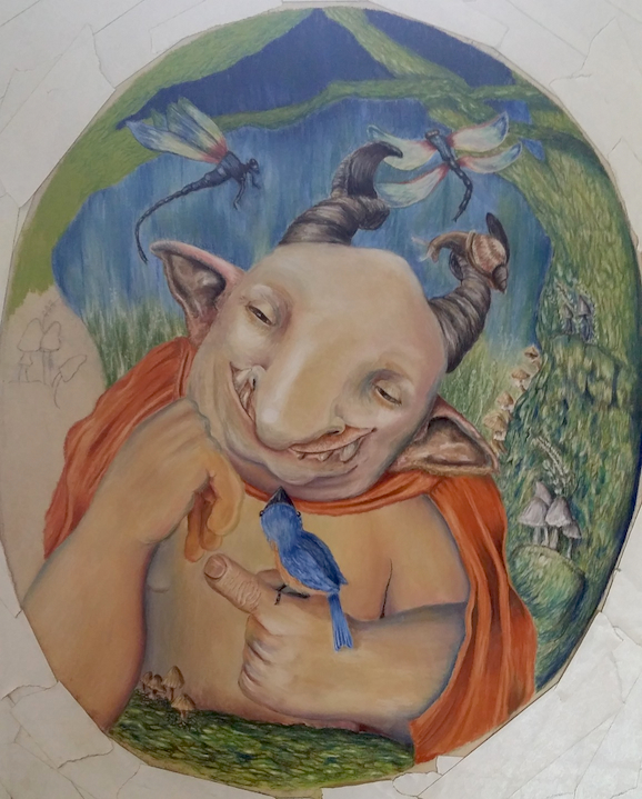
Hey everyone, I'm new here, so I figured I'd jump in and share what I'm working on. I've been drawing for 4 1/2 years (mostly in graphite) and I just started working in pastel pencil last month.
This is washed out because of the lighting at my house...I'd love any suggestions/thoughts on this piece. It's a submission for a weekly illustration challenge group I'm part of on Facebook - the theme is "Monster." I find backgrounds/environments are especially challenging for me...
Suggestions/critiques are very welcome (really - I don't take offense at critiques at all - it's how I learn best) and I look forward to getting to know everyone!!

-
Wow. This is awesome and pretty unique. Don't tell me you did this in one week?!
I like it!
-
@Jana Thank you so much, Jana! I wish I was that fast! lol...I just started with the group (this is my 1st piece), but I think I'm probably going to have to submit sketches from now on - I'm so slow! This has taken me about 10 days (not counting a couple of not-sure-how-to-do-this-spot procrastination days! lol).
-
Very unique and intriguing to view. Nice work! One comment I have is that the right hand looks a little awkward in that the fingers hang down at an extreme angle. I struggle with drawing and rendering hands so that is maybe why I noticed it. Keep up the good work and keep sharing!
-
@Rob-Smith Hi Rob - thank you so much for the suggestion on the hand! I didn't even see it...I think I see how I can adjust the knuckle so that it looks less funky...I'll post an update when I get it fixed!
-
I like the color, texture, the design of your monsters and those critters are adorable! I like your background but the dragonfly to right is touching his horn and the tree at the same time which creates a shape or barrier that block my eyes from going into the background. A smaller dragonfly might help to fix the issue. Also I think his right knuckle (left on the screen) pressing against his face needs a bit more pressure.
-
@Naroth-Kean Thank you so much for the suggestions, @naroth! Backgrounds are so difficult for me - they're a block, for some reason. Can you please tell me if it's necessary for the eye to go to the background if I'm just going to keep it fuzzy, the way it is? Rob also mentioned the hand issue & I think I know how to fix it, so I'll repost here when I have an update. Thank you again for your helpful advice!
-
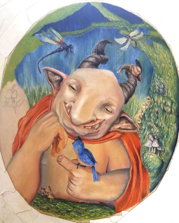
Hi Amber I drew over your work a bit and I hope you don't mind. Here I bring the contrast up a bit. Smaller dragonfly make the composition feel a bit nicer in my opinion. I added some shadow and folds between his knuckle and and his cheek. I loosen up the detail of his finger to balance out the detail. If you want to keep the detail on the finger I think need to work on more detail on his skin. I hope this help :D. Please excuse my poor English.

-
@Naroth-Kean HI Naroth: awesome - thank you for illustrating this! My pic is really washed out from the lighting in my house - I probably should have fixed the contrast before posting, lol. This is definitely an argument for working digitally - the original is pastel, so I don't know if I can make that dragonfly smaller...But I can definitely fix the wrinkles and the face folds! I don't have a lot of confidence yet, so getting suggestions helps a lot.
-
i love the feel on this piece! but it can be improved more!! like the hands for instance!
but i like your original fantasy way of thinking!!
-
I'd accent or change the color of the snail on the horn, the browns are just a little close.
-
His expression definitely gives him a sense of life and personality. My suggestion is to increase the variation in value between him and the background to really make him pop from the background. It'll probably feel scary to push the hard work you did on the background to the...background, but I think it'll make the overall image more dramatic and powerful.
-
@shinjifujioka Awesome - thank you! I can see what you mean, but I'm not sure how to do it...I don't have much detail in the background, so should I make it a lot lighter?
-
@bharris Thank you, I'll add a little color to him!
-
@smoke Yeah, can you tell I struggled with the hands? LOL...A couple other people suggested that also, so I've done some work on them today - I'll post the update in a few minutes.
-
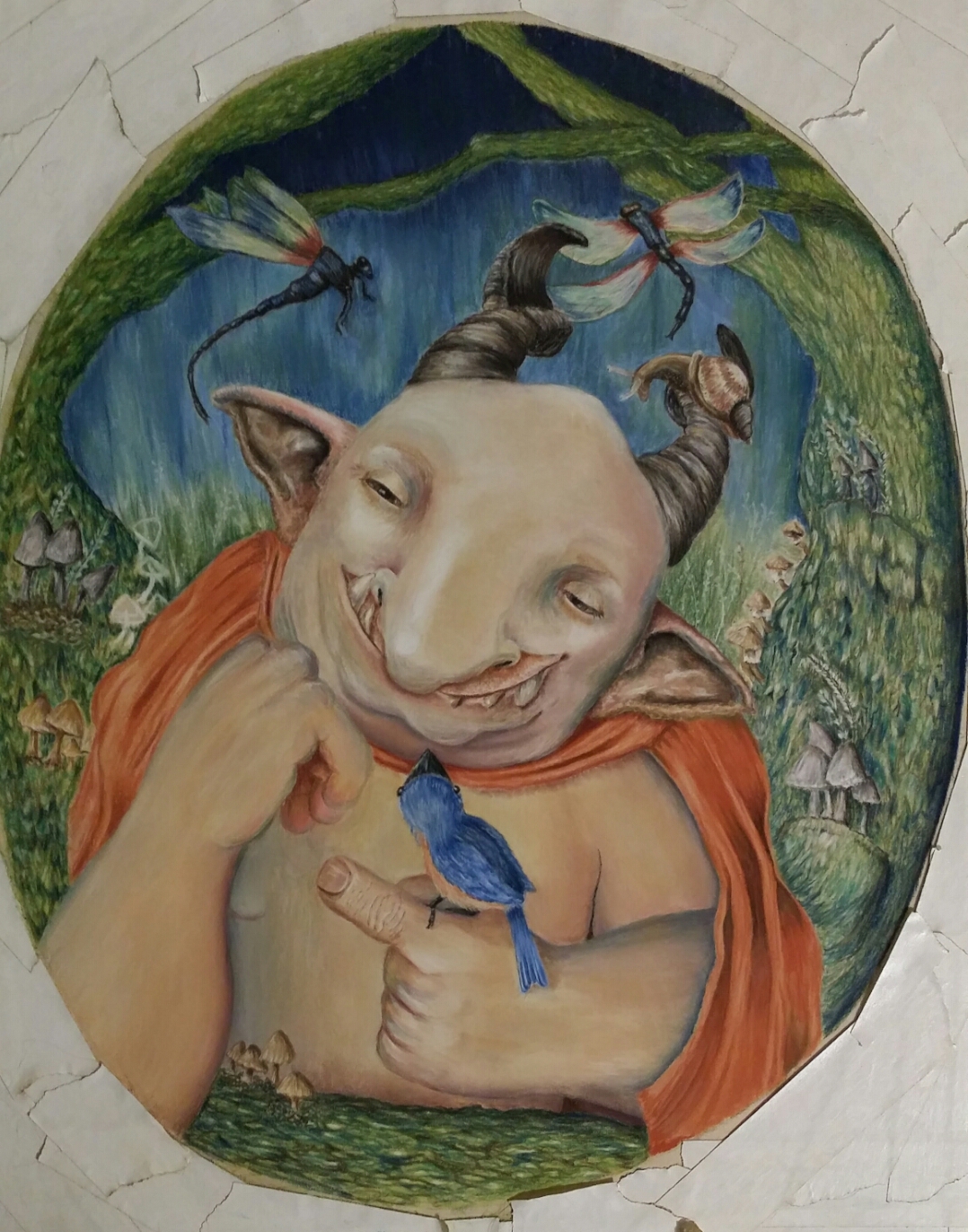
UPDATE: Hey everyone, so here's the update incorporating all of the suggestions except changing the snail's color - I just remembered that one! So I'm almost finished (I just have to finish all of the mushrooms on the left side tree and then darken the tree on the right side). Aside from that, is there anything else you can see that might improve this guy? Also, does the right hand look better?

-
Good job fixing the hand! Really sweet piece!!
-
@amberwingart hi amber, What a great piece! Love the look and feel. There are a view things that i notice. The Gnome isn't looking at the bird, thats a bit odd, shouldn't not be that he's looking at him? As @Smoke mentioned, the hands may need some improvement. You can try and look for good reference and than practice a lot, cause hands are very difficult. But I am sure You'll manage! go for the best! Have a nice weekend!
-
@Thrace-Shirley-Mears Thanks so much!!
-
@Leontine Thank you for the suggestions! The hands still need some work? I just fixed those - I'm not sure what else to do on them...It's so funny, I'm usually pretty okay with hands (they aren't usually a stumbling block for me) in graphite, but I had such a struggle with these ones & I don't know why! Could you please tell me what I should fix on these? And the eyes - I meant to fix those too! lol Thank you for the reminder
 Do you ever look at your work and feel like it looks like a beginner did it? That's how I feel with this piece...I like the colors but I feel like the composition is off or something