March WIP: Everything’s broken - halp! 😂
-
Hi all! I’m beginning the March prompt and was hoping to get some feedback. Especially on suggestions for composition.
I know it’s pretty rough but any recommendations are appreciated.
Do you think it is missing a foreground element? Is the composition boring?
 ️ All critiques welcome and appreciated.
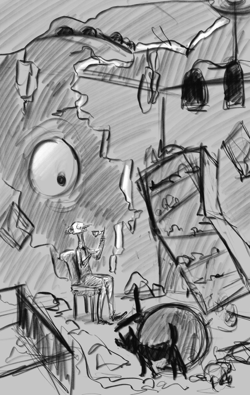
-
I really like this! I don't think it's boring and I don't think it needs a foreground element. I would make sure the creature is a dark enough value so that it doesn't blend into the building and that the white of the eye pops. I might remove the ceiling in the upper left corner. I think it flattens the piece a little bit. Maybe you could show the sky with a bird looking down or a helicopter. That might also add some depth too. Great start. Love the poses of both the dog and the man.
-
@j-sienkowski oh I like that idea of the bird! Thank you so much

I’ll definitely keep in mind the values. Do you think the monster should be the darkest element? Or the wall - to sort of frame them both in?
I’ll have to do a couple value studies.I want to try to keep this drawing really loose and lively so I want to avoid too much heaviness/dark area.
-
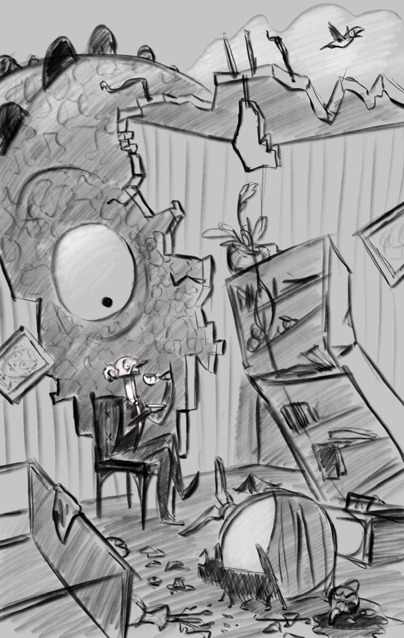
Update!
A.
B.
I’m leaning towards A.... but. Thoughts? B? Mystery option C?
Instagram: https://www.instagram.com/eliamurrayart/
Portfolio: www.eliamurray.com -
Leaning towards A as well, although I think either could work if the values were pushed a bit more and colour played alongside with the contrast

love the idea and composition, and especially the character design! Nice work!
-
@Nathalie-Kranich I like A but you would really need to figure out the lighting direction/type to make it convincing. I love the guy's expression. You might want a hand or tentacle on the top of the wall reaching in show the reason for the destruction.
-
Thank you! Yes I do agree a tentacle or hand would be good to put in. I'll definitely work on that. A tentacle would be so fun!
I'll work on bumping up the contrast / begin doing color studies today and see where that takes me.
Thank you again
-
@EliaMurrayArt I love A, the monster being darker frames the character nicely and makes the big eye standout. I really like the man's frozen expression, nice job! And opening up the building so we can see the sky, more monster, and the bird is a great adjustment.
Carrie Copa
https://carriecopadraws.com/ -
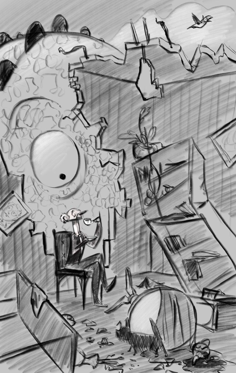
@EliaMurrayArt - I thought this concept was fantastic! It worked perfectly as my eye went to the man drinking his tea in the rubble first, then I spotted the eye and laughed! Great work. I preferred A just for the contrast, I can’t wait to see the finished piece. I particularly liked the chap who looked so smart and dapper in amongst the chaos around him! Fantastic idea!
-
@carriecopadraws Thank you so much! I agree with what you said and will be working with something more like A. I'm so excited to work on this piece
I am slowly forcing myself to put my characters in environments haha so I feel like having a crumbling room is almost like a baby step because I only have to work on half - before actually filling a room with lots of real perspective
 at least that's what I'm telling myself.
 -
@Lorna-H oh I'm so so glad you said that - that is the EXACT read I was hoping for. Thank you
I can't wait to see this finished either  wish me luck!
 -
@EliaMurrayArt I like A too for the same reasons as @carriecopadraws.
-
Color study-ish.... Color is super tough for me...
How do you all pick your colors?
I feel so random. Like I’m throwing mud at a wall and ... not even sure when it sticks it’s any good.
Do you have a process for picking colors? Or like... do you choose color schemes? But then how to use them
 bleh
bleh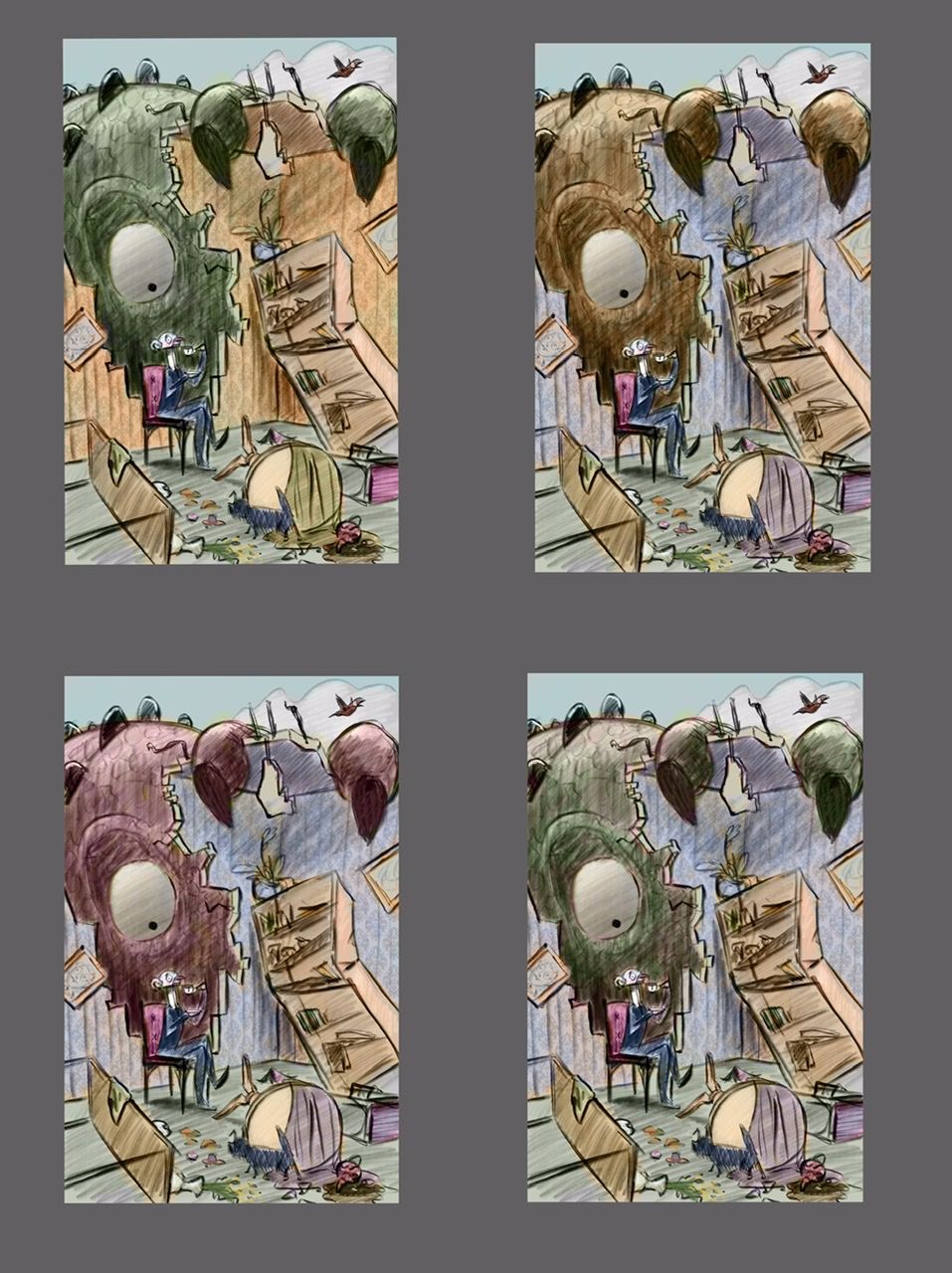
Instagram: https://www.instagram.com/eliamurrayart/
Portfolio: www.eliamurray.com -
@EliaMurrayArt hi I really like what you’re doing. What helps me the most when choosing the colors is that first, I choose the mood of the piece. I then pick colors that will compliment that mood. Then afterwards you have to take into consideration the time of day, weather, season, lighting etc.
Portfolio: nyrrylcadiz.com
Instagram: https://www.instagram.com/nyrryl_cadiz/
YouTube: https://www.youtube.com/channel/UCbJCF1Im8ZO7hpGWTKOJMuA -
@Nyrryl-Cadiz thank you!
That is something to think about. Like an entire subplot to think through.
-
@EliaMurrayArt Have you ever tried using a Gradient Map? I think most software will let you create a gradient map layer and set the mode to Color. You can check lots of color moods that way by changing the colors in the gradient.
Gradient maps apply color according to the values in the image, so it's a quick way to add some color to get an idea of what direction to go color-wise. I sometimes have two maps - warm tones and cool ones, and use masking to highlight important parts of the scene. (Like if your illustrations was primarily gold/warm, the man would be blue/cool to stand out.)
Carrie Copa
https://carriecopadraws.com/ -
@carriecopadraws
Oh I have not tried that! That sounds like a great thing for me to mess around with. Thank you for the suggestion. -
@EliaMurrayArt I like the contrast that happens between the green monster and the red chair and yellow/orange walls!
Bailey Vidler
Portfolio: baileyvidler.com -
@baileymvidler Thank you! that is what I was leaning towards so I appreciate the feedback

-
Hahahahaha the look on the guy’s face!