Society of Visual Storytelling

    SVSLearn Forums

    • Register
    • Login
    • Search
    • Recent
    • Tags
    • Popular
    • Users
    • Groups
    • Search

    March WIP: Everything’s broken - halp! 😂

    Artwork
    16
    41
    1964
    Loading More Posts
    • Oldest to Newest
    • Newest to Oldest
    • Most Votes
    Reply
    • Reply as topic
    Log in to reply
    This topic has been deleted. Only users with topic management privileges can see it.
    • EliaMurrayArt
      EliaMurrayArt last edited by

      Update!

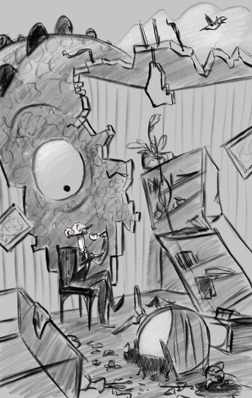
      A. 489D28DB-00B2-4571-96D8-9871D3B5F446.jpeg

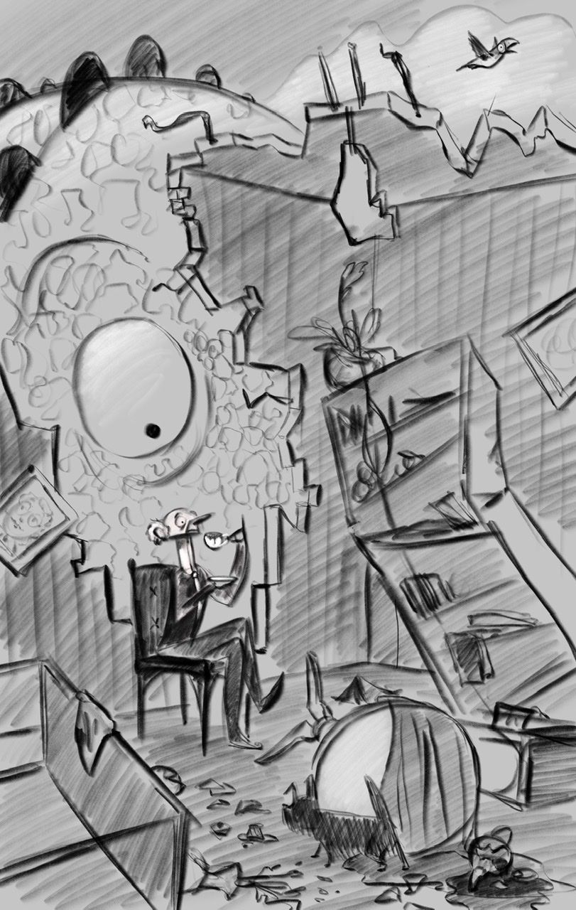
      B. 0AFD9740-DF5E-480F-904A-8374E8C83A17.jpeg

      I’m leaning towards A.... but. Thoughts? B? Mystery option C?

      Instagram: https://www.instagram.com/eliamurrayart/
      Portfolio: www.eliamurray.com

      carriecopadraws j.sienkowski Griffin McPherson 3 Replies Last reply Reply Quote 5
      • Nathalie Kranich
        Nathalie Kranich last edited by

        Leaning towards A as well, although I think either could work if the values were pushed a bit more and colour played alongside with the contrast 😃

        love the idea and composition, and especially the character design! Nice work!

        www.nathaliekranich.com
        https://www.artstation.com/nathaliekranich
        https://www.instagram.com/nathalie.kranich/?hl=en

        chrisaakins 1 Reply Last reply Reply Quote 0
        • chrisaakins
          chrisaakins @Nathalie Kranich last edited by

          @Nathalie-Kranich I like A but you would really need to figure out the lighting direction/type to make it convincing. I love the guy's expression. You might want a hand or tentacle on the top of the wall reaching in show the reason for the destruction.

          Chris Akins
          www.chrisakinsart.com
          www.instagram.com/chrisakinsart/

          EliaMurrayArt 1 Reply Last reply Reply Quote 0
          • EliaMurrayArt
            EliaMurrayArt @chrisaakins last edited by

            @chrisaakins

            Thank you! Yes I do agree a tentacle or hand would be good to put in. I'll definitely work on that. A tentacle would be so fun!

            I'll work on bumping up the contrast / begin doing color studies today and see where that takes me.

            Thank you again 😊

            Instagram: https://www.instagram.com/eliamurrayart/
            Portfolio: www.eliamurray.com

            1 Reply Last reply Reply Quote 0
            • carriecopadraws
              carriecopadraws SVS OG @EliaMurrayArt last edited by

              @EliaMurrayArt I love A, the monster being darker frames the character nicely and makes the big eye standout. I really like the man's frozen expression, nice job! And opening up the building so we can see the sky, more monster, and the bird is a great adjustment.

              Carrie Copa
              https://carriecopadraws.com/

              EliaMurrayArt 1 Reply Last reply Reply Quote 0
              • L
                Lorna H last edited by

                @EliaMurrayArt - I thought this concept was fantastic! It worked perfectly as my eye went to the man drinking his tea in the rubble first, then I spotted the eye and laughed! Great work. I preferred A just for the contrast, I can’t wait to see the finished piece. I particularly liked the chap who looked so smart and dapper in amongst the chaos around him! Fantastic idea!

                Lorna

                www.lornashawart.crevado.com
                www.Instagram.com/lorna_shaw_art

                EliaMurrayArt 1 Reply Last reply Reply Quote 0
                • EliaMurrayArt
                  EliaMurrayArt @carriecopadraws last edited by

                  @carriecopadraws Thank you so much! I agree with what you said and will be working with something more like A. I'm so excited to work on this piece 😃

                  I am slowly forcing myself to put my characters in environments haha so I feel like having a crumbling room is almost like a baby step because I only have to work on half - before actually filling a room with lots of real perspective 😅 at least that's what I'm telling myself.

                  Instagram: https://www.instagram.com/eliamurrayart/
                  Portfolio: www.eliamurray.com

                  1 Reply Last reply Reply Quote 1
                  • EliaMurrayArt
                    EliaMurrayArt @Lorna H last edited by

                    @Lorna-H oh I'm so so glad you said that - that is the EXACT read I was hoping for. Thank you 😃 I can't wait to see this finished either 😬 wish me luck!

                    Instagram: https://www.instagram.com/eliamurrayart/
                    Portfolio: www.eliamurray.com

                    1 Reply Last reply Reply Quote 0
                    • j.sienkowski
                      j.sienkowski @EliaMurrayArt last edited by

                      @EliaMurrayArt I like A too for the same reasons as @carriecopadraws.

                      www.instagram.com/jsienkowski
                      www.jtsienkowski.com

                      1 Reply Last reply Reply Quote 0
                      • EliaMurrayArt
                        EliaMurrayArt last edited by

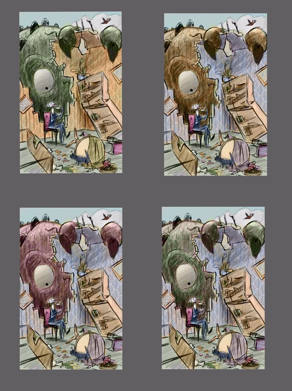
                        Color study-ish.... Color is super tough for me...

                        How do you all pick your colors?

                        I feel so random. Like I’m throwing mud at a wall and ... not even sure when it sticks it’s any good.

                        Do you have a process for picking colors? Or like... do you choose color schemes? But then how to use them 😞 bleh

                        C054F536-324E-430B-B5C0-172DA1823C0A.jpeg

                        Instagram: https://www.instagram.com/eliamurrayart/
                        Portfolio: www.eliamurray.com

                        Nyrryl  Cadiz carriecopadraws baileyvidler 3 Replies Last reply Reply Quote 1
                        • Nyrryl  Cadiz
                          Nyrryl Cadiz SVS OG @EliaMurrayArt last edited by

                          @EliaMurrayArt hi I really like what you’re doing. What helps me the most when choosing the colors is that first, I choose the mood of the piece. I then pick colors that will compliment that mood. Then afterwards you have to take into consideration the time of day, weather, season, lighting etc.

                          Portfolio: nyrrylcadiz.com
                          Instagram: https://www.instagram.com/nyrryl_cadiz/
                          YouTube: https://www.youtube.com/channel/UCbJCF1Im8ZO7hpGWTKOJMuA

                          EliaMurrayArt 1 Reply Last reply Reply Quote 0
                          • EliaMurrayArt
                            EliaMurrayArt @Nyrryl Cadiz last edited by

                            @Nyrryl-Cadiz thank you!

                            That is something to think about. Like an entire subplot to think through.

                            Instagram: https://www.instagram.com/eliamurrayart/
                            Portfolio: www.eliamurray.com

                            1 Reply Last reply Reply Quote 0
                            • carriecopadraws
                              carriecopadraws SVS OG @EliaMurrayArt last edited by

                              @EliaMurrayArt Have you ever tried using a Gradient Map? I think most software will let you create a gradient map layer and set the mode to Color. You can check lots of color moods that way by changing the colors in the gradient.

                              Gradient maps apply color according to the values in the image, so it's a quick way to add some color to get an idea of what direction to go color-wise. I sometimes have two maps - warm tones and cool ones, and use masking to highlight important parts of the scene. (Like if your illustrations was primarily gold/warm, the man would be blue/cool to stand out.)

                              Carrie Copa
                              https://carriecopadraws.com/

                              EliaMurrayArt 1 Reply Last reply Reply Quote 0
                              • EliaMurrayArt
                                EliaMurrayArt @carriecopadraws last edited by

                                @carriecopadraws
                                Oh I have not tried that! That sounds like a great thing for me to mess around with. Thank you for the suggestion.

                                Instagram: https://www.instagram.com/eliamurrayart/
                                Portfolio: www.eliamurray.com

                                1 Reply Last reply Reply Quote 0
                                • baileyvidler
                                  baileyvidler @EliaMurrayArt last edited by

                                  @EliaMurrayArt I like the contrast that happens between the green monster and the red chair and yellow/orange walls!

                                  Bailey Vidler
                                  Portfolio: baileyvidler.com

                                  EliaMurrayArt 1 Reply Last reply Reply Quote 0
                                  • EliaMurrayArt
                                    EliaMurrayArt @baileyvidler last edited by

                                    @baileymvidler Thank you! that is what I was leaning towards so I appreciate the feedback 😀

                                    Instagram: https://www.instagram.com/eliamurrayart/
                                    Portfolio: www.eliamurray.com

                                    1 Reply Last reply Reply Quote 0
                                    • danielerossi
                                      danielerossi last edited by

                                      Hahahahaha the look on the guy’s face!

                                      https://www.instagram.com/heyfrankybanky

                                      1 Reply Last reply Reply Quote 1
                                      • EliaMurrayArt
                                        EliaMurrayArt last edited by

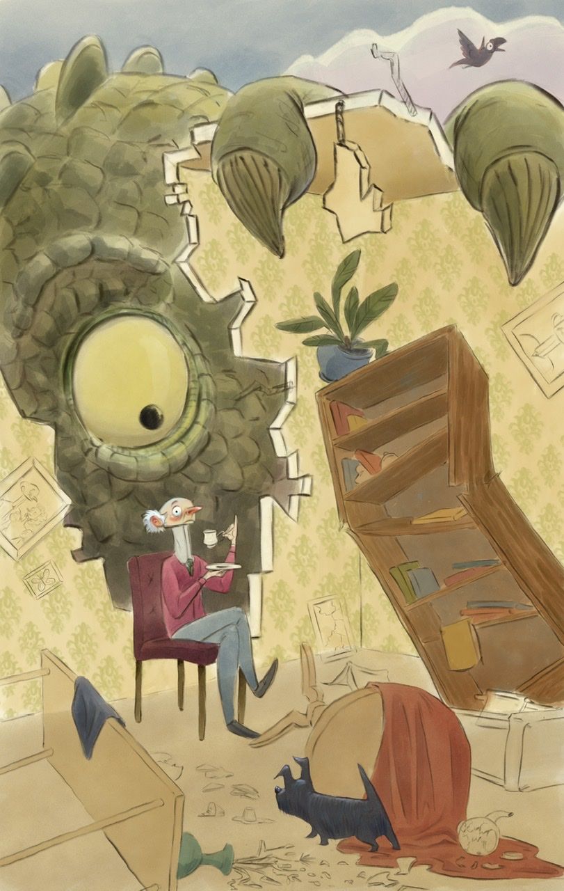
                                        8EC86F35-C539-4481-81B1-113249106692.jpeg

                                        Progress shot- I’m fumbling my way through color.

                                        Any thoughts? The details of the books and things are throwing me for a loop. I think I’m getting bogged down in color picking.

                                        How do you guys sort colors of small “insignificant “ items?

                                        Instagram: https://www.instagram.com/eliamurrayart/
                                        Portfolio: www.eliamurray.com

                                        KaraDaniel 1 Reply Last reply Reply Quote 6
                                        • KaraDaniel
                                          KaraDaniel @EliaMurrayArt last edited by

                                          @EliaMurrayArt I saw in one of videos classes here on svs start with coloring things that are supposed to be a certain color (plants green, firetruck red, an orange orange etc) then work out from there. You could also find an image online you like the color palette then just pull colors from that image.

                                          instagram.com/sha_kara
                                          karadaniel.net

                                          EliaMurrayArt 1 Reply Last reply Reply Quote 0
                                          • LauraA
                                            LauraA SVS OG last edited by LauraA

                                            I love the guy's expression! I think my ideas about color are frequently different from those of other people. I tend towards warm/cool contrasts rather than monochromatic or all warm/cool schemes. So take my advice for what it's worth. But, cools recede and warms come forward. So depending on what you want the viewer to see first--the wall or the monster-- I like either the first or second one. At any rate, I don't think there's any danger of not seeing the monster. Just be careful not to lose the man!

                                            P.S. Oh, sorry, somehow I didn't see the latest post so I was commenting on the color trials. I think you did well to make the man's sweater a contrasting color and have the monster the same tone as the wall. So far your book color choices harmonize well, so just keep it up!

                                            Instagram: https://www.instagram.com/lauraintorino/
                                            http://lauraaldersonart.com/

                                            EliaMurrayArt 1 Reply Last reply Reply Quote 0
                                            • First post
                                              Last post