March WIP: Everything’s broken - halp! 😂
-
Color study-ish.... Color is super tough for me...
How do you all pick your colors?
I feel so random. Like I’m throwing mud at a wall and ... not even sure when it sticks it’s any good.
Do you have a process for picking colors? Or like... do you choose color schemes? But then how to use them
 bleh
bleh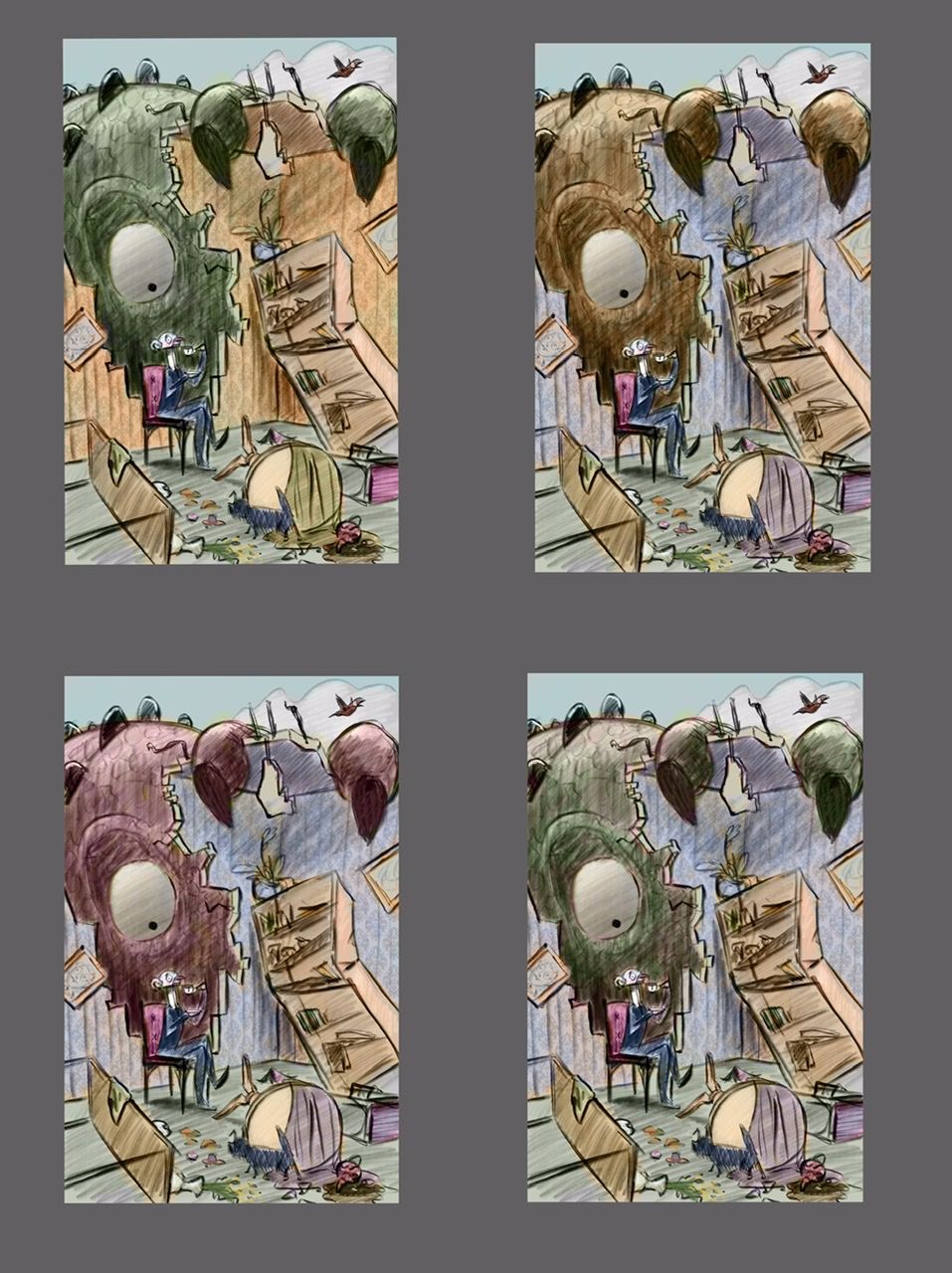
Instagram: https://www.instagram.com/eliamurrayart/
Portfolio: www.eliamurray.com -
@EliaMurrayArt hi I really like what you’re doing. What helps me the most when choosing the colors is that first, I choose the mood of the piece. I then pick colors that will compliment that mood. Then afterwards you have to take into consideration the time of day, weather, season, lighting etc.
Portfolio: nyrrylcadiz.com
Instagram: https://www.instagram.com/nyrryl_cadiz/
YouTube: https://www.youtube.com/channel/UCbJCF1Im8ZO7hpGWTKOJMuA -
@Nyrryl-Cadiz thank you!
That is something to think about. Like an entire subplot to think through.
-
@EliaMurrayArt Have you ever tried using a Gradient Map? I think most software will let you create a gradient map layer and set the mode to Color. You can check lots of color moods that way by changing the colors in the gradient.
Gradient maps apply color according to the values in the image, so it's a quick way to add some color to get an idea of what direction to go color-wise. I sometimes have two maps - warm tones and cool ones, and use masking to highlight important parts of the scene. (Like if your illustrations was primarily gold/warm, the man would be blue/cool to stand out.)
Carrie Copa
https://carriecopadraws.com/ -
@carriecopadraws
Oh I have not tried that! That sounds like a great thing for me to mess around with. Thank you for the suggestion. -
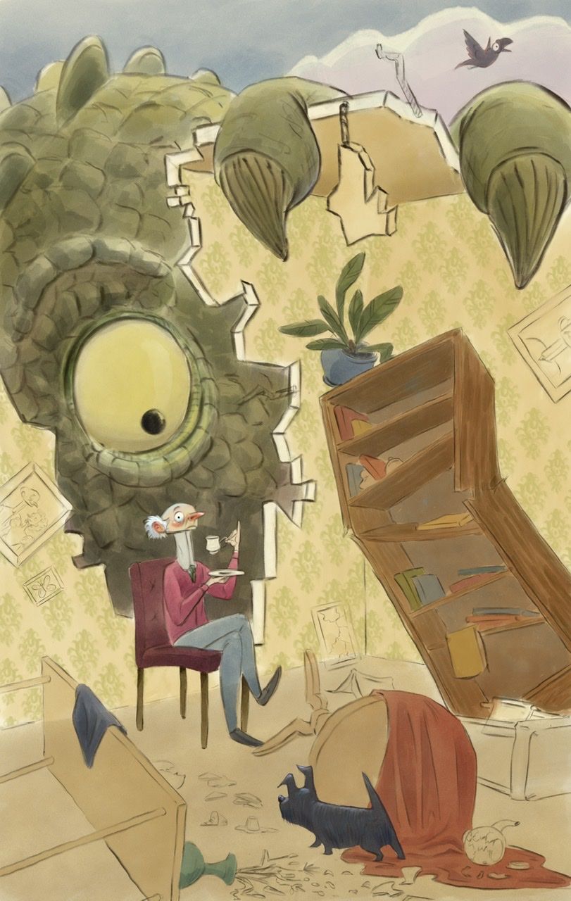
@EliaMurrayArt I like the contrast that happens between the green monster and the red chair and yellow/orange walls!
Bailey Vidler
Portfolio: baileyvidler.com -
@baileymvidler Thank you! that is what I was leaning towards so I appreciate the feedback

-
Hahahahaha the look on the guy’s face!
-
Progress shot- I’m fumbling my way through color.
Any thoughts? The details of the books and things are throwing me for a loop. I think I’m getting bogged down in color picking.
How do you guys sort colors of small “insignificant “ items?
Instagram: https://www.instagram.com/eliamurrayart/
Portfolio: www.eliamurray.com -
@EliaMurrayArt I saw in one of videos classes here on svs start with coloring things that are supposed to be a certain color (plants green, firetruck red, an orange orange etc) then work out from there. You could also find an image online you like the color palette then just pull colors from that image.
-
I love the guy's expression! I think my ideas about color are frequently different from those of other people. I tend towards warm/cool contrasts rather than monochromatic or all warm/cool schemes. So take my advice for what it's worth. But, cools recede and warms come forward. So depending on what you want the viewer to see first--the wall or the monster-- I like either the first or second one. At any rate, I don't think there's any danger of not seeing the monster. Just be careful not to lose the man!
P.S. Oh, sorry, somehow I didn't see the latest post so I was commenting on the color trials. I think you did well to make the man's sweater a contrasting color and have the monster the same tone as the wall. So far your book color choices harmonize well, so just keep it up!
-
I love this, I think it all works really well
")
-
Looking totally awesome

-
Soooooo good!
-
@KaraDaniel That makes total sense! I have been trying to follow another image's color palette that I liked - but these little extra things like the books seem to just be.. I dunno confusing or I feel like I'm being super fussy. I think I'll take a breath and step back for a moment to see my brain doesn't go into such a frenzy of "omg what color should I use!" haha
-
@LauraA Thank you! I really appreciate your view - I think I tend towards warm/cool color schemes too. I think that I wanted it to read with the monster being kind of a "second" read. Where you look at the man, and then go oh Monster!
I'm going to keep chugging along and see if I can push it some more. I think I tend towards kind of desaturated tones - I'm looking at the image on my computer screen now (I've been painting it in procreate) and it is looking really dull to me... I hope to try to make some colors pop even more.

-
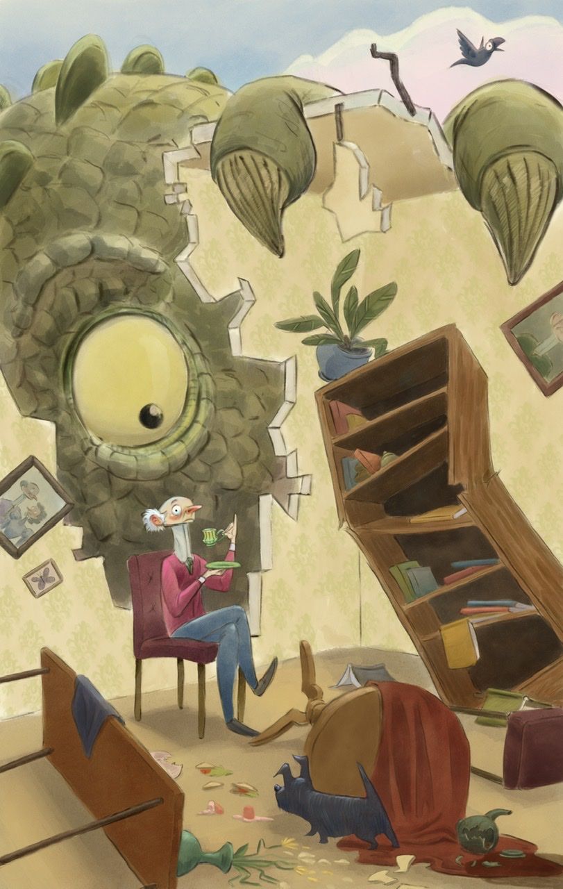
What would you change, add, darken, lighten?
As I am finishing this up, I would love some extra eyes to point out the weakest parts and make suggestions on how I can improve.
Thank you!
️Instagram: https://www.instagram.com/eliamurrayart/
Portfolio: www.eliamurray.com -
@EliaMurrayArt I would also go with option A, the creature being darker works a bit better I think
-
@EliaMurrayArt I would just try darkening the right wall a bit to see how that looks, that could give the image a bit more depth. I know the bookshelf is broken but the perspective of it is distracting got me because it isn’t quite lining up with the plane of the wall. The way I would go about adjusting it is sketching in the bookshelf unbroken so you can see how it would look in proper perspective and then break it and adjust from there. Hope this helps!
-
@Griff said in March WIP: Everything’s broken - halp!
 :
:@EliaMurrayArt I would also go with option A, the creature being darker works a bit better I think
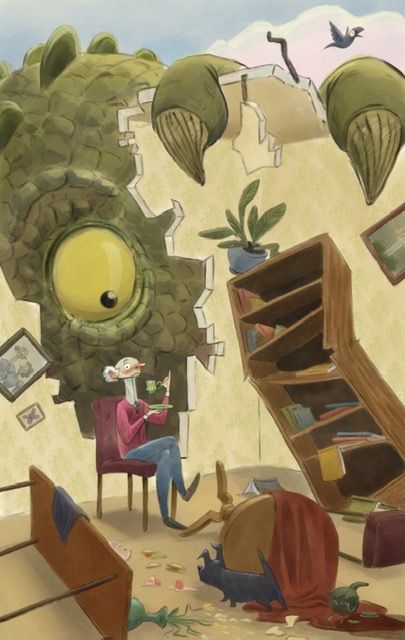
What does your eye go to first? Here’s a darker creature. But I’m wondering if he’s too saturated now? I want the man to be the first look.
Instagram: https://www.instagram.com/eliamurrayart/
Portfolio: www.eliamurray.com