Book Cover WIP: Mrs. Frisby and the Rats of NIMH
-
I think the first one is a little vague compared to the other two. My preference is number 2 but I agree that you maybe need to develop it a little so the rats don't look as threatening. Number 3 is also lovely and conveys a sense of adventure but I think 2 best illustrates the story.
-
I loved this book and movie as a child! Something is drawing me to 3 but it depends, as others have said, on the atmosphere you're trying to convey. There's something nice and calm about 3. I would flip the direction the mouse is facing though. By facing towards the right you are almost subconsciously encouraging someone to turn the page and open the book.
I also like 2. It's very dynamic, I think it could make a great spot illustration from the book (obviously taking out the title etc). The pointed rats faces facing towards the small mouse is great.
-
One if my favorite childhood books! I really like the idea of number 2. I think it captures the essence of the story. But I agree - definitely work on making the rats look non threatening.
-
2 looks the best to me, the composition is pleasing and it captures the story and the characters' relationships best out of the three. Only thing I would suggest is maybe removing the two small rats/mice by the title words "and the", Initially I wasn't really sure why they were there or if they were a part of the larger illustration. The rosebush border with the crow and owl is really cool!
-
Thanks for the feedback everyone! I thought #3 was the most "boring" idea because it's a mouse in a field pretty much, I was surprised to see many people gravitate to it. But the design is reminiscent of old classic tales. I think #2 might be the more interesting concept, and will play around a bit more with the composition and shapes.
-
@carriecopadraws Hi!I think version 3 works with me a lot .though it seems like a bboring idea like you said, the use of negative space really makes it interesting! With that being said, B is a pretty nice idea ,but i think you have to incorporate some kind of negative space to it..
Just my opinion on this!!thanks for sharing!
PS : Something like this,with the sky creating the negative space or something like that.
Hope I helped you even a little!
Instagram : https://www.instagram.com/g.chris.artwork/
Deviantart : https://www.deviantart.com/g-chris -
@Georgios-Christopoulos Maybe a better word is that #3 felt cliche to me, not boring. But if so many people like that one it must have a strong composition! Perhaps I will develop that cover instead. I appreciate everyone sharing their views.
Thanks for the updated #2 concept! You're right that it probably needed more contrast. The rats in the story live in a rosebush so I was going for dark tones, but it was probably too dark. In fact your updated look reminds me of concept #3 and how the values work well on that one - a sense of adventure, but not too dark and scary.
-
I’ll put in another vote for 3. I think the contrast is nice and you have a clear focal point. I didn’t notice the crow in it though (looking on a phone). If you want that as a point of emphasis you might want to make it a little more clear or just unclutter the top some. I thought the mouse was looking up at the title until one of the other comments mentioned the crow.
-
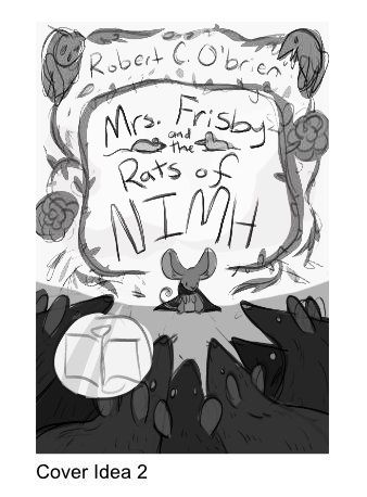
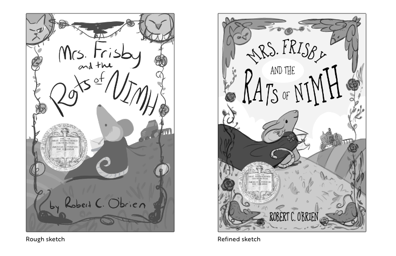
I refined cover idea #3 with your feedback! I think it's looking promising, I'm glad you guys helped me pick the cover to go forward with. I changed the top part of the design to artistic representations of the crow and owl from the story. (Mrs. Frisby is still looking at her friend the crow.) The rose/vine design borders the cover with space at the bottom for the author's name, and two rats in the lower corners. I kept the scene background fairly simple so the border will stand out.
Thoughts on this? I know the mouse's red cape is too long to be realistic but it reminds me a of a super hero cape this way. And draws the eye to her.
-
I really like that refined sketch.
-
This is phenomenal! I love everything about this. It's so whimsical.
As for the cape, I would be interested in seeing a color comp. Because the red is such a strong color, I suspect the image might look totally different in color vs. black and white.
Bailey Vidler
Portfolio: baileyvidler.com -
@baileymvidler Thank you, color studies are next! I wanted to nail down the composition and rough values first. If it works in greyscale it's more likely to work in color.
-
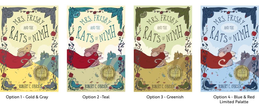
Color studies are ready! This is a story from 1971, so it's a classic tale with a modern cover update. The story takes place in spring and keywords are: Heartwarming (or hopeful), courageous, adventure. Which do you think works best?
(The option 4 mouse has a different tail treatment that I will probably apply to the final cover because it flows better.)
Carrie Copa
https://carriecopadraws.com/ -
@carriecopadraws This is really beautiful! Color palettes are super subjective so I think you may get a wide range of opinions here, as you've made each one attractive. My personal faves are 1,2,3 lol. Does that help? 4 is beautiful, but maybe would be better saved for a different project. When I think of the 70s, farms, and The Secret of Nimh, I personally think of a warmer color palette.
I do think you could make slight tweak (very very subtle adjustments). That could be down to monitor differences however.
Option 1- I think you could make the gray in the border just a whisper darker.
Option 2- I think you could make Mrs Frisby's fur a bit less pink.
Option 3- The sky a little lighter.
Website: www.tessawrathall.com
Instagram: www.instagram.com/tessawrathall_art/
-
@TessaW Thank you! I like all your suggestions for each option, and will keep them in mind for the final illustration!