Vehicle Design course
-
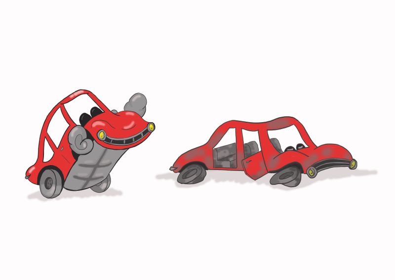
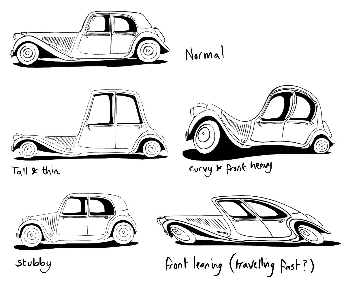
I decided I’m going to include a vehicle in my entry for the March contest so it’s a good time to do the vehicle design course! Here are my caricatures for the first assignment. I feel maybe I could have pushed them a bit further so will try to keep that in mind as I move on to the stance part of the first assignment.
-
@burvantill I agree about the flat tires. Great idea. It looks like your image might be a bit too small judging by the texture and line quality. I would consider doing slightly larger drawings for the future assignments and focusing on craftsmanship and tightness. Looking forward to more from you!
-
@neschof Excellent work! I’m impressed at the wide variation in proportions. And very nice line quality. Keep it up.
-
@neschof nice variation, I love the stubby car
-
@shanehunt Thankyou for the suggestion. I’ve been drawing these in my sketchbook (vertical format). I will start using the full page from now on.

-
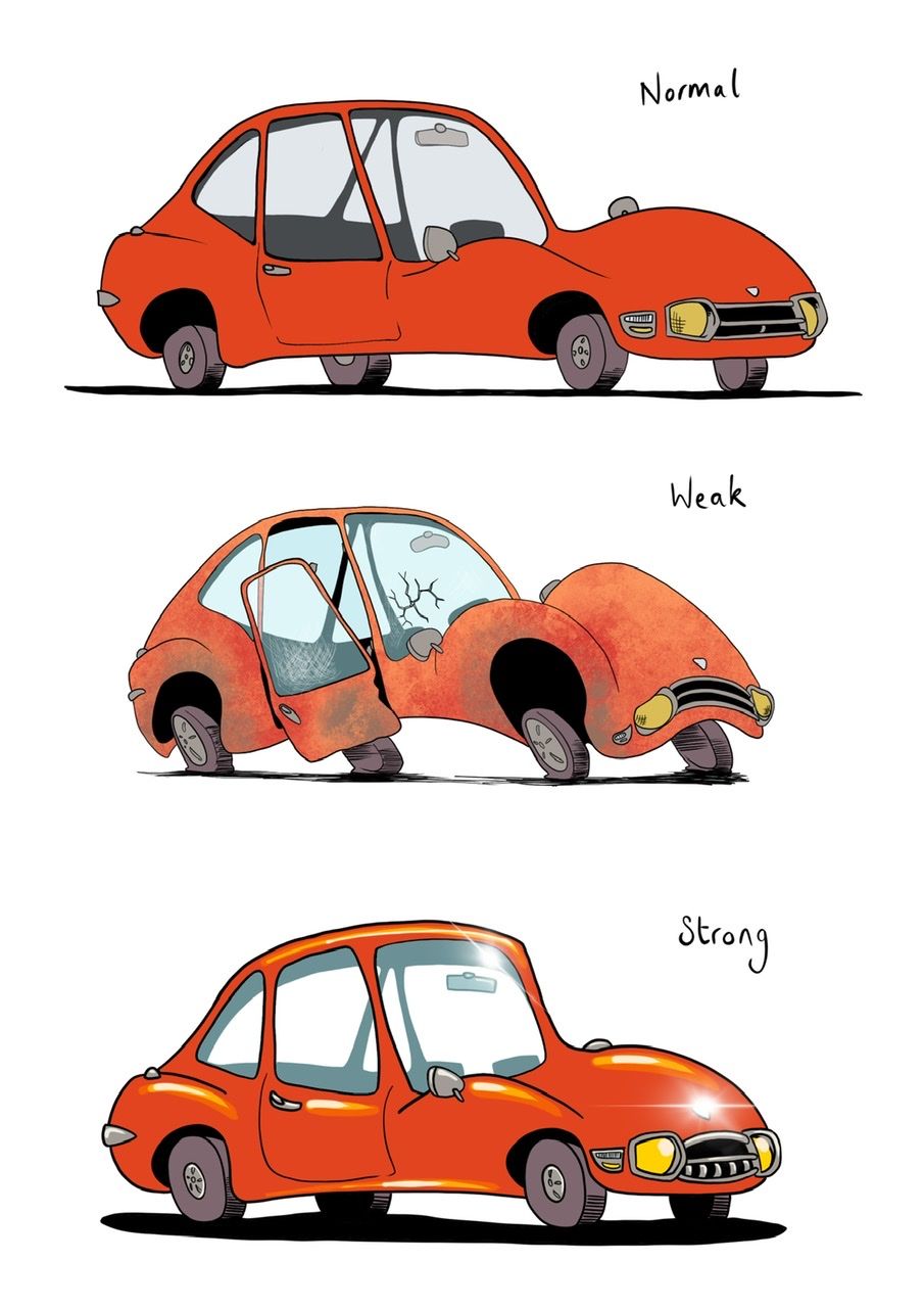
Next part of the assignment - stance. I found this really hard but also quite fun. I had a vague idea of a scared & cringing creature for weak, I was trying for sort of hunched "shoulders", and being pushed forward but not wanting to go. For strong I was thinking of the puffed up superhero stance with chin up and chest out. It ended up more subtle than I thought.
-
@shanehunt thank you! I’m finding the course fun and super useful / interesting

@ArtofAleksey thanks, I think stubby one kinda looks like a normal(ish) mini

-
@ArtofAleksey just seen your strong stance - he's so perky and cute! 🥰
-
@neschof thanks!
I like your weak stance it sorta looks terrified. Although your strong stance looks very close to the “normal” one you did
-
Assignment 1 Part 3
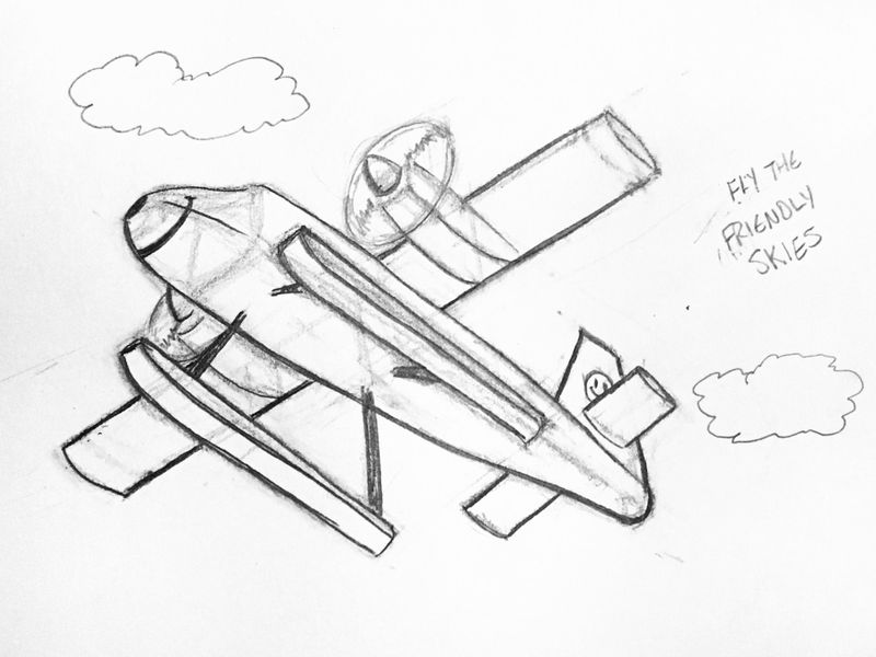
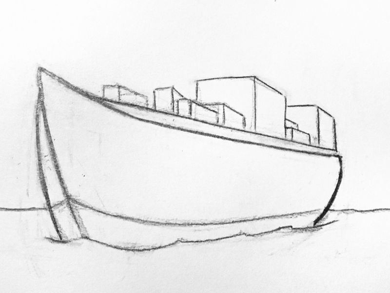
What I see: The pontoon on the port side seems wrong. I think it should be slightly bigger even though my perspective lines lineup, it’s closer so it should be a little bit bigger. It looks weird like this. And the starboard tail wing is too long.
I think my ship is OK except for the tangent of the horizon line and the bottom of the hull. LolWhat do you see?

-
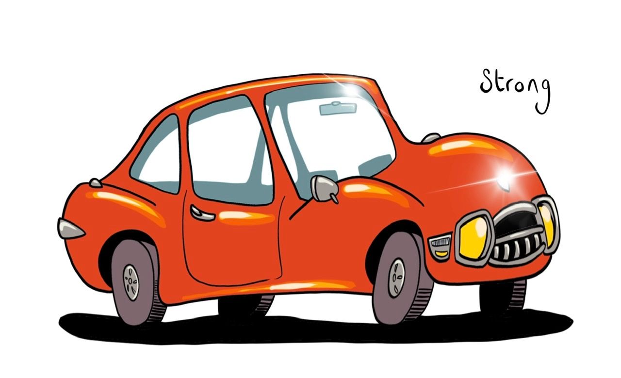
@ArtofAleksey yeah, it is only subtly different. How about this? I’ve tweaked him a bit to bulk/puff him up and lean forward a little.
-
@burvantill I’m going to give this a go now. I think you’ve done a good job - It looks quite complicated!
-
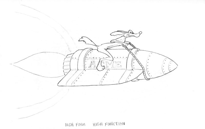
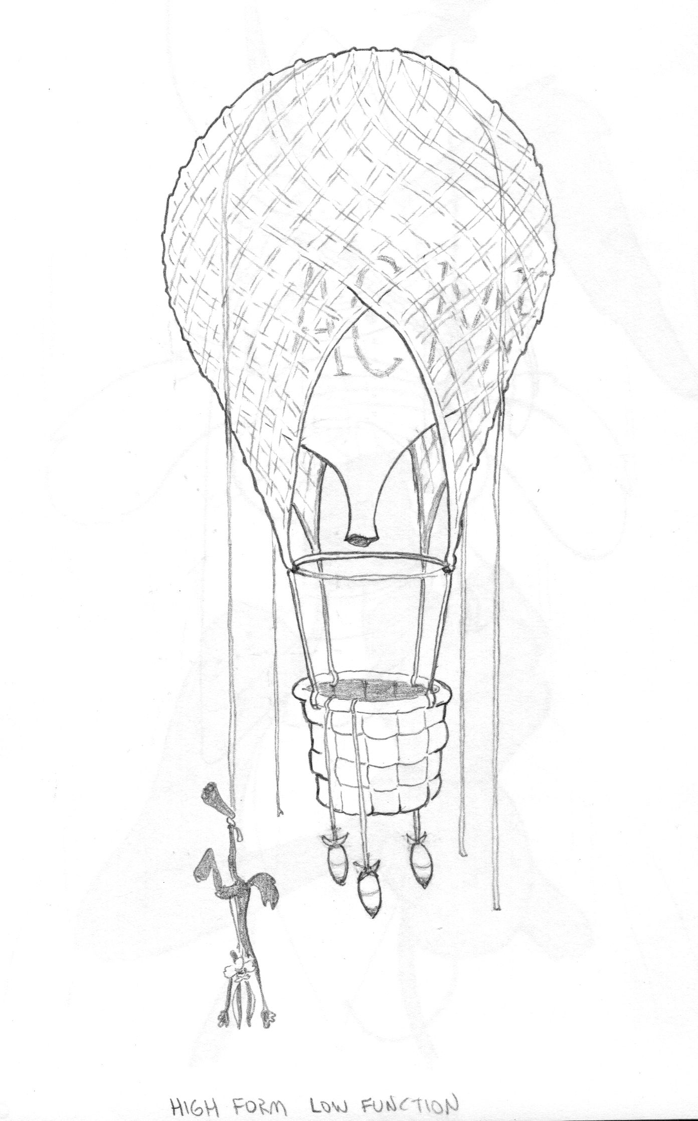
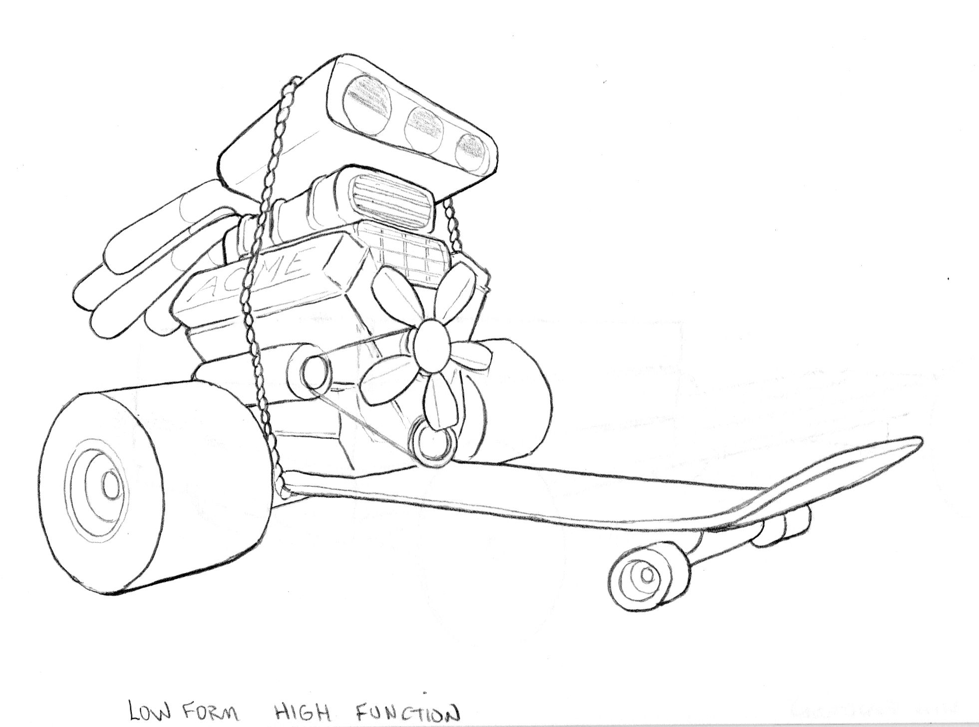
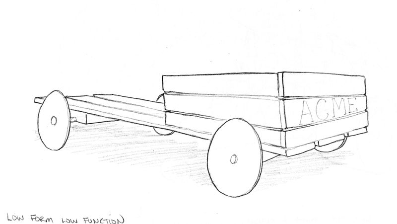
Here are my vehicles for Assignment 2. My character is Wile E. Coyote and these are vehicles that he would use to try and chase down the Road Runner.
-
@burvantill these look great! -low form high function is my favorite.
-
@burvantill really nice ideas and also lovely drawings. My favourite is the second, I feel like low function machines are kinda Wile E Coyote's thing

I chose Winnie the Pooh but I'm struggling with it so might change my mind!
-
@Heather-Boyd Thanx! My very first ever engine drawing. I used to wonder why, when we were little, my brother would make car noises while drawing. I totally get it now. LOL
-
@neschof Thanx! Low function are totally suited for Wile E. Coyote. Lol. Every once in a while he does great but screws it up somehow.
I think Winnie the Pooh is a great character, good challenge for sure, since he doesn't normally use vehicles, BUT if he did, now would be your chance to show us and expand his universe for Pooh fans.
-
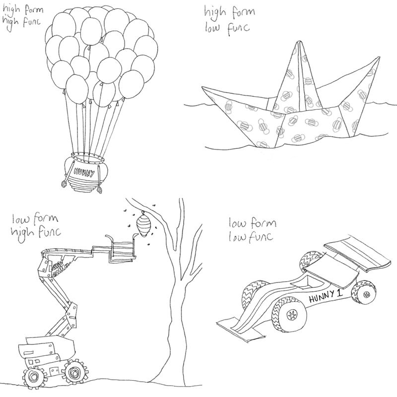
Ok, here are my vehicles especially for Winnie the Pooh. High form for him seemed like it should be simple, naive, childlike, and maybe related to honey. Low form is high tech, industrial, flashy and fast. Low and high function was much harder to think about. A paper boat is exactly the sort of thing I can imagine him trying to use. But is it low function because it will get soggy and sink or high function because it will set the perfect conditions for a Winnie the Pooh story? So sort of high function in terms of appropriate storytelling. Probably I’m just over thinking it!
-
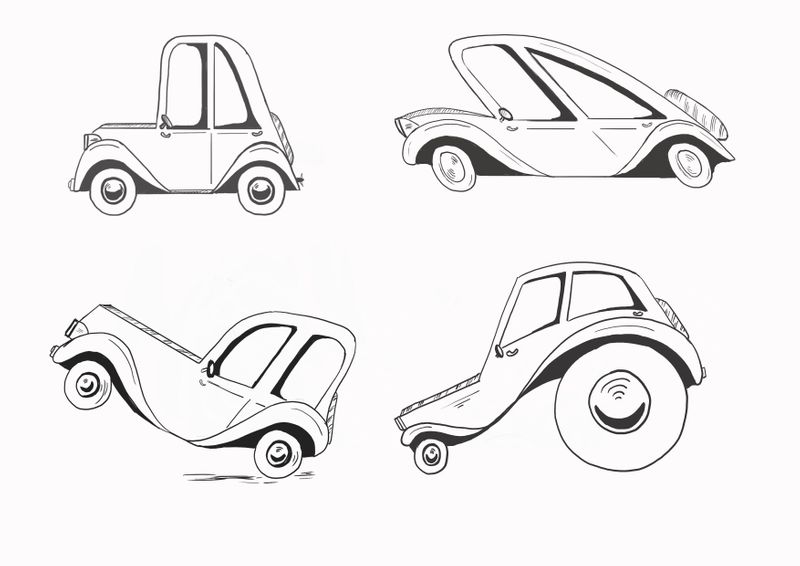
Just started the vehicle design course and thought id share my first part ....
-
Inspired by the body lifters in the gym!
Strong and Weak
