Society of Visual Storytelling

    SVSLearn Forums

    • Register
    • Login
    • Search
    • Recent
    • Tags
    • Popular
    • Users
    • Groups
    • Search

    Thoughts/critique/ advice needed on typography for this illustration 🤔

    Artwork
    12
    27
    1132
    Loading More Posts
    • Oldest to Newest
    • Newest to Oldest
    • Most Votes
    Reply
    • Reply as topic
    Log in to reply
    This topic has been deleted. Only users with topic management privileges can see it.
    • TessaW
      TessaW last edited by TessaW

      @baileymvidler Thanks for your guidance! 😊

      @jdubz Love the tweaks you mentioned. Subtle, but they make a big difference.

      Website: www.tessawrathall.com

      Instagram: www.instagram.com/tessawrathall_art/

      1 Reply Last reply Reply Quote 0
      • TessaW
        TessaW last edited by

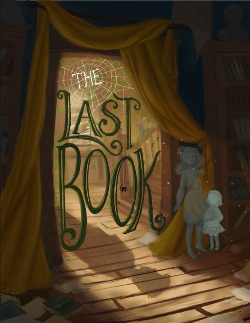
        Ok, played with it a bit more using your suggestions. Any improvement? I think it's looking a bit better, eh? I would still need to clean it up, but I don't want to go too far without the design being more finalized.
        Intruder text update 1.jpg

        Website: www.tessawrathall.com

        Instagram: www.instagram.com/tessawrathall_art/

        Nyrryl  Cadiz ? baileyvidler 3 Replies Last reply Reply Quote 5
        • Nyrryl  Cadiz
          Nyrryl Cadiz SVS OG @TessaW last edited by

          @TessaW i love it!

          Portfolio: nyrrylcadiz.com
          Instagram: https://www.instagram.com/nyrryl_cadiz/
          YouTube: https://www.youtube.com/channel/UCbJCF1Im8ZO7hpGWTKOJMuA

          1 Reply Last reply Reply Quote 1
          • ?
            A Former User @TessaW last edited by A Former User

            @TessaW THE is emphasized in this when I read it. I think if you would change it to the same color as the rest and tone down the white of the web surrounding it, the whole thing would be perfect.

            TessaW 1 Reply Last reply Reply Quote 1
            • TessaW
              TessaW @Guest last edited by

              @carolinedrawing Thanks I'll give it a try.

              Website: www.tessawrathall.com

              Instagram: www.instagram.com/tessawrathall_art/

              ? 1 Reply Last reply Reply Quote 0
              • ?
                A Former User @TessaW last edited by

                @TessaW you know what, i just thought of another thing: all of the other letters fit within each other, and i think the 'THE' should do the same. If you move the center of the web to the top left, you can use the three web openings between the top of the A and T to fit the 'THE' in. You can also try shifting the center the opposite way to fit 'THE' closer to the L. That would unify all the words.

                1 Reply Last reply Reply Quote 1
                • Griffin McPherson
                  Griffin McPherson last edited by

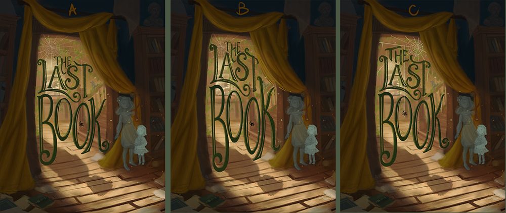
                  Seems to me that the top left image is the easiest to read. The lighter letters work week in the web and the darker text below mixes well with the environment.
                  For the right image the dark "the" feels out of place due to the value of it and the same goes for all of the text in the lower image.

                  The first image looks great to me, looks very nearly finished to me so I’m eager to see the end result since you said you’re going to polish it even more.

                  1 Reply Last reply Reply Quote 1
                  • baileyvidler
                    baileyvidler @TessaW last edited by

                    @TessaW Gorgeous!

                    Bailey Vidler
                    Portfolio: baileyvidler.com

                    1 Reply Last reply Reply Quote 1
                    • J
                      jdubz last edited by

                      Yeah this is really popping. Looks great!

                      Josh White
                      https://www.instagram.com/joshwhiteillustration/

                      1 Reply Last reply Reply Quote 1
                      • TessaW
                        TessaW last edited by

                        Thank you guys so much for your help! I've updated it one last time after the latest feedback and will choose from the iterations I've done with your help. If anyone wants to weigh in still, I'm all ears. It's nice to feel like I'm getting close to a final design. 😺 You guys are the best.

                        Intruder text update 2.jpg

                        Website: www.tessawrathall.com

                        Instagram: www.instagram.com/tessawrathall_art/

                        Nyrryl  Cadiz carriecopadraws 2 Replies Last reply Reply Quote 5
                        • Georgios Christopoulos
                          Georgios Christopoulos last edited by

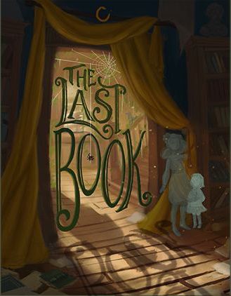
                          @TessaW I definately love the C version!you ve come a long way from the first post. I d definately try and make something with the shadow of the letters to see if I earn something from it.
                          I tried something,hopefully it ll bring some value!!
                          Untitled-1.jpg

                          Waiting to see the finished piece!!

                          Instagram : https://www.instagram.com/g.chris.artwork/
                          Deviantart : https://www.deviantart.com/g-chris

                          Nyrryl  Cadiz 1 Reply Last reply Reply Quote 2
                          • Nyrryl  Cadiz
                            Nyrryl Cadiz SVS OG @Georgios Christopoulos last edited by

                            @Georgios-Christopoulos i think the text’s shadow is making the image a bit too busy. It also kinda obscures the boy’s shadow.

                            Portfolio: nyrrylcadiz.com
                            Instagram: https://www.instagram.com/nyrryl_cadiz/
                            YouTube: https://www.youtube.com/channel/UCbJCF1Im8ZO7hpGWTKOJMuA

                            Georgios Christopoulos 1 Reply Last reply Reply Quote 2
                            • Nyrryl  Cadiz
                              Nyrryl Cadiz SVS OG @TessaW last edited by

                              @TessaW i also like the third one. The word “The” fits snugly with “last”.

                              Portfolio: nyrrylcadiz.com
                              Instagram: https://www.instagram.com/nyrryl_cadiz/
                              YouTube: https://www.youtube.com/channel/UCbJCF1Im8ZO7hpGWTKOJMuA

                              1 Reply Last reply Reply Quote 1
                              • Georgios Christopoulos
                                Georgios Christopoulos @Nyrryl Cadiz last edited by

                                @Nyrryl-Cadiz yeah I think you re right. Who knows 😉

                                Instagram : https://www.instagram.com/g.chris.artwork/
                                Deviantart : https://www.deviantart.com/g-chris

                                1 Reply Last reply Reply Quote 0
                                • Tracy McCusker
                                  Tracy McCusker last edited by

                                  Oh wow, I love all three of these thumbnails! If I had to pick, I think I'd also throw my hat into the ring with @Georgios-Christopoulos and @Nyrryl-Cadiz on thumbnail C. This piece really came together; I would be severely tempted to thumb through this book if I came across it in a bookstore, so: mission accomplished! 😍

                                  1 Reply Last reply Reply Quote 0
                                  • carriecopadraws
                                    carriecopadraws SVS OG @TessaW last edited by

                                    @TessaW I also vote C, the typography fits nicely together there. The eye is also drawn around the image with the spiderweb, character, and shadow on the floor. This is really good!

                                    Carrie Copa
                                    https://carriecopadraws.com/

                                    1 Reply Last reply Reply Quote 0
                                    • First post
                                      Last post