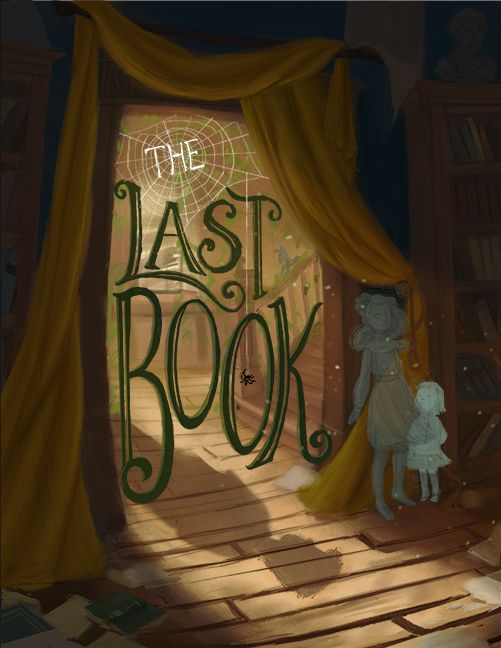
Thoughts/critique/ advice needed on typography for this illustration 🤔
-
Top left is my favourite. Easy to read but incorporates the web into the text. Pretty cool

-
@Tracy-McCusker Thanks for your feedback! I'm willing to change anything and everything with the text, so I really appreciate the notes you gave me.

@demotlj Thank you! It helps to get a consensus.
@Coley Awesome, thanks!
-
@TessaW hi! I’m not a graphic designer nor do I know anything about text but I think you may be using one too many font styles? I think 1 or 2 would do but then again, I’m no expert so take this comment with a huge grain of salt.
Portfolio: nyrrylcadiz.com
Instagram: https://www.instagram.com/nyrryl_cadiz/
YouTube: https://www.youtube.com/channel/UCbJCF1Im8ZO7hpGWTKOJMuA -
@Nyrryl-Cadiz Thank you! I'll try it out with a more unified text style too see how it looks.
-
Hi @TessaW! This looks really nice! I agree with @Nyrryl-Cadiz that maybe the styles could be unified. I love how you did "Book" and my vote is to make "The Last" match in style to "Book." I might also suggest adding a tiny bit more contrast between the text and background.
Regarding your vector question, I'm not sure. Normally, my impulse is to always vector type. But I'm concerned it wouldn't match the painterly style of the rest of the image...
Your composition here is fantastic! The shadow on the floor is such a nice touch.
-
@baileymvidler said in Thoughts/critique/ advice needed on typography for this illustration
 :
:Just a thought...
I'd even try darkening the letters even more - maybe match it to the darkest area of the curtains above. Maybe also put the spider web leading to the spider in front of the "T" of Last but keep it behind the "O". If the letters were even darker it would I think make that pop and then the line would lead the eye down into the words.
-
@baileymvidler Thanks for your guidance!

@jdubz Love the tweaks you mentioned. Subtle, but they make a big difference.
-
Ok, played with it a bit more using your suggestions. Any improvement? I think it's looking a bit better, eh? I would still need to clean it up, but I don't want to go too far without the design being more finalized.
Website: www.tessawrathall.com
Instagram: www.instagram.com/tessawrathall_art/
-
@TessaW i love it!
-
@TessaW THE is emphasized in this when I read it. I think if you would change it to the same color as the rest and tone down the white of the web surrounding it, the whole thing would be perfect.
-
@carolinedrawing Thanks I'll give it a try.
-
@TessaW you know what, i just thought of another thing: all of the other letters fit within each other, and i think the 'THE' should do the same. If you move the center of the web to the top left, you can use the three web openings between the top of the A and T to fit the 'THE' in. You can also try shifting the center the opposite way to fit 'THE' closer to the L. That would unify all the words.
-
Seems to me that the top left image is the easiest to read. The lighter letters work week in the web and the darker text below mixes well with the environment.
For the right image the dark "the" feels out of place due to the value of it and the same goes for all of the text in the lower image.The first image looks great to me, looks very nearly finished to me so I’m eager to see the end result since you said you’re going to polish it even more.
-
@TessaW Gorgeous!
-
Yeah this is really popping. Looks great!
-
Thank you guys so much for your help! I've updated it one last time after the latest feedback and will choose from the iterations I've done with your help. If anyone wants to weigh in still, I'm all ears. It's nice to feel like I'm getting close to a final design.
 You guys are the best.
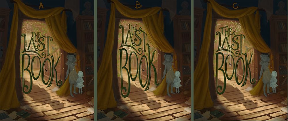
Website: www.tessawrathall.com
Instagram: www.instagram.com/tessawrathall_art/
-
@TessaW I definately love the C version!you ve come a long way from the first post. I d definately try and make something with the shadow of the letters to see if I earn something from it.
I tried something,hopefully it ll bring some value!!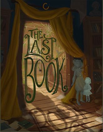
Waiting to see the finished piece!!
Instagram : https://www.instagram.com/g.chris.artwork/
Deviantart : https://www.deviantart.com/g-chris -
@Georgios-Christopoulos i think the text’s shadow is making the image a bit too busy. It also kinda obscures the boy’s shadow.
Portfolio: nyrrylcadiz.com
Instagram: https://www.instagram.com/nyrryl_cadiz/
YouTube: https://www.youtube.com/channel/UCbJCF1Im8ZO7hpGWTKOJMuA -
@TessaW i also like the third one. The word “The” fits snugly with “last”.
-
@Nyrryl-Cadiz yeah I think you re right. Who knows
")