Society of Visual Storytelling

    SVSLearn Forums

    • Register
    • Login
    • Search
    • Recent
    • Tags
    • Popular
    • Users
    • Groups
    • Search

    Thoughts/critique/ advice needed on typography for this illustration ๐Ÿค”

    Artwork
    12
    27
    1132
    Loading More Posts
    • Oldest to Newest
    • Newest to Oldest
    • Most Votes
    Reply
    • Reply as topic
    Log in to reply
    This topic has been deleted. Only users with topic management privileges can see it.
    • TessaW
      TessaW last edited by TessaW

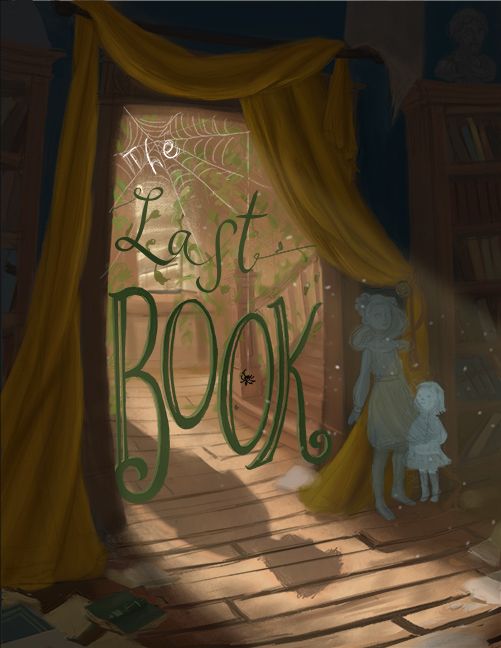
      Hi everyone! I'm kind of clueless when it comes to typography, text, titles- whatever the correct terminology is. I'm working on this piece that's supposed to be a chapter title, and I would greatly appreciate some feedback on it. The text currently is in a sketch phase and would need to be refined and tweaked.

      1. Does it generally look ok? Thoughts on anything like colors, spacing, size, and style?

      2. For those who are more graphic design savvy, do you recommend making it into a vector, so it's crisp and clean, or treating it as painted letters so it looks a little more "humble"?

      Web light.jpg Intruder text.jpg
      Intruder light text.jpg

      Help please? ๐Ÿ˜ณ

      Website: www.tessawrathall.com

      Instagram: www.instagram.com/tessawrathall_art/

      Nyrryl  Cadiz 1 Reply Last reply Reply Quote 3
      • EliaMurrayArt
        EliaMurrayArt last edited by

        Though I will admit I do not often work with words/typography. My initial response is that I'd develop one of the top two.

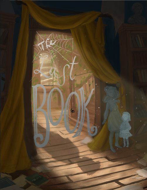
        Just with a cursory glance, I had a tough time seeing the lighter colored font on the bottom.

        Personally I lean towards the top left. I find it to be the easiest to read.

        I'll let a more experienced typographical artist remark on whether vectors are necessary or not ๐Ÿ˜„

        Instagram: https://www.instagram.com/eliamurrayart/
        Portfolio: www.eliamurray.com

        1 Reply Last reply Reply Quote 1
        • TessaW
          TessaW last edited by

          Thank you @EliaMurrayArt for your thoughts!

          Website: www.tessawrathall.com

          Instagram: www.instagram.com/tessawrathall_art/

          1 Reply Last reply Reply Quote 0
          • Tracy McCusker
            Tracy McCusker last edited by

            I agree with @EliaMurrayArt -- the top two are the most appealing! I also find the top left to be the easiest to read. The contrast with the white "the" and the green "Last Book" is a much more nuanced approach to the lettering than making it either fully green, or fully light/white-gray gradient.

            This is a really appealing type treatment, overall! I think the only thing that stands out to me is that the stem of the uppercase B in Book looks too crowded against the framing doorway. The K has a lot more room to breathe and is much easier to recognize at a glance. You might want to try a thumbnail where "Book" is shifted to the left to give it more space & make the word look slightly less crowded.

            (I fully understand that shifting the Book will probably also require you to shift "Last" over as well in order to keep the bottom of the S from running into the O. So I apologize if this suggestion triggers a cascade of extra work!)

            TessaW 1 Reply Last reply Reply Quote 1
            • demotlj
              demotlj SVS OG last edited by

              I'm with the others on one of the top two. They are easier to read. The whole composition is really nice.

              Laurie DeMott
              instagram.com/demotlj

              1 Reply Last reply Reply Quote 1
              • Coley
                Coley last edited by

                Top left is my favourite. Easy to read but incorporates the web into the text. Pretty cool๐Ÿ˜Ž

                https://www.instagram.com/nicoleledrewmay/

                1 Reply Last reply Reply Quote 1
                • TessaW
                  TessaW @Tracy McCusker last edited by

                  @Tracy-McCusker Thanks for your feedback! I'm willing to change anything and everything with the text, so I really appreciate the notes you gave me. โ˜บ

                  @demotlj Thank you! It helps to get a consensus.

                  @Coley Awesome, thanks!
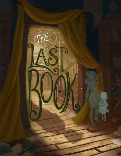
                  Website: www.tessawrathall.com

                  Instagram: www.instagram.com/tessawrathall_art/

                  1 Reply Last reply Reply Quote 1
                  • Nyrryl  Cadiz
                    Nyrryl Cadiz SVS OG @TessaW last edited by

                    @TessaW hi! Iโ€™m not a graphic designer nor do I know anything about text but I think you may be using one too many font styles? I think 1 or 2 would do but then again, Iโ€™m no expert so take this comment with a huge grain of salt.

                    Portfolio: nyrrylcadiz.com
                    Instagram: https://www.instagram.com/nyrryl_cadiz/
                    YouTube: https://www.youtube.com/channel/UCbJCF1Im8ZO7hpGWTKOJMuA

                    TessaW baileyvidler 2 Replies Last reply Reply Quote 1
                    • TessaW
                      TessaW @Nyrryl Cadiz last edited by

                      @Nyrryl-Cadiz Thank you! I'll try it out with a more unified text style too see how it looks.

                      Website: www.tessawrathall.com

                      Instagram: www.instagram.com/tessawrathall_art/

                      1 Reply Last reply Reply Quote 0
                      • baileyvidler
                        baileyvidler @Nyrryl Cadiz last edited by

                        Hi @TessaW! This looks really nice! I agree with @Nyrryl-Cadiz that maybe the styles could be unified. I love how you did "Book" and my vote is to make "The Last" match in style to "Book." I might also suggest adding a tiny bit more contrast between the text and background.

                        Regarding your vector question, I'm not sure. Normally, my impulse is to always vector type. But I'm concerned it wouldn't match the painterly style of the rest of the image...

                        Your composition here is fantastic! The shadow on the floor is such a nice touch.

                        Bailey Vidler
                        Portfolio: baileyvidler.com

                        1 Reply Last reply Reply Quote 1
                        • J
                          jdubz last edited by

                          @baileymvidler said in Thoughts/critique/ advice needed on typography for this illustration ๐Ÿค”:

                          Just a thought...

                          I'd even try darkening the letters even more - maybe match it to the darkest area of the curtains above. Maybe also put the spider web leading to the spider in front of the "T" of Last but keep it behind the "O". If the letters were even darker it would I think make that pop and then the line would lead the eye down into the words.

                          Josh White
                          https://www.instagram.com/joshwhiteillustration/

                          1 Reply Last reply Reply Quote 1
                          • TessaW
                            TessaW last edited by TessaW

                            @baileymvidler Thanks for your guidance! ๐Ÿ˜Š

                            @jdubz Love the tweaks you mentioned. Subtle, but they make a big difference.

                            Website: www.tessawrathall.com

                            Instagram: www.instagram.com/tessawrathall_art/

                            1 Reply Last reply Reply Quote 0
                            • TessaW
                              TessaW last edited by

                              Ok, played with it a bit more using your suggestions. Any improvement? I think it's looking a bit better, eh? I would still need to clean it up, but I don't want to go too far without the design being more finalized.

                              Intruder text update 1.jpg

                              Website: www.tessawrathall.com

                              Instagram: www.instagram.com/tessawrathall_art/

                              Nyrryl  Cadiz ? baileyvidler 3 Replies Last reply Reply Quote 5
                              • Nyrryl  Cadiz
                                Nyrryl Cadiz SVS OG @TessaW last edited by

                                @TessaW i love it!

                                Portfolio: nyrrylcadiz.com
                                Instagram: https://www.instagram.com/nyrryl_cadiz/
                                YouTube: https://www.youtube.com/channel/UCbJCF1Im8ZO7hpGWTKOJMuA

                                1 Reply Last reply Reply Quote 1
                                • ?
                                  A Former User @TessaW last edited by A Former User

                                  @TessaW THE is emphasized in this when I read it. I think if you would change it to the same color as the rest and tone down the white of the web surrounding it, the whole thing would be perfect.

                                  TessaW 1 Reply Last reply Reply Quote 1
                                  • TessaW
                                    TessaW @Guest last edited by

                                    @carolinedrawing Thanks I'll give it a try.

                                    Website: www.tessawrathall.com

                                    Instagram: www.instagram.com/tessawrathall_art/

                                    ? 1 Reply Last reply Reply Quote 0
                                    • ?
                                      A Former User @TessaW last edited by

                                      @TessaW you know what, i just thought of another thing: all of the other letters fit within each other, and i think the 'THE' should do the same. If you move the center of the web to the top left, you can use the three web openings between the top of the A and T to fit the 'THE' in. You can also try shifting the center the opposite way to fit 'THE' closer to the L. That would unify all the words.

                                      1 Reply Last reply Reply Quote 1
                                      • Griffin McPherson
                                        Griffin McPherson last edited by

                                        Seems to me that the top left image is the easiest to read. The lighter letters work week in the web and the darker text below mixes well with the environment.
                                        For the right image the dark "the" feels out of place due to the value of it and the same goes for all of the text in the lower image.

                                        The first image looks great to me, looks very nearly finished to me so Iโ€™m eager to see the end result since you said youโ€™re going to polish it even more.

                                        1 Reply Last reply Reply Quote 1
                                        • baileyvidler
                                          baileyvidler @TessaW last edited by

                                          @TessaW Gorgeous!

                                          Bailey Vidler
                                          Portfolio: baileyvidler.com

                                          1 Reply Last reply Reply Quote 1
                                          • J
                                            jdubz last edited by

                                            Yeah this is really popping. Looks great!

                                            Josh White
                                            https://www.instagram.com/joshwhiteillustration/

                                            1 Reply Last reply Reply Quote 1
                                            • First post
                                              Last post