Society of Visual Storytelling

    SVSLearn Forums

    • Register
    • Login
    • Search
    • Recent
    • Tags
    • Popular
    • Users
    • Groups
    • Search

    March WIP: Everything’s broken - halp! 😂

    Artwork
    16
    41
    1964
    Loading More Posts
    • Oldest to Newest
    • Newest to Oldest
    • Most Votes
    Reply
    • Reply as topic
    Log in to reply
    This topic has been deleted. Only users with topic management privileges can see it.
    • EliaMurrayArt
      EliaMurrayArt @LauraA last edited by

      @LauraA Thank you! I really appreciate your view - I think I tend towards warm/cool color schemes too. I think that I wanted it to read with the monster being kind of a "second" read. Where you look at the man, and then go oh Monster!

      I'm going to keep chugging along and see if I can push it some more. I think I tend towards kind of desaturated tones - I'm looking at the image on my computer screen now (I've been painting it in procreate) and it is looking really dull to me... I hope to try to make some colors pop even more.

      ☺

      Instagram: https://www.instagram.com/eliamurrayart/
      Portfolio: www.eliamurray.com

      1 Reply Last reply Reply Quote 1
      • EliaMurrayArt
        EliaMurrayArt last edited by

        7369341F-5637-4CA9-8B75-9588F6094528.jpeg

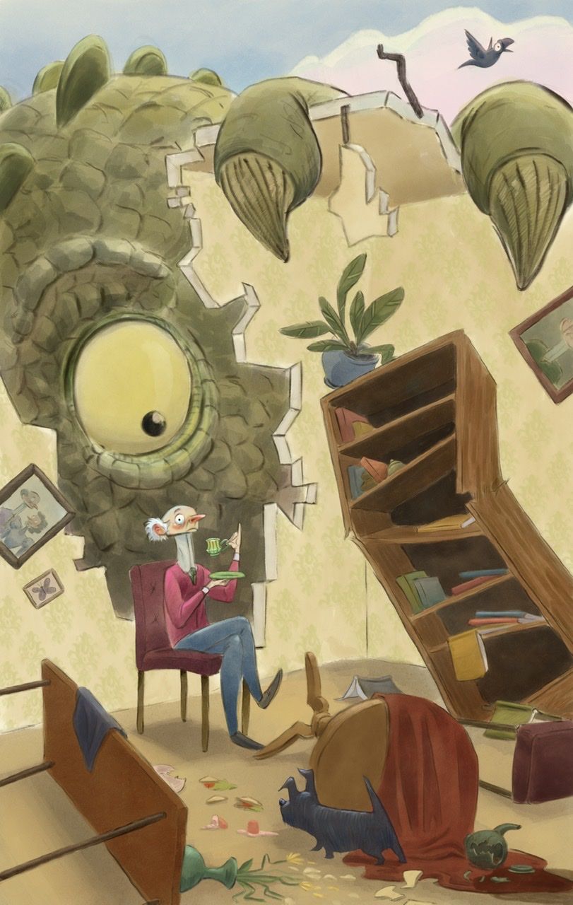
        What would you change, add, darken, lighten?

        As I am finishing this up, I would love some extra eyes to point out the weakest parts and make suggestions on how I can improve.

        Thank you! ☺️

        Instagram: https://www.instagram.com/eliamurrayart/
        Portfolio: www.eliamurray.com

        Griffin McPherson 1 Reply Last reply Reply Quote 0
        • Griffin McPherson
          Griffin McPherson @EliaMurrayArt last edited by

          @EliaMurrayArt I would also go with option A, the creature being darker works a bit better I think

          EliaMurrayArt 1 Reply Last reply Reply Quote 1
          • Griffin McPherson
            Griffin McPherson @EliaMurrayArt last edited by

            @EliaMurrayArt I would just try darkening the right wall a bit to see how that looks, that could give the image a bit more depth. I know the bookshelf is broken but the perspective of it is distracting got me because it isn’t quite lining up with the plane of the wall. The way I would go about adjusting it is sketching in the bookshelf unbroken so you can see how it would look in proper perspective and then break it and adjust from there. Hope this helps!

            EliaMurrayArt 1 Reply Last reply Reply Quote 1
            • EliaMurrayArt
              EliaMurrayArt @Griffin McPherson last edited by

              @Griff said in March WIP: Everything’s broken - halp! 😂:

              @EliaMurrayArt I would also go with option A, the creature being darker works a bit better I think

              B14B63E0-C344-4319-A169-47BECDA4609E.jpeg

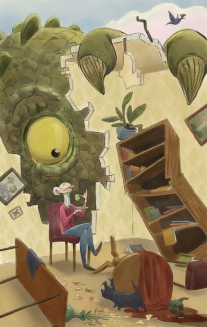
              What does your eye go to first? Here’s a darker creature. But I’m wondering if he’s too saturated now? I want the man to be the first look.

              Instagram: https://www.instagram.com/eliamurrayart/
              Portfolio: www.eliamurray.com

              Griffin McPherson 1 Reply Last reply Reply Quote 1
              • Griffin McPherson
                Griffin McPherson @EliaMurrayArt last edited by

                @EliaMurrayArt I don’t mind the saturation but I do think the creature is too dark around the man and it makes it harder to see him

                1 Reply Last reply Reply Quote 1
                • EliaMurrayArt
                  EliaMurrayArt @Griffin McPherson last edited by

                  @Griff hmmmm agreed! I’ll work on that!

                  Instagram: https://www.instagram.com/eliamurrayart/
                  Portfolio: www.eliamurray.com

                  chrisaakins 1 Reply Last reply Reply Quote 1
                  • chrisaakins
                    chrisaakins @EliaMurrayArt last edited by

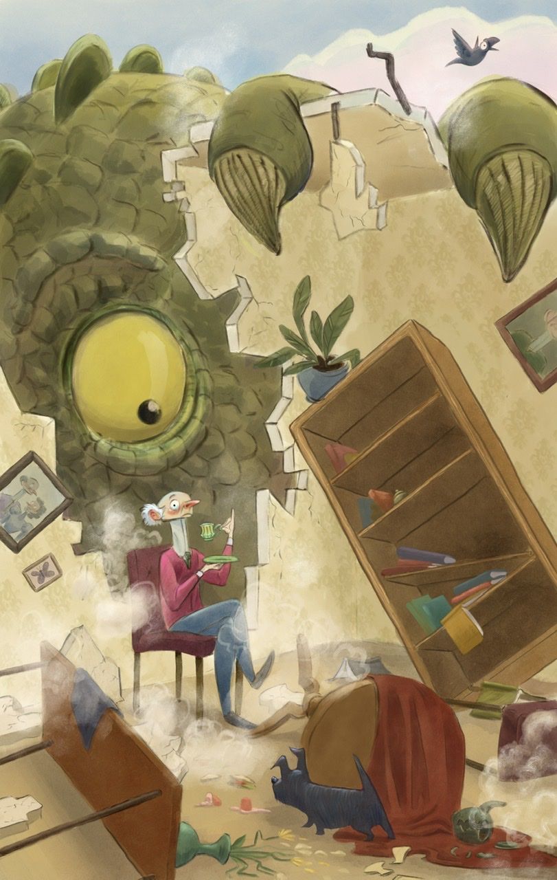
                    @EliaMurrayArt I think if you saturate the man it will help. I also think that you need to add some shadows to the broken wall angles where you can see the cross sections. I really am liking this. Your gesture and expression is wonderful. I think if you had a couple of chunks of ceiling falling down and some dust clouds it will help with the "the monster just ripped off the ceiling" vibe.

                    Chris Akins
                    www.chrisakinsart.com
                    www.instagram.com/chrisakinsart/

                    EliaMurrayArt 1 Reply Last reply Reply Quote 0
                    • EliaMurrayArt
                      EliaMurrayArt @chrisaakins last edited by

                      @chrisaakins dust clouds, yes, I love it! I thought it felt too still and what you’re suggesting is spot on. Yes. I have tried adding shadows to the walls but it always felt weird. I’ll give it some more goes. Thank you!!

                      Instagram: https://www.instagram.com/eliamurrayart/
                      Portfolio: www.eliamurray.com

                      1 Reply Last reply Reply Quote 0
                      • EliaMurrayArt
                        EliaMurrayArt last edited by

                        Does this look like rubble dust clouds..... ? Is this working?

                        785DD457-D0C2-4870-84B7-3A46FD9890F2.jpeg

                        Instagram: https://www.instagram.com/eliamurrayart/
                        Portfolio: www.eliamurray.com

                        carlianne 1 Reply Last reply Reply Quote 3
                        • carlianne
                          carlianne @EliaMurrayArt last edited by

                          @EliaMurrayArt oh yeah the dust helps a lot!

                          Check out my art and tutorials :)

                          Instagram: www.instagram.com/carliannecreates/

                          Youtube:
                          https://youtube.com/c/CarlianneCreates

                          Shop: www.carliannecreates.com

                          EliaMurrayArt 1 Reply Last reply Reply Quote 1
                          • EliaMurrayArt
                            EliaMurrayArt @carlianne last edited by

                            @carlianne thank you!

                            Instagram: https://www.instagram.com/eliamurrayart/
                            Portfolio: www.eliamurray.com

                            1 Reply Last reply Reply Quote 1
                            • chrisaakins
                              chrisaakins last edited by

                              @EliaMurrayArt looks good!

                              Chris Akins
                              www.chrisakinsart.com
                              www.instagram.com/chrisakinsart/

                              EliaMurrayArt 1 Reply Last reply Reply Quote 0
                              • EliaMurrayArt
                                EliaMurrayArt @chrisaakins last edited by

                                @chrisaakins Thank you!! I am so glad you suggested it!

                                Instagram: https://www.instagram.com/eliamurrayart/
                                Portfolio: www.eliamurray.com

                                1 Reply Last reply Reply Quote 0
                                • First post
                                  Last post