WIP, I feel like it’s missing something, Critiques always welcome!
-
@TessaW
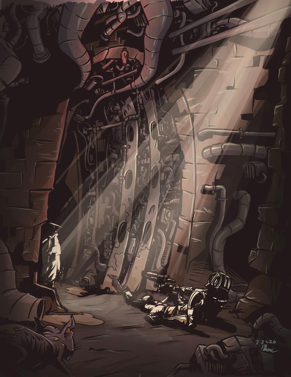
How’s this? -
Lovely work, but at the moment everything still feels too busy and all my attention is drawn to the detail on the wall when it should be on the characters and situation of the scene.
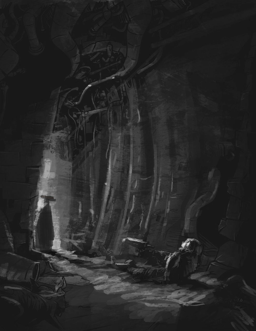
In terms of the story, I would read it this scene as the spaceman (?) is injured and an unknown character has entered the scene, who appears to be hostile, but is actually there to help him. I like how you have done the lighting, however because the environment has so much detail I think it detracts from the impact of the painting. I hope you don't mind but I did a quick paintover that puts the main light behind the mysterious character casting a shadow towards the spaceman, it's nothing super original, but iI think it would lead the viewers eye and make the scene more tense. You could also add a second light behind the spaceman to brighten some of the environment up and would give you the chance to play with warm/cool colors (unless you are only going for the monochrome look)
-
@Gary-Wilkinson Oh yeah, that looks way better, thanks so much! Just curious which brush did you use?
-
@phoenix-yip thanks I hope the advice helped. Like I say it all depends on the scene. If you want the mysterious character to become more of a saviour/Samaritan then lighting from an upper source that fall onto him highlighting his face would work nicely.
I used the damkeeper brush used by Tonko house. I needed to tweak it a bit to fit my usage but it's a lovely brush to rough in ideas
-
@Gary-Wilkinson is that in photoshop?
-
@Gary-Wilkinson
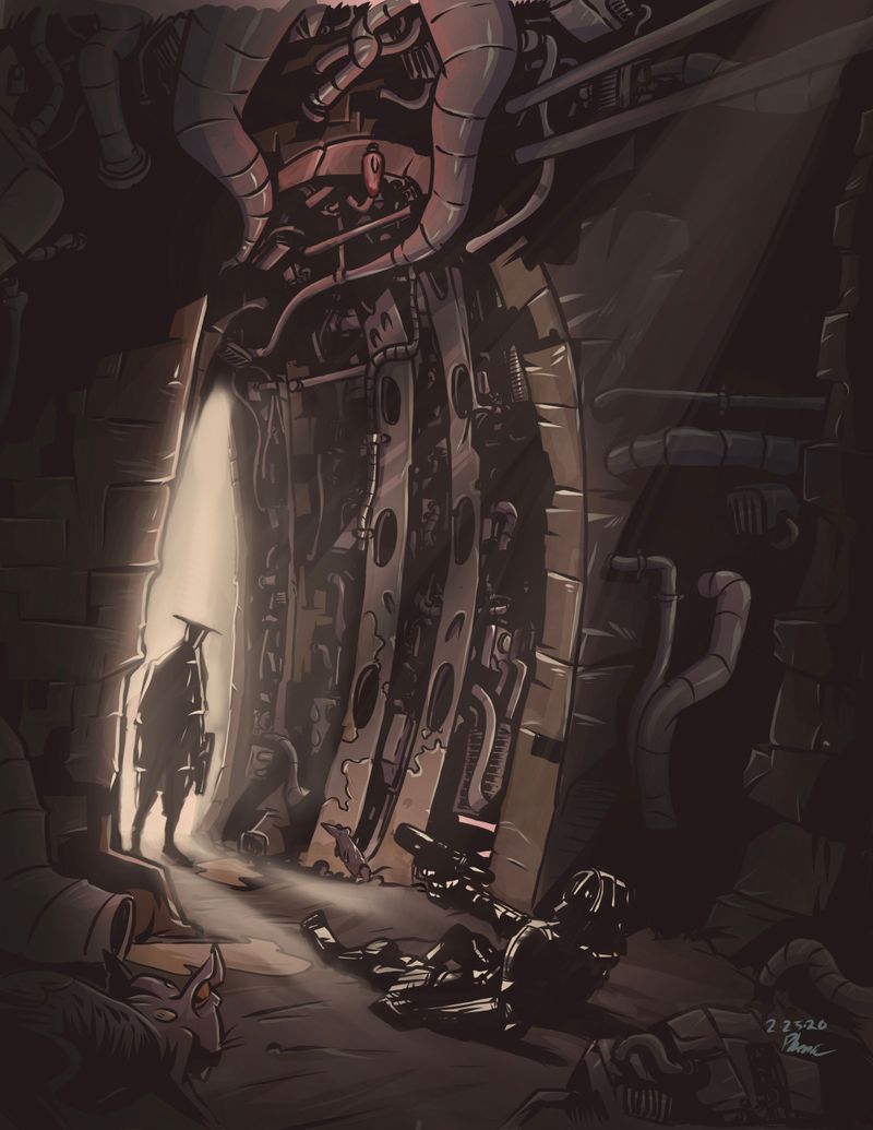 How does this look?
 -
@phoenix-yip This is a really cool piece. I could never do this style or subject matter and don't really 'consume' images like this but I find it really appealing anyway.
So couple things to take with a grain of salt: the highlight works better placed like the draw-over, where it's shifted to the left, along the left side of the entrance with a bit of fade toward the other side, and the tinge of red at the top might be better emanating from the character. Is he unarmed? Has he dropped his weapon in defeat? I think I'd like to know more, and maybe you can use color for that. the details on the top of the image are cool, but those are something i'd explore on a second or third look.
-
@carolinedrawing So the story is there is these ground of people called the Foryn. They are believed to be descendants of this entity called Morke. There’s this huge backstory and everything, but that’s not important. The guy standing in the entrance is a bounty hunter called Ronan. His mom was killed by the Foryn when they raided his village. Later they stole his child, the only thing he had left. After that he swore to find his child and kill every Foryn he sees. The guy in the foreground is a Foryn who was stationed in this tunnel while they were exporting raw kemonite from this planet called Eran on the kemorim. Kemonite is a rare ore only found on the kemorim, it’s used to make military grade armor and vehicles. So this guy who lives on Eran hunts down these Foryn soldiers who are stationed in the tunnel.
-
@phoenix-yip this is cool. I would use an even brighter highlights on the figure closest to us.
-
@carolinedrawing so just some clarity, you are saying to place the highlight over the lines and move it to the left? I see what you’re saying with the red, but I was just a little confused, I just get lost easily
 . thank you so much for taking the time to critique!
 -
@phoenix-yip What I see in your version is a band of the brightest light coming from the center top and going straight down to highlight Ronan, and I don't think that works as well as the placement in @Gary-Wilkinson 's draw over, where it emanates from the back of the tunnel and highlights the bounty hunter with a larger glow.
Sorry it's hard to explain! But the color red in small amounts in a monochromatic image that deals with revenge could be really useful. Since the person can't know what the back story is, I would put every bit into the details of these characters, to tell as much of the emotional part of the story as you can. You don't need the viewer to know the backstory to feel the stewing, tense, vengeful emotion of it.
One of the difficulties you have with presenting this image on its own is that your characters don't have eyes. So EVERYTHING has to be expressed with their body language. The body language should carry everything anyway. Ronan looks a little defeated to me. A little weary. But I think I need to believe that he is not going to be passive in this situation, because his purpose has a much deeper meaning than the Foryn soldier's.
-
@carolinedrawing yes, this is great, I think I’m starting to understand. Thanks so much!
-
@carolinedrawing
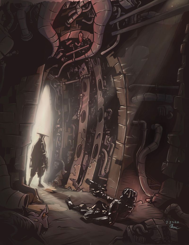
How does his body language look now?
-
@phoenix-yip I'm trying to understand this character based on the other versions, and I think I understand, but might not completely. He looks calm to me, and in one version he is wearing what looks like a white draped cloth and his weapon is clearer. I understand that this might just be because it's part of what sounds like a whole book. I understand the rat more than the characters because that's familiar.

Basically, I would need to go over all your versions tomorrow and see if I can articulate what works and doesn't work in each. -
@carolinedrawing It’s ok! Thank you for trying, I have to turn this in today anyways, thanks for your help!
-
@phoenix-yip Sorry missed your question @phoenix-yip. Yes it was just in photoshop, if you want the brush I think its free and should be easy to find.
I like your update, but I think your should remove or reduce the intensity of the light in the upper left as I feel that it is in conflict with the composition. Have you also looked at using 2 different colors for the scene? I think you might get something really interesting if you played around with it