Our SVS Virtual Studio APRIL 2020🐰
-
Hi @jdubz, although I like them both, I can certainly see what you’re saying. The Procreate piece feels more balanced, whereas the PS version brings my eyes and attention to her hair. I suppose it depends on what your mission is. Either way, beautiful piece!
-
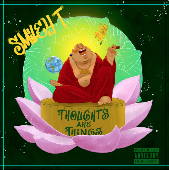
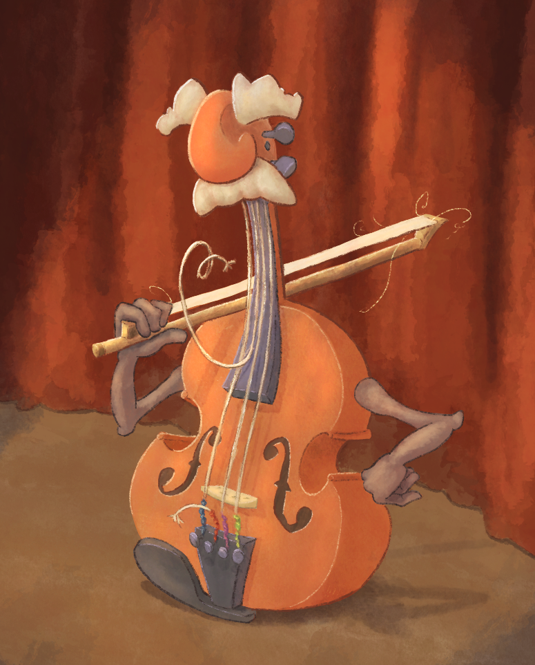
Working on an album cover for a client who raps about peace, politics, the environment and also plays the fiddle.

-
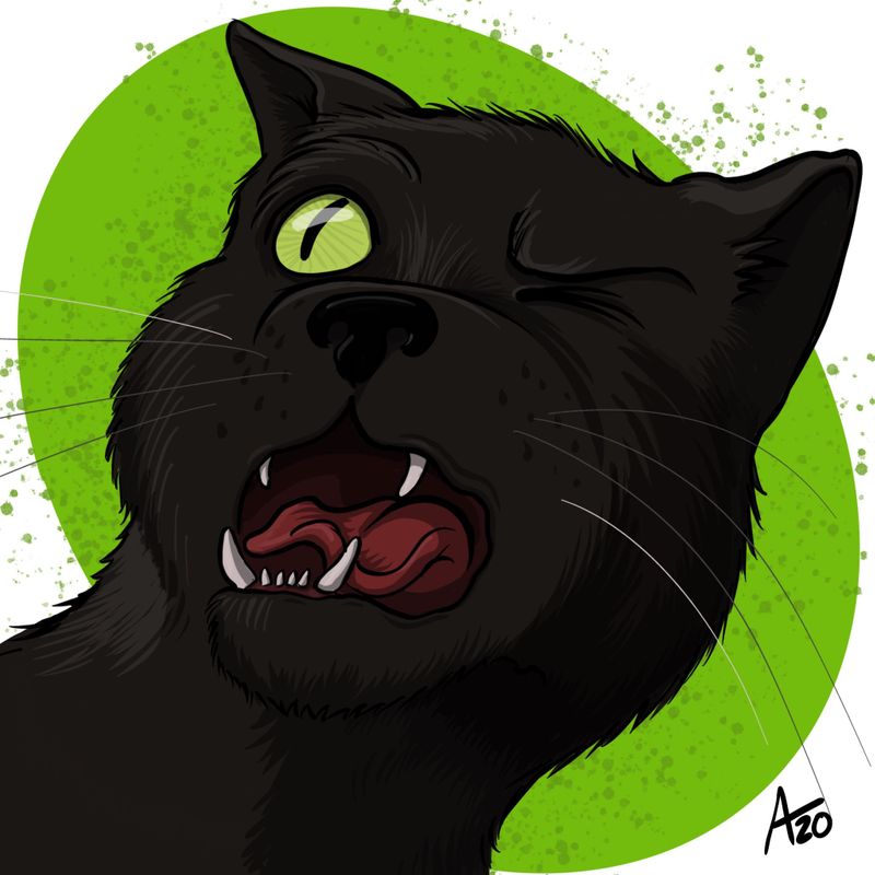
Spending the day watching canceledcon and doodling. Another personal project inspired by one of the cats sneezing in my face.
-
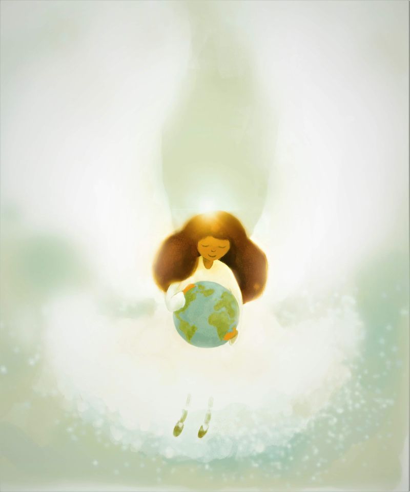
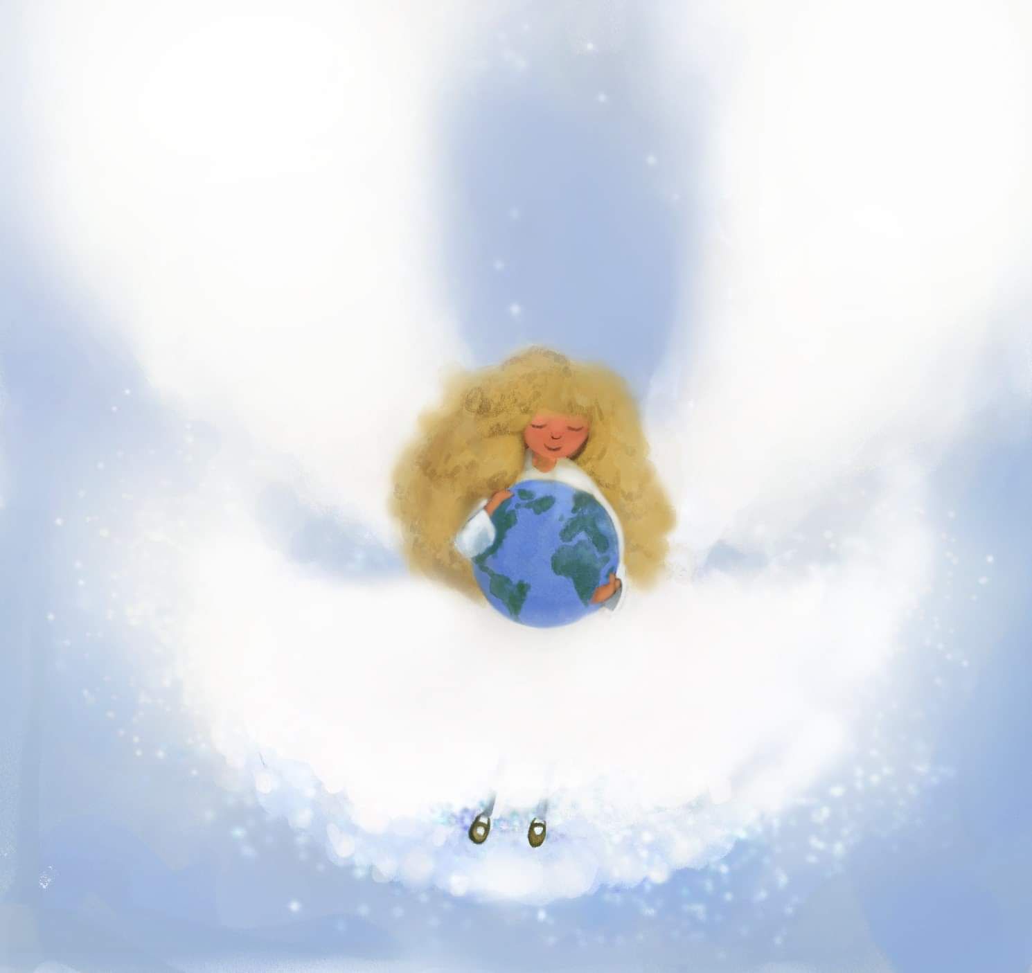
Posted in another thread but worked on my first angel and then did another one. Gonna do more I think. AT least I'm doing more illustrations with a theme of hope to help get me through current times.
-
@SunnySommerset
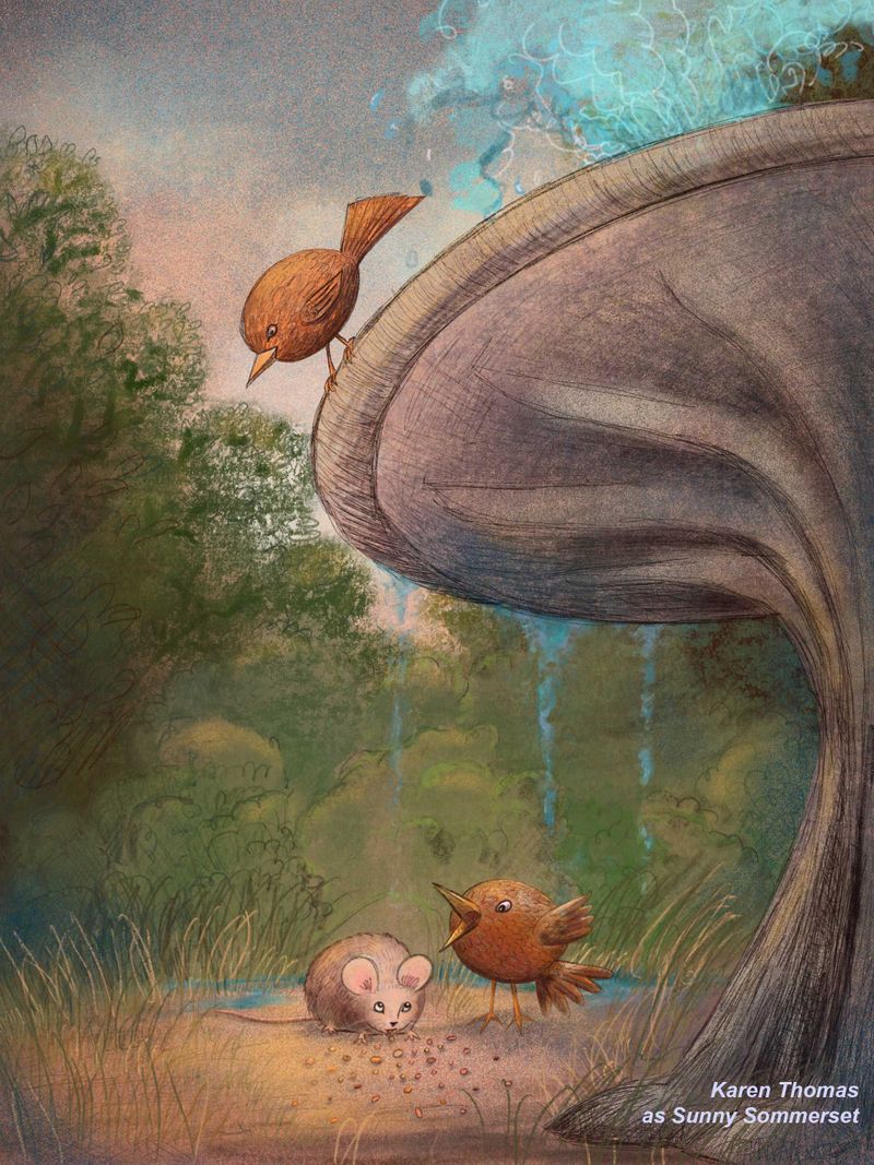
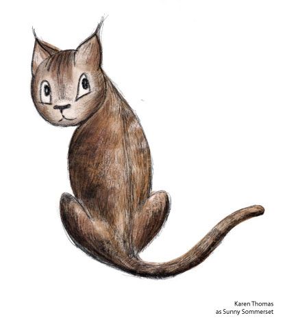
I deleted the background foliage and started over. I really concentrated on a lot of illustrations I've seen. I did a highlight color layer and a shading layer. Looked at it for a while and thought it needed more white - so I did a "white pop" layer behind the mouse, both birds and some of the central area. It looks okay on the screen but when I print it - it looks muddy - and that is mainly the foliage. The characters blend into the background. I did this on Procreate and I really made sure not to have high saturated color. I have another drawing I did of a cat and I like how it prints. It's got the right amount of contrast. Any tips on getting a better handle of on this?
-
@jdubz I'm going through this as well.
I like your Procreate version. It's loose and more painterly. The colors look good - I don't think they are over saturated. Have you printed it? Curious as to what you think.How are you picking your colors on Procreate? After watching Will Terry's live coloring sessions ( only 2 of 3 though) I started my new project differently. I really made sure not to have saturated colors -- I'm using the Value Control on the color generation. What are you using?
I should probably watch a tutorial on creating colors in Procreate. (!) lol.I am using my iPad Pro and Procreate by default because - I cannot do long periods of time on a desktop - with photoshop.
") I'm committed to figuring out the iPad-Procreate combo.
I'm committed to figuring out the iPad-Procreate combo. -
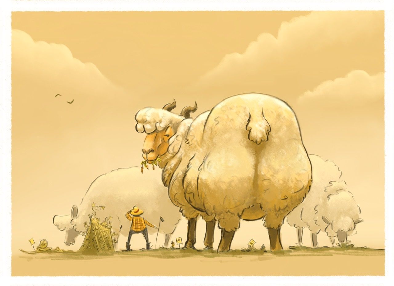
Monochrome Month Prompt for today was Giant in the Garden. Reminded me of some of @Braden-Hallett work. So I went with some Megafauna and thought about some of the lessons/tips from his live stream! Another big thank you, Braden!
If you didn’t get a chance to see it live I recommend watching it when he posts it
Instagram: https://www.instagram.com/eliamurrayart/
Portfolio: www.eliamurray.com -
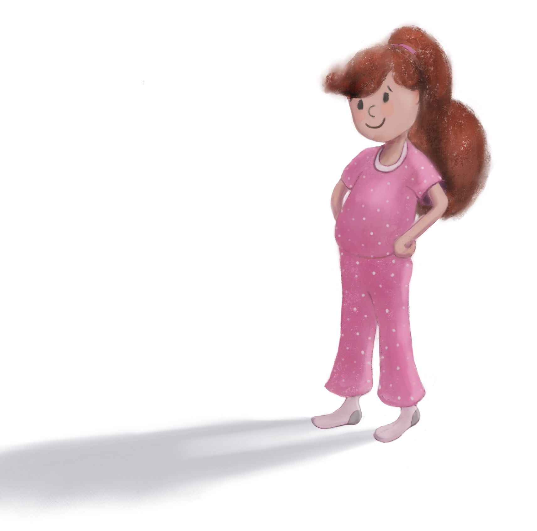
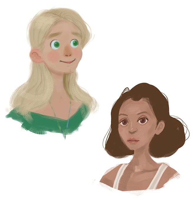
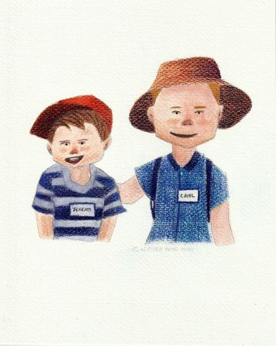
Practicing another character
-
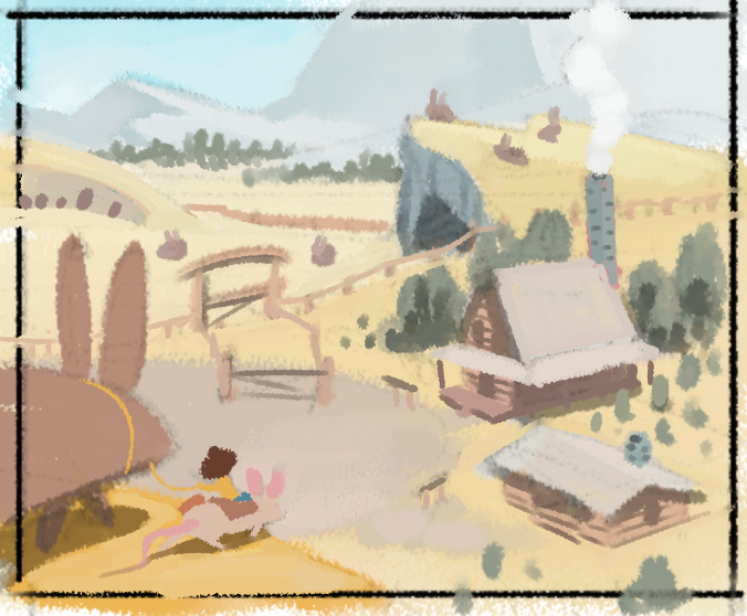
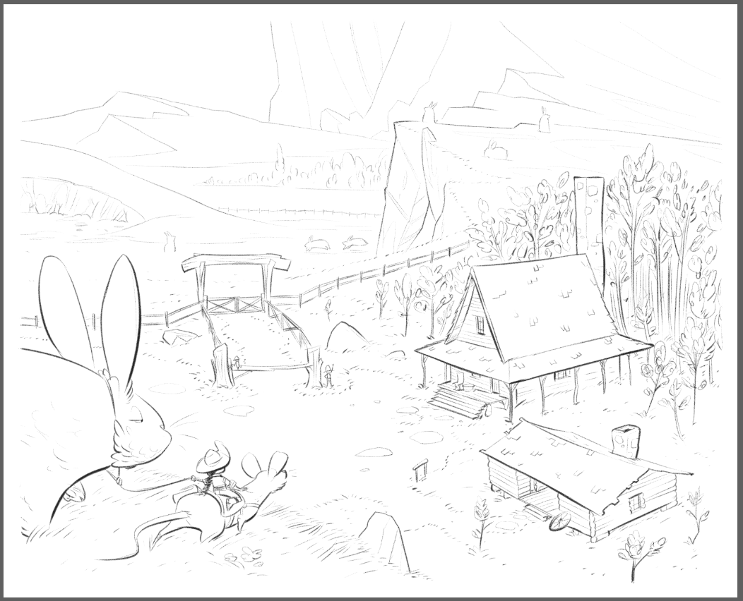
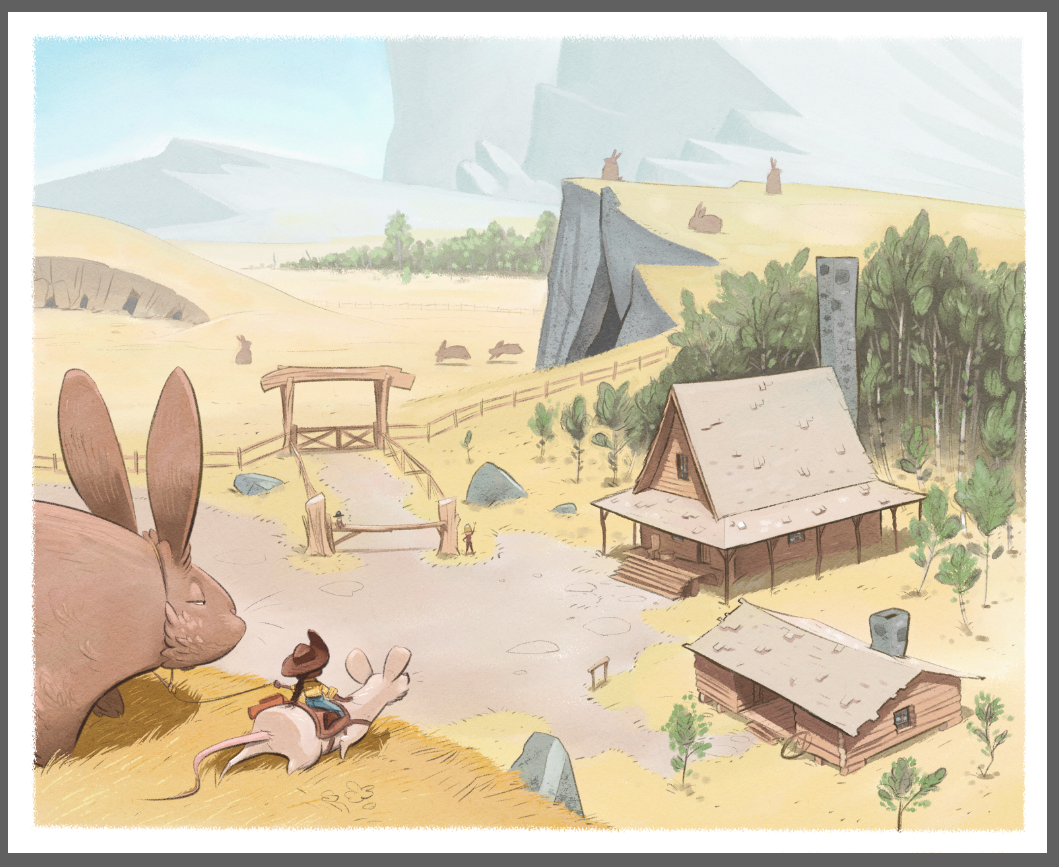
Big ol' dirt hill for the rabbit warren, an area off camera for the mouse nests, and of course a nice hotspring cavern for the capybara.
-
@EliaMurrayArt said in Our SVS Virtual Studio APRIL 2020
 :
:Monochrome Month Prompt for today was Giant in the Garden. Reminded me of some of @Braden-Hallett work. So I went with some Megafauna and thought about some of the lessons/tips from his live stream! Another big thank you, Braden!
Aaaaaaah look at those shepp!
Awesome
And you're most welcome! -
@SunnySommerset So far I've kind of been flying by the seat of my pants in color creation. I think only in the past several weeks have I been forcing myself to set up a color palette thumbnail based on colors that work together.
I'm pretty new to color in general also, so for me I've just been trying to practice every chance I get to build some of those muscle memory decisions.
The biggest change I've made since I really started working with color last year was that I purposely worked in mostly desaturated tones (like nothing over 30%) unless it was the focal point. I think that's done the most to help me than anything else. The challenge for me right now is that the results appear inconsistent between Procreate and Photoshop. I THINK I'm going it in PS, but the results are saying that I'm not doing that great at it, so I'm working specifically to try and change that behavior in PS.
-
Finished illustration for very start of book.

-
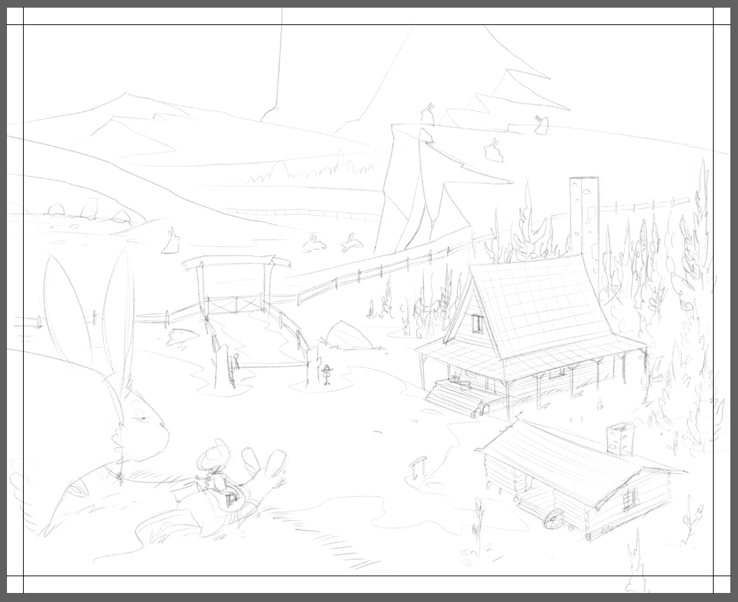
Okeedokee, Thumper. Back to the pen.
-
I’m finally close to finishing my alphabet flash card project! Only two left to take from sketch to finals (I worked them out of order) Thankfully my daughter likes seeing the images.
-
@Braden-Hallett looking great
-
I know I'm posting a lot, but I got this inked a lot faster than I expected
-
@Braden-Hallett don’t apologize for posting! Apologize if you don’t post

This is so much fun to look at and see the environment . Love it

-
@Coley I apologise since I haven't posted yet this month.
On that note I am posting two things. I finished this up yesterday;
Also I started a website. It's a free account for the time being -until I get my stuff in order and making some income from it. It's a start and good start since I've actually did it finally. Now my family who are not on instagram can see my work.
Here it is, https://heatherboydillustration.wordpress.com/ I did struggle a bit with wordpress.
Let me know what you think. Thanks.
Instagram: www.instagram.com/heatherboyd.illustration/
Website: https://heatherboydillustration.ca
Shop: https://www.inprnt.com/search/products?q=HeatherBoydIllustration
Ko-Fi: https://ko-fi.com/heatherboydillustrationBe blessed,
-
All bunnies require an overlook of somekind to keep a wary eye for predators.
I can't imagine the noise when they start stamping their feet on the ground to warn the others.
-
Relaxation sketches.