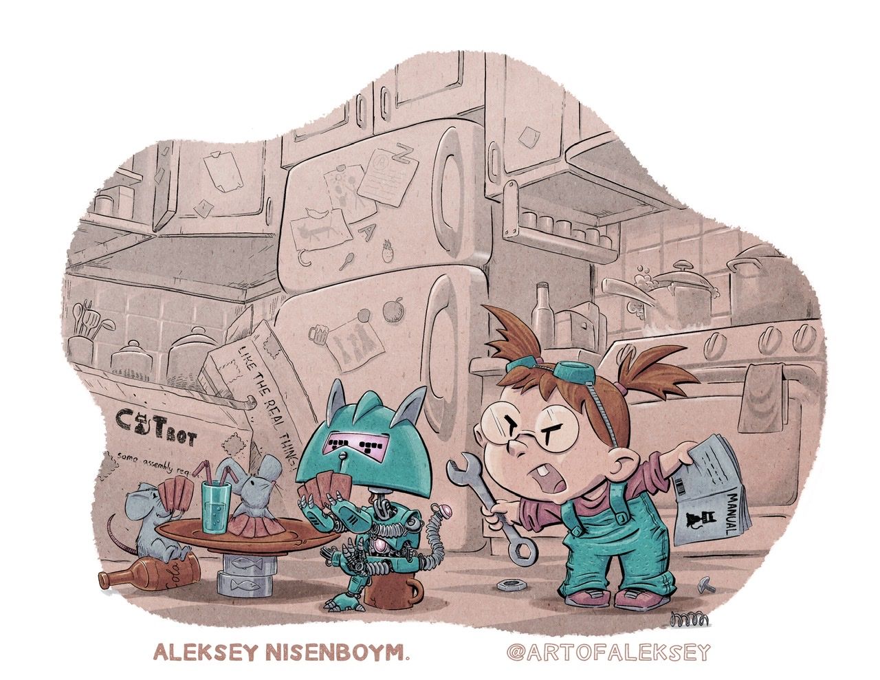
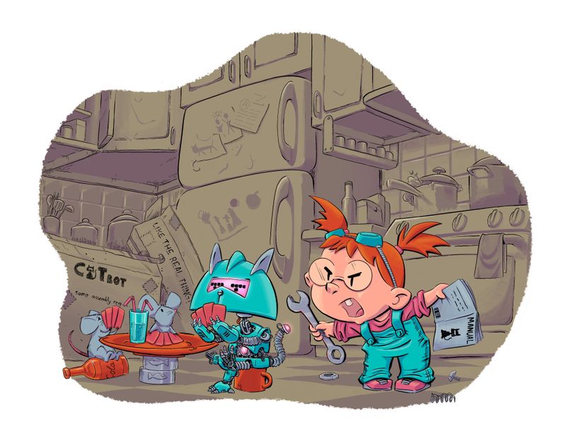
April Contest Cat Bot WIP
-
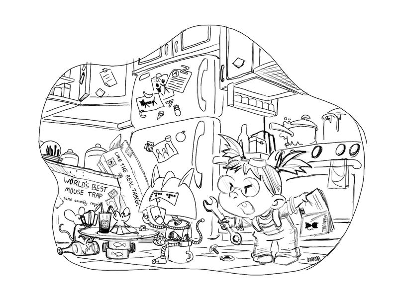
Ok rough line sketch
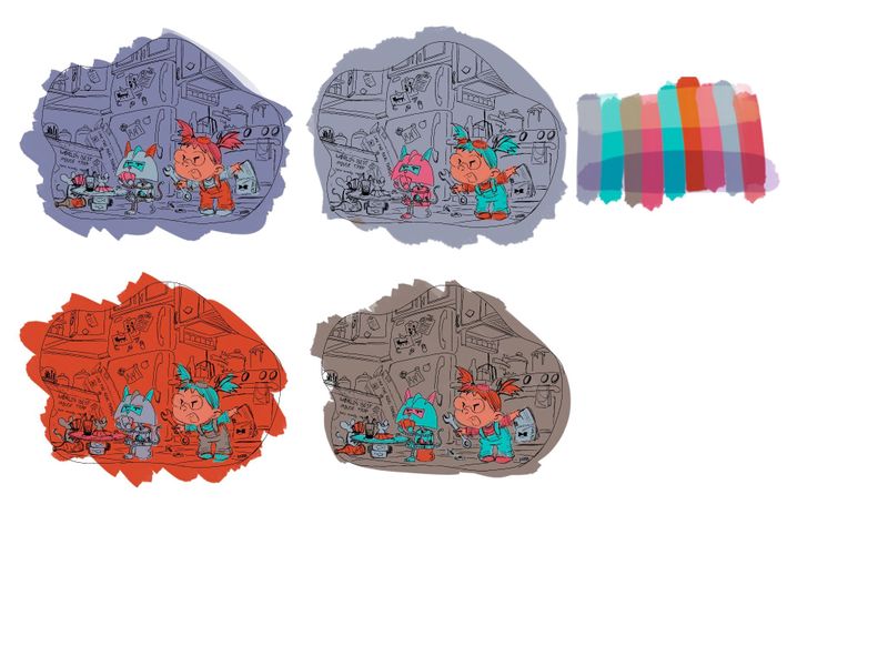
Gonna try that color method i just learned from the youtubes to see if i can make the characters pop
-
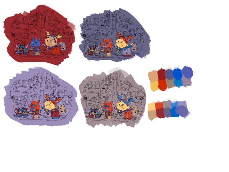
My first attempt at a color study.. gonna try another couple
instagram and twitter: @artofaleksey
alekseyillustration.com -
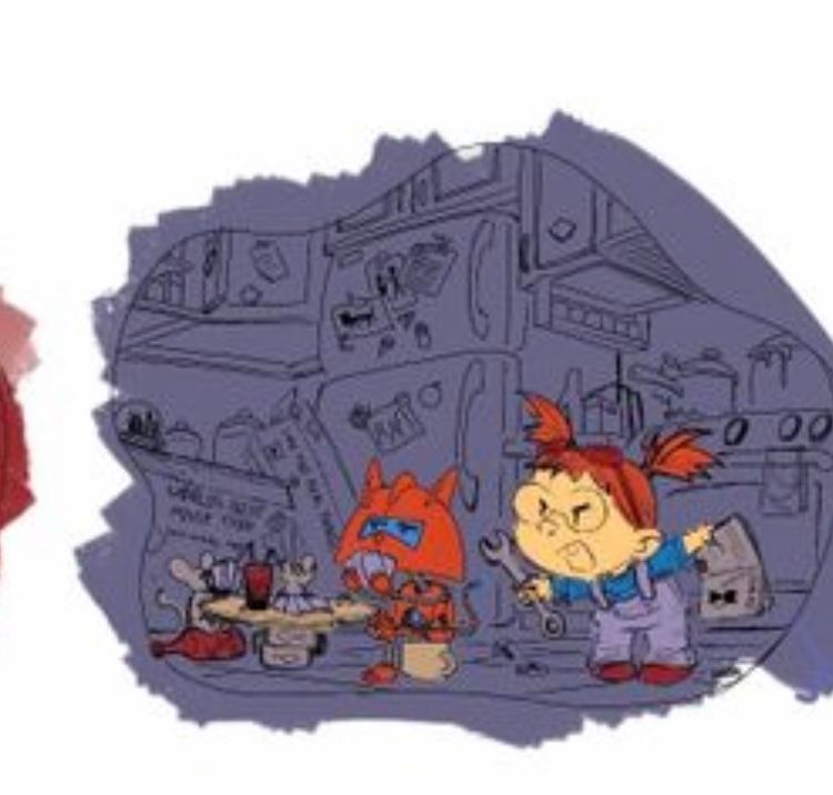
@ArtofAleksey if you wanted feedback It's easier to see the characters on the two on the right.

Check out my art and tutorials :)
Instagram: www.instagram.com/carliannecreates/
Youtube:
https://youtube.com/c/CarlianneCreatesShop: www.carliannecreates.com
-
@carlianne thanks i agree with you
And yes of course feedback is welcome.
Im already at the color study stage and it’s really fun
-
More color Study options
Although these came out kinda dark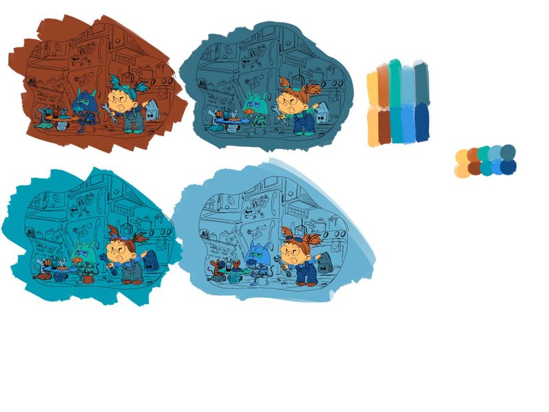
instagram and twitter: @artofaleksey
alekseyillustration.com -
I really love the concept of this, really funny, but also your characters are fantastic. I love the cat’s nonchalant appearance in contrast to the girls outrage
 I tended to prefer the blue backgrounds as seems to help the girl to stand out. Amazing work!
 -
Ok my last color study
-
Ok ive narrowed it down to these 3
The second 2 her face looks a little too pink im gonna mess with that a tiny bit but everything else i like
-
Loving the colour studies !
-
@ArtofAleksey your concept and process is so great to watch, I'm learning a lot! (never done colour studies...)
-
@marine oh awesome im glad that you’re learning from it. I’m actually learning as i go with this one too.
-
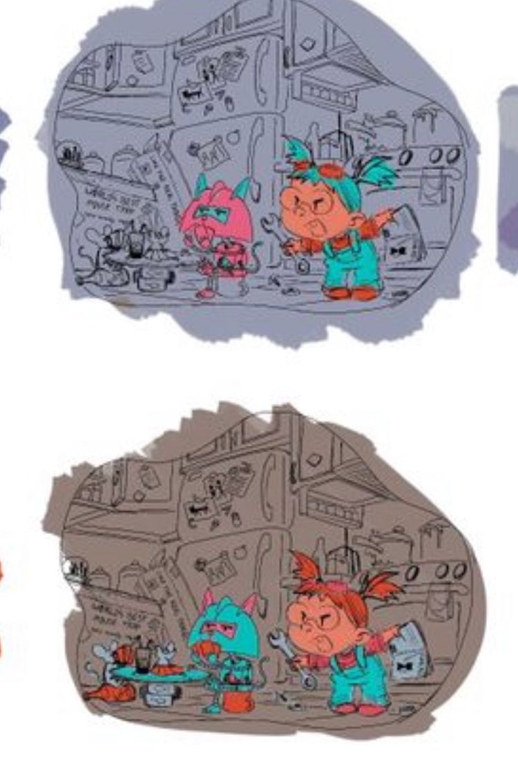
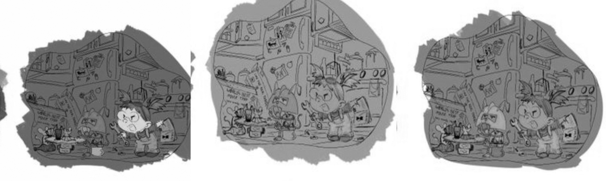
These are looking fantastic, I love your concept and that kitchen design is stellar, personally I'm drawn to the top color study but it may be because the other two don't have much color contrast? (I know these are just color studies and not value studies, just something to keep in mind)
Taylor Woolley
(Formerly Taylor Ackerman / StudioLooong)
Website: www.woolleystories.com
Instagram: https://www.instagram.com/woolleystories/ -
@StudioLooong great point thanks!
-
@ArtofAleksey I find of these the first brown/red really helps pop your characters but find the last lighter blue one softer or easier to look at for my eyes (though the dog gets lost with a blue head). And from the 3 you've chosen the first and I agree with the mention of the value study. I have been doing value studies first then trying my colour studies.
-
Cool concept! I like how well you designed the kitchen; keeping the focus on the characters, while making it look like most of the kitchen's I've been in: busy
I noticed that the box for the Catbot just has the tagline for the product on it, and with most products having the product name in a prominent place on the packaging, maybe it would be good to add a name on there (Whiskers 3000, Catinator 251…etc) either above the tagline or in place of it. I mean, the image reads well enough that I could tell that the Catbot is supposed to get rid of the mice, so the tagline could even go away all together if you wanted.
Looking forward to seeing where you go with the final colour!
-
@JoshSchouwstra yeah I thought about that. But the cartoonist in me couldn’t resist. I’ll try it though because maybe it will be better than a tag line. I can practice my typography a bit
-
@ArtofAleksey great concept. Love seeing your progress.
I echo @StudioLooong regarding value. I think value is especially important with busy scene such as the one you are designing. Keep in mind a simple quesiton may help "is it a dark shape on a light background, or light shape on a dark background?" I would group all background in the same value zone, and simplify the rendering if I can. You could try to use more or less line work for the bakcground, and have a bit more rendering and details going on for the forground characters. -
@xin-li yeah that’s what i was thinking gonna try and see if I can make that happen, thank you.
-
Ok im taking a little break now. Im having trouble tying the background with the foreground and I think that’s because none of the background colors are in the foreground and vise versa. I gotta figure that out, or repaint the background? I gotta push the values a bit more too they are too close.
-