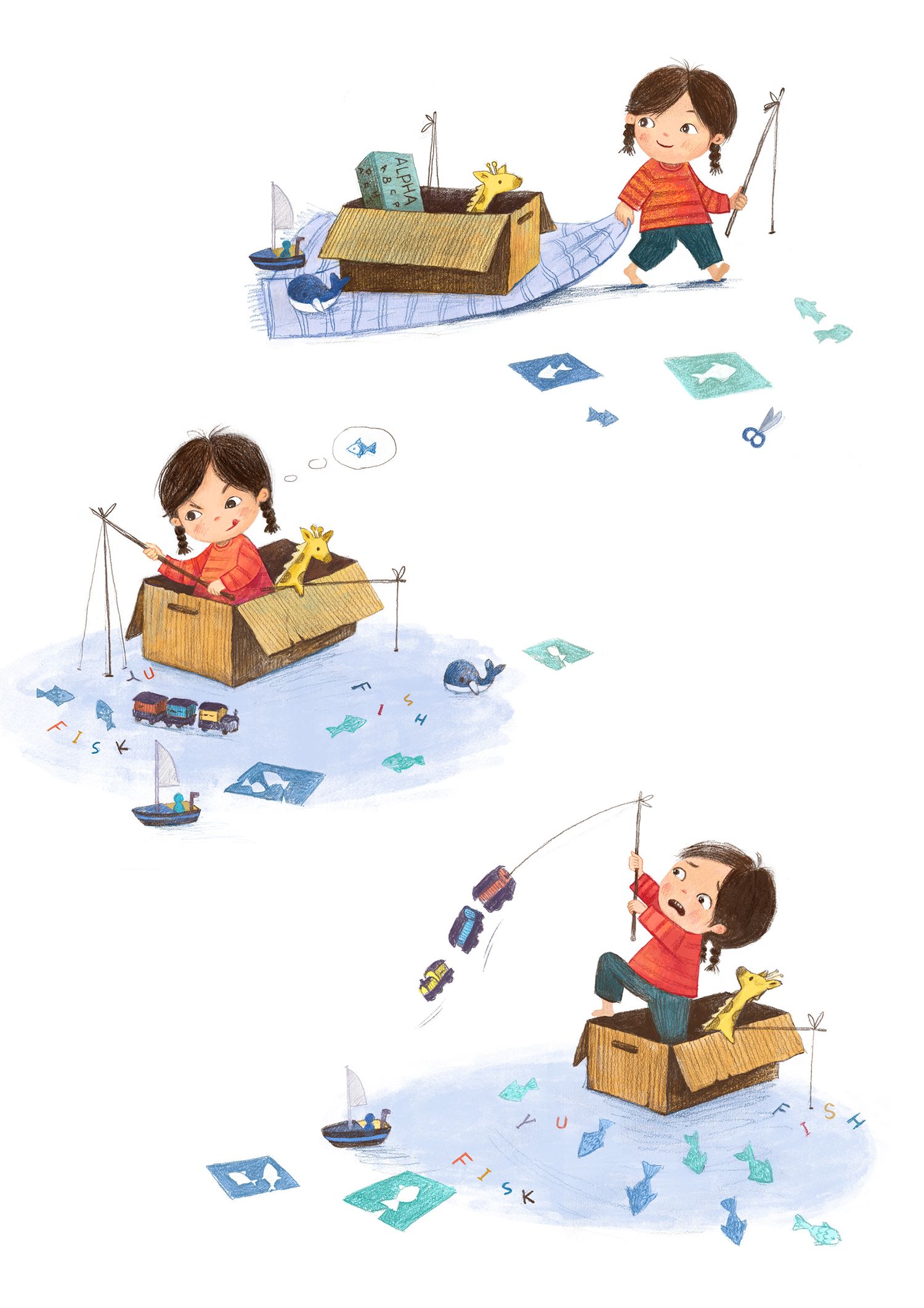
Critique please: little fishing girl.
-
@xin-li Love these, great character design. The only thing that sticks out to me is the hair in the third image has her hair parted further to the right than the first two images.
-
The arms, legs, and eyes don't always correspond - in the last one, her arms feel shorter even though it's an action pose, her leg is much longer with a sharp knee, and her eyes are smaller even though she is widening them.
Her face in the last one is also barely turned compared to the others, while her hair is turned almost to a profile.
Maybe her hand can be closer together while she's concentrating on fishing as a contrast to the other poses.
I don't know that you need to change anything if you're happy with it. I had to really study the images to find these things. I really love the surprised giraffe in the last one.
-
So cute! The last one is so funny with her expression! You really get a good sense of her playing. The giraffe is such a nice secondary focus. Only thing that kind of gave me pause was how she's holding the fishing pole in the second one. It does give a nice silhouette, but it kind of feels unnatural- both to how you'd normally hold a fishing pole and to convey that she's trying to position it to the right spot as a toy. Maybe if her hands were closer together or if her higher hand/fingers were clenched a bit, it would feel more genuine.
-
@JudeKillory thank you for the feedback. The hair/face of the last one seems to have the biggest problem.
@carolinebautista wow. great feedback. I will try to do some work on the third image to see if I can fix some of the more obvoius issues witout re-draw the whoe thing
")
@TessaW Thank you so much. Now I see the hand in #2 and #3 need some work. I first thought maybe toddlers have somewhat odd way of holding stuff. I have to ask my daughtor to hold that toy fishing rod for me to see tomorrow

-
@xin-li Yeah, I could see both of my daughter's at this age holding the pole similarly. We've had a toy fishing pole with a magnet and it was sometimes tricky getting the magnet lined up. I just feel like the top hand would be holding onto the pole a bit more. Right now it kind of looks like it's resting casually and doesn't quite reinforce the concentration on her face.
-
@xin-li I think they're on to something about the hand positions. Young kids tend to hold things in a closed fist, not in a dainty way. Especially while pulling like in the last image. I also feel like her eyes look a bit smaller in the last image? But everything mentioned in my comment and in this thread are very nit-picky, because these are gorgeous and very professional images to put in your portoflio!
vanessastoilova.com
instagram.com/vanessa.stoilova/Check out my Youtube channel for tips on how to start your career in illustration! www.youtube.com/c/ArtBusinesswithNess
-
@NessIllustration thank you so much. I will put in another hour to fix stuff that has been mentioned on this thread tomorrow, and get the illo out tomorrow :-).
Thank you so much, everyone.
-
@xin-li These look so good! Really nice work!
-
@xin-li : These illustrations are adorable! The series feels consistent and grounded on first glance and the points below are things I found after really scrutinizing to look for "1%" improvements:
- Part in hair in 2nd image stands out a little more for me (since hair overlaps more in the first image)
- The fishing pole line in the 2nd image feels rigid and almost looks like there are 3 stiff wires (even if we can decipher it isn't). Perhaps you can reduce it to one slightly curved line (to show pliability) and add 'wiggle' gesture lines toward the bottom? Or lighten/curve the bottom of the two side lines so it doesn't look like it can stand by itself? On a side note I can almost pretend along with the character and confuse whether the blue ground is water because the straight fishing line can look like it is dipping into the rug/water so... it can go both ways!
- I agree with others that the child is handling the pole in a mature (lady-like?) posture. My toddler always wants to hold the very end of a stick or spoon and then hold it at arms length making it hard to control anything (but that might just be unique to my kiddo)
- As @carolinebautista mentioned the legs in the 3rd image are longer. The heights appear consistent for the first two images (assuming she is always standing?). She might be sitting in the 2nd image too, but the box appears to be waist-high in both images.) Maybe referencing the box for height relations can help if you do any future series images.
Again, I write to help brainstorm considerations. The illustrations are fun, light-hearted and relatable!
-
@xin-li these are amazing! Love them
 the only thing I’d point out is that the expression on the second one could be more defined. I think the problem is with the eyebrows. She looks a bit angry, but I think you were going for a focused kind of look, right?
 -
@xin-li they look pretty great!! My main concern on the character consistency would just be the face in the first illo, it looks a bit more round while the others square off a bit more on the sides. Also I think the eyes are bigger in protein there than in the others.
You could always try overlapping the images with one of them at 50% opacity (or more) and check details that way!
The little girl looks especially cute!
-
@xin-li Hi Xin Li I think they are terrific. On the first one, the top of the head is bigger and the left eye needs just a tiny adjustment to make it smaller and lower both eyes a tiny bit.
On the second one the eyebrows can be a bit lighter in color. -
Hei, everyone. Thank you so much for the feedback. I try to incorprate as much as I can without re-drawing the whole thing :-).
I did these with traditonal pencil, and colored digitally. Now I see the challenge of working traditonally - it is a lot harder to make bigger changes without starting over again. I did re-drawing hands and feet digitally, it was a lot harder to match the texture. Hmm, I could use a lightbox just redrawing the hands and feet on paper... I will try that method next time for doing bigger changes next time.@carlianne I definitely should remember your tips in the sketching phase next time.
-
The changes look perfectly integrated. This little series is so cute and feels so genuine to how kids play! Love it.
-
These are fantastic! I was looking at them for several minutes when I noticed that the blanket in the first image turns into water in the second and third images. It was an "Aha!" moment. Very clever. And I love the giraffe to bits.
-
@xin-li That's great!
-
@TessaW Thank you so much. I am glad to hear that.
@baileymvidler So happy that you notice the blanket. I was not sure what I should do in the 2rd and 3rd image in the beginning. I had one version I drew a more detailed blanket, but then it became to distracting. So I truned it into a simple block of color to represent the imaginary water.
@Mara-Price Thank you so much. -
@xin-li I don't have a critique, I just wanted to say that I think these are so fun & fabulous (and will be a great addition to your portfolio)!
-
The character design is very adorable! Good use of color.
I've noticed that the character's proportions within the last two images, felt off. especially with the hair line and hands. The hands in the first image are larger than in other images.
I recommend going back and deconstructing your first desing and examining the proportions. Then reworking the the last two images with your deconstruced design as a reference.
Overall, It's a cute story with a girl and her little griaffe friend. Keep up the great work!
-
I don’t have a critique, Just wanted to tell you I love these! Great expressions and so playful!