WIP - Bongo & Clyde - Feedback Wanted
-
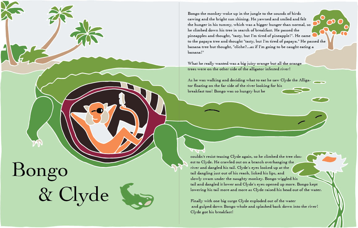
@carolinebautista I wanted to test the change of text all on 1 page. This is what we get.
I like it except for the text over the horizon line. But I am not sure how bad that will be once overlaid on a photograph of the cut paper? Just not sure...
I shrunk the catfish and reduced the contrast by making him green and I believe that is a big improvement. I also reduced the contrast of the orange tree's trunk which I think helps as well.
Open to any thoughts.
-
@theprairiefox This looks great!
"into the river! Clyde got his breakfast!" can be moved right above Clyde's snout in that space under the lily pads. Perfect for it to hover right over that super satisfied expression on his face.
You might want to carry that orange all the way through the arm to emphasize his full pose. I can't figure out any way to use this technique you used to make one leg recede on the arms that doesn't mean missing info. Part of the reason for this is that the arm closest to us is partially cropped. Maybe you can emphasize the relaxed pose by not cropping that - either the stomach shape accommodates his elbow, or he can be brought in front of the stomach.
"Bongo" in the title can be moved nearer the center of the page, it's too close to the outer edge.
The sky doesn't need to peek out of the top right corner.
The lily pad with the flower can also be partially cropped on the side of the page rather than crowding the text too close to the gutter. It's not that you don't have the space open there like you're supposed to, it's jus that there are a lot of words to each line, and that can make the text feel like there isn't enough room.
I really love the catfish but still feel like it doesn't quite fit the rest of the drawing yet - maybe some white outlines? Catfish might do better on the other side of "The end."
Maybe make Bongo's smirk stand out by making his mouth a black line like is eyes? Either that or widen it to make him smile more. A half smile might say mischief more than just a wink, but i'm not sure.
These last two I'm not sure about, so have left them as questions. Since I know your work I'm so curious how you will exactly translate this to paper. You may be able to do something with details like the lily pads and the other side of the river that would make it possible for the text to go comfortably in front, so that your text goes around all the important things and helps emphasize them. These are minor points that have more to do with the text than anything (which isn't really all that important, you're basically there with the composition), so I don't want to get you frustrated. I'm actually feeling the crunch on my contest entry today.
Ok so this post got somewhat out of hand! I confused myself a bit while writing it so it may not make much sense.
-
@carolinebautista thanks for the response.
A bunch of the items you noted are just artifacts of the this being a color test and not truly finished. Bongo's smirk and the no white outlines on the fish for example. There will be NO white outlines but paper over paper. I just wanted to do a quick color representation so it is a little odd.
I will do a revision of the inks today and move stuff as appropriate. It will incorporate both your feedback and that from @Johanna-Kim then I will do a quick color test on the inks and move on to start cutting some cardstock.
Again thanks for the great feedback, it has definitely moved the image forward!
-The Prairie Fox
https://www.instagram.com/theprairiefox
https://www.theprairiefox.com -
@theprairiefox Hi, sorry for the late response. Lovelovelove the color palette you've chosen. Regarding the text, if this were really for a children's book or magazine, the text would be much larger on the page and also ample space between text lines for ease of readability. Check out sample magazine issues from Spider and Cricket on their website. I would suggest placing just enough text that fits comfortably on your layout, and having the rest of the story flow off as if it was continuing onto another spread that we can't see.
I also I really like how you've moved the title to the first page, bottom left. Seeing the fish there now makes total sense to move us across the spread. Also, the flower on the right now makes sense, too. I see you had it all planned out:)
-
@Johanna-Kim thanks for the encouragement. I am pleased with how it is progressing especially with the changes based on feedback.
I think you are right about the text being too small. I will play with that once I get the final photo and decide how much put on. Thanks for giving me permission to let some flow off the page... I was kind of forcing myself to make it fit and it doesn't do it justice.
-The Prairie Fox
https://www.instagram.com/theprairiefox
https://www.theprairiefox.com -
@theprairiefox I kept trying to imagine the pieces in paper.
 I'm not so great at that! Can't wait to see it.
 -
@theprairiefox Actually, another option for the text would be to simply insert some faint horizontal lines where the text would be placed. I've heard from at least two art directors that such lines is a good way to show where you've left room for text, which they love. Also, when I've inserted text into my own finished pieces, I had a recent consultation with an art director who said that it made her think that the piece had already been published, which was not the case, so it was a confusing message. She much preferred leaving the space blank, or placing light horizontal lines.
-
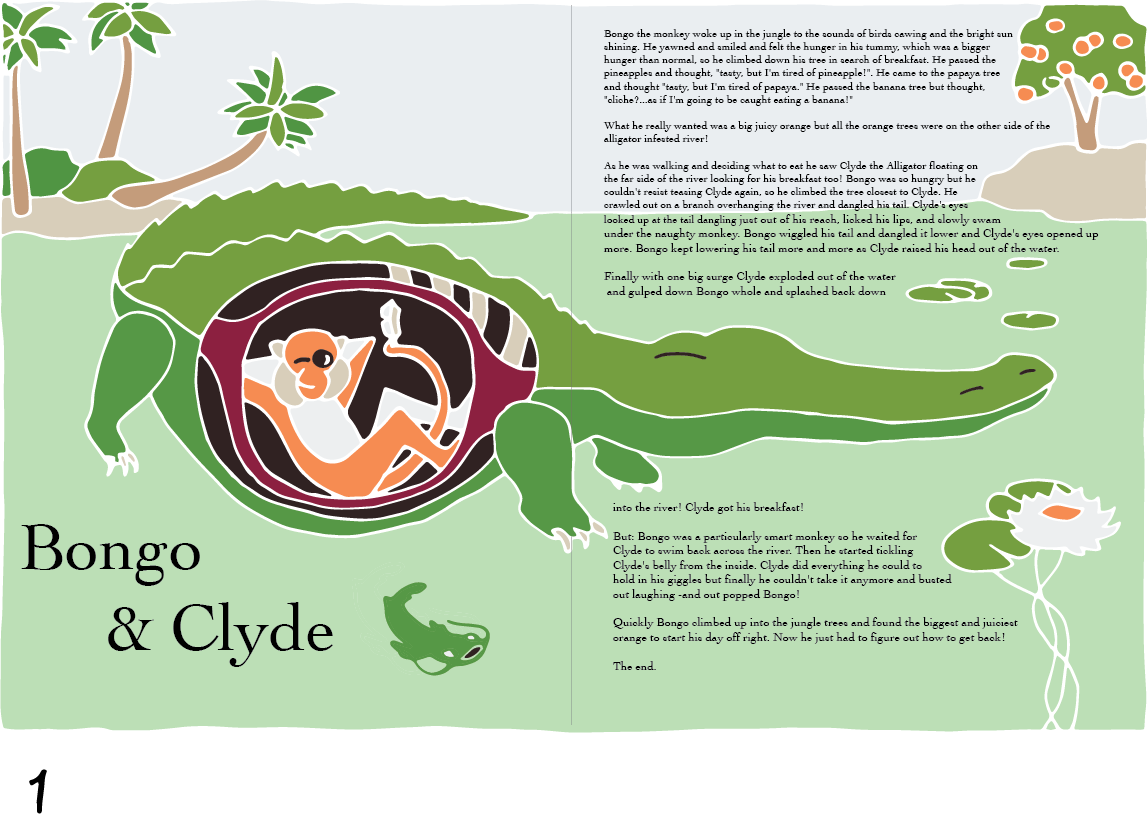
@Johanna-Kim & @carolinebautista here is the updated color study with sketch changes as well.
I updated the following
- Trees now not going off the top and creating eye traps
- Smaller catfish to pull less attention
- Improved drawing of palms and bushes
- Curved the plant stems to draw viewer in more
- Changed stomach to show Bongo's full arms
- Minor changes to back ridges to look more uniform and clean
- Larger oranges
- Moved Title away from page edge
- Enlarged the font and line spacing
Next step is to start creating outlines for paper pieces. Let me know if you see anything that could be updated before I start cutting paper!
Thanks again.
-
@theprairiefox I think this looks great! The only picky thing I would point out is that I don't think the center of the flower should be orange. The color connects Bongo to the thing he wants, so maybe change it to something neutral.
Do you have tons of interesting paper around? Or do you purchase new paper for a project?
-
@carolinebautista I will definitely try a couple of colors in the final and see what works best on the flower.
On the pieces I did last month I used Arches cold press and watercolor them. I wanted to try some paper that was already a specific color this month. So I went on Amazon and found some American Crafts Cardstock. I wanted something with some body to it. I didn't realize this was textured as well but I am excited to see what that will do to the end product.
All of the colors come from the Autumn cardstock package:
AC Cardstock Autumn Variety Pack
I love the muted colors. I also ordered the Summer package. We will see what I can create!
-
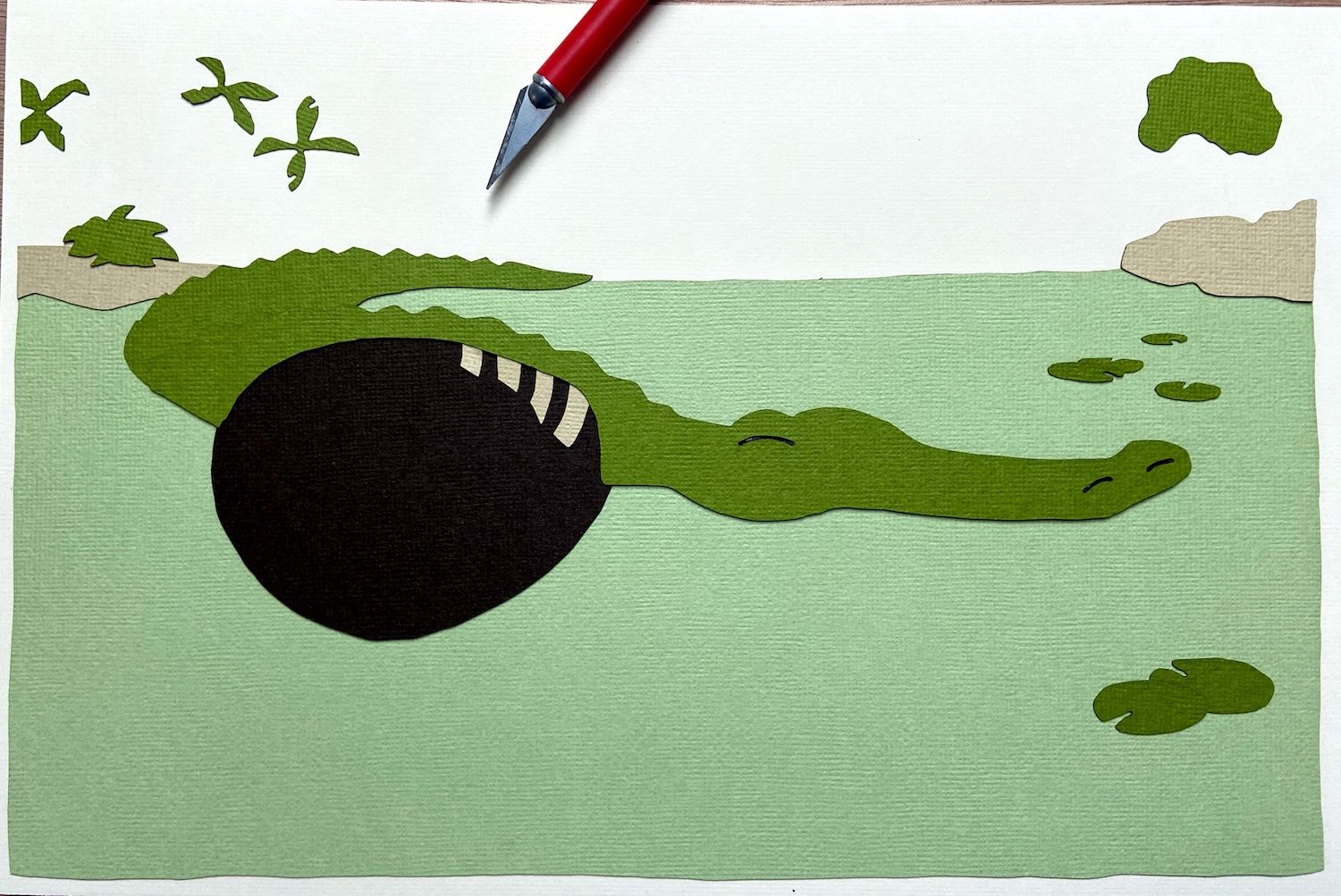
@carolinebautista & @Johanna-Kim I thought I would put a WIP of the cut paper.
I am really liking the textured cardstock and the colors!
-The Prairie Fox
https://www.instagram.com/theprairiefox
https://www.theprairiefox.com -
@theprairiefox I really love the textured paper! I think I might like it better than the watercolor paper, how surprising.
-
@theprairiefox Sorry if I'm late for feedback. First of all, I love your process and all the steps you took to get to the paper cut-out phase. This is going to be a cool piece. The illustration is fun and really pulls me in.
As a designer, I do have some thoughts on your type.
I'm glad you've made some improvements from your original type placement. I agree with the feedback that Johanna Kim gave.
Looking at your latest type treatment, I might have some additional thoughts. First, wrapping text around objects is a craft and is as equally important to a page as the illustration.
In the first paragraph, the rag you have around the tree needs some love. My suggestion would be to drop 'so' to the next line to help fill up that negative space right after 'He passed the...'. I'm also worried about that widow (single word) at the end of your paragraph. We want to do everything within our power to avoid them. Perhaps tracking your type out a bit to force another word or two to drop and share that last line?
On the third paragraph, I would try to avoid breaking any important words with hyphens. A soft return to get 'Alligator' to the next line should help.
The rag on the paragraph below Clyde is perfect! I wonder if you can track that first line in, to bring 'closest' back together. No worries if you can't.
The last paragraph has an odd break at the first line. Seems like there's some negative space after water.
^^^^ These are all minor tweaks that you can make to get your type in a good place. I can't wait to see the finished piece. Great work!
-
@dickdavid thanks for the detailed feedback!
I did not go to this level yet with the text as I was just testing it out. I will definitely pay close attention as I place the actual text over the final illustration. It is great to get the pointers!
-The Prairie Fox
https://www.instagram.com/theprairiefox
https://www.theprairiefox.com -
@theprairiefox forgive me if I went to far in the weeds with that. I hope I didn’t get to prescriptive with my comments. I don’t usually say much, but when I do, sometimes I can’t turn it off. Hahaha.
I’m looking forward to seeing the final spread.
-
@dickdavid it was great insights. Thanks for the comments. Definitely NOT too much. I love feedback and it always improves my pieces.
-
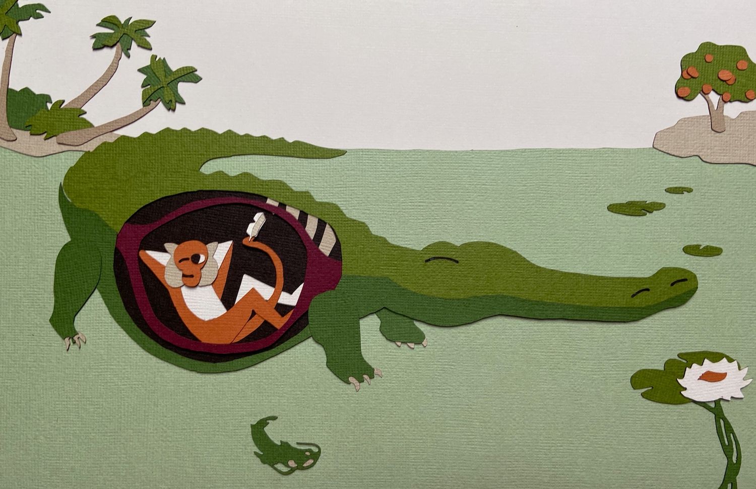
Okay, I finally got to finish cutting all of the pieces! Was down to my last color when I had to run off.
Here is what it looks like in cut paper.
Please let me know your thoughts or any improvements that could be made. It is NOT glued down 100% (some small pieces are glued so I could get it laid out). So changes are definitely an option.
I have some different shades of each of the colors if you think there is a problem.
I will probably glue everything down tomorrow once I have feedback and then move on to putting the text on the image.
I can re-cut anything so don't hold back on feedback because you think it might be too much work.
-
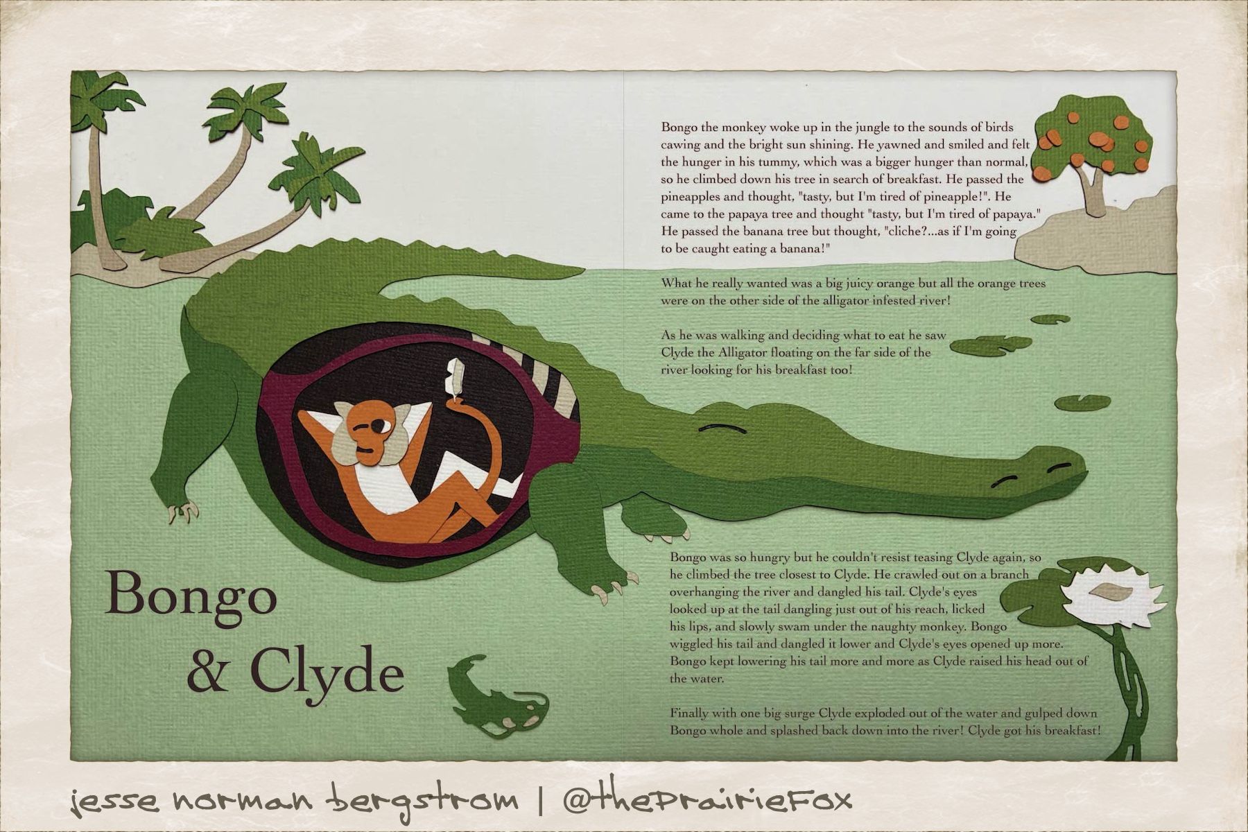
I think this is my final. @carolinebautista, @dickdavid, @Johanna-Kim let me know if you see anything I should change before submitting tomorrow!
-The Prairie Fox
https://www.instagram.com/theprairiefox
https://www.theprairiefox.com -
@theprairiefox Wow, this turned out so beautiful. I love the paper texture and overall look. Not sure if you submitted already, but if you did, it's fantastic. If you still want some feedback, and it's just a personal preference thing I think, I'd prefer that Bongo's gaze lead to the Clyde (i.e., slide the the right). My gaze goes straight to his eyes, which feel like they're moving off to the left when what you really want is to move to the right and then circle back and around. Otherwise, love this. Great job!
-
I love the final piece. The paper craft technique is great and the type looks much better.