Society of Visual Storytelling

    SVSLearn Forums

    • Register
    • Login
    • Search
    • Recent
    • Tags
    • Popular
    • Users
    • Groups
    • Search

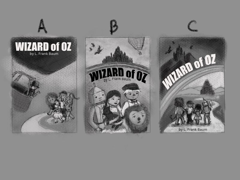
    Wizard of Oz: Pick a thumbnail

    Artwork
    16
    23
    1260
    Loading More Posts
    • Oldest to Newest
    • Newest to Oldest
    • Most Votes
    Reply
    • Reply as topic
    Log in to reply
    This topic has been deleted. Only users with topic management privileges can see it.
    • TessaW
      TessaW last edited by

      I like 8, 5, and 3

      Website: www.tessawrathall.com

      Instagram: www.instagram.com/tessawrathall_art/

      1 Reply Last reply Reply Quote 1
      • sigross
        sigross @holleywilliamson last edited by

        @holleywilliamson I like no 10 the most. I have a problem with No 3. I think revealing what Oz looks like on the cover is a massive spoiler.

        I'm just listening to the audible version with Anne Hathaway reading it to me - so good. And Oz being a mystery is such an important part of the story. BTW I've never watched the film or read the book before.

        www.grossiebazaar.com
        www.sigross.com
        www.instagram.com/sigross/

        1 Reply Last reply Reply Quote 1
        • Aisleen
          Aisleen last edited by

          I like 3, 5 and 11 ... but looking at it again, I also kind of like number 9

          1 Reply Last reply Reply Quote 1
          • MOO
            MOO SVS OG @MOO last edited by

            @Marsha-Kay-Ottum-Owen says: I also like 3's compostion and 4 because she is riding a lion and I think that's pretty cool.

            Marsha Ottum Owen

            1 Reply Last reply Reply Quote 1
            • Kevin Longueil
              Kevin Longueil SVS OG @holleywilliamson last edited by

              @holleywilliamson Very nice! i am liking 9 the best, it stands out as being unique - something i have not seen before for an Oz cover - they all look nice though!

              Portfolio: kevinlongueil.com
              https://www.instagram.com/kevinlongueil/

              1 Reply Last reply Reply Quote 1
              • djlambson
                djlambson last edited by

                I really like #5 as well but feel like its been done in that manner so many times..I vote for #3 for that reason. Its unique and adventurous and looks great as far as composition goes. Love them all.

                https://www.instagram.com/deborahlambson_art/
                https://deborahlambson.com/folio

                1 Reply Last reply Reply Quote 1
                • holleywilliamson
                  holleywilliamson SVS OG last edited by

                  Thanks for all the feedback so far, I usually don’t have a hard time picking a thumbnail, but for A I am worried that it is giving away too much story, also that they all look worried. For B I am worried that it is too generic, not different enough, but you can really see the character design. With C, their backs are shown, which is pretty popular with book covers but is that too easy of a solution? Also For C I was going to do their silhouettes, but then it doesn’t really go with the dark vs. light theme.

                  Let me know which one you like!

                  35825DA6-9988-4841-8502-24ABFD595B30.jpeg

                  https://www.instagram.com/holleywilliamsonart/
                  http://holleywilliamson.com

                  1 Reply Last reply Reply Quote 2
                  • MOO
                    MOO SVS OG last edited by

                    B and C. Though with A I might make the characters a little smaller so thry don't go off the page. That might just be personal preference.

                    Marsha Ottum Owen

                    MOO 1 Reply Last reply Reply Quote 1
                    • MOO
                      MOO SVS OG @MOO last edited by

                      @Marsha-Kay-Ottum-Owen Since my husband is sitting next to me I asked him. He chose 3. Not an artist, just a regular guy with an opinion 🙂

                      Marsha Ottum Owen

                      1 Reply Last reply Reply Quote 1
                      • Neha Rawat
                        Neha Rawat last edited by

                        I like B and C. Leaning more towards C.

                        Any reason they're all looking off to the right in B? Instead, I'd like to see some of the characters interacting with each other.

                        https://www.nrbstudio.in/
                        https://www.instagram.com/nrbstudio.in

                        1 Reply Last reply Reply Quote 1
                        • cszoltan
                          cszoltan last edited by

                          Wow, this is a hard pick. I think nr. 1 and nr. 2 are the strongest. Nr. 3 is split in two by the rainbow, I think that kind of creates an imbalance in the image.
                          In conclusion I think I would go with nr. 1, It is well balanced, the title is super clear, in your face with that strong contrast and also what is underneath fatefully encapsulates the story, and has everything that you need to know about OZ. So yeah Nr. 1.
                          Cant wait to see your Update!

                          C.S.Zoltan
                          Portfolio: www.behance.net/cszoltan
                          Instagram: www.instagram.com/c.s.zoltan

                          1 Reply Last reply Reply Quote 1
                          • holleywilliamson
                            holleywilliamson SVS OG last edited by

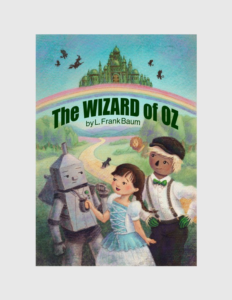
                            Well this is what I ended up with. I wasn’t loving any one so figured it was time to do another idea. I really liked having the characters up close, but added more story. I am thinking of doing some additional black and white illustrations of some of the other thumbs that you guys liked that would be inside the book. Working on character continuity is something I have been working on. Thanks for the feedback!

                            4587E77B-3211-466F-ADE9-F145174A6B81.jpeg

                            https://www.instagram.com/holleywilliamsonart/
                            http://holleywilliamson.com

                            Nyrryl  Cadiz 1 Reply Last reply Reply Quote 3
                            • Nyrryl  Cadiz
                              Nyrryl Cadiz SVS OG @holleywilliamson last edited by

                              @holleywilliamson This is looking really lovely! I love your colors and I love your characters' outfits, especially Dorothy and Scarecrow's.

                              Portfolio: nyrrylcadiz.com
                              Instagram: https://www.instagram.com/nyrryl_cadiz/
                              YouTube: https://www.youtube.com/channel/UCbJCF1Im8ZO7hpGWTKOJMuA

                              holleywilliamson 1 Reply Last reply Reply Quote 1
                              • holleywilliamson
                                holleywilliamson SVS OG @Nyrryl Cadiz last edited by

                                @Nyrryl-Cadiz thanks! Their clothing designs were from the first SVS contest I entered a couple years ago but did not execute other things very well!

                                https://www.instagram.com/holleywilliamsonart/
                                http://holleywilliamson.com

                                1 Reply Last reply Reply Quote 1
                                • First post
                                  Last post