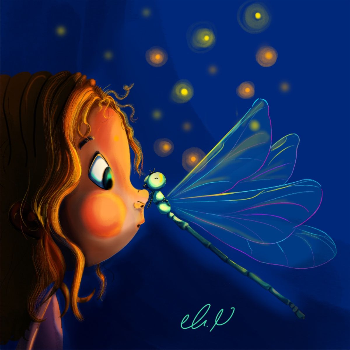
August contest: Dragonfly
-
Hello,
I am new to the community I am so excited I have discovered svs, I saw the contest yesterday, and I really admire dragonflies.
So thought I make this entry.Instagram:
https://instagram.com/ghadeernemer_illustrations
-
@ghadeer-nimer Welcome to SVSLearn's Forums! This is a gorgeous piece! Make sure you're adding it to the official contest entry thread, otherwise it will get lost...
https://forum.svslearn.com/topic/9888/august-contest-dragonfly/161
-
@ghadeer-nimer welcome! It is a cute one! Coreyartus is right! Post it to the thread, it would be a shame if it doesn't enter the contest
That's the one just below, same title with a pin
-
@Coreyartus Thanks a lot! <33
-
@Julia Thank you very much <3!!
-
@ghadeer-nimer welcome to the community and it's great you are joining in with the contest
 Are you wanting any critiques for this painting?
 -
@Gary-Wilkinson Thanks you, yes of course I would love to hear critiques
 ️
️ -
This post is deleted! -
@ghadeer-nimer I think you have a cute idea with the painting, but here are some thoughts I have about how it could be improved:
- Color and light is all about what something is next to, for example -
A grey square will look dark on a white background, but light on a black background.
Red will stand out more surrounded by green
A colorful ball will stand out in a dull and unsaturated room.In this case, everything is saturated and fighting against each other for attention so the parts that you want to be bright and colorful don't feel as colorful as they should be. Another thing to consider if you plan to print in CMYK is that those blues will not print out as vibrant as you see on the screen (same goes with anything highly saturated around the magenta range)
-
I think the composition of the painting could be improved upon by adjusting the pose of the dragonfly or in your choice of where the background lights are.
-
Try to think about where your light is coming from. Is it emanating from the dragonfly or from a source off screen? I'm guessing you want it from the dragonfly, however it doesnt feel light a light source, maybe if you gave it more of an angelic glow or reduced the intensity on the girls face then it fit in better. Do a small quick study to check if the lighting works first.
-
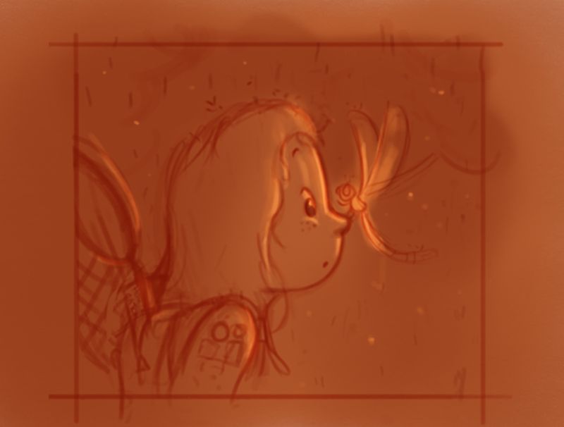
If you are taking part in the contest then a big thing to consider is what the story is. As it stands the story is a dragonfly on a girls nose, how about if the girl was a girl scout looking for dragonflies, but it suddenly rained so she decided to walk home and then one lands on her nose.... . The story can be anything and it only needs a few props or hints to lead the viewer to what the message is.
-
Your signature is very bright and takes up more of the image than it should. I try to make my own signature visible but tucked away and in a way that won't affect parts of the scene
Did a quick sketch of a couple of the things I mentioned and i'm sure you could explore this concept so much more , but remember to keep things basic at first and then build up from there

-
@Gary-Wilkinson
Oh wow! everything you say will make very strong improvements, I am so thankful for all of your detailed comments.
I also really liked the story you came up with.
I really feel excited to maybe redo the illustration later.
I appreciate you taking the time to give me critiques. you are awesome thank you !