Re-working of Ink Fairy
-
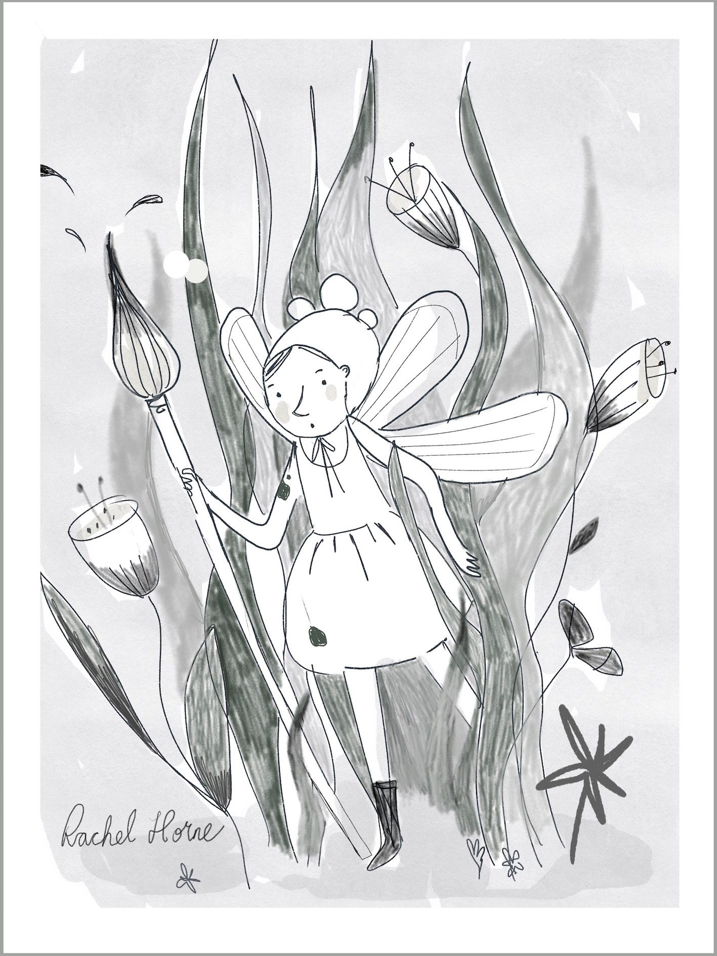
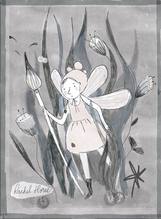
Hi everyone, after the comments about not having enough range in value on the SVS critique, I've re-worked my Ink Fairy. It's very loose as I'm also busy working on Inktober and other projects at the moment. Version A is the submitted piece and B the new one...It looks a bit dark to me now. What do you think?? Should my fairy be a bit darker too?
-
@Rachel-Horne my art teacher say that a way to create light is to use contrast. Maybe the water could be deeper on the ground and lighter up and maybe you could push some dark greys a bit? Not much, but for exemple of the tip of the seeweeds. As a result, your character would be even more the focus? I like your simple style for the character but if you want to build volume, a bit of contrast will be welcome! Again not much, just a touch!
I hope it helps, I am a beginner too and not at all an expert. There are good illustrators on the forum with really good advices. Maybe my post put your thread on top and hopefully they will share their knowledge!
-
@Julia thank you for your feedback. It's not actually water that she's meant to be in...the initial image is meant to mimic an old black and white photograph, hence the bokeh (the little round spots of light) and the seaweed is actually leaves. It's ok, I think the contrast is just a bit too much now, I'm thinking I need to maybe tone down the background a little.
-
@Rachel-Horne oh I am sorry!! I really mistaken it for sea! I should have noticed the flowers, it is definitely not corral!
-
@Julia
") no worries!
no worries! ")
-
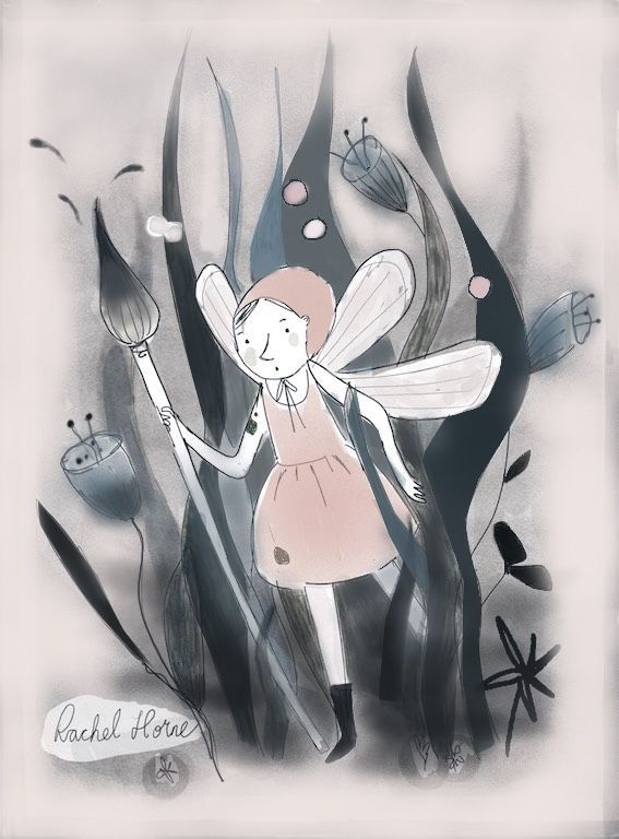
@Rachel-Horne Hi! I really love the style you’re using here, just lovely. I like your original image better than the re-work here. I do think that you could use more darks, but I think the background is just fine how you had it, nice and light. I see you’re doing a sketchy kind of thing on all the grasses and flowers, and I think you can still keep that, just punch up the darks a bit more. It might help when you start a picture to think where is your lightest light going to be and where is your darkest dark going to be, and really push those to the very lightest and the very darkest, so some part of your image should be pretty much pitch black, and some part absolutely white. I took the liberty of messing around with your image in procreate to give show you what I mean. Hope it’s helpful to you!
I also moved the bubble lights off of her head because they almost looked like part of her hat (maybe they were?)
I think just by doing this simple value adjustment , it really makes the fairy pop! I also darkened her hat and clothes a little to give her some separation from her wand, skin, and wings. I tried not to over do it because your style seems to lean towards the delicate colors and I do like that.
-
@VeronicaMui thank you so much for your feedback! That’s so helpful - I really like the changes you’ve made a lot and I’ll definitely re-work it with those in mind. I too think the original looked better but couldn’t see how to add the darks, I think I was a bit nervous about going really dark. That said, my original idea was that the image was actually meant to be an old faded photograph but this obviously didn’t come across...and yes, the little bobbles were a actually her hat
 Tha is again
-
@Rachel-Horne the hat -
 oops! Glad it was helpful!