Society of Visual Storytelling

    SVSLearn Forums

    • Register
    • Login
    • Search
    • Recent
    • Tags
    • Popular
    • Users
    • Groups
    • Search

    thumbnails for a book cover - what do you think?

    Projects
    9
    36
    2416
    Loading More Posts
    • Oldest to Newest
    • Newest to Oldest
    • Most Votes
    Reply
    • Reply as topic
    Log in to reply
    This topic has been deleted. Only users with topic management privileges can see it.
    • miranda-hoover
      miranda-hoover @doro_thea last edited by

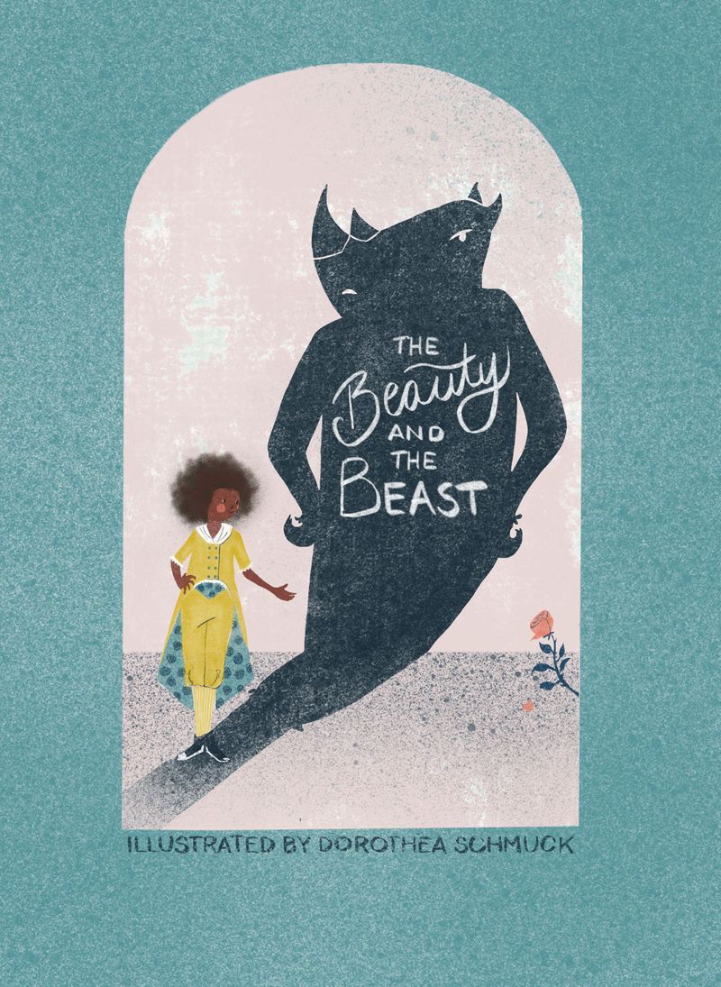
      @doro_thea I really like the direction of this cover!

      My main critique would be the balance of the piece. The illustration seems to be pulled towards the bottom-left corner. Your main character is down there, the shadow is leading down there, the text is leaning that way, and the floor is slanted in that direction. I think shifting some elements around (including straightening the floor--or even having it angle the opposite way) would help--or possibly adding another element to the bottom-right corner of the pink section would add a counterweight. I've found that flipping/mirroring your image is very helpful for getting a fresh look at the balance in an image.

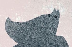
      I agree with what @Jacy13 said about the beast's silhouette. I would also make a slight clean-up to the beast's texture. When I was looking more closely, a couple of the larger dots stood out to me (circled below), and I couldn't stop seeing them as eyes (so may brain saw a rhino--which would be an interesting direction, but I'm assuming not the one you were intending).
      Image 12-16-20 at 10.50 AM.jpg

      The design of her outfit is super cute. The style is very unique and approachable. Keep up the good work! I look forward to seeing it finished πŸ’›

      https://www.instagram.com/mirananemone

      D 1 Reply Last reply Reply Quote 1
      • txels
        txels @doro_thea last edited by txels

        @doro_thea I like the lettering!

        I am not sure I understand the reasons behind the different font sizes though. It feels like "The Beauty" is the title and "and the beast" is a subtitle - is this intentional?

        ---txels.

        https://carles.barrobes.com/drawing/
        https://www.deviantart.com/txels

        D 1 Reply Last reply Reply Quote 0
        • txels
          txels @doro_thea last edited by

          @doro_thea Also have you tried other approaches to her hair? Currently it looks like a background shadow, it doesn't feel like it's in the same plane as the head.

          ---txels.

          https://carles.barrobes.com/drawing/
          https://www.deviantart.com/txels

          1 Reply Last reply Reply Quote 0
          • D
            doro_thea @Jacy13 last edited by

            @Jacy13 thanks for the feedback. I will defiantly look at the hair again. i wanted to get across the stanching idea/technique, where you often have the things not perfectly aligned, but I need to rethink where to do it. Face is obviously not the right place. Thanks for pointing that out!
            Regarding the colour, the dress is yellow, as the beauty in the beauty and the beast is traditionally dressed in yellow. And as Belle does not have the rest of the usual trails in my design ( suit instead if a dress, BIPOC instead of white), I wanted to stick with something traditional. But maybe I need to choose a different yellow tone, or reajust the rest of the colours.
            I'll think about the horns (actually in my character design it did not have actual horns, but hair that sticks out like horns, but maybe I should relook at that as well...)Untitled_Artwork 38.jpg

            Jacy13 1 Reply Last reply Reply Quote 1
            • D
              doro_thea @txels last edited by

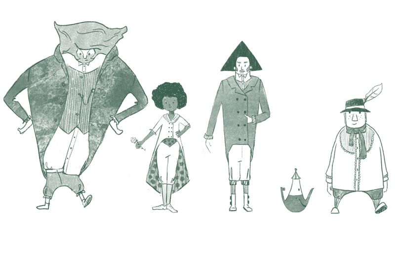
              @txels Hi, thanks for the feedback. It is not intended to be a subtitle. So I will relook at it and maybe adjust the size of the lettering. And I will look at the hair as well, not 100% sure what I want to do with it though...

              1 Reply Last reply Reply Quote 0
              • D
                doro_thea @miranda-hoover last edited by

                @miranda-hoover Thank you so much for your feedback. Very appreciated.
                I did a super dirty draw over. do you think this improved the balance?
                bookcover WIP.jpg
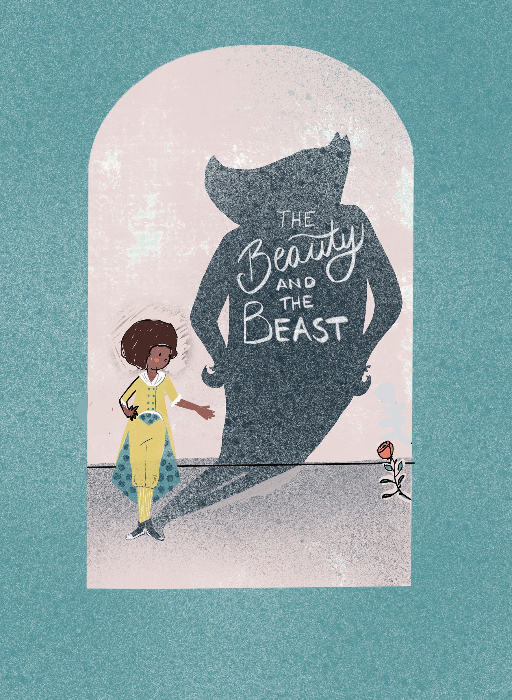
                Thanks for the tip with mirroring.
                I will defiantly clean up the the texture of the beast and I guess I should look into the silhouette again as well. Not sure what to do yet, but I'll have a look.
                any more feedback?
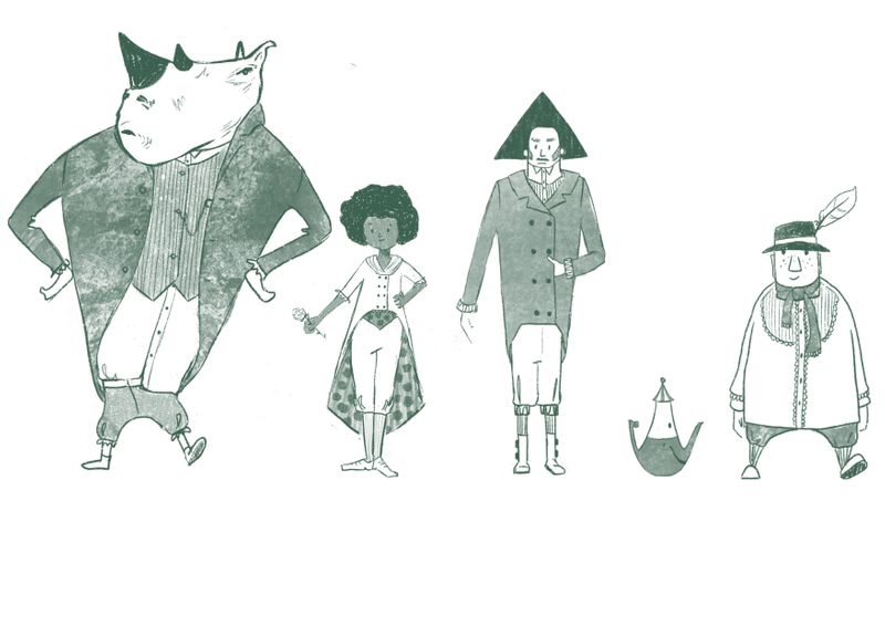
                BTW: I love the Idea of a rhino. I am considering to redo the lineup with a rhino designed beast.πŸ˜‰

                miranda-hoover 1 Reply Last reply Reply Quote 1
                • krish iyer
                  krish iyer last edited by

                  I had a hard time picking between these, I don't know what exactly this character or book is all about but they all look really promising!
                  They all have a different vibe to them and look like they tell slightly different versions of a story.
                  out of these however, I personally really liked c and d !
                  These thumbnails really made me stop and think about the story and the cover and the character and what they all mean!
                  that alone is amazing about your designs so great going!

                  D 1 Reply Last reply Reply Quote 0
                  • Jacy13
                    Jacy13 @doro_thea last edited by

                    @doro_thea Okay, see the color choice for the suit makes more sense knowing that. I admittedly don't know much about princess stories, so I wouldn't have known about the yellow color of the attire at all. Oops! πŸ™ƒ

                    And I didn't know that your Beast doesn't have horns per say. Either way, I would still think about exaggerating that part in your silhouette. πŸ™‚

                    Deviantart: https://www.deviantart.com/jacy13
                    Instagram: https://www.instagram.com/jacy13draws/?hl=en
                    Portfolio: https://jacy13.artstation.com/

                    D 1 Reply Last reply Reply Quote 0
                    • miranda-hoover
                      miranda-hoover @doro_thea last edited by

                      @doro_thea Yes! I think the balance is much better. I'd probably tilt the line of the floor a bit more towards the right--but that's probably just me getting nit-picky.

                      Looking great πŸ’›

                      https://www.instagram.com/mirananemone

                      D 1 Reply Last reply Reply Quote 0
                      • D
                        doro_thea @miranda-hoover last edited by

                        @miranda-hoover Thank you! I'll also try the the tilting the floor, as I really like how your feedback influenced my design.

                        BTW tried out the rhino beast. And I am actually considering to rethink my line up, as i think it is so much fun πŸ˜‰ Untitled_Artwork.jpg

                        miranda-hoover Kori Jensen 2 Replies Last reply Reply Quote 1
                        • D
                          doro_thea @Jacy13 last edited by

                          @Jacy13 I will look into how to exaggarate the "horns". I think this is really good feedback that the silhouette needs to be more interesting...

                          1 Reply Last reply Reply Quote 1
                          • D
                            doro_thea @krish iyer last edited by

                            @krish-iyer Thank you so much for your opinion. What stood out for you on C and D? anything in specific?

                            krish iyer 1 Reply Last reply Reply Quote 0
                            • miranda-hoover
                              miranda-hoover @doro_thea last edited by

                              @doro_thea Really cool! Definitely makes it unique!

                              https://www.instagram.com/mirananemone

                              D 1 Reply Last reply Reply Quote 0
                              • Kori Jensen
                                Kori Jensen @doro_thea last edited by

                                @doro_thea is it just me or is the best really standing crooked?

                                https://daddydudeler.wixsite.com/portfolio

                                D 1 Reply Last reply Reply Quote 0
                                • krish iyer
                                  krish iyer @doro_thea last edited by

                                  @doro_thea I liked that they were both simple and like representations of the characters and in a way open to interpretation, I liked the silhouette style of c and how simple and neat d was

                                  D 1 Reply Last reply Reply Quote 0
                                  • D
                                    doro_thea @Kori Jensen last edited by

                                    @Kori-Jensen yes, it is. will change πŸ˜‰

                                    1 Reply Last reply Reply Quote 1
                                    • D
                                      doro_thea @krish iyer last edited by

                                      @krish-iyer Thanks for the explanation, I was really drawn to the silhouette style as well, so maybe I will make a second version later on.

                                      1 Reply Last reply Reply Quote 1
                                      • D
                                        doro_thea @miranda-hoover last edited by

                                        @miranda-hoover Thanks for the great Idea πŸ˜‰

                                        1 Reply Last reply Reply Quote 1
                                        • D
                                          doro_thea last edited by

                                          I worked some more on it. Any final feedback before I call this finished?
                                          bookcoer.jpg
                                          And thanks for everyone who commented so far. I really appreciate your feedback!

                                          1 Reply Last reply Reply Quote 0
                                          • Asyas_illos
                                            Asyas_illos last edited by

                                            Very nice I like the single rose in the corner

                                            Asyasewardillos@gmail.com
                                            www.Instagram.com/asyas_illos/
                                            https://asyasewardillos.wixsite.com/mysite

                                            1 Reply Last reply Reply Quote 0
                                            • First post
                                              Last post