What’s missing?
-
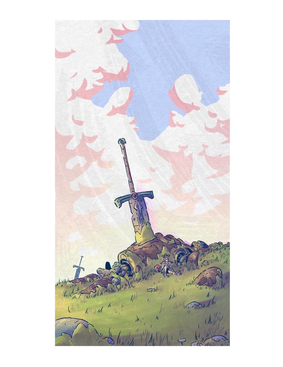
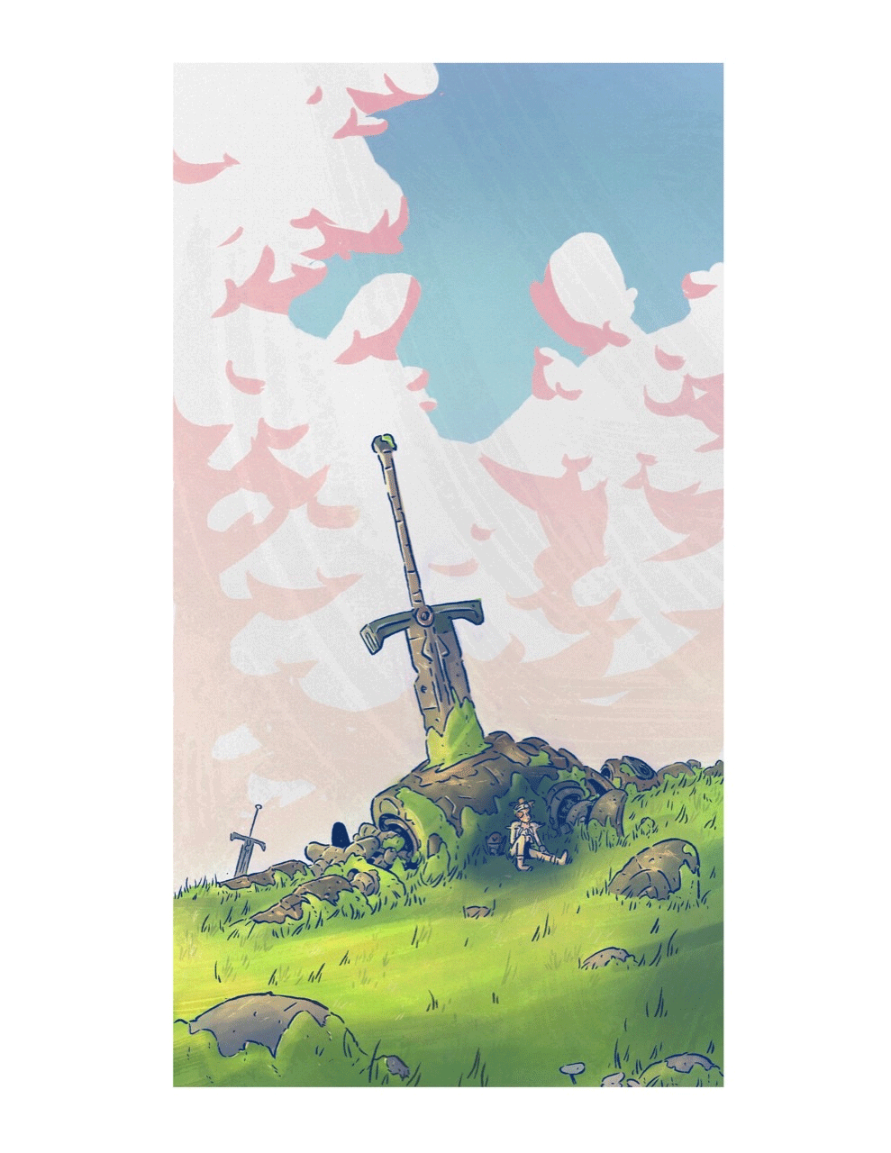
What do you guys think about this piece? It holds a special place in my heart and I want it to be the best I can make it. Any critiques or comments would be very appreciated. Thank you! -
@phoenix-yip I think the image is okay, but perhaps the issue is the foreground.
I feel like you should perhaps crop it so that it takes more of the canvas and really emphasizes the scale difference between the sword and the little person, all while keeping the sky in place.
Another tip I would suggest is creating a figure-ground by making keeping the sky bright but have the main focus of this piece a little darker with shadows to create a good contrast. Here's a final mockup.
Finis Coronat Opus
Instagram: www.instagram.com/madgcartoons/
Behance: www.behance.net/madgcartoons
Website: https://michaelangelodgo.wixsite.com/madgcartoons -
I love it. haha. My nitpicking critic:
- move the foreground to the right so that the sword is not bang in the center.
- If you want to direct the eye to the person, perhaps make a creative decision to add a light to your focal point(make the colors in that area more saturated).
Aside from that, great job. It's already perfect haha. Hope to see more of your story
")
Instagram: https://www.instagram.com/donnamakesart/
Behance: https://www.behance.net/donnamakesart
Website: https://donnamakesart.com/ -
It looks really fun! I would love to know the story behind it. I would have to agree with @donnamakesart 's comment. If it's about the person, it takes a while to see him. I think he blends with the background. But if the main story is about the sword and the person is just there for scale, I think it's good to go.
-
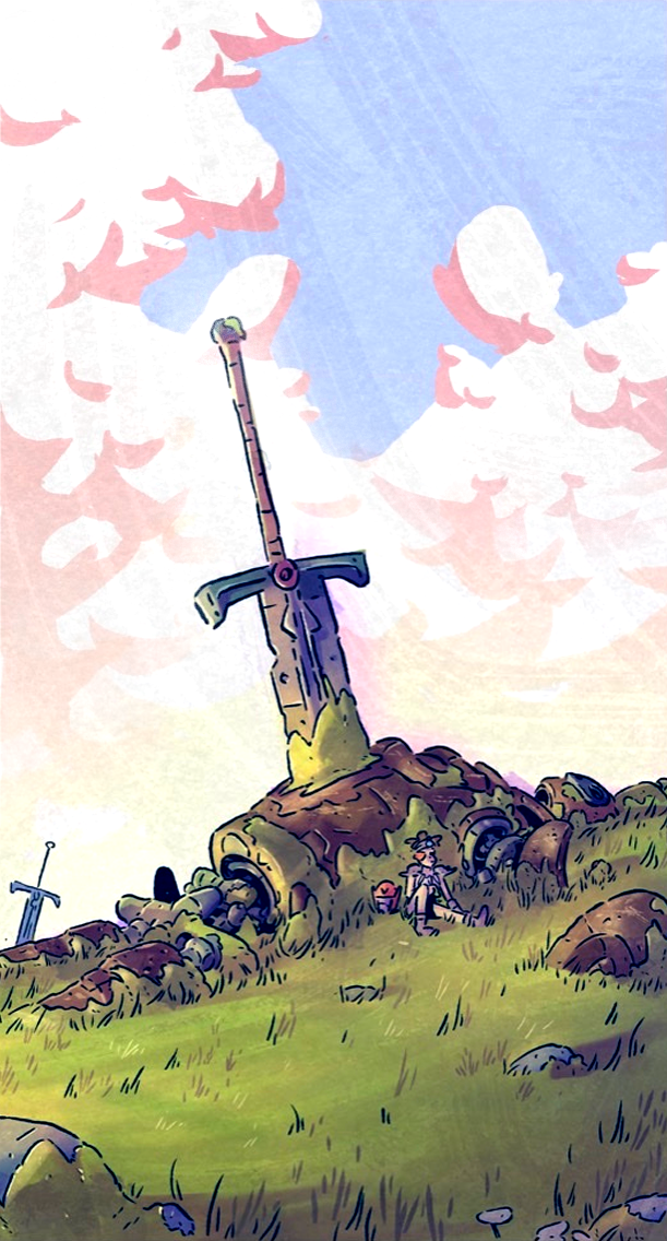
@Michael-Angelo-Go Great tip about the cropping.
-
@Michael-Angelo-Go thanks so much! Yeah for the cropping I plan to post this on insta and their cropping is weird so that’s why I pit white around. It does look much better though, and the contrast top really helps. Thank you!
-
@phoenix-yip really love this piece. A lot of the stuff on my "inspiration" Pinterest board looks like this. It’s a style I’m working on developing in my own work. As for a critique the only thing I can say is crop in just a bit.
Again, really lovely piece. I’m a big fan of it -
@donnamakesart
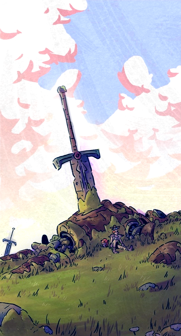
How is this? I tried emphasizing the character a little more and moved my foreground to the right a little. I do like the idea of letting the viewer explore the piece rather than being to focused on one point, but I also do like having a focal point that ties together the entire thing, so I’m just trying to find that balance Ig. Thanks for your help! Really appreciated -
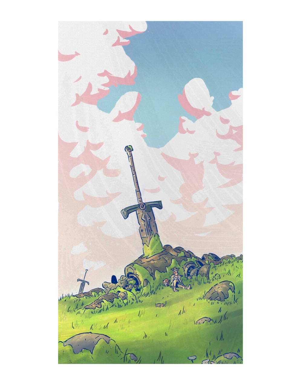
Hi @phoenix-yip I absolutely love the design of this piece.
I must admit on my first look I completely missed the character sat at the base of the sword.
I would go even further than what you've done here and darken the area around the character to make their silhouette pop out to the viewer.
I hope you don't mind I've done a very quick paint over to show you what I was thinking
-
@skillydan that’s a great idea, thanks!