February Yeti cooking -update with 3d model
-
@Georgios-Christopoulos thank you!!
-
@Kevin-Longueil looking great, I like him larger as well
-
@Kevin-Longueil The scale increase really works! Liking your composition and the story you're telling. Great job!
Something you may want to consider is dialing back on the detail. This would be a stronger spot illustration and would have more impact if the background detail was reduced or even completely eliminated. (Just my opinion, though.)
And you probably already have this covered, seeing how this is just a sketch, but thought I'd mention it anyway ... the realistic hands don't match the stylized and smooth lines of the rest of your yeti, and I feel that disconnect. But as I said, this is probably just the sketch and you've got it well in hand (no pun intended, haha!).
Really, really looking forward to seeing the finished piece!

-
@KaraDaniel Thank you Kara!
@Melissa-Bailey-0 Thank you for the feedback Melissa! You are right about the hands... they have blue fur on them now and are not as out of place i think. I'm thinking you are right about the background too. I think I will most likely keep the background though .. i have so many pieces with no background on my portfolio website that i think i need to show that i can draw an environment... so i was going to try to get this to work.
One other random thing is i am going to try to make 2 more pieces with this kitchen or these characters in it somehow... I really think that is lacking in my portfolio also.. showing any kid of continuity of environment or character.... i just paused to look at your website Super Nice work!! Thank you again for the feedback! -
@Kevin-Longueil thanks so much!

-
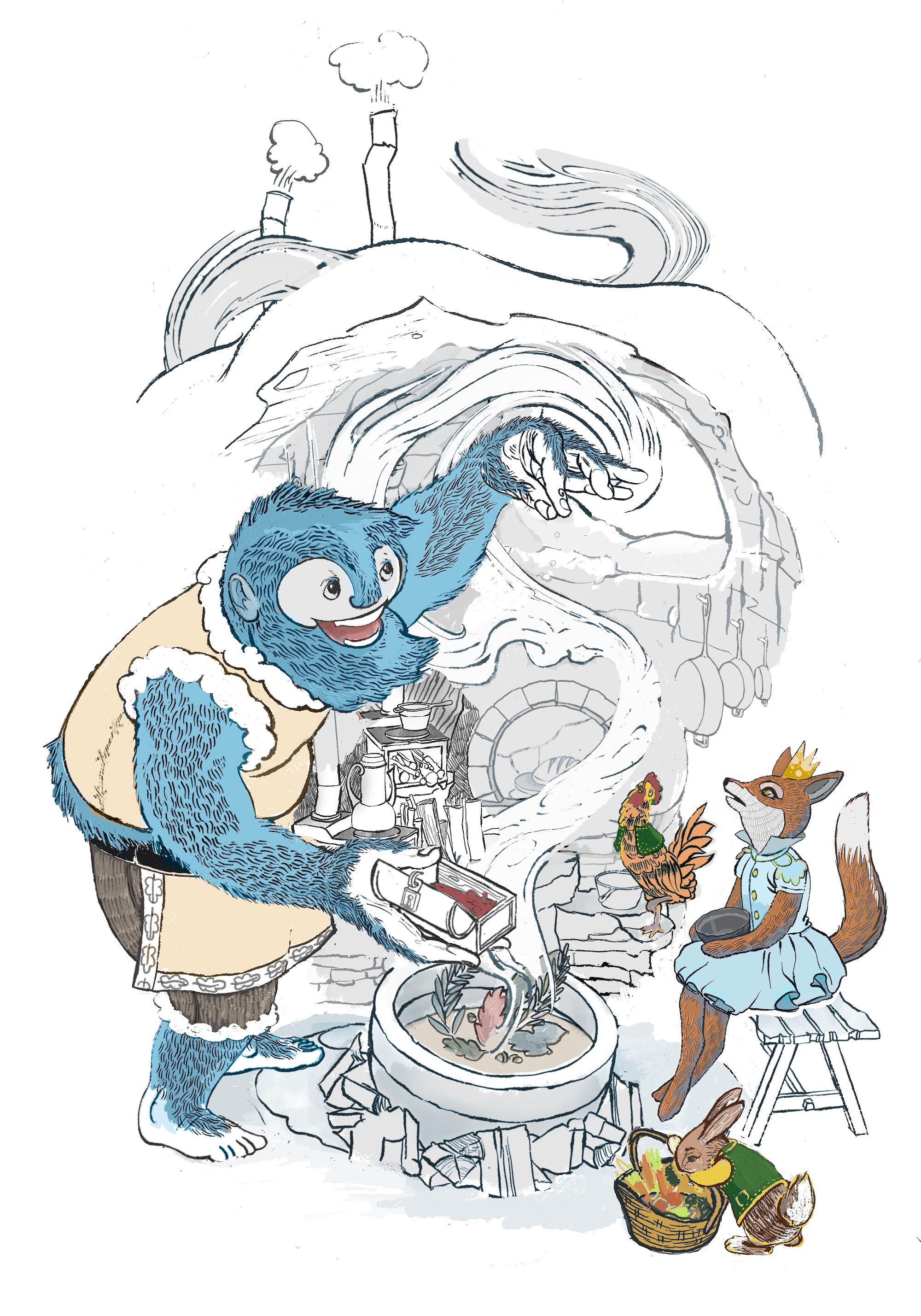
@Kevin-Longueil I feel like there was not enough story going on... the bunny and rooster are really rough and scribbly but i think i am liking them ... i tried all kinds of animals - a goose almost made the cut - i did want a chicken or rooster in there from the start though so it was probably inevitable - my colors and rendering are all over the place and not final....still messing with the composition and story.... I increased the scale of the fox which i'm still not sure about... not sure about the crown on the fox or the cape on the rooster either..... or have i gone off the rails in general and should go back to just the yeti and the fox???? any feedback is always very appreciated - thanks for looking
")
-
I love this one! I think it's a great composition, and I love all the quirky characters. Really looks like a fairy tale story I'd love to read. I like how the bunny is doing something different at the bottom, a great detail. The fox and the rooster are good, but they almost look identical in their reactions. Maybe give the fox a different expression? I know you said the colors aren't final, but the red and green is really isolated on one side of the image, so you might want to put some on the Yeti to keep the image consistent? Overall, really awesome! Great job!
-
@MarksByMallory Thank you for the feedback! - Super helpful
-
Wow! This looks awesome! Just an idea but I think going with a real minimal blue toned colour palate could be something to play around with. Like an icey blue tone getting less blue/cold looking around the warm from the cooking. Hope that makes sense.
-
@Richard-Matthews Thank you for the feedback! You are totally right! There is is no color harmony going on in this piece at the moment... i think what you've mentioned is kinda my plan alf the time... i do want some warm tones from the fire and possibly the oven(s) by the end... though i keep going back and forth .... the background looks much better as warm earthy tones than it does as an ice cave...so i'm not sure...maybe blue livery for critters too might help? The yeti really pops with an earthy background... when i get that far i'll post both ideas and maybe you can let me know what you think? Thanks again for the feedback!
-
@Kevin-Longueil you are welcome, I'm glad to have helped! Yes post your ideas when you can and I will have a look :). I think colour consistency would really help unify the work. Keen to see where you get! Just a thought but you could go with animals that are more expected in an environment like that, like an arctic fox, snowy owl, seal, polar bear, or an arctic hare or something. There are lots of cool arctic animals. I think it would help with the consistency because at the moment the animals you have chosen are consistent with their normal colours, but they don't really belong in this environment. Hope that helps and no pressure or anything :).
-
@Richard-Matthews I'm thinking more Himalayan than arctic?...that is a bit funny i need to look that up... but that is where i think of when i think Yeti - they've got red foxes, roosters and bunnies there for sure - i did look those up along with the little stoves i put in the background (a shrunken version anyways).....i did try many other beasts in the composition but if you look at the original little color sketch way up above there is a little blob next to the indistinct animal on the bench... that is a chicken... i have really had my heart set on one
-
@Kevin-Longueil ooo fair enough! Keen to see where you get to next
-
The clock is ticking and i'm still mucking about with the drawing...trying to make a small cozy space....
not sure if it is working - added thickness to the roof area and a wooden beam, rearanged the cast iron pans above the fox, changed the fire a bit... ...just noticed his toes need some work... i keep changing the lighting too ... 4 days to figure out color..hopefully get a good chunk of time this weekend - i think this could be technically called a spot or vignette still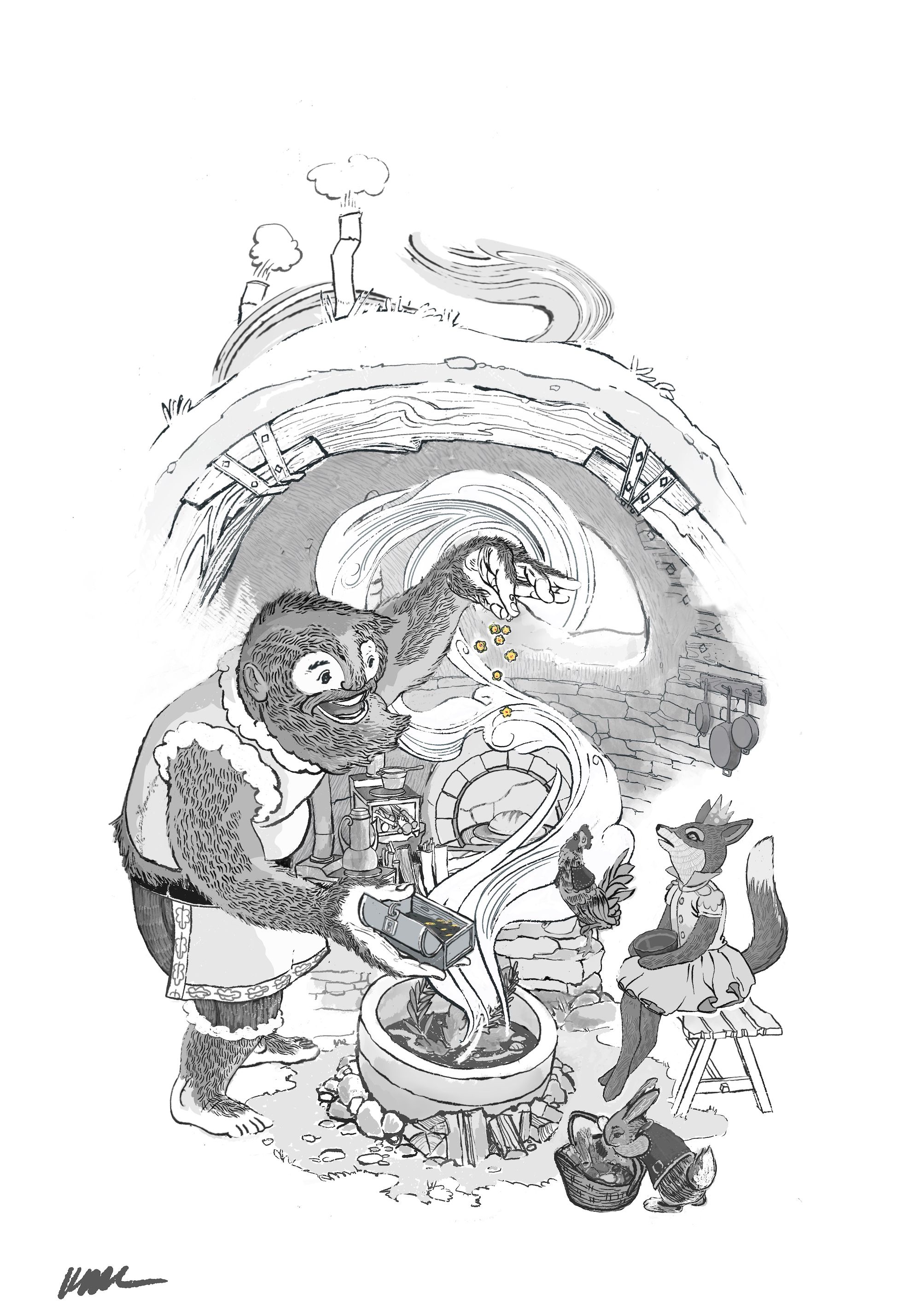
-
@Kevin-Longueil looking good! I'm liking that wooden beam. I think the bunny is working, what would happen if it was on the Yetis near shoulder and facing towards the fire? Not sure how the basket would work but it could be fun haha.
-
@Richard-Matthews Very glad you like the beam! Part of me felt like i was shoehorning it in...which i guess i did .. but wood beams definitely have a cozy factor which is what i was try to increase - i edited the bunny question out of my post before i saw your response ... i decided to keep the little fellow
- thank you for your feedback! -
@Kevin-Longueil I am going to go hard core and suggest a major change. According to the definition given by @Lisa-F a spot has limited background. What if you lose the roof and crop it more like this:
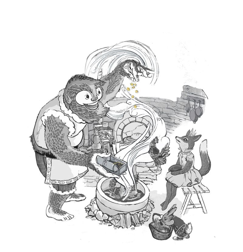
Here is my reasoning:
It helps create a nice silhouette for your character, his action, and one of the central aspects: the wafting aroma.
Second, the ceiling competes for my attention with his hand and smoke because of the repetition of the curve and leads my eye off the page.
Lastly, it fits more with a spot illustration definition.You lose nothing but gain impact.
Just my two cents.
Lovely job as ever, a winner for sure. -
@chrisaakins This change really helps with the focus and you can see the silhouette better!
-
I really like the style of this piece!
-
@chrisaakins Chris, thank you so much for the thoughtful feedback and the paint over!! These are great points you make and something i have struggled with. Painting out the background is definitely a possibility - @Melissa-Bailey-0 mentioned this earlier too - I have a layer similar to your paint over in my stack though i like how you left a hint of the window in your paint over that is a good idea. I'll keep messing with it - i do go back and forth on this one... was really trying to make an interior that was appealing for my portfolio(which has zero interiors) - i have faded the background too..but wondered if it was a bit gimmicky .. it seemed like a cheap fix for a difficult problem too since i have not sorted out my values yet - my specialty does seems to be spending days working on things only to paint them out in the end :). Thank you again for the feedback.
@Kim-Rosenlof Thank you for the feedback Kim - it is really helpful to hear what is working for folks!