Feedback on wip western magic
-
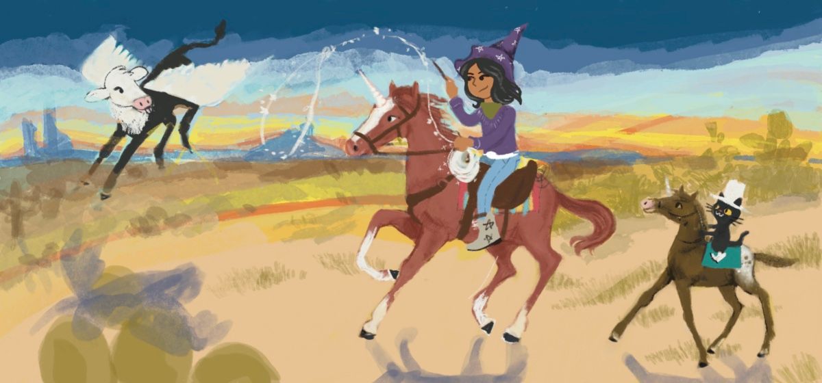
I had this idea to make a Twitter/website header with the things I like to draw the most, but it’s getting away from me a bit because I can’t decide if this the best time of day, or if I need a cactus in the foreground or what. Any suggestions as I overthink it?
-
Love the colors and the theme. Western + Magic feels like uncharted territory to me. It has a very loose feel to me - like a painting. I can't tell if that is a deliberate style choice or if it is unfinished. I think that means it still needs work so that the viewer (me) can know for certain which it is. Specifically, the drop shadows seem too strong and/or misplaced/inconsistent with the lighting of the rest of the piece. Also the cactus in the foreground could use more details and appears to be translucent. Lastly, the balance of the characters feels a little off. The right side is very heavy.
All that said, I really enjoy looking at it. It has life and charm. Love the flying cow.
-
Your witchy unicorn cowgirl and sidekick cat are SO RAD! I love that kind of 'national park gouache poster' palette. I look at this book for landscape and color research all the time. Maybe it would be useful to you too?
I do think your cactus in the foreground idea is promising, because I think right now you need something to ground us in that bottom left corner. If I were you right now, I'd copy your piece like 6 times into a document in black and white, like 3 inches wide each, and work on some grayscale composition roughs. Take an hour or two to play with lighting, values, focal points, and placement of objects.
This is going to be such a cool image! Can't wait to see it. -
@ABCre8ive totally in progress, it was just going to be a quick project but I really got into it lol
-
@Valerie-Light thank you! That book looks awesome! Working on this has made me want to take a vacation even more lol
-
My progress for today, it changed a lot! I want to finish the saddle a bit, and Ive been trying to figure out Will Terry’s color dodge layer trick. Ive seen it in so many videos now but I can’t quite figure it out for some reason. -
I really like the new version! A few words of critique though; it feels to me that the shadow of the left character is positioned wrong. The way the center character looks, it feels like she is looking straight ahead, but the shadow says the left character is positioned way more to the back. I feel like moving the shadow a bit more down (almost touching the cactus) would remedy this. And somehow I feel the right most cactus should be moved a bit more to the lower right (above the horses tail) to get an overlap with the cat to suggest depth. And currently the witches hat and the cactus are almost the same height, where I think that one should be tallest (preferably the main character).
The colours really bring the scene to life, and remind me of Arizona’s dry heat.
Instagram: www.instagram.com/novanbergen/
-
@Niels it was way wrong, I am so bad at cast shadows outdoors. I'm working through the svs class on shadows because of that. For some reason my brain goes all "math? NOPE" even though it's not math.
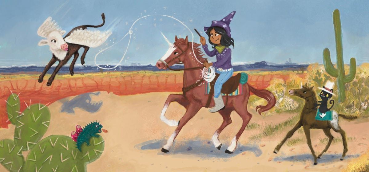
I had some feedback from a friend on twitter asking what this was for and I said I just wanted a better banner for twitter and my website, which kind of put into perspective what I should be doing with it. A lot of people didn't understand the little cat on his own horse either. So I ended up with this, although this copy of it became weirdly blurry and I don't know why. Maybe a procreate thing I need to learn.
The main thing I got from this is that I want to visit Arizona when things get better, or New Mexico! -
That little lizard in the foreground is so awesome.
")
-
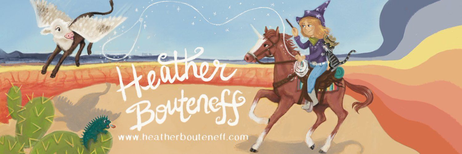
I think you made it work very well in the end!! Love the typo and it really feels like a header now, more than an illustration. Also I think you moved the girl a bit away from the center of the image and that makes it so much more dynamic! beautiful work
 love the lizard also and the cow has such a cure expression
 -
It seems slightly cramped space wise, since a lot of details touch the edge of the image in this last version. Is this intentional? I would try to add a bit of space at the top and bottom of the image - not much, just enough that the hooves, hat, wing and tail do not touch the edge.
Instagram: https://www.instagram.com/mortenchristiansenart/
DeviantArt: https://www.deviantart.com/mortenchristiansen -
This looks great. I like the changes you've made.
Something I would change, if it were up to me, is that the reddish strip of land seems to take up a lot of attention and I think it's supposed to be on the girl and the flying cow. So I would suggest to make it a more neutral color. There's also a tangent on the horses' front legs so a bit of adjustment there would help. I like your lettering though, it's really pretty.instagram: https://www.instagram.com/jeannellepita/
website: http://jeannellepita.com/ -
@KathrynAdebayo I have ridiculously fond memories of trying to catch horny toads as a kid, he def has that personality of one lol
-
@Freya-Chakour My grandparents had cattle growing up and my brother showed me the old ledgers from vaccination weekends, I had covered the margins in cows. They are really just so much more mischievous than people expect!
-
@Morten-Christiansen you're totally right, I had to go a little too far in the opposite way to fix it but I had trouble resizing it to the exact size I wanted. Noob problem! >< I put the most recent one on my twitter header https://twitter.com/hbouteneff
-
@Jeannelle I took your advice and it does look a lot better I think, thank you!
-
@HeatherBouteneff I like how it flows image flows from the winged animal to the witch! The one thing that I think would make it a bit clearer would be to have the abstraction of the horizon start before the horse or a bit after. It is a bit confusing with one side bing detailed and the other side being abstracted.
-
@HeatherBouteneff this looks great! It's awesome to see the changes and the progress as well. One thing I have noticed is that the lines in the foreground and the background look very similar, I think if you made the foreground lines just a bit sharper it would add to the depth of the image. Great work!