Feedback on wip western magic
-
@Niels it was way wrong, I am so bad at cast shadows outdoors. I'm working through the svs class on shadows because of that. For some reason my brain goes all "math? NOPE" even though it's not math.
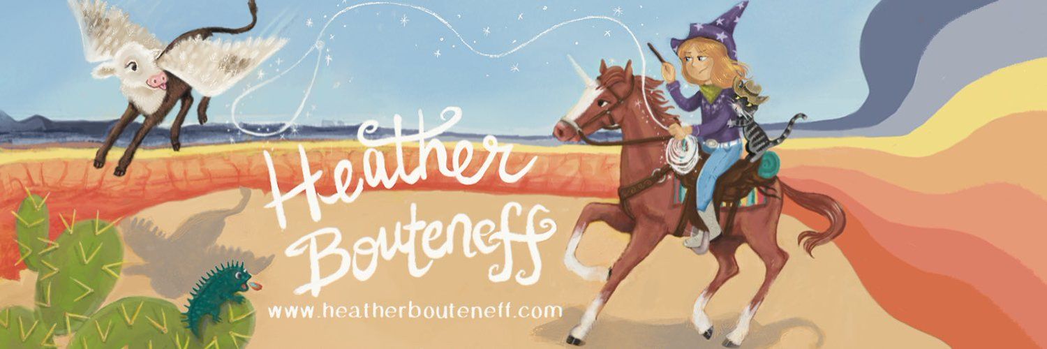
I had some feedback from a friend on twitter asking what this was for and I said I just wanted a better banner for twitter and my website, which kind of put into perspective what I should be doing with it. A lot of people didn't understand the little cat on his own horse either. So I ended up with this, although this copy of it became weirdly blurry and I don't know why. Maybe a procreate thing I need to learn.
The main thing I got from this is that I want to visit Arizona when things get better, or New Mexico! -
That little lizard in the foreground is so awesome.
")
-
I think you made it work very well in the end!! Love the typo and it really feels like a header now, more than an illustration. Also I think you moved the girl a bit away from the center of the image and that makes it so much more dynamic! beautiful work
 love the lizard also and the cow has such a cure expression
 -
It seems slightly cramped space wise, since a lot of details touch the edge of the image in this last version. Is this intentional? I would try to add a bit of space at the top and bottom of the image - not much, just enough that the hooves, hat, wing and tail do not touch the edge.
Instagram: https://www.instagram.com/mortenchristiansenart/
DeviantArt: https://www.deviantart.com/mortenchristiansen -
This looks great. I like the changes you've made.
Something I would change, if it were up to me, is that the reddish strip of land seems to take up a lot of attention and I think it's supposed to be on the girl and the flying cow. So I would suggest to make it a more neutral color. There's also a tangent on the horses' front legs so a bit of adjustment there would help. I like your lettering though, it's really pretty.instagram: https://www.instagram.com/jeannellepita/
website: http://jeannellepita.com/ -
@KathrynAdebayo I have ridiculously fond memories of trying to catch horny toads as a kid, he def has that personality of one lol
-
@Freya-Chakour My grandparents had cattle growing up and my brother showed me the old ledgers from vaccination weekends, I had covered the margins in cows. They are really just so much more mischievous than people expect!
-
@Morten-Christiansen you're totally right, I had to go a little too far in the opposite way to fix it but I had trouble resizing it to the exact size I wanted. Noob problem! >< I put the most recent one on my twitter header https://twitter.com/hbouteneff
-
@Jeannelle I took your advice and it does look a lot better I think, thank you!
-
@HeatherBouteneff I like how it flows image flows from the winged animal to the witch! The one thing that I think would make it a bit clearer would be to have the abstraction of the horizon start before the horse or a bit after. It is a bit confusing with one side bing detailed and the other side being abstracted.
-
@HeatherBouteneff this looks great! It's awesome to see the changes and the progress as well. One thing I have noticed is that the lines in the foreground and the background look very similar, I think if you made the foreground lines just a bit sharper it would add to the depth of the image. Great work!