Feedback
-
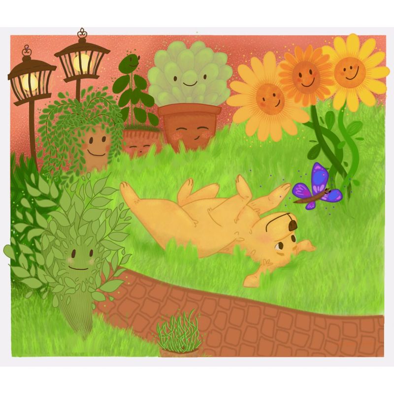
Hello! My name is Madeline and I wanted to know your opinions and get some constructive criticism for my illustration. Thank you!
-
Hi Madeline, very cool illustration, your dog is very cute! One of the things you can look at is using value and saturation to create focus in your drawing. If you make your drawing greyscale you will see that everything has kind of the same value, but you want probably most of the focus on the dog. SVSlearn has a very nice course called creative composition that talks about this. Good luck!
-
@Andy Hi Madeline. Very cute illustration. I think the character design, gesture and expressions are really great!
I do agree that the colors are not helping with the focus. The grass is too bright and it distracting from the focus from the dog. Also the bright purple butterfly against the bright green grass is also a little not soothing to see.
Since you're also showing perspective based on overlapping objects, I think you'll need to get the perspective of the brick patterns on the road correct as well. Right now it looks as though its on a vertical plane as opposed to a horizontal plane.
Oh and maybe add a tail to the dog?
Hope this helps! Good luckl!
-
Hi Madeline! What a cute scene! You're characters are all so pleasing.
My critique is what the others have said about focus. Ideally there'd be a main focal point we'd want to spend the most time looking at and then have our eyes look through other parts of the piece and keep coming back to the focal point. Right now it's hard to focus on any one thing. I'm seeing the plants and lamp posts standing out the most through value contrast. The dog is in the middle and seems like it's supposed to be the focal point, but it's losing value contrast with the grass, and the grass is a very dominant color. The butterfly is getting lost in the dark busy background of the sunflower stalks.
Another small critique would be to add some linework details here and there to the grass, mostly where it meets the edges of things like the pots, the puppy and the path. You wouldn't have to draw every grass line, but I think adding a few would help unify the piece, considering you use linework heavily elsewhere.
Great job overall, and thanks for sharing!

Website: www.tessawrathall.com
Instagram: www.instagram.com/tessawrathall_art/
-
@joosterwijk thank you very much! You’re right about everything having the same kind of value, I’ll work on that!
-
@Neha-Rawat thanks for the feedback! And yes, you’re right about the colors, seeing it now the grass is very bright. I have a lot of trouble with matching the colors in my screen with how it looks later in the iPhone but I definitely Need to be more careful with my values. Thanks for the nice comments and pointing out the purple against the bright green!
-
@TessaW thanks for the feedback! You’re right about making the dog the focal point, I think I didn’t put that much attention on the dog because I liked the plants better
 But thanks to you and to everyone for making me see that I need to work in my values, perspective and colors.