Society of Visual Storytelling

    SVSLearn Forums

    • Register
    • Login
    • Search
    • Recent
    • Tags
    • Popular
    • Users
    • Groups
    • Search

    March wip - Fairy Tale Traveler - Critique

    Artwork
    8
    28
    1191
    Loading More Posts
    • Oldest to Newest
    • Newest to Oldest
    • Most Votes
    Reply
    • Reply as topic
    Log in to reply
    This topic has been deleted. Only users with topic management privileges can see it.
    • APHOTICMOTH
      APHOTICMOTH Moderator last edited by

      critter1 sm.jpg critter goods sm.jpg

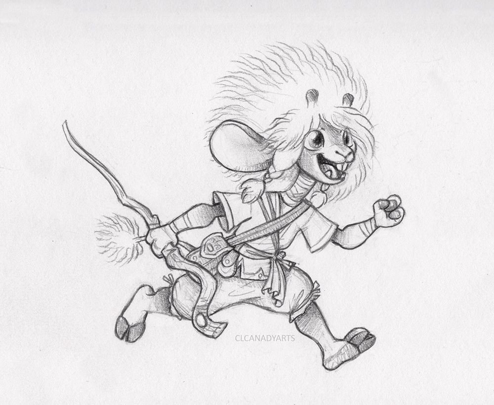
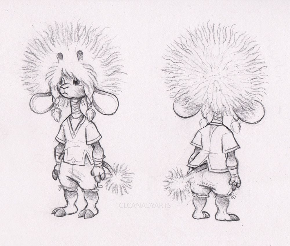
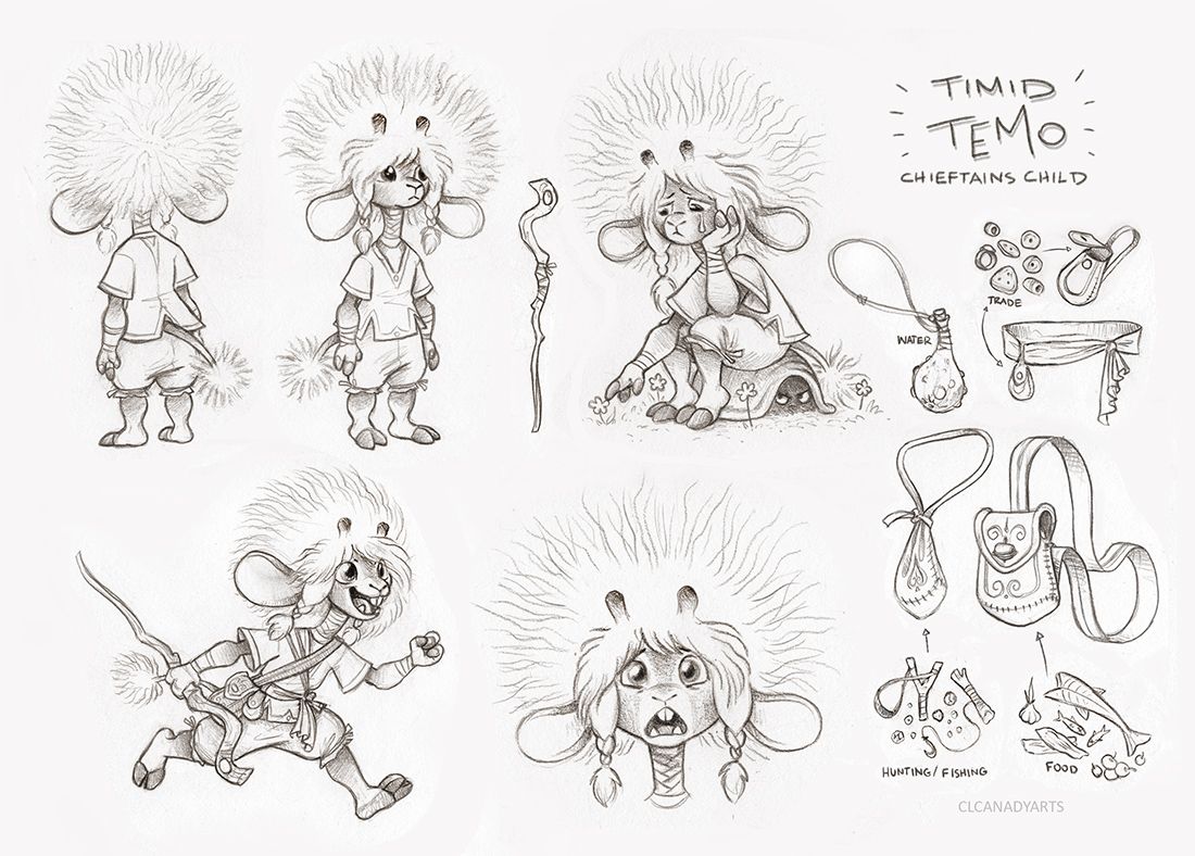
      Made more changes to the design. Felt too humanish, so I gave them some hoof feet/fingers, and a longer tail with a puff ball on the end. Made the neck a bit shorter, and the head a tad smaller, hoping that they would look a bit younger.

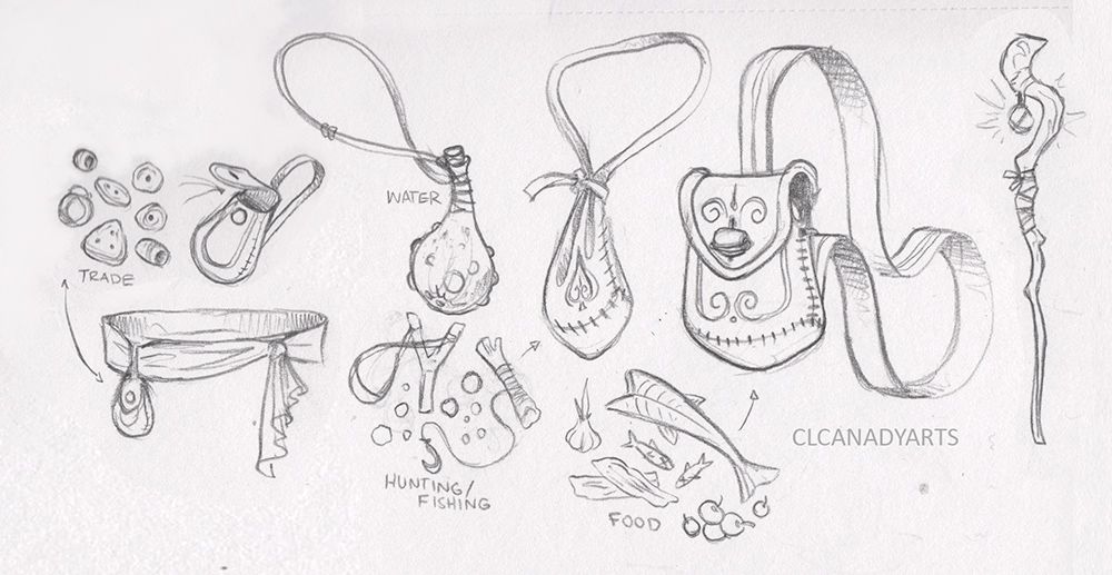
      Playing around with some travel gear; food pouch, hunting/fishing pouch, water gourd, trade pouch that slips over a waistband, and a walking stick.

      Dropped the rounded hook as I saw someone else did it, and I've done it many times in the past. The gem hanging from the sick glows at night to help keep away certain baddies that love the dark and fear the light. The gem glows when wanted, only having to touch it to light up, touch it again to darken.

      All my links: https://APHOTICMOTH.carrd.co/

      1 Reply Last reply Reply Quote 3
      • APHOTICMOTH
        APHOTICMOTH Moderator last edited by

        critter run.jpg

        Got rid of the hanging gem, as it would flop around, and I didn't want to draw extra anchor points, too detailed, but boring details. So I embedded the gem right into the head of the staff.

        Really happy with this now, might have to go back over the last two pieces a bit more, things seem a bit off.

        This whole time, I've wanted to put giant gauges in their ears, but thought it would make them look less "innocent, naive".

        All my links: https://APHOTICMOTH.carrd.co/

        1 Reply Last reply Reply Quote 1
        • APHOTICMOTH
          APHOTICMOTH Moderator last edited by

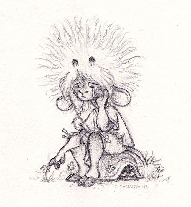
          Sitting pose. I drew this much smaller than the others.. Its about 2 inches tall, and I think it shows... It's grainier to me. Is it obvious to you?
          sadsitcritter sit sm.jpg
          critter1 sm.jpg
          critter run.jpg

          Thinking I need to redraw it, or atleast touch it up. I know the 3 scans looks different color wise, I will fix that when I place them all into once image.

          All my links: https://APHOTICMOTH.carrd.co/

          1 Reply Last reply Reply Quote 2
          • APHOTICMOTH
            APHOTICMOTH Moderator last edited by

            I don't think his knees showing works either, they are covered in the other pieces, but I thought it would slip up, but he does have the knee ties, and it's baggy pants.. So Time to redraw..

            All my links: https://APHOTICMOTH.carrd.co/

            1 Reply Last reply Reply Quote 0
            • APHOTICMOTH
              APHOTICMOTH Moderator last edited by

              Redrew the sitting pose.

              BEFOREsadsitcritter sit sm.jpg
              AFTER sadcrittersit sm 2.jpg

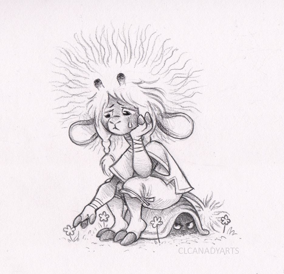
              Much happier, just drew the first one way too small, and rushed it. Was working on about 45 minutes of sleep on the first version.

              All my links: https://APHOTICMOTH.carrd.co/

              1 Reply Last reply Reply Quote 1
              • APHOTICMOTH
                APHOTICMOTH Moderator last edited by

                svs character sheet march 2021 WIP SM.jpg

                Work in progress. Need to adjust the whites, I can see some shadowing from separate scans.

                Going to do some color exploration next.

                All my links: https://APHOTICMOTH.carrd.co/

                1 Reply Last reply Reply Quote 2
                • Asyas_illos
                  Asyas_illos last edited by

                  I love the hair now I just want to run my fingers through it lol!

                  Asyasewardillos@gmail.com
                  www.Instagram.com/asyas_illos/
                  https://asyasewardillos.wixsite.com/mysite

                  APHOTICMOTH 1 Reply Last reply Reply Quote 1
                  • APHOTICMOTH
                    APHOTICMOTH Moderator last edited by

                    colormockup sm.jpg

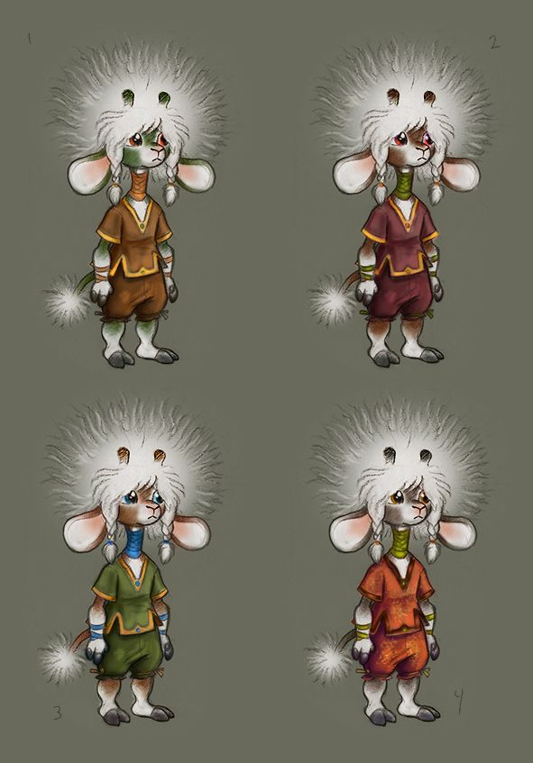
                    I really want white hair, so that's set. First thought, green like a dandelion stem. I'm liking 3.

                    All my links: https://APHOTICMOTH.carrd.co/

                    1 Reply Last reply Reply Quote 0
                    • APHOTICMOTH
                      APHOTICMOTH Moderator last edited by

                      I really want to design a big puffy spiderish creature that looks like his head. I still feel like his nubs look like false eyes, and his bangs look like mouth parts..

                      All my links: https://APHOTICMOTH.carrd.co/

                      1 Reply Last reply Reply Quote 0
                      • APHOTICMOTH
                        APHOTICMOTH Moderator @Asyas_illos last edited by

                        @Asyas_illos Aw. It does look like bunny fluff now. πŸ˜ƒ

                        All my links: https://APHOTICMOTH.carrd.co/

                        1 Reply Last reply Reply Quote 0
                        • Asyas_illos
                          Asyas_illos last edited by

                          I like two and three it’s the brown fur I think looks better with the outfits I like the color combos

                          Asyasewardillos@gmail.com
                          www.Instagram.com/asyas_illos/
                          https://asyasewardillos.wixsite.com/mysite

                          1 Reply Last reply Reply Quote 1
                          • Larue
                            Larue last edited by

                            Love that this creature could be a boy or a girl, great expressions!

                            APHOTICMOTH 1 Reply Last reply Reply Quote 1
                            • APHOTICMOTH
                              APHOTICMOTH Moderator @Larue last edited by

                              @Larue I'm glad you think that. I was going for a bit androgynous. I've been saying they, them, child. If it were a book, to keep neutral terms, to me would mean that anyone reading it could relate/identify/place themself in the story.

                              All my links: https://APHOTICMOTH.carrd.co/

                              1 Reply Last reply Reply Quote 0
                              • APHOTICMOTH
                                APHOTICMOTH Moderator last edited by

                                Hmm. got one vote. We both like #3, and I want to work on this, so 3 it is. πŸ™‚

                                All my links: https://APHOTICMOTH.carrd.co/

                                1 Reply Last reply Reply Quote 0
                                • APHOTICMOTH
                                  APHOTICMOTH Moderator last edited by

                                  clcanadyarts svs character sheet march 2021.jpg

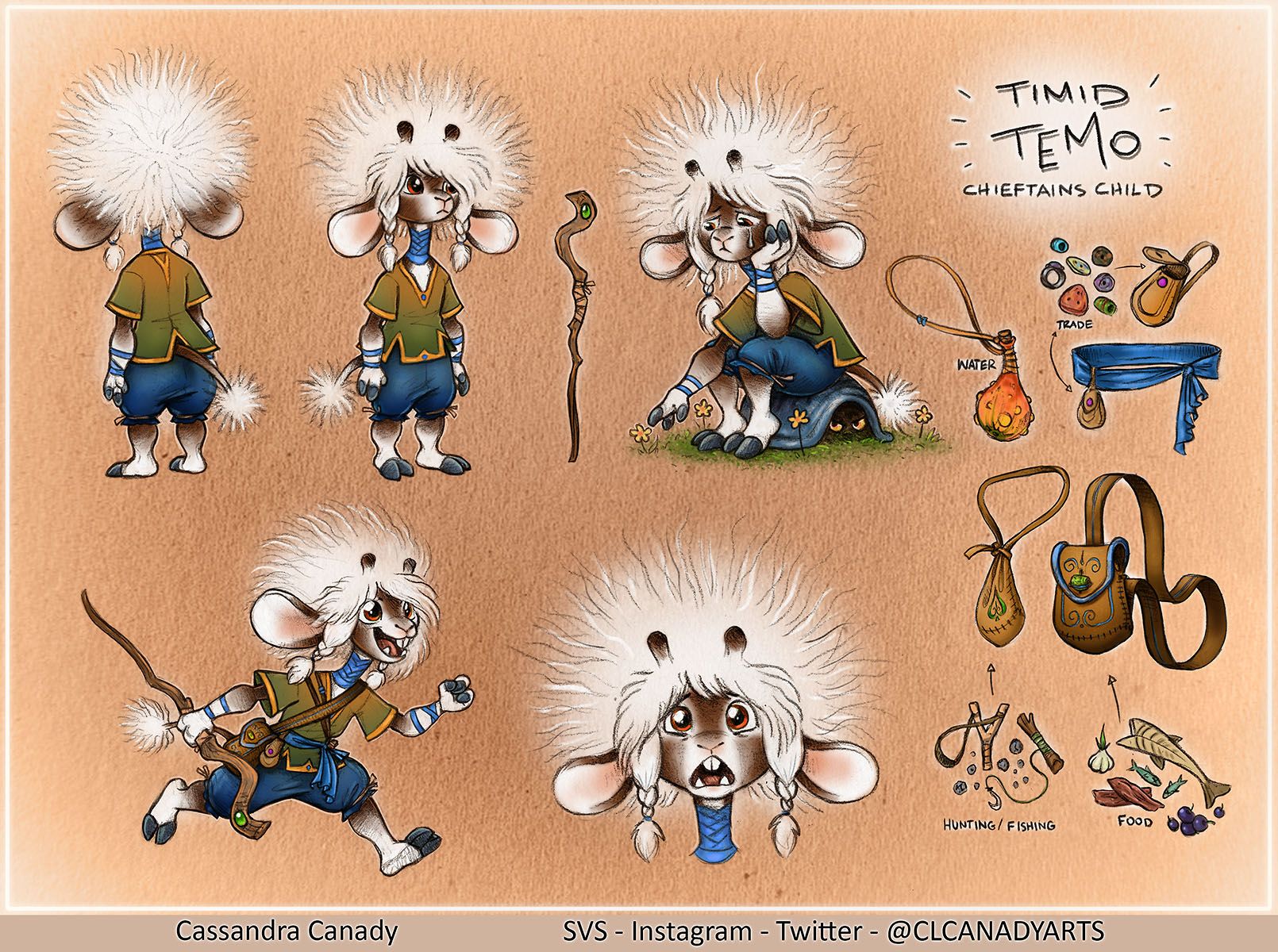
                                  I think I'm going to call this done.
                                  Feel free to critique, I'm not submitting it to the final thread just yet.

                                  Made some changes to the clothing color, all green was boring. Switched to brown pants, and it was just too much brown overlapping,

                                  The first poses are bland because the prompt said "neutral pose" which I took as a generic action figure pose. Left one looks like they are in time out since they are looking into the corner. πŸ˜›

                                  All my links: https://APHOTICMOTH.carrd.co/

                                  Jeremiahbrown 1 Reply Last reply Reply Quote 1
                                  • Jeremiahbrown
                                    Jeremiahbrown @APHOTICMOTH last edited by

                                    @CLCanadyArts
                                    I've loved seeing your progress and the end piece looks great! Thank you for sharing all of it!

                                    Personally, I would like to see some of the accessories you detailed on the side put on each of the character poses. It doesn't need to be all of them on each character but they're so intricately rendered and I think it would give the viewer more reason to observantly linger on each character. Impressive stuff though!!

                                    Jeremiah Brown
                                    www.jeremiahbrownillustration.com
                                    https://www.instagram.com/jeremiah.brownillustration/

                                    APHOTICMOTH 1 Reply Last reply Reply Quote 1
                                    • APHOTICMOTH
                                      APHOTICMOTH Moderator @Jeremiahbrown last edited by

                                      @Jeremiahbrown Thanks for the feedback. I was thinking the same, but kept it a bit simple. Are initial poses supposed to be plain, so you see the character themselves, and then others with their gear/accessories? Maybe I'm thinking about animation, or 3d too much. For now I will keep this one as it is, but I will keep that in mind for the next ones. I get what you mean about the extra detail would help keep peoples attention longer, more to look at and pick apart for sure. πŸ™‚

                                      All my links: https://APHOTICMOTH.carrd.co/

                                      1 Reply Last reply Reply Quote 0
                                      • Matthew Oberdier
                                        Matthew Oberdier @APHOTICMOTH last edited by

                                        @CLCanadyArts I love the way you drew those goblin heads. There's something really natural about the line work,

                                        Instagram.com/mattoberdier

                                        APHOTICMOTH 1 Reply Last reply Reply Quote 1
                                        • APHOTICMOTH
                                          APHOTICMOTH Moderator last edited by

                                          clcanadyarts svs  march 2021 edit.jpg

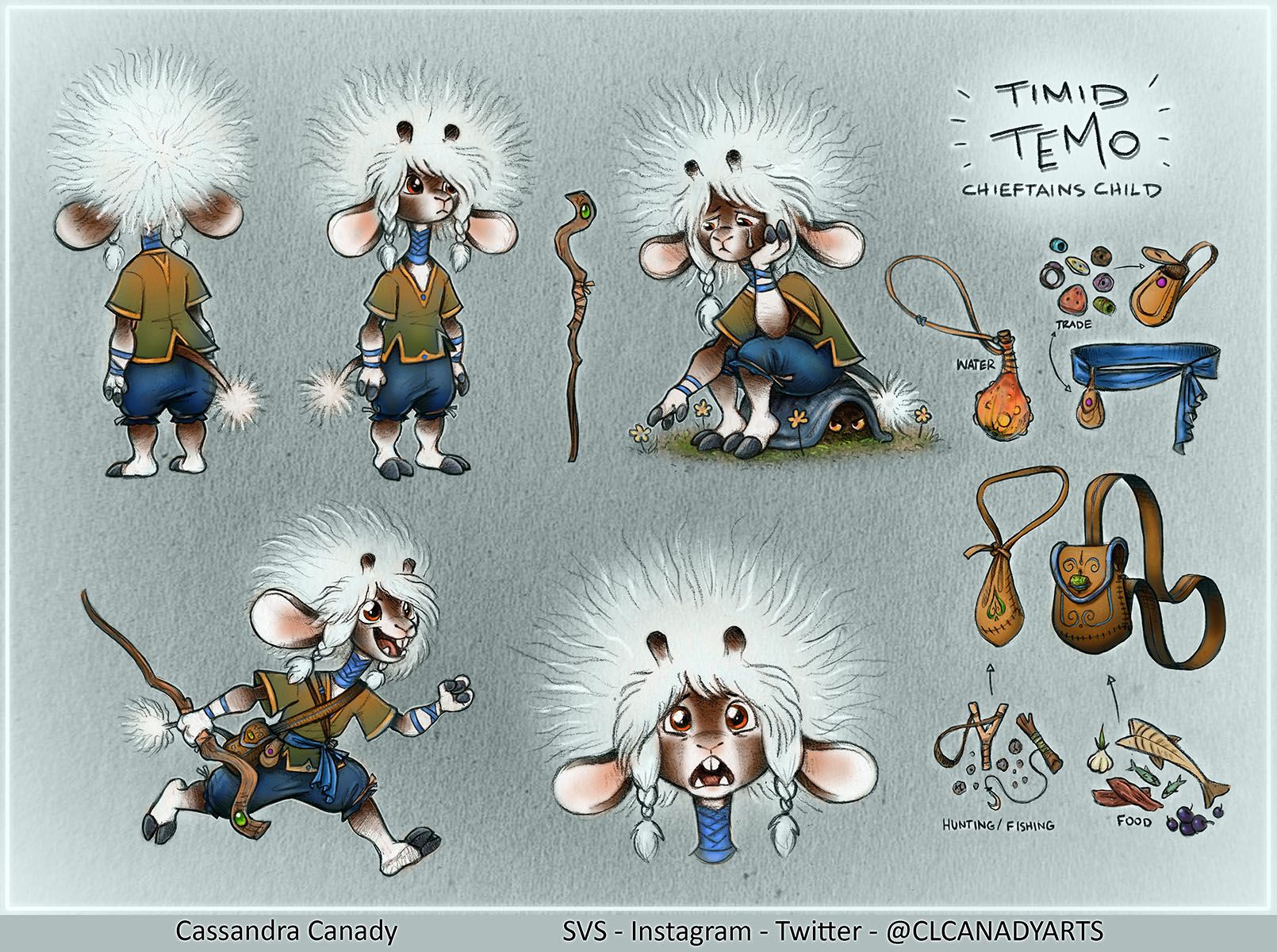
                                          So orange is my favorite color, but it is an intense color... I think it muddled out the colors on the last sheet. Switched it to a grey with a hint of blue. It allows the colors to stand out nicely, without a blinding white background.. Better?

                                          All my links: https://APHOTICMOTH.carrd.co/

                                          1 Reply Last reply Reply Quote 0
                                          • APHOTICMOTH
                                            APHOTICMOTH Moderator @Matthew Oberdier last edited by

                                            @Matthew-Oberdier Thanks. Just sketching, things always seem to stiffen up in the refined drawing phase. Starting to enjoy just coloring sketches.

                                            All my links: https://APHOTICMOTH.carrd.co/

                                            1 Reply Last reply Reply Quote 0
                                            • First post
                                              Last post