Critique please?
-
Hello everyone!
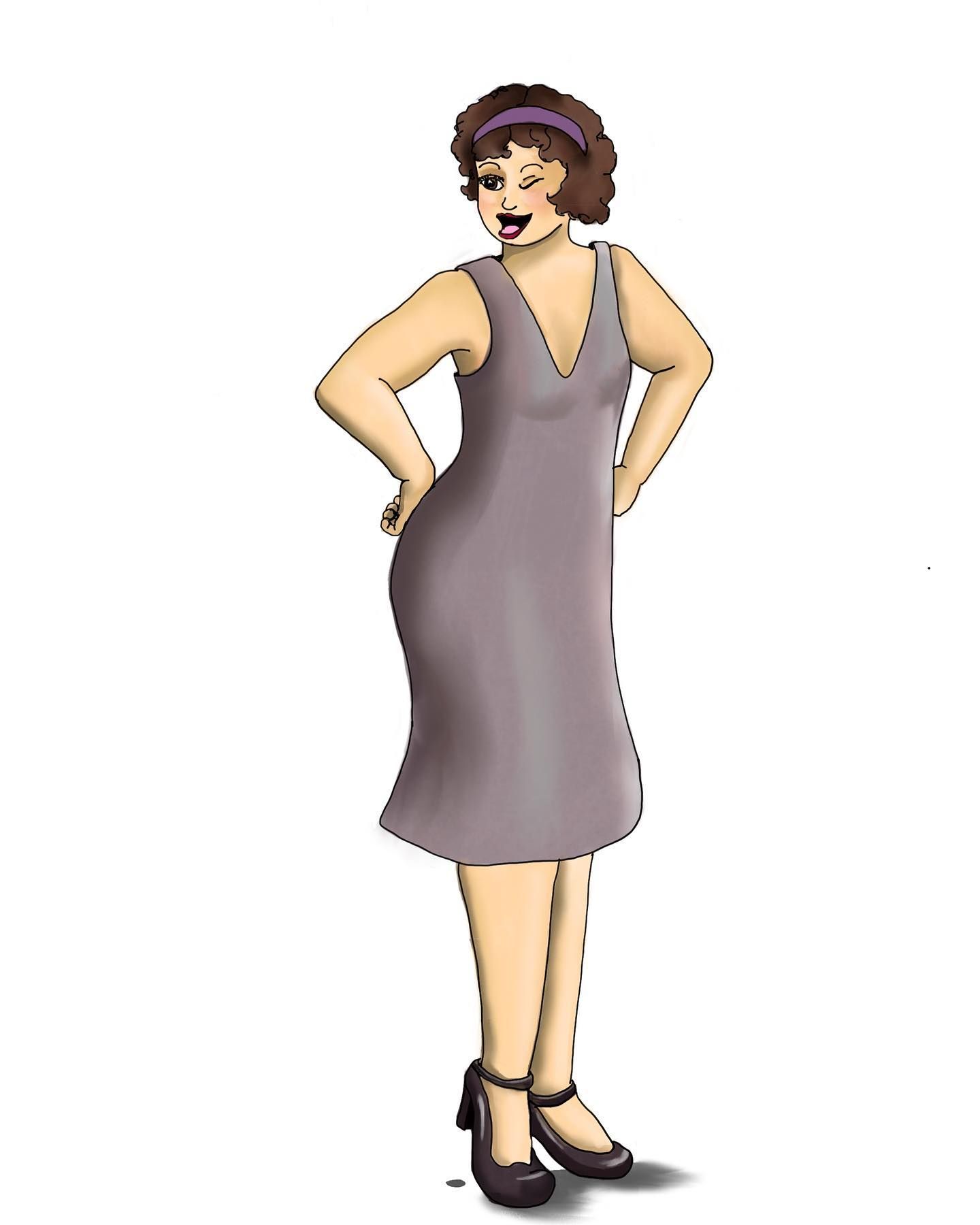
As the school year is (thankfully) starting to wind down and I'll be teaching less soon, I thought I'd get back to work improving my portfolio. I've posted both of these on the forums before, but they keep standing out to me as possible portfolio pieces (my long term goal is to fully revamp my website, but that's for another time).
I was wondering what I could do to make these better. Are they even good pieces to be considered portfolio pieces?
Thank you!
-
What program do you use to draw these @lpetiti ?
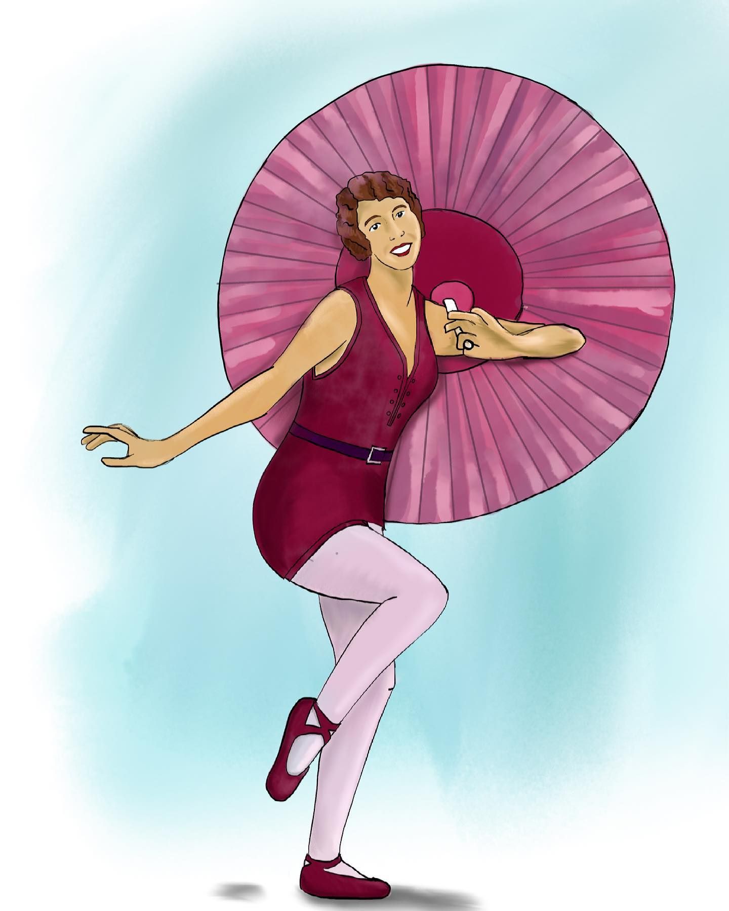
What I would personally recommend is maybe consider cel-shading your characters and cleaning up your lines? They look kind of like construction lines so you need to fix the bumpiness, line weights, close your gaps and remove intersecting lines.
I can give you a critique for each individual character hands-on, just give me a second.
-
I use Fresco for these pieces, and most of my work recently. I use an ink brush, but there are vector brushes that eliminate the overlap issue, I just didn’t happen to use them since I was mimicking what I’d traditionally be doing in my Inktober sketchbook.
 For the colors I use a variety of brushes
 -

So I don't know if it's just because you're going for that "watercolor, rough-outline, not completely clean look" but maybe you should perhaps try cleaning up your drawings?
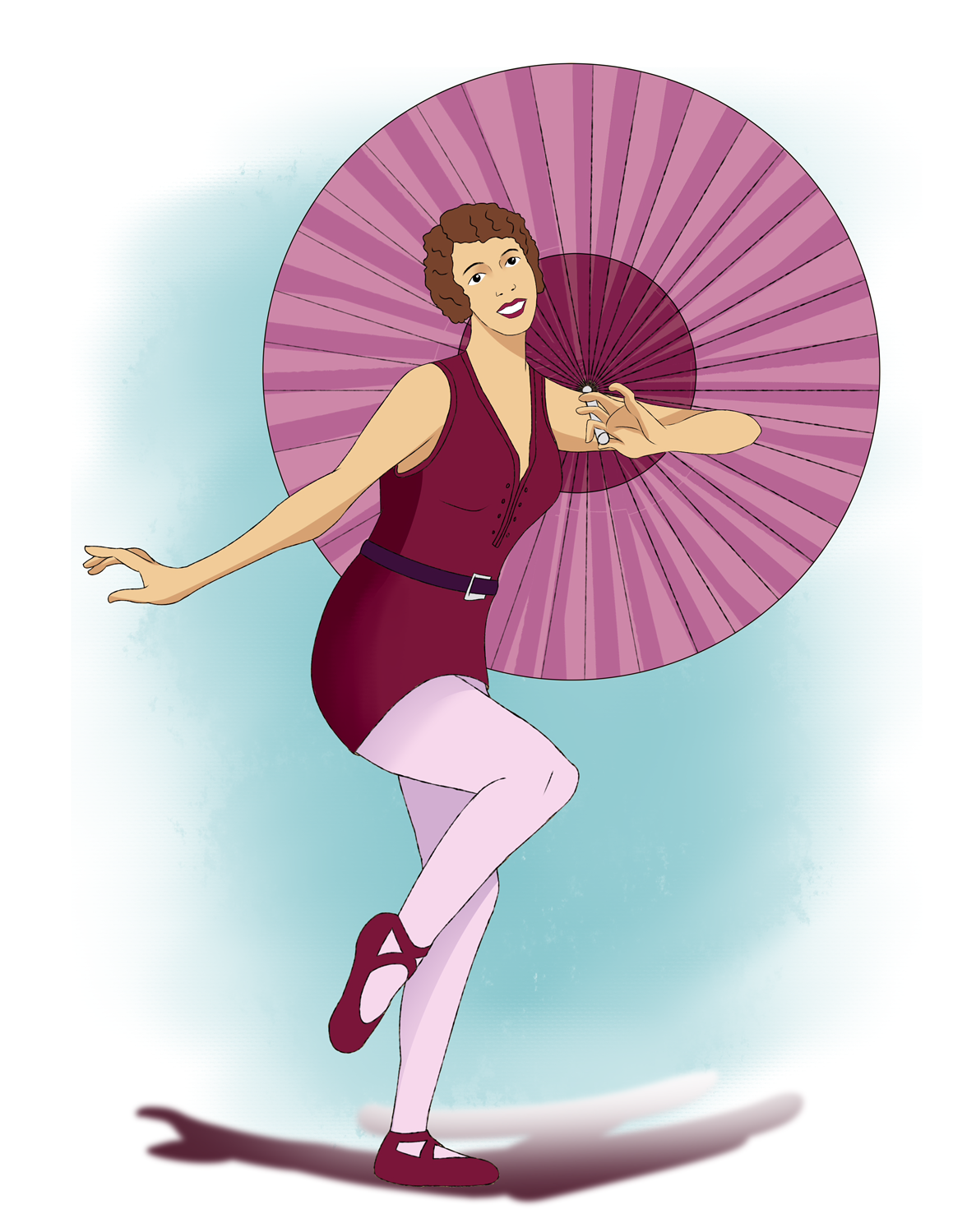
What I did here was fix the lineweights of your first drawing, adjusted the colors a bit so they look a bit more lively and gave her a decent mix of hard to soft shading, but definitely a lot more hard shading, but sparingly. She loks a lot better don't you agree?
The issues with the original was that the hand looked really weird. I was really confused at what I was looking at until I realized it was her palm. Usually when drawing palms you need to input a lot more detail to make it look more clear to use what we're looking at. Her hand just looked kind of broken. I also fixed her left foot and made the shadow a lot more accurate to her figure.
-
@Michael-Angelo-Go thank you for the input. I’m curious, what were some strengths you saw in the original design? Just so I can see what a second pair of eyes thinks is going well in these drawings as well as what can be improved.
-
I think you are very good at tracing and the colors you chose are decent. I also like the textures, which I'm sorry I couldn't replicate but the point of the redraw is more to give you an idea of what direction to go as opposed to me doing everything that needs to be fixed.
Just work on your shading and clean up your lines is all your really need to do as far as I can tell regarding her.
-
@Michael-Angelo-Go thank you for taking the time to do this. While I was going for a more watercolor/sketched look, the goal is not for it to look unfinished, so I appreciate seeing it in a different style that was more finished, it’s something to consider. It’s interesting that that is the impression that was giving to other viewers, I’m curious if others see the same thing?
-
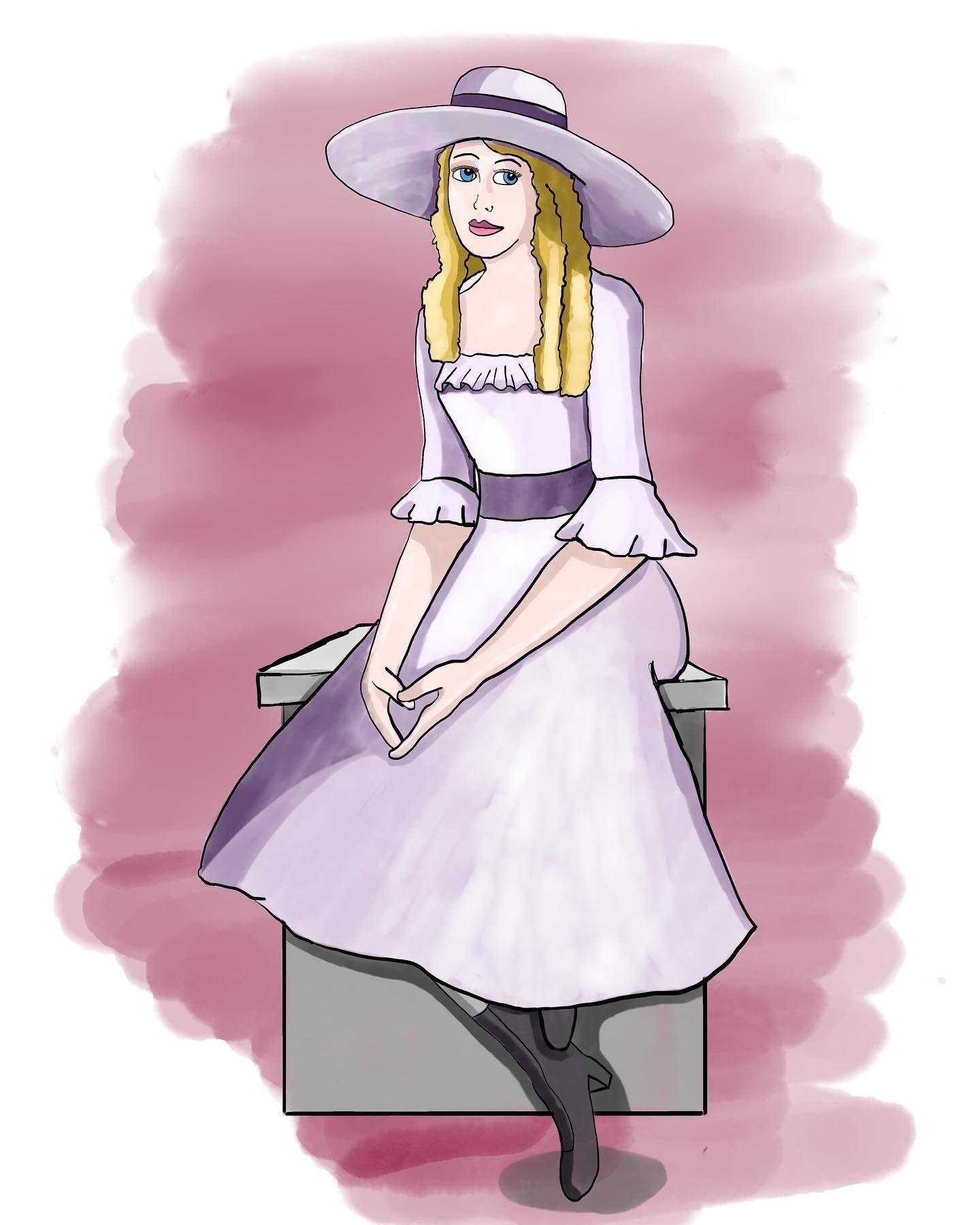
Hi @lpetiti my next feedback for you will be regarding your second image, with the girl in a hat and lilac dress.
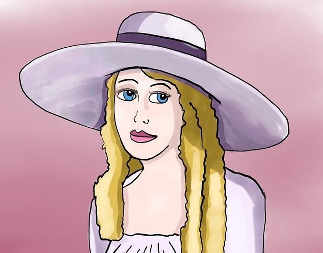
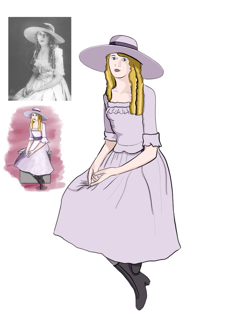
So I don't want to repeat myself too much, because I think my feedback would be very similar to what I offered in the other drawing, but one thing that struck me the most was her face. The structure is rather wonky.
I did a mild clean up because it did bother me just a bit, not too much of a significant difference. I made the eyes the same size and made them more almond-shaped so they appear more "3-Dimensional". I also changed the shape of the nose so it looks more 3-Dimensional as well and I felt like the lips are little too long. This is what I created.
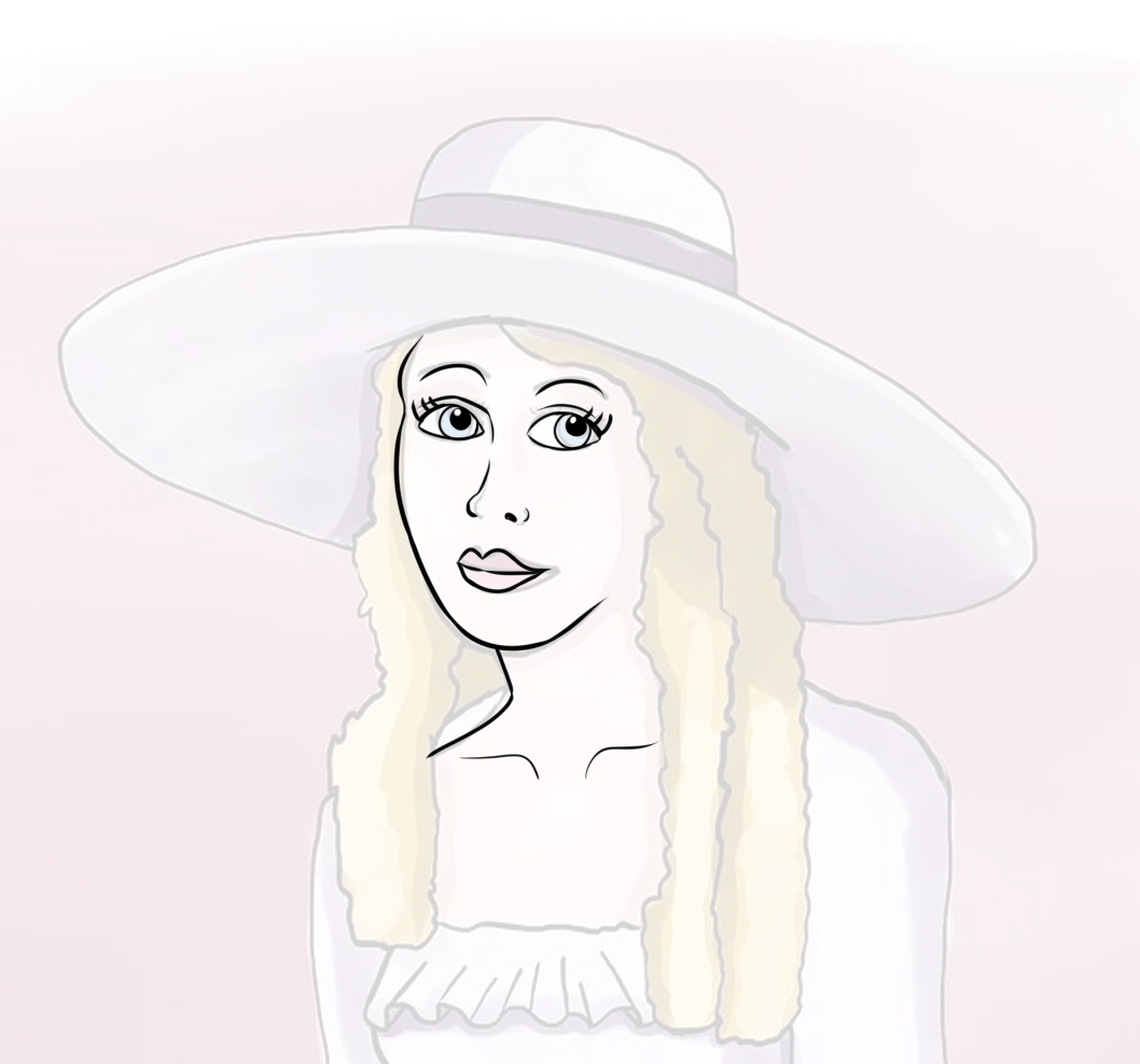
Two more comments I had was just face shape and eyelashes. I just pronounced her temple and cheekbones so that her face feels a lot more "human" and regarding eyelashes, don't make so many tiny details, because overall the character's appearance is not that complex. I simplified it to three lashes on the corners of each eye. You can also just thicken the lineweights of the upper eye outline to convey eyelashes on a character. I did both for my example.
-
@Michael-Angelo-Go thanks! The reference photos of the actress (Mary Pickford) I was basing this one are about 100 years old so it was difficult to get the shape of her face correct, even after looking at tons of reference. I like the subtle changes to her face!
-
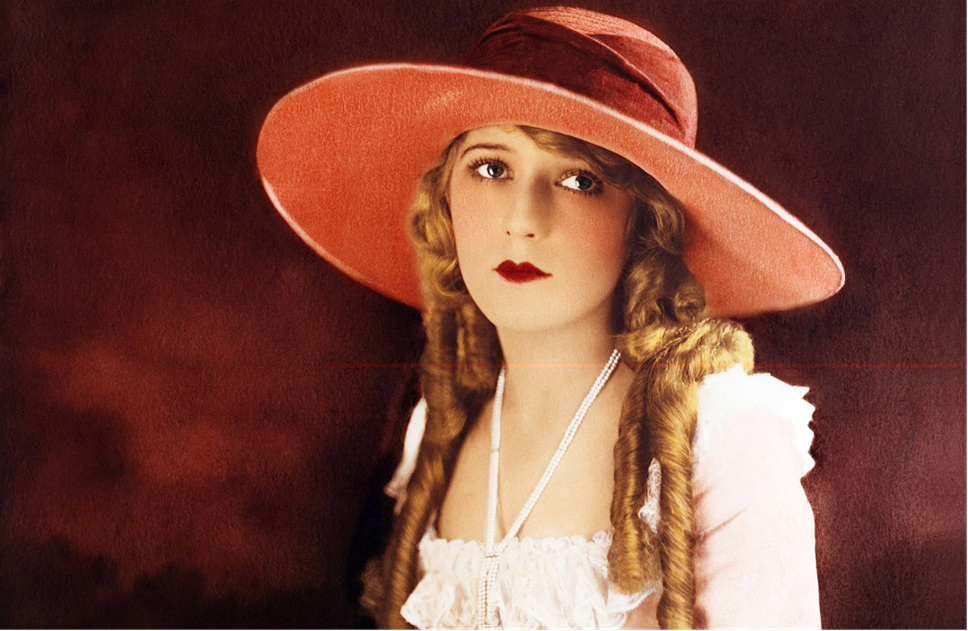
Is this the photo that you referenced?
-
Please don't take this harshly.
To me it looks like you aren't looking at your reference enough, you are focusing more on your drawing. Put them side by side, and look back and forth quickly, you will see where the drastic differences are.
Second note, I do not see any pressure sensitivity in your lines, at all. Fresco has that, so are you using your finger, or a non pressure sensitive stylus? If you do not have a pressure sensitive stylus, I would recommend doing it traditionally, and refine it by tracing on a light pad. You can get them so cheap now. I use a "light tracer" that I've had for about 15+ years. I use my light table religiously, especially to clean up really over sketched pieces.
It just feels like your pieces need some more refining before moving onto inks, you are trying to finish them too early. It's a start though, I see where you are going.

-
@CLCanadyArts that’s actually what I do with reference, I’ll put it as a separate layer on the screen when I’m working and work off of that. I wasn’t aware that it looked like I wasn’t really working off of my reference so I’ll work on that. I was trying to not do things like directly trace off of the photos I was working with and make them my own, but perhaps I went too far away from the reference, sort of swung the pendulum the other way

I do use an Apple Pencil actually (I can’t imagine ever drawing on a tablet with my finger, never have done that personally because it always has seen liked such a clunky option). I use pressure sensitivity too, but I think I’m still learning how to work with the pressure sensitivity of the ink pens and vector pens I’ve been using at such small detailed levels, because I’ve definitely been frustrated with my struggles with them before.
Could you recommend anything I could do to practice the line sensitivity? I realized that even in traditional pen and ink work I struggle with it and definitely want to get better
I really appreciate the recommendation of refining the sketching more. Since these are based off of my Inktober idea from last year I think I was in the inktober mindset of doing them quickly
 I’ll slow down, definitely.
 -
@Michael-Angelo-Go yeah, expect I believe the one I used was in black and white (I’m on my phone now so I don’t have the reference in front of me). See the nose issue? I struggled a lot to get the shape of her nose correct which is probably why the end result is so odd.
Thank you for taking so much time to help me with this! I really do appreciate it, these are some of my favorite pieces and I want them to get better
-
@Michael-Angelo-Go and @CLCanadyArts
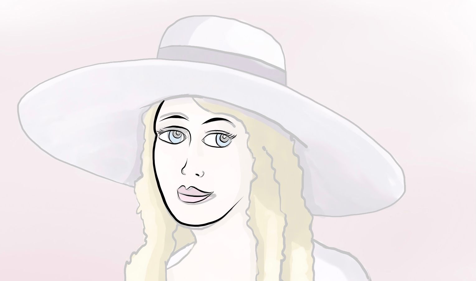
So I went back and flattened the original Mary Pickford image, just so I can make a clean start of things. I stopped using a rastered ink brush, because I think that’s what’s making it look really rough and unfinished. I started using a basic tapered brush and started focusing on things like edge quality.
What I’m wondering is: is this starting to go in a stronger/better direction? Are the slightly more rounded shapes starting to make her more traditionally feminine?
Thank you both so much for your notes!
-
@lpetiti I think the face shape in the original image is because her face is turned much more towards the viewer than yours is. The key is how much space there is between her right eye and the side of her face, and also the way the neck attaches to the face. The way you positioned the eyes make it seem like her head is much more 3/4 angle, and then it looks weird that there's no cheekbone at all. In general I agree with @CLCanadyArts that you are straying a bit too far from your references. Making it yours is cool, but before you can do that it would help you so much to sharpen your observation skills. As it is, the choices you make of what to keep vs. what to change, instead of enhancing the original image and make it more appealing, end up often creating problems in the anatomy that where not there before. I suggest improving your observation skills by trying to stick as close to your reference images as you can (including the shadows, which you also have a bit of trouble with). Enhancing those skills will significantly boost your overall ability and help you when you decide to start stylizing reference images to make them yours

-
@NessIllustration thank you! As I’ve been sorting through all of the critiques, I’ve been thinking about what it is that’s been the most difficult for me. I realized this morning what’s going on. I admit that I’m embarrassed that I’m still having such trouble with the basics. Why? Because I feel like they shouldn’t still be an issue for me after all of this time. Hearing crits that all have one theme in common (work on the basics) makes me wonder what the heck I was doing in art school when I should have been learning and mastering these things. You’d think that being there for five years would have gotten it to click for me, plus another five years out of school


 ️I see all this amazing work you guys do and...yeah...feel embarrassed/ashamed at where I am (even though I know everyone struggles with different things)
Anyway, what I think I might do is go back and really work on the reference again.
-
@lpetiti Oh hun there's no need to feel embarrassed! Mastering the basics is a life-long journey. I still practice anatomy and observation with frequent live drawing sessions (now online of course). I also notice that many artists stop practicing the basics way too early because they think "they should have mastered it by now"... Mostly it just ends up slowing their growth. Forget what you think should or shouldn't be an issue, and just keep working on your weaknesses and keep improving at your own pace

-
@NessIllustration I’m starting to realize that. I really appreciate this community and all of your support!
-
Ok, last post about this today since you’ve all been so wonderful! Am I heading into the right direction?
-
@lpetiti huge improvement!!
