First post. Anyone willing to critique?
-
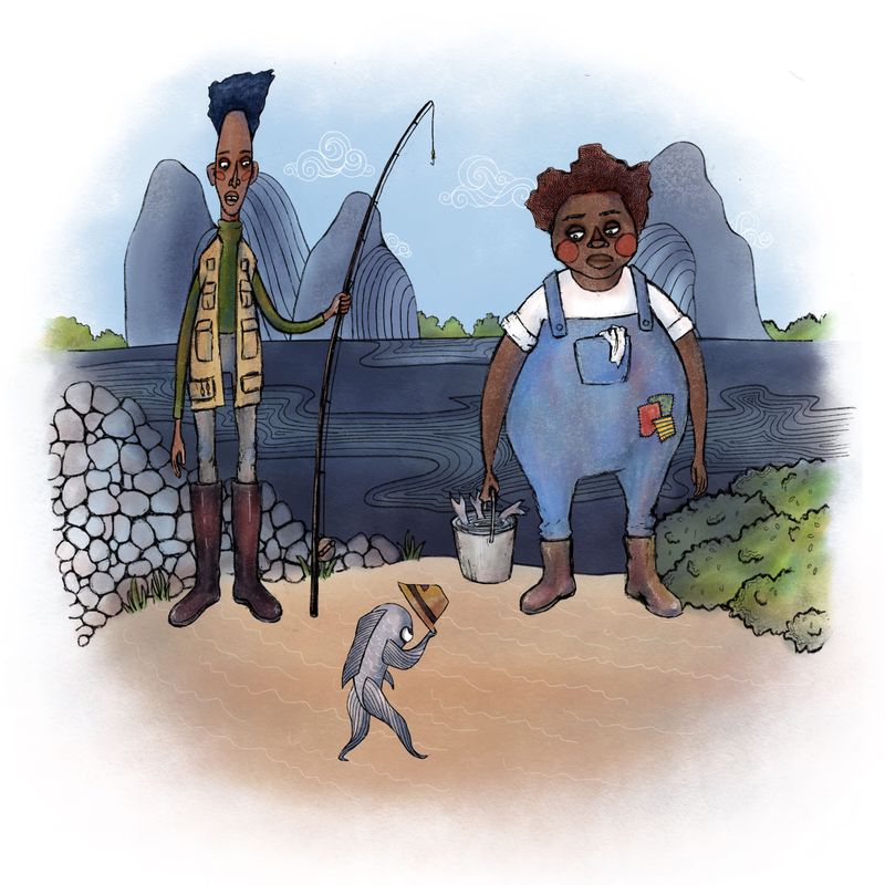
Hi! I’m new here. I have a background in fine art but have been more of a hobbyist for several years. I’m trying to make the transition to illustration and it’s a bigger learning curve than I expected. I’ve been doing digital illustration about 6 months and I’m still learning. I finished this little vignette in procreate today. Any feedback would be really helpful and appreciated. It’s like every time I finish a piece I just feel disappointed with how it turned out. Anyone relate?
-
I can totally relate. As for your art I really like it. It has a paper cutout feel to it. My criticism would be the composition is not very dynamic. Other than that it is hard to critic not knowing what you are trying to achieve. I hope this was at least a little helpful.
-
Hi @Freddie-Leota! Your work is really good. I like the stylization and the shapes you've chosen for your characters.
But I agree with what @Mandy-Forte said, the composition could definitely be better. Let me analyze your image.
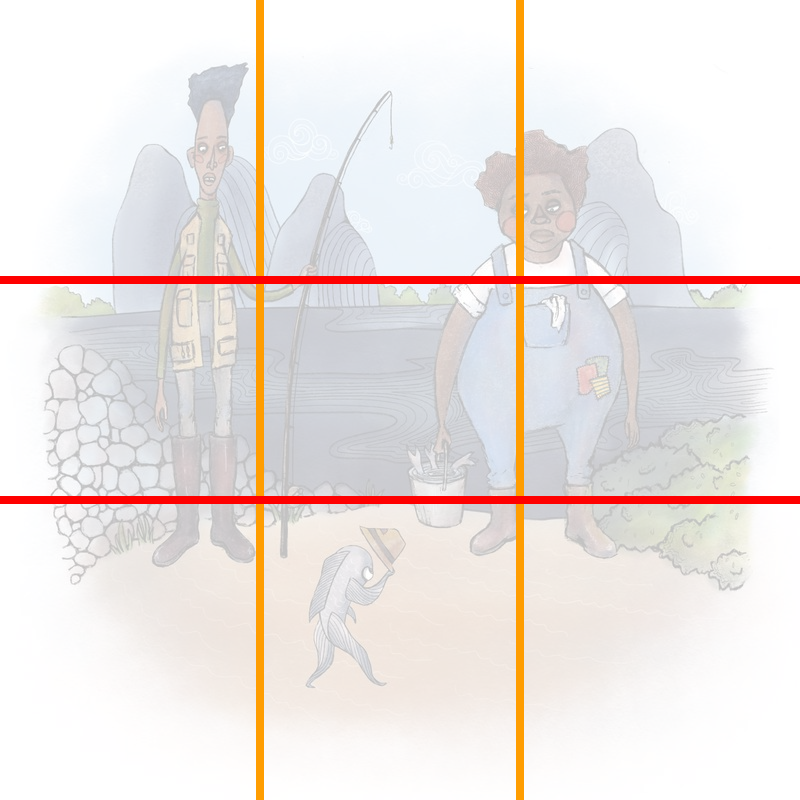
So I think you're following a very basic rule very well, which is the rule of thirds. The image is divided by the sky with the mountains, the dark sea and then the sandy shores. So that's one thing you did well with the composition. The one I don't agree with is how you placed you two main human characters in this setting.
I feel like you put them a little too far from each other. There is just this negative space that is created between the two men. Why don't you push the two characters closer to each other, in the middle, and push the mountains to the sides to make better use of the negative space?
Another issue that I'm noticing is the values. I think the round character's overalls are too similar of color to the sea and the mountains, and if you were to put the image in grayscale, they'd be very similar shades of gray. Same goes for the other character's pants that are almost, just almost blending in with the cool rocks that you've added.
What if you used more warmer colors (red, yellow, orange, brown) for the characters of the story to compliment the more cooler tones (blue, green) that you've used to color the background? One trick that people also use when illustrating a scene is manipulating the saturation. It's either that the background is really colorful but the main characters are not as much, or it's the otherway around where the background is a little bit dull, but the main characters are pretty saturated.
Another thing you could do is add a filter behind your characters so they stick out more. Usually when people draw backgrounds, far away objects tend to become lighter, desaturated and sometimes even blurry (you don't need to use that technique) or just less detailed. This is because at certain distances, you are more able to visibly see the atmosphere that then obscures your view of the distant background. Like so?
I hope this helps.
-
@Mandy-Forte Thanks for your response! Yes I agree the composition needs work! It started out as character doodles then I just added the background and fish in. I should have sketched out some different compositions. I'm really guilty of drawing without planning
@Michael-Angelo-Go wow thanks for the thoughtful feedback! It's so helpful. I'm glad I found my way to this forum. It definitely seems like my big issue here is lack of planning. I'm super guilty of this! I guess I just can't wait to get to the exciting part. I see what you're saying about the values as well. I will definitely use this feedback!
-
Nice first post. Welcome!
Since others have already critiqued, I will only add a note about the expressions. There is a special fish with a hat, but there isn't much expression from the people, the person on the right even looks very unimpressed with the fish. Maybe it's a "yeah yeah, nice try, now get into the bucket" kinda mood.

All my links: https://APHOTICMOTH.carrd.co/
-
@Freddie-Leota Thumbnails can be fun, they are also fast at first and then they can get harder past 5-10 if you haven't practiced. I also like to look at other compositions to get some ideas. Keep the thumbnail to simple shapes and 2-4 values to help you bring forward what you want us to read first.
And last but not least Welcome (how did I miss that, lols).
-
@CLCanadyArts Maybe they're having a bad day and seeing a fish take off their hat to them is like "I've had enough anthropomorphic animals to deal with today...".
-
Hi @Freddie-Leota, welcome to the forum and thanks for posting your piece!
I like the calming effect it has and blank facial expressions; pretty neat.
I agree with @Michael-Angelo-Go regarding rule of thirds, especially with front facing characters.
For a critique, I would like to see fish climbing out of the bucket and the main foreground fish doing something more distracting, which instantly provides a story of distraction and escape. Just my thoughts.
Look forward to seeing more of your work.
Cheers!
-
Welcome @Freddie-Leota ! I'm not new here, but I've had my head down for a long time, so I am trying to re-engage. I love the humor in your work. I love the lines in the water & the rock -- they feel very storybook-ish, & they make a fun contrast with the characters who feel slightly more "real", but still belong in this world.
Thank you to @Michael-Angelo-Go for the detailed analysis. Very instructive! I am learning a lot here.