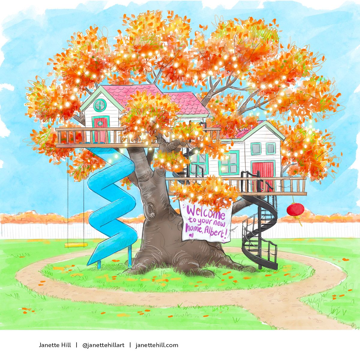
JULY CONTEST: Albert needs a home!
-
@lizardillo Thanks! It was a last minute adjustment. I wanted it to be a surprise for anyone who looked closely.
-
@Kim-Rosenlof it was a nice surprise

-
@LisaF are they announcing this months challenge during critique arena or will we know before that?
-
@lizardillo Thank you
 , all airplanes need emergency exit, so I thought it's fun to add one to my plane house also
-
I would definitely want to stay! Great job..
-
Hey gang, has everyone or anyone received the link to tomorrow’s Critique Arena? I never know when to expect it now as I’ve been left out of the mailing list the last three months in a row. Now I feel bad asking for another link, especially if I’m jumping the gun before the email goes out to all subscribers.
-
@DaveLeekArt I got one this afternoon!
-
I'm bummed I have to work and will miss it. =(x
-
i Have had my idea for a while, but didnt start it till this morning
.
-
@DaveLeekArt Yes, I got one yesterday! Hope you've had a link through by now...
-
@ruth nope! I’m on it though. Thanks for the reply:) See you guys there..
-
@LisaF I didn't get a link to the critique. Could you send it to me please?
 janettehillart@gmail.com
Or, could someone else send me the link?
-
@Janette Will do!
-
@LisaF You're a superstar! Thank you!
-
Congratulations @chrisaakins and @Iain-Davidson!!!!
And also congratulations to everyone who made the Sweet 16!
-
@Jeremy-Ross Thank you so much! And thanks to everyone who voted.
-
Congratulations to @chrisaakins and @Iain-Davidson !! So beautiful
 !
!I learned a lot from this month's critique arena ... good learning experience.
-
OK peeps, I know its a bit late for critique. I did this on the last day for submission so I should have done it earlier and got critique! But, where did I fail on this? I think the biggest thing is that I focused too much on the tree and not enough on the actual house. If you take away the tree, the house on its own looks a bit boring. Let me know your thoughts.

-
@Janette I love the happy colors of this! I think you are right about the viewer's attention being drawn to the tree. Part of it, I think, is the orange against the blue color contrast. I know people have mixed feelings about grey (there may be a color mixing joke in there somewhere) but if the orange were toned down a bit or darkened, that might help...it would also make the glowy fairy lights stand out even more.
Did you get a chance to watch Critique Arena live? One of the top 16 had perspective like yours where it's almost flattened...if you didn't see it live, check out the recording. I know Lee said something nice about it.
I love your color choices and the spiral staircase up an spiral slide down. I see the red paper lantern...are there any other references to your character that would identify him?
-
@Iain-Davidson the colors on this one is just adorable