Digital Sketching Series WIP
-
@Gary-Wilkinson These are so tight, you win the steady hand award. I wish I could get my lines to be so smooth. Of course, the compositions are great too.
-
Wow, these are all amazing @Gary-Wilkinson. I love the style. I was just scrolling through and thinking they couldn't get any better and then you upped the contrast and they did! Ha! Thanks for sharing your progress.
")
-
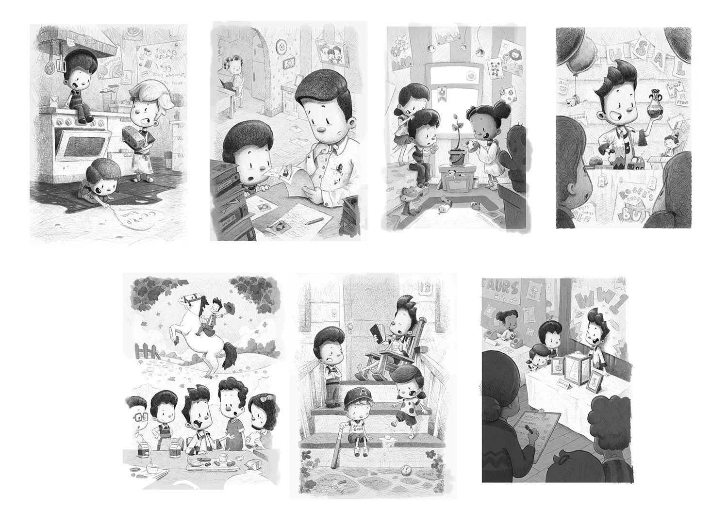
Thank you for all the comments. I think that everyone's advice on pushing the contrast has really helped improve the pictures. Got about 3 left to go, but happy how it's moving forward
-
Sorry I'm chiming in so late but this has a great vibe to it. I think you absolutely create a more traditional leaning atmosphere. There are still small details that tell me it's digital. Specifically, the evenly thick and evenly textured line on the front side of their faces. This part nudges digital but I don't think it's all that noticeable and don't think it impacts your aesthetic much. Again, this is pretty darn awesome, I love the way you crosshatched in perspective on the floor, that makes a massive difference!
-
@Gary-Wilkinson Just want to say these are really great Gary.
-
Another late chiming in just to say that I love this style. Definitely looks traditional and I do love seeing digital pencil rendering.
-
Well I'm super late replying on your posts, I've been away from the forum for quite awhile. Anyway I think what you got going here is very nice. Keep it up.
-
Pencil looks nice. Maybe a little light though. I usually darken up my sketched by duplicating the layer once or twice, and then reduce the opacity if needed. Overall, it looks and feels authentic to a true pencil sketch.
-
@gary-wilkinson that is gorgeous! I think you pulled it off beautifully!! Can’t wait to see this project finished.
-
Love it! They definitely have a traditional feel. I agree though that they could use the odd smudge here and there to really up the confusion to digital or traditional. Fabulous work!