Personal Project: Beatrix Potter kids magazine article
-
Hi everyone,
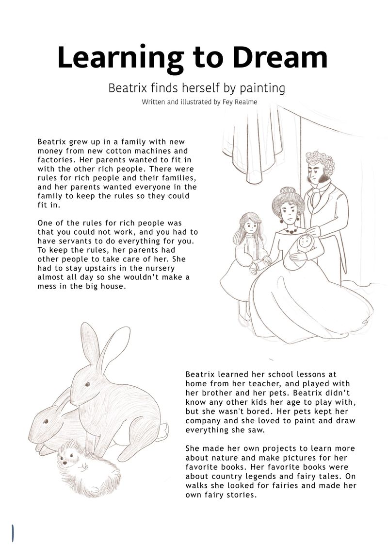
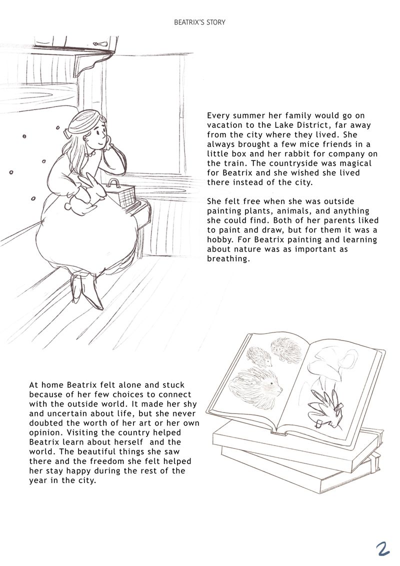
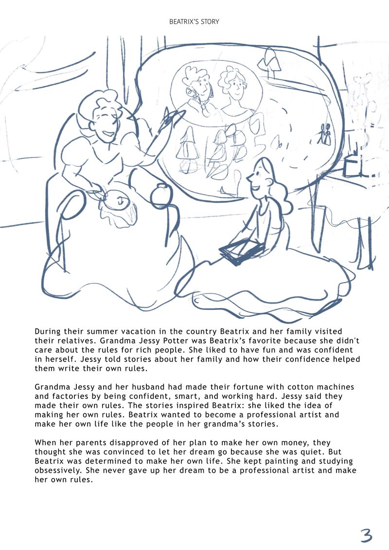
I am trying to flesh out my portfolio by doing personal projects inspired by work I have seen in children's magazines. I think that getting work for children's magazine illustration might be a good first step, anyway that's my goal for now. There is this magazine called Bravery for children (6-12), showing strong female role models from history, they usually have the story of one lady's life split into three parts (usually 3 pages per part, 3 paragraphs per page) with two spot illustrations or one half page illustration per page.I decided to cover Beatrix Potter (1866-1943), the author illustrator of the little books (Peter Rabbit, Mrs. Tiggy-Wiggle, etc.), who overcame upper middle class constraints and controlling parents by diligently working on her own interests (art and natural science), and trying to be positive in constrictive circumstances.
I don't have anything for you to critique at the moment, but I will really soon! My main goals in this project is to have cohesive illustrations that are dynamic, engaging, and accompany the text well. I wrote the article already and will be moving to sketches for the illustrations soon (there are quite a few, like 13). I am starting the project off with a "Draw this in Your Style" challenge set in the style I will use in the project, kinda like a landmark for me to use while working on the project.
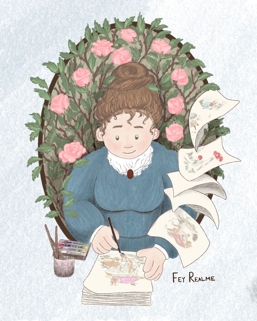
I will be posting my progress in this thread, and I hope that you all will help me work out the kinks to make stunning illustrations! Here is the DTIYS image for reference, to kick of the project. I hope some of you will join me with the hashtag #beatrixpotterdtiys.
Thanks for your time
-
Hey everyone. I made these three screen cap studies of the movie about Beatrix Potter to get an even better feel for the style and the approach.
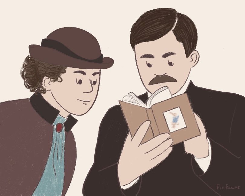
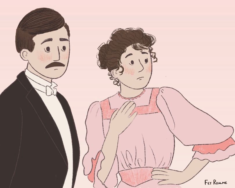
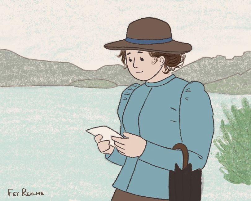
I feel like I am going in a good direction, but I'm also inexperienced so any input on how to make the execution more polished or attractive is welcomed.
some things I think are strong/I really like: the texture and the brush, the way I am doing faces and hands specifically, the muted colors.
Is there anything in these examples as a series that could be improved to be more polished? Do the flat colors and lack of highlight and shadow make the pieces seem flat? Is that a bad thing? If so, how do you think I can apply shadow and highlight without overworking the image and getting beyond the simplicity it has now?
Thanks for your time!
-
I finished the writing, and here are the rough to semi finished illustrations. How can i improve the way the pictures and words work together? Is the story bubble in the last illustration distracting or confusing? If so, any ideas how i can clarify it? Would it work if i took the bubble out