I’d appreciate help with this book cover! Please stop by if you can lend an eye.
-
To all the illustrators here who I have come to admire, and to those of you who I haven’t become familiar with yet… I’d really appreciate your help with this book cover if you have a moment to offer advice.
I’ve been working on an illustration job for nearly four years now. It’s finally coming together, and the last thing to paint is the cover. I can’t believe this is almost done! It’s a crazy and wonderful feeling!
To give a little background on the book…
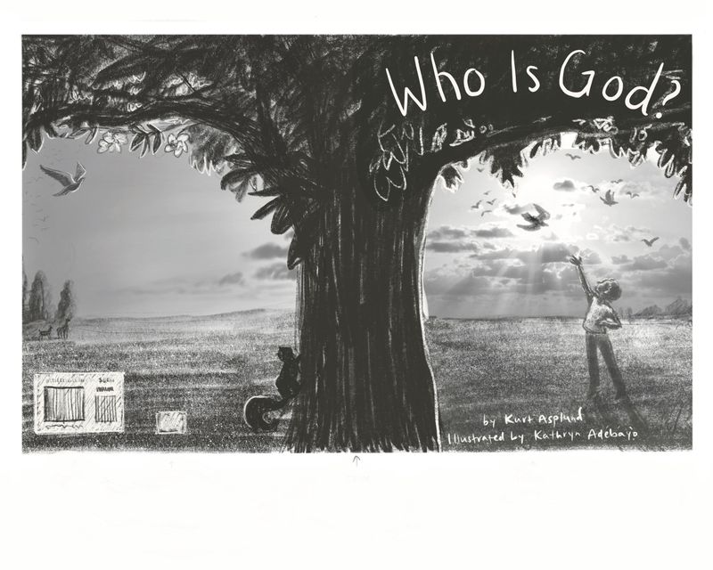
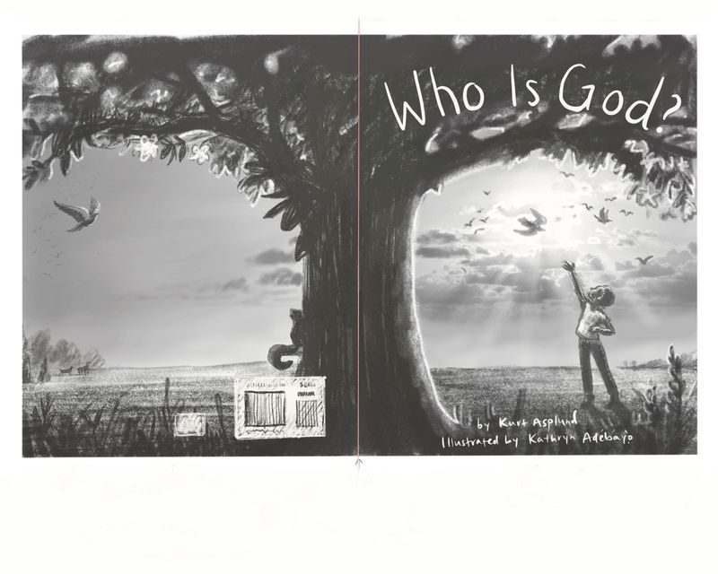
It’s a children’s book that shares analogies that kids can think about when considering God… For instance, the book compares God to the sun that gives life to the earth, and to love which we can feel but not see. The text doesn’t tell a story necessarily, but the pictures try to. They show a boy who loves this huge, beautiful tree in his yard who is devastated when it is cut down by workers building a road. (Both the boy and the tree are in the sketch below.) In his sadness, he wonders why God would let his beloved tree be cut down. He is comforted by his family, prayer, and a dream that shows him a tiny seedling. When he wakes up from the dream, he sees the same seedling in his yard and decides to transplant it, and lots of other plants, along the side of the newly constructed road. The last spread shows the boy as a grown man looking at all of the trees and plants which have grown to line the road, and which form a garden that includes many trees like the one that he loved.
I’ve been using a mix of watercolor and acrylics, then making some digital adjustments. All of the handwritten text is a placeholder for real font.
I’m really needing help with this cover because I want it to look professional, inviting, joyful yet reverent, and hopefully well-designed. Right now, this is what the sketch/value study looks like. I’ve tried lots of color studies so far, but nothing seems right. It makes me think that the sketch itself is missing something (or many somethings). How do you guys think I could improve this so that it looks like something you’d want to pick up off the shelf? What feelings do you get from it so far? (I know that’s a hard question without colors.)
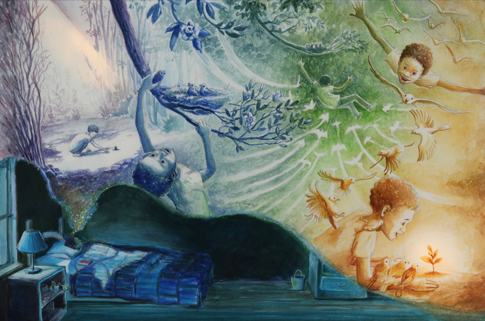
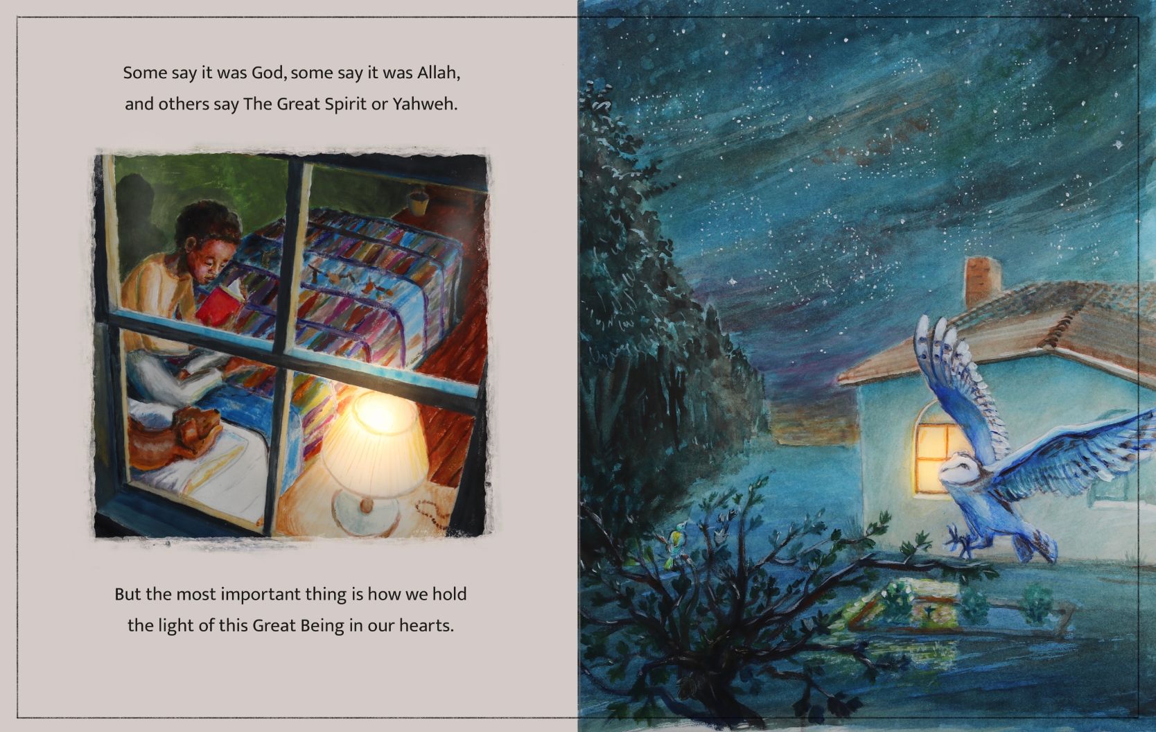
Here are some other (not fully edited) illustrations from the book to give a feel for what the art looks like.
Thank you so much for the help!
-
Congratulations on such a wonderful idea and you're almost done!! So great.
I really like your cover. I like that the tree is on both front and back. I love the rays of light with the dove in the center.
Just focusing on the front, it feels a bit heavy on the tree side to me. And the child is getting upstaged. I think that you could darken the value in the child and possibly the dove to bring the balance back over to them. Maybe lower the value of the tree trunk a little as well.
This is going to be a beautiful cover. I can't wait to see it finished, ON A STORE SHELF!
Lisa Burvant
www.lisaburvant.com
Instagram & Twitter & SVS: @burvantill -
@KathrynAdebayo congratulations with your book almost coming to fruition!
Some feedback I have is that the cover image has a lot going on with the texture in the trees, clouds and grass. If you look at the image as a thumbnail, the child is almost blending into the grass and clouds. The value of his pants is similar to the grass and his shirt similar to the sky. I would simplify some of the areas to make him stand out more.
Hope that helps! Good luck!
-
Hi Kathryn!
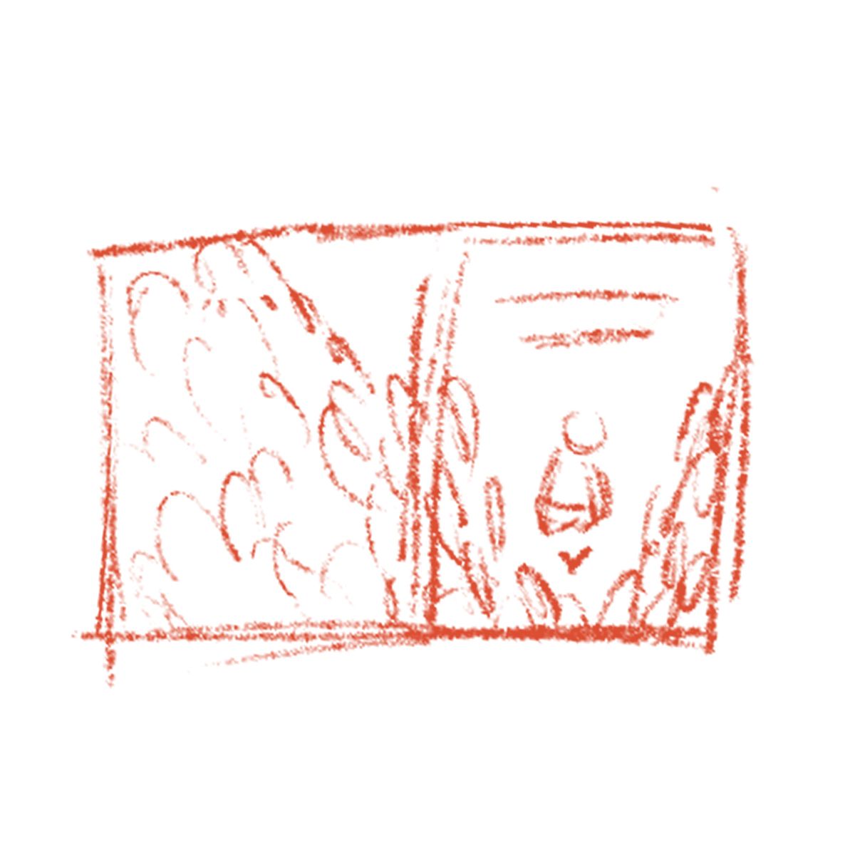
Your illustrations are gorgeous and the colors work so well together. As for the cover, I do agree with what others have said about the tree feeling a little overbearing. I know you mentioned an abundance of trees and plants in the last spread. Maybe you could do something similar for the cover? I've roughly sketched an idea below where the boy is planting a small seed and is surrounded by a large number of plants that continue to the back of the cover. Please let us know when these hit the shelves! Awesome work!
-
I think the cover design looks great, but if you darken the values on the boy, and lighten the tree to match I think it will be better balanced. Maybe one other foreground element of the same value on the right side of the boy will also help.
-
@KathrynAdebayo Wow...your art is breath-taking.
I understand design-wise what people are suggesting about making the tree a bit smaller, but keeping it large seems to better reflect the content of the book. The tree could be a bit lighter in value (how great is that white spine type going to look against that tree!).
The title seems too close to the top for me. I would pull the canopy down a smidge on the front, or maybe add a branch, so that you can still have the type knock out of the leaves. Maybe also lower the field's horizon to give the sky as much space as it has here in this original.
Because your handling of the sky is so dynamic, I'd suggest having the boy's shirt and pants be closer in value so they don't compete with what's going on in the sky.
-
@burvantill Thank you so much for the help and encouragement! That is such useful feedback. I’ve tried to implement your ideas in this next draft. I can’t wait to see it on a shelf too… surreal! Thanks again, and feel free to share any more advice that comes to your mind!
@ContinuousLines Hi! Thank you so much for your very helpful feedback. You’re right - the shapes and textures of everything are very busy and the boy just doesn’t stand out well enough. I’ve tried to make things a bit less busy now, but honestly it may still be too busy, especially the clouds - what do you think?
@aprilshin Wow, thank you for taking the time to make that thumbnail. That’s really awesome. For now, this is the sketch that the author and I have agreed on (in general), so unless it’s clear that I need to start from scratch, I’ll try to stick to this concept. I appreciate your suggestion to tone down the tree and have tried to do that a little bit, but the value is still quite dark - maybe too dark. Thanks again for your help, and I welcome any more advice that you have.
@jenithornhill Thanks so much for your help. I think your comments are spot on. I also really like the idea of something on the right to balance things a bit and have tried to incorporate that in this next draft. Do you think it looks balanced? Thanks again!
@RachelArmington Woah, thanks so much for your compliment. That is very encouraging! I really appreciate your suggestions and have tried to take them to heart in this next draft. Great call on the text being too close to the top, and I think lowering the point of view a bit looks much better to my eye. Please let me know if you have any other suggestions!

Do you guys think it's better?

-
A couple more tweaks…
-
Ah, sorry I didn't take into consideration that you would've agreed upon this design beforehand. Apologies! But the recent version looks a lot better in my opinion!
-
@aprilshin Oh no worries at all! It wasn't clear that it was an agreed upon design, so a suggestion for a different one made total sense.
") Thanks again for your help.
Thanks again for your help. -
@KathrynAdebayo YESSS!!!

-
@burvantill Yay!
-
Thanks so much for the help so far. Here are some color studies. The feeling i’m going for is warm, inviting, hopeful, intriguing and… loving? If that’s a feeling that makes sense outside of my head.
I’d appreciate suggestions and would love to know which one you like best.
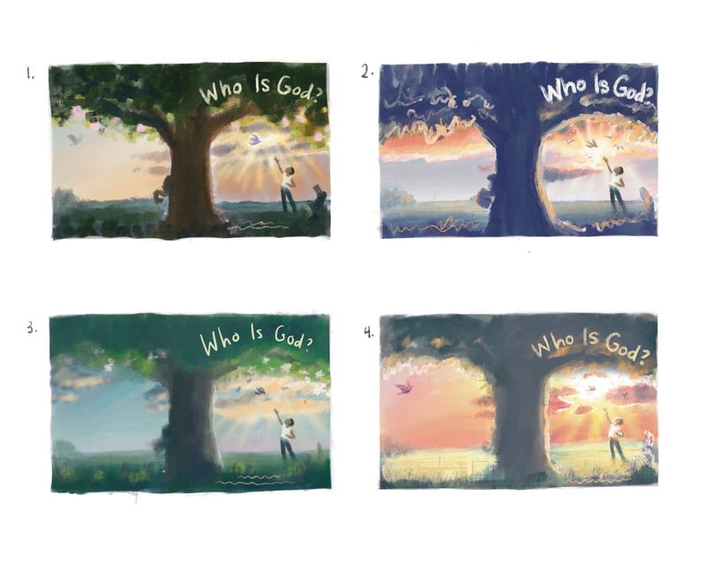
Honestly, none of these are really standing out to me as a good start. Colors are hard. Any ideas?
-
Hi @KathrynAdebayo -- hope I'm not too late with this comment...
First of all, great job communicating the feeling you're trying to evoke in this cover.
Secondly: are you creating the artwork to the dimensions of the cover template? (Please disregard if you're an old pro at this and know all about creating cover artwork ... from your comment, I got the feeling that this might be your first book.) If you don't have a cover template/cover dimensions to use as a guide to create the cover artwork, pause right now and get that information! Otherwise, you might be putting in a lot of hard work and designing a composition that isn't the correct dimensions and that could be a huge headache for you or the book designer.
There are a lot of things that go into creating cover artwork. Is the book going to be printed as a hardcover, softcover, or both? What is the size of the bleed/foldover, spine, margins, and hinge?
Looking at the layout from a design perspective, I see a few potential issues.
- It looks like a few elements might be too close to the margins.
- Ideally, there should be more grass/empty space on the bottom so there is ample room for placement of author and illustrator names.
- What is the width of the spine? (If it's softcover, a line indicating the spine is adequate, as a softcover spine usually measures about 2mm. If the book will be printed hardcover, the spine will be at least 0.25" wide and that needs to be accounted for. Spine width varies depending on the number of pages and weight of the paper.)
- There may not be adequate room for the title, even though in the sketch it looks like there will be. This is because margins and hinge will affect title placement. If the author or book designer is planning to have really large text for the title, the cover art should leave at least 1/2 page open for the title; right now there is about a 1/3 of the page open for title placement. This is adequate if the author and/or book designer are not planning on the title being a prominent element on the cover.
- What content is going on the back cover? Has the author shared that content with you so you can ensure you're leaving enough room for text?
As far as the color studies, I think 2 & 4 are the most effective. However, the trunk and leaf canopy are really dark and read as one solid shape, and that's overpowering the design; it's the first thing I look at. Does the trunk have to be shown on the cover? Would showing the leaves be enough? If the trunk needs to be shown, can it be a lighter value? Could you move it more to the left so there is not such a strong dark verticle that draws the eye?
Again, please forgive me if I've overstepped in my assumptions. This is all meant to help and not intended to step on any toes. And if you have any questions, please ask. Congratulations on almost being done with illustrating this book! Would love to see how it all turns out for you!
illustrator - author - smiley person
mbaileyart.com
instagram.com/mbaileyart/ -
Numbers 2 & 4 are my favorite. I like the pinks and red sky in 4 the most. If you go with 2, I would make the child's shirt orangish to match the clouds in the sky so she/he is more visible.
@Melissa-Bailey-0 makes some great points about the design template. Definitely get the specs before you go any further, if you haven't already.Lisa Burvant
www.lisaburvant.com
Instagram & Twitter & SVS: @burvantill -
@KathrynAdebayo I love seeing all the progress

-
@KathrynAdebayo HI!!! For the colors, is there a chance we can combine the tree from 1 and the sky from 2?
Portfolio: nyrrylcadiz.com
Instagram: https://www.instagram.com/nyrryl_cadiz/
YouTube: https://www.youtube.com/channel/UCbJCF1Im8ZO7hpGWTKOJMuA -
@Melissa-Bailey-0 Now THIS is exactly the type of critique I was hoping for. Thank you so much for taking the time to write that and share your experience and knowledge.
A bit of background, yes, this is my first book. I'm a complete novice.
 I came into the project knowing nothing about illustration, contracts, publishing, etc. SVS has really been essential in my learning process. So, initially, I thought that I was going to be working with a legit publishing company (with art direction, promotion of the book, etc) but I have come to realize that it is an unusual version of a vanity publisher, and that they will have nothing to do with me until I send them the completed book file. I've reached out to the author of the book to share my concern about this and to warn them that they may be disappointed by spending their money this way, but ultimately the decision is theirs. It may end up being a self published project.
So... I'm really happy to read your insights about needing more room for text and finding a proper template. I agree that the vertical trunk draws a lot of attention and the shape of the tree is heavy. I think it's all a bit too much for one design. I've definitely been feeling bothered by the text - It seems like it should be more prominent and fixing that might mean removing the tree or greatly reducing it.
The book is 8x10 and I'm planning for both a soft cover and hardcover version.
There are really more questions to be answered before I can lay paint to paper, but hopefully in the meantime the design and colors can be solidified a bit. I'm super grateful for your comments and will take them into account in the next draft. I really appreciate how you help so many people on this forum!
-
@KathrynAdebayo you're so welcome!
It sounds like you could be in a tricky situation -- you're right that the author ultimately has the final say. In my experience working with self-publishers, my advice would be RUN AWAY from any vanity publisher. Most take your money, produce a sub-par book, and do next to nothing to market the book. The author ends up paying out a bunch of money to see no return on their investment.
So as the illustrator, what you really need now is printing specs, before you can move forward. Get those cover dimensions, or better yet, since this is your first time illustrating a book, a cover template! That will give you dimensions and guidelines, which are a great help in designing the cover.
Are you going to be formatting the book yourself for print? Or is the author/publisher going to hire a book designer to do that?
Please get in touch with me if you have any questions.

-
@burvantill Sorry it took a while to reply - Thank you so much for your input! I really appreciate it and will take everything into consideration.