Questions on planing a Toot & Puddle master copy
-
Hi fellow illustrators,
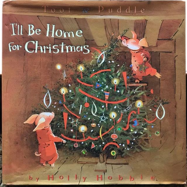
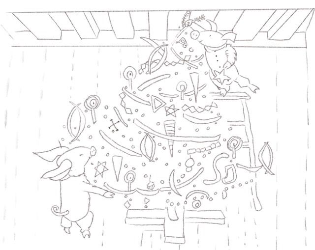
I’m wondering the best way to work in traditional watercolor for a master copy of one of my favorite illustrators, Holly Hobble.I love the cover of her picture book, I’ll be Home for Christmas. The cover illustration is the one I want to recreate. I’m including a copy of the illustration and a line art drawing.
My questions are:
What are the likely steps Holly Hobbie took in creating this image?Do I start with the background doing a brown wash of watercolor?
Do I exclude the tree area in the brown wash, or does it not matter?
After masking out items in the xmas tree, do I wet the tree area down to do wet on wet greens, let it dry, then add pine branch details?What other steps do you think Holly Hobbie used in creating this image?
Thanks,
Robin
-
Watercolor can be a tricky beast. You'll likely need to do several versions of this. I'm not sure of your level of comfort with watercolor, so I'm going to approach this as if you're new. Please pardon me if something is old hat.
There is really a lot with watercolor, I'm going to do my best at explaining just a few steps that I can see from looking at the book cover. You may want to use your pencil sketch as a transfer sketch, so that you can transfer this to multiple sheets of watercolor paper, if you haven't done that already.
Some things to think about with watercolor:
-Generally, work from light to dark.-Watercolor pigments vary in there level of transparency. If you have worked digitally before, think of it as everything is set to multiply.
-The paper is important. Cold Press paper has more texture and Hot Press will be smoother. (Hard to say for sure, but based on the lack of tooth in the big areas of color, I'm guessing they used HotPress. Cold press is more common though. Try both if you can?) There is also sizing to consider. Sizing in watercolor is referring to how absorbent the paper is, it's a binding agent. Someone please correct me if I'm wrong, but the more sizing, the more pigments will sit on the surface, giving you brighter colors. Sizing varies brand to brand and you can wash some of it off when you stretch you paper.
-For masking, you'll want to leave some elements in the illustration masked longer than others. Seems obvious, but I had to remind myself of this when thinking through the process for more complicated watercolors pieces lol.
For the steps I think they took.
You'll want some masking fluid for this one, like you mentioned. It looks like the ornaments are masked, the pigs, and parts of the tree. If you look in the bottom left corner of the tree, on the lightest branches, it looks like it was masked, the background (BG) painted, mask removed, then green on top. You can see some areas around the lightest part of the tree, on the edge, where the green pigment went on the brown BG a bit. It is hard to tell for sure though, because on the left side of the tree you can see some areas where it looks like they painted wet into wet.You'll have to experiment, but I think you're on the right track. Starting with the BG, moving to the tree where there seems to be some wet into wet with the BG, then once dry adding the darkest greens of the tree like you asked. Red streamers last to be unmasked. Most of the white parts no the tree look like they were added last with an opaque white.
Writing through this and thinking more, for the tree, they may have had the branches masked, then while doing the BG, did some wet into wet with the green and the BG. Once dry, removed the tree mask, then paint those branches green, using washes of green. Did that make sense?
Long winded, but I hope I was able to make sense and this was helpful.
Happy painting!
-
Hi. I have this book so I took it down and looked at it with a bright light. Definitely mask off the lights, sparkles and I think also the colored ornaments, including all the red decorations. Also, unless you are really good at painting washes around a white area, I would mask off Toot and Puddle, too.
The background is definitely layered washes. Its possible that the first wash is a light brown and light sage-y green. Then I think she built up from there, painting around the tree details with the layers of brown, and maybe even green at the same time in area's. There are a couple of small bleeds. With everything masked off you can get into the detail of the tree with out worrying that you might lose a sparkle here and there.
She uses a light ink here and there after all is said and done.
Good luck and FUN! I can't wait to see it finished. I LOVE Holly Hobbie. =)x -
Hi Norman Morana & Lisa Burvant,
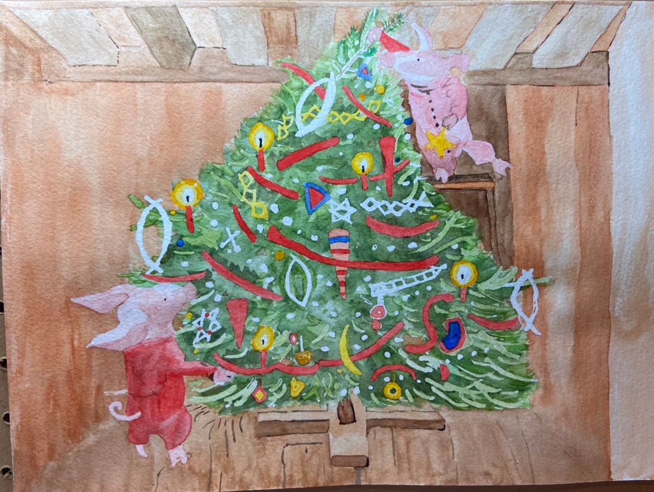
I’ve got a work in process to share with you both and the svs forum. Lisa & Norman your advise covered lots of areas and helped me plan. After I put masking fluid on the cold press paper, I had a little fear set in, and this project sat in the background for a bit. I am a novice watercolor painter, so hesitation at various points is probably normal.
All the masking fluid is removed now. Moving forward from here the task list look like this to me-- Add more background color wash to the wood walls and ceiling.
(Requires some more masking around the pigs and tree)
-Add more red color wash to the pig near the top of the tree
-Add more green branches and pine needles to tree.
-Add dark brown outline details to the tree, pigs, tree, and background.
Now I’ve reached a point where I can see the illustration develop I’m feeling the project is heading in the right direction.
I’m open to hearing thoughts and ideas as I move forward.
Thanks again for looking,
") Robin
Robin - Add more background color wash to the wood walls and ceiling.
-
@RobinCampbellArt Hi Robin! I am also a huge fan of Holly Hobbie and look to her for inspiration all the time. Just this week I was reading her book, The Art of Holly Hobbie. At one point she describes her process, which I thought you might enjoy. This is what she says she does after figuring out her sketch. Hope it is helpful:
I begin to paint cautiously, with pale washes of watercolor, using small kolinsky brushes. Stronger colors are added as I discover what I want them to be. Watercolor is a live, spontaneous medium. I frequently change my mind in midstream, and scrub out areas of the painting, which can create interesting textures. I achieve other effects by puddling the watercolor. Mistakes also play a part in the process. Spills and dribbles. Too often a loaded paintbrush pops from between my fingers - I'm concentrating too hard, I think, when that happens - and rolls across the picture, adding something I didn't intend. Important aspects of a piece, a background or even another figure, may be efforts to conceal accidents.
As the painting develops, I use a pen and colored inks, as needed, to emphasize line and detail. The final piece is the result of alternating layers of watercolor and ink drawing.
. . . [being in flow] can lead to a state of temporary blindness, in which I can overwork a small painting to death . . . It is essential for me to get away from a painting in order to see what I'm doing. When I can't leave something alone, it usually means I've already ruined it . . . You must know when to stop. That is very satisfying, the feeling that you have stopped at the right time . . .
-
Hi @Timbdsf-
Thank you for finding the watercolor process details from Holly Hobbie. There are some good tidbits from that Holly Hobbie art book. About the rubbing out of areas, I did have to resort to removing watercolor once on the xmas tree stand, and I don’t think it’s noticeable. I will add another candle ornament on the left side in the background wood area, by first rubbing out.
Masking areas again had me worried, but I googled it and it sounds like I won’t damage the underpainting or paper. The cold press paper I used does seem to be giving this master copy a more textured look than the original. Hot press is probably a better paper choice when I do my next Holly Hobbie master copy, even though I haven’t used it before.
This in-process master copy is turning out so far, and I will try not to overwork it -
@RobinCampbellArt
Hi! I'm glad you continued. I'm having trouble viewing it properly on my phone screen. I will take a peak from my computer so I can give a better feedback. -
Hi @RobinCampbellArt this is a great first pass! Very technically complicated illustration. I can see that the way you’re working will lead to a nice master copy. The values are not quite there, but nailing values it a life long practice. I find myself squinting at illustrations, this can help blur the details so you really only see the values. You generally want to aim for 3 clear value groups, light, medium, and darks. But this is great! I have to build myself up too when I go to make a mark on the paper, it can be scary haha. Freeing part is you’ve done it this time, you can do it again and again.