May 2022 Storm WIPs
-
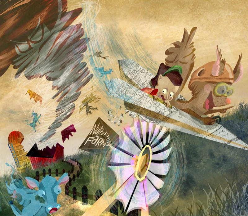
I feel I'm nearing the end on this piece. I don't like to over work things and I've spent a good twenty hours or so on this now - but do let me know if anything pops out as strange. Thanks all!
-
@Kristen-Lango LOVE your textures! There's so much movement in this piece! And 20 hours of work ... whew! Know the feeling.
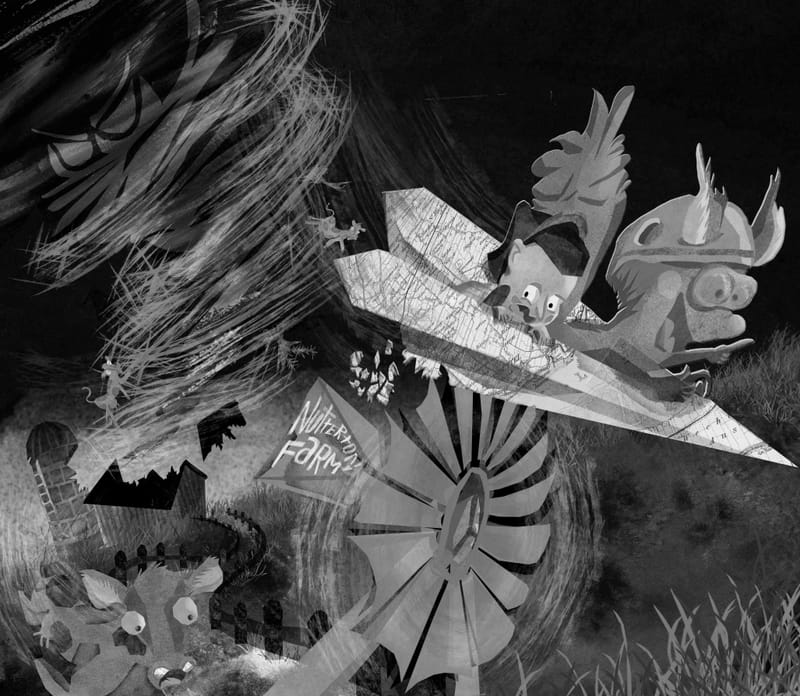
As you're finalizing, you may want to pay attention to your values and how they impact the storytelling. While the storytelling is much clearer, after seeing all the elements come together, there still is some confusion for me, especially the angle of the plane and how just the tip is going off the page. Controlling your values might help with that, along with adjusting the individual elements, if they're on separate layers.
What is your focal point? Do you want the eyes to go to the plane & characters first, or the storm, or the farm? Or the windmill? (That's the lightest element with the most contrast, so it does tend to draw the eye.)
Hope you don't mind that I took a screenshot -- this is to visually show what I'm talking about. I didn't change anything to it but convert to grayscale, allowing us to focus on the value without color.
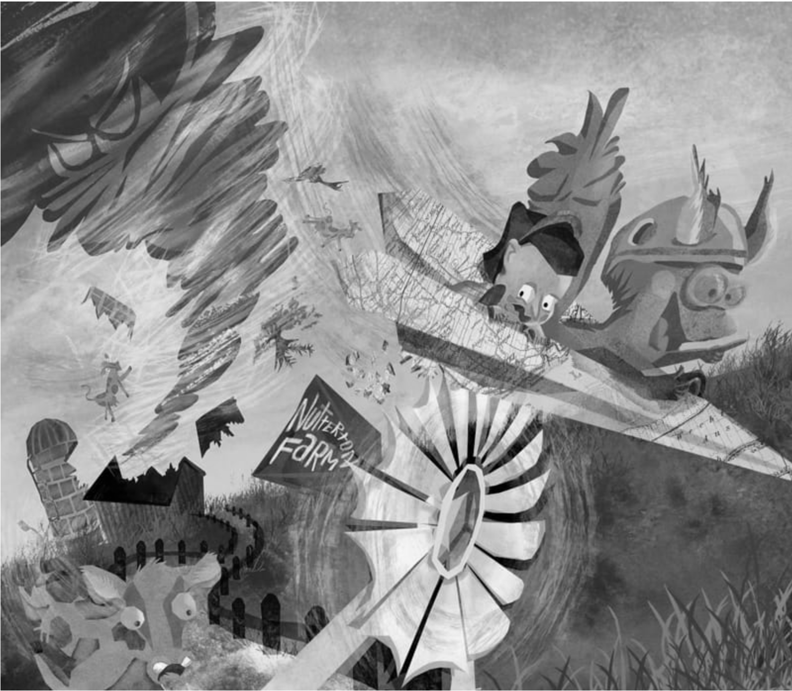
While there are light and darks, the main elements tend to land in a middle value.Here is that same image with some value adjustment:
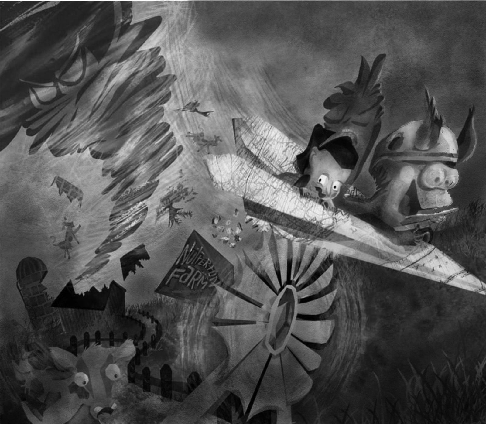
This example might be a little darker than you were originally going for, but I really wanted to push the values to put the focus on the plane and main characters -- plus, tornadoes usually are accompanied by darkened skies that knock out a lot of light.One more thing you may want to consider is adjusting or changing the color of Nutterton -- he is a middle value and doesn't stand out against the similarly colored sky.
Just a few thoughts. Love all the movement and detail in this piece! I think adjusting some colors and values will really clarify the storytelling and take it to the next level!
illustrator - author - smiley person
mbaileyart.com
instagram.com/mbaileyart/ -
@Melissa_Bailey Thanks so much for this!! I really appreciate you taking the time to do that value study and typing this up! This helps me so much in understanding how to make this more clear and effective... I spent 10 minutes looking at it thinking, hmm something isn't quite right, and this has definitely helped me to see what that is!
Things are on separate layers so adjusting this should be doable. Thanks again! I'll send another version once I've taken a crack at fixing those values
")
-
@Kristen-Lango you're so welcome! Glad it helped clarify things for you and you know where you want to go with this piece now!
illustrator - author - smiley person
mbaileyart.com
instagram.com/mbaileyart/ -
Great textures. It is definitely a fun composition. I would have never thought of a blue cow, which is really comical. You are really developing your own style and heading in an exciting direction.
-
@Melissa_Bailey Definitely it did!
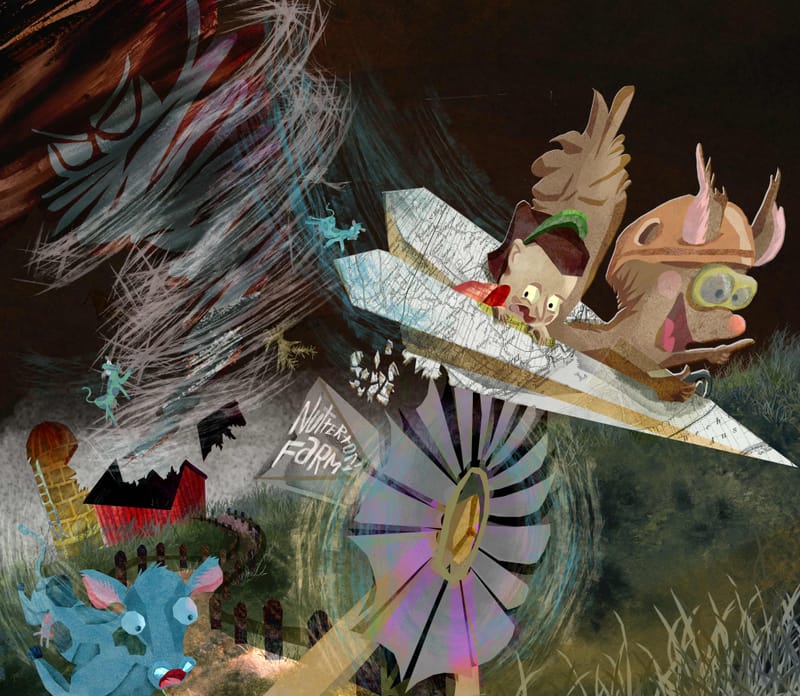
Here's what I've come up with
-
And here is the black and white of that, which I think makes things more clear... I've left a little white around the characters as well as a way to draw attention them in the chaos of the scene... I'm going back and forth if I like that part or not... -
@Kristen-Lango MUCH more clear! The focus is now on the main characters. Well done!
illustrator - author - smiley person
mbaileyart.com
instagram.com/mbaileyart/ -
@Melissa_Bailey Aw thank you! You've been such a help
-
@Robert-Henderson Thank you Robert! That's really sweet of you to say and means a lot to me
